 我要评论
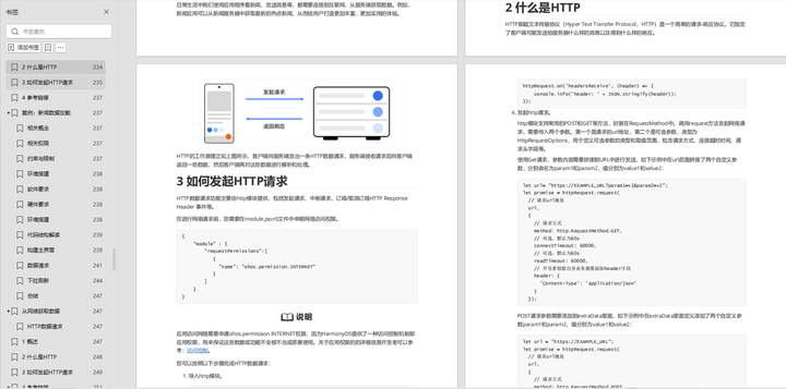
我要评论设置组件的颜色渐变效果。
lineargradient
lineargradient(value: { angle?: number | string; direction?: gradientdirection; colors: array; repeating?: boolean; })
线性渐变。
卡片能力: 从api version 9开始,该接口支持在arkts卡片中使用。
系统能力: systemcapability.arkui.arkui.full
参数:
| 参数名 | 类型 | 必填 | 说明 |
|---|---|---|---|
| value | { angle?: number | string, direction?: gradientdirection, colors: array<[resourcecolor, number]>, repeating?: boolean } | 是 | 线性渐变。 - angle: 线性渐变的起始角度。0点方向顺时针旋转为正向角度。 默认值:180 - direction: 线性渐变的方向,设置angle后不生效。 默认值:gradientdirection.bottom - colors: 指定某百分比位置处的渐变色颜色,设置非法颜色直接跳过。 - repeating: 为渐变的颜色重复着色。 默认值:false |
sweepgradient
sweepgradient(value: { center: array; start?: number | string; end?: number | string; rotation?: number | string; colors: array; repeating?: boolean; })
角度渐变。
卡片能力: 从api version 9开始,该接口支持在arkts卡片中使用。
系统能力: systemcapability.arkui.arkui.full
参数:
| 参数名 | 类型 | 必填 | 说明 |
|---|---|---|---|
| value | { center: point, start?: number | string, end?: number | string, rotation?: number | string, colors: array<[resourcecolor, number]>, repeating?: boolean } | 是 | 角度渐变,仅绘制0-360度范围内的角度,超出时不绘制渐变色,只绘制纯色。 - center:为角度渐变的中心点,即相对于当前组件左上角的坐标。 - start:角度渐变的起点。 默认值:0 - end:角度渐变的终点。 默认值:0 - rotation: 角度渐变的旋转角度。 默认值:0 - colors: 指定某百分比位置处的渐变色颜色,设置非法颜色直接跳过。 - repeating: 为渐变的颜色重复着色。 默认值:false 说明: 设置为小于0的值时,按值为0处理,设置为大于360的值时,按值为360处理。 当start、end、rotation的数据类型为string,值为"90"或"90%",与90效果一致 |
radialgradient
radialgradient(value: { center: array; radius: number | string; colors: array; repeating?: boolean })
径向渐变。
卡片能力: 从api version 9开始,该接口支持在arkts卡片中使用。
系统能力: systemcapability.arkui.arkui.full
参数:
| 参数名 | 类型 | 必填 | 说明 |
|---|---|---|---|
| value | { center: point, radius: number | string, colors: array<[resourcecolor, number]>, repeating?: boolean } | 是 | 径向渐变。 - center:径向渐变的中心点,即相对于当前组件左上角的坐标。 - radius:径向渐变的半径。 取值范围:[0,+∞) 说明: 设置为小于的0值时,按值为0处理。 - colors: 指定某百分比位置处的渐变色颜色,设置非法颜色直接跳过。 - repeating: 为渐变的颜色重复着色。 默认值:false |
示例
// xxx.ets
@entry
@component
struct colorgradientexample {
build() {
column({ space: 5 }) {
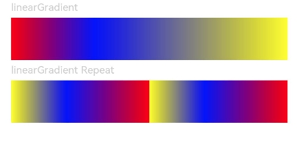
text('lineargradient').fontsize(12).width('90%').fontcolor(0xcccccc)
row()
.width('90%')
.height(50)
.lineargradient({
angle: 90,
colors: [[0xff0000, 0.0], [0x0000ff, 0.3], [0xffff00, 1.0]]
})
text('lineargradient repeat').fontsize(12).width('90%').fontcolor(0xcccccc)
row()
.width('90%')
.height(50)
.lineargradient({
direction: gradientdirection.left, // 渐变方向
repeating: true, // 渐变颜色是否重复
colors: [[0xff0000, 0.0], [0x0000ff, 0.3], [0xffff00, 0.5]] // 数组末尾元素占比小于1时满足重复着色效果
})
}
.width('100%')
.padding({ top: 5 })
}
}
@entry
@component
struct colorgradientexample {
build() {
column({ space: 5 }) {
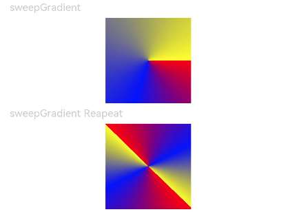
text('sweepgradient').fontsize(12).width('90%').fontcolor(0xcccccc)
row()
.width(100)
.height(100)
.sweepgradient({
center: [50, 50],
start: 0,
end: 359,
colors: [[0xff0000, 0.0], [0x0000ff, 0.3], [0xffff00, 1.0]]
})
text('sweepgradient reapeat').fontsize(12).width('90%').fontcolor(0xcccccc)
row()
.width(100)
.height(100)
.sweepgradient({
center: [50, 50],
start: 0,
end: 359,
rotation: 45, // 旋转角度
repeating: true, // 渐变颜色是否重复
colors: [[0xff0000, 0.0], [0x0000ff, 0.3], [0xffff00, 0.5]] // 数组末尾元素占比小于1时满足重复着色效果
})
}
.width('100%')
.padding({ top: 5 })
}
}
// xxx.ets
@entry
@component
struct colorgradientexample {
build() {
column({ space: 5 }) {
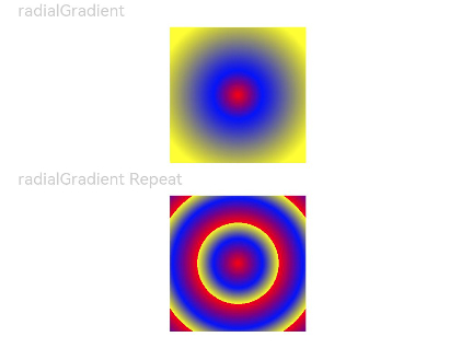
text('radialgradient').fontsize(12).width('90%').fontcolor(0xcccccc)
row()
.width(100)
.height(100)
.radialgradient({
center: [50, 50],
radius: 60,
colors: [[0xff0000, 0.0], [0x0000ff, 0.3], [0xffff00, 1.0]]
})
text('radialgradient repeat').fontsize(12).width('90%').fontcolor(0xcccccc)
row()
.width(100)
.height(100)
.radialgradient({
center: [50, 50],
radius: 60,
repeating: true,
colors: [[0xff0000, 0.0], [0x0000ff, 0.3], [0xffff00, 0.5]] // 数组末尾元素占比小于1时满足重复着色效果
})
}
.width('100%')
.padding({ top: 5 })
}
}
最后,有很多小伙伴不知道学习哪些鸿蒙开发技术?不知道需要重点掌握哪些鸿蒙应用开发知识点?而且学习时频繁踩坑,最终浪费大量时间。所以有一份实用的鸿蒙(harmony next)资料用来跟着学习是非常有必要的。
这份鸿蒙(harmony next)资料包含了鸿蒙开发必掌握的核心知识要点,内容包含了(arkts、arkui开发组件、stage模型、多端部署、分布式应用开发、音频、视频、webgl、openharmony多媒体技术、napi组件、openharmony内核、harmony南向开发、鸿蒙项目实战等等)鸿蒙(harmony next)技术知识点。
希望这一份鸿蒙学习资料能够给大家带来帮助,有需要的小伙伴自行领取,限时开源,先到先得~无套路领取!!
获取这份完整版高清学习路线,请点击→纯血版全套鸿蒙harmonyos学习资料
鸿蒙(harmony next)最新学习路线

-
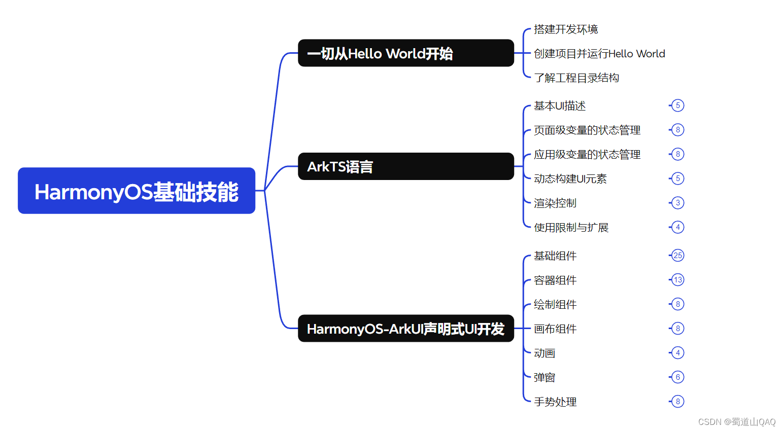
harmonos基础技能
- harmonos就业必备技能

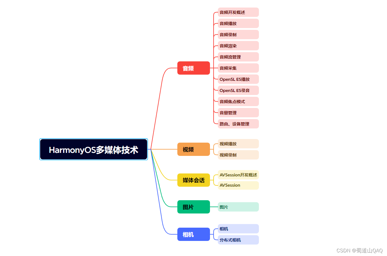
- harmonos多媒体技术
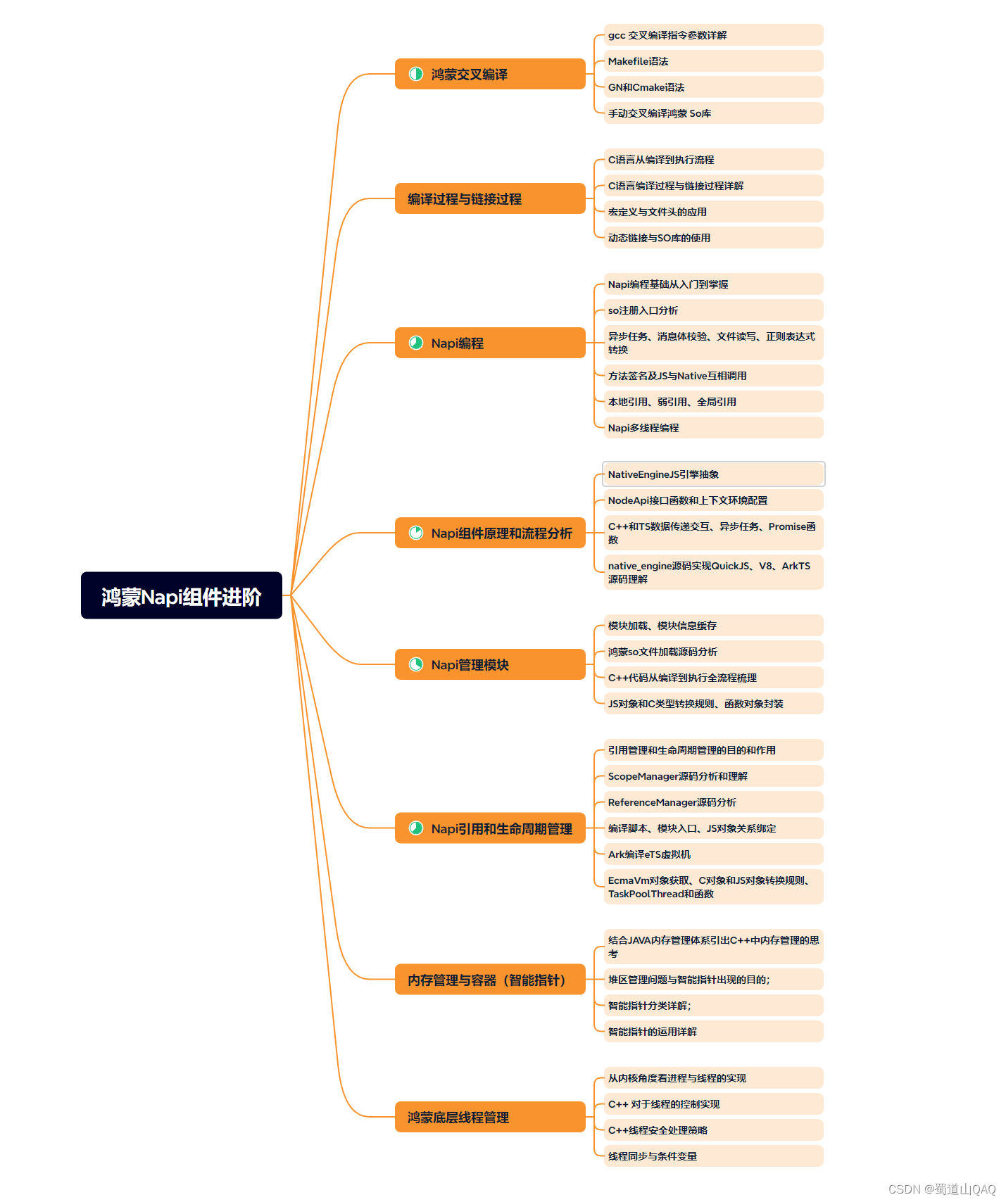
- 鸿蒙napi组件进阶
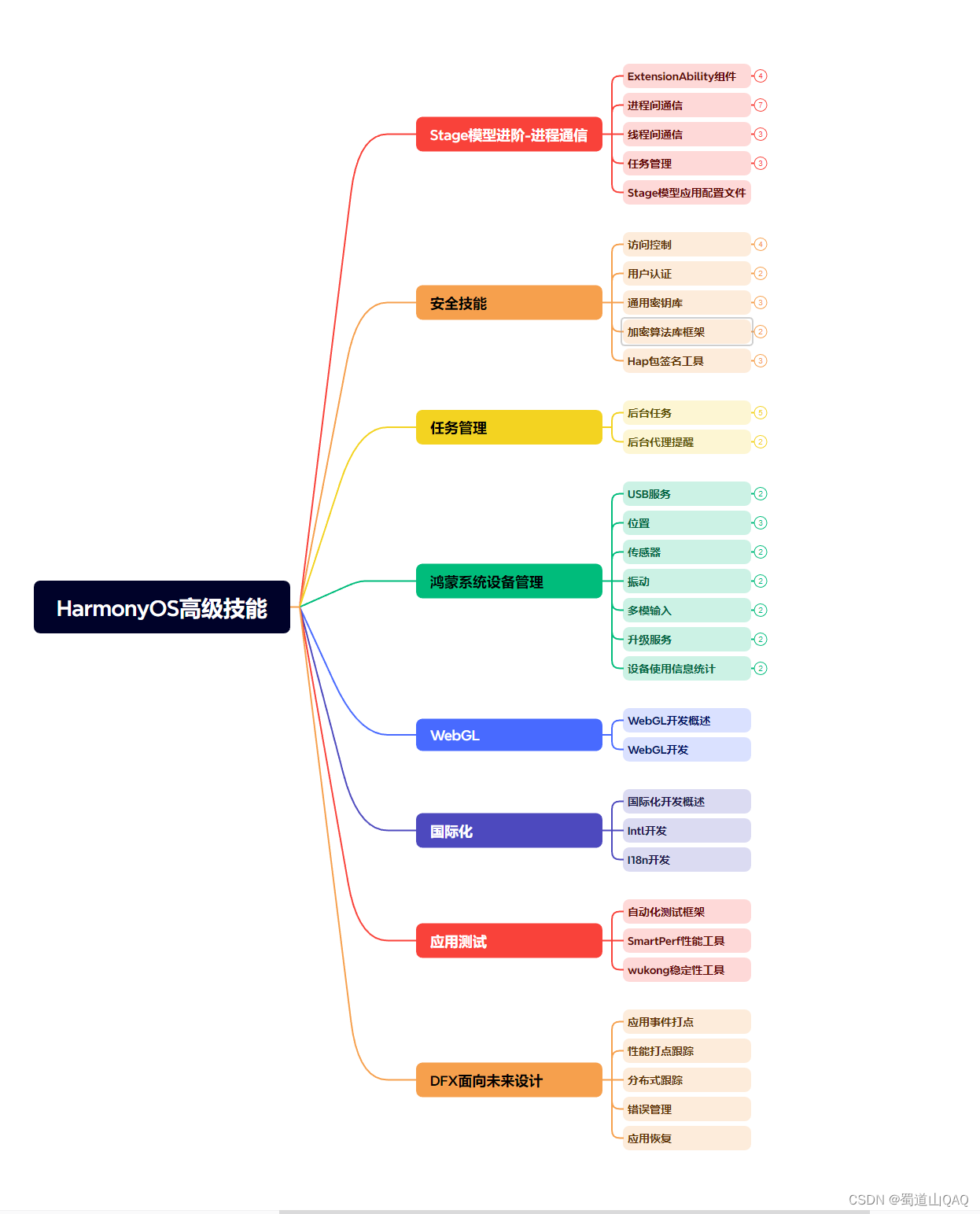
- harmonos高级技能
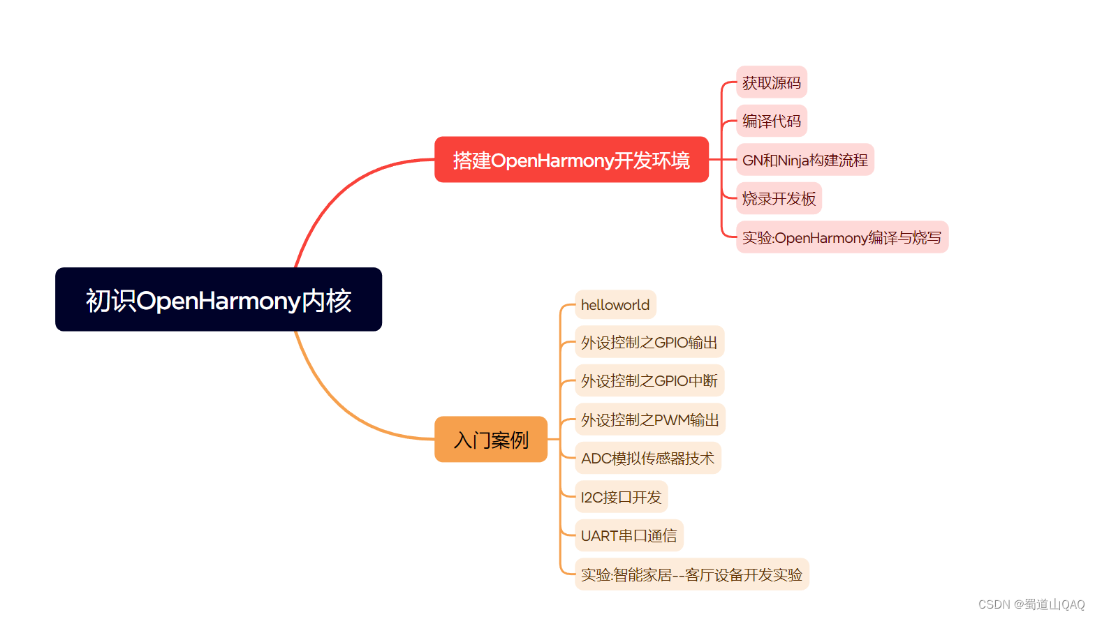
- 初识harmonos内核
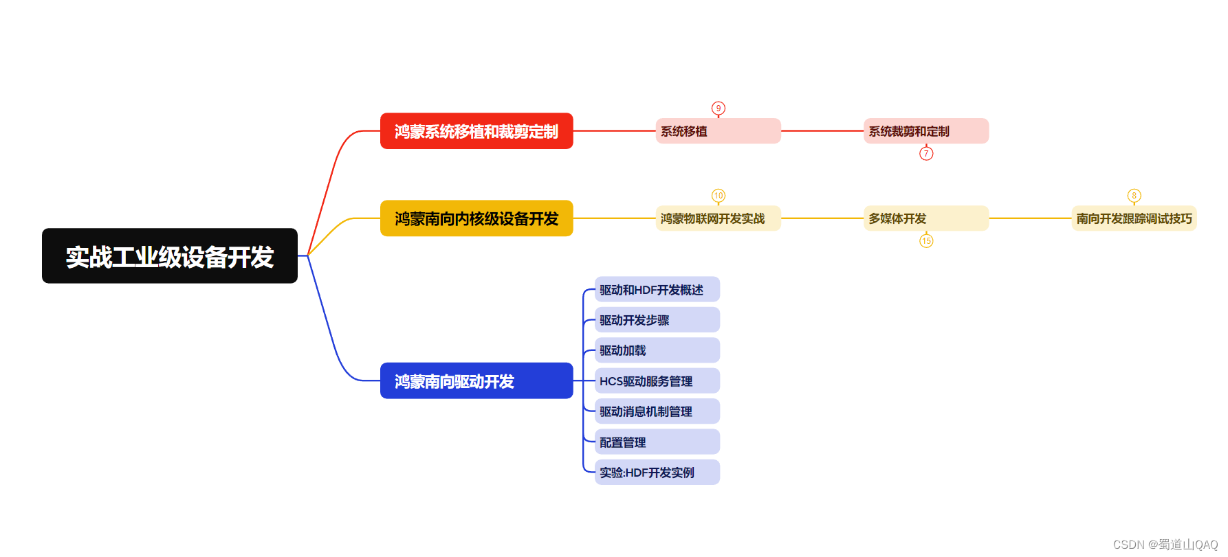
- 实战就业级设备开发
有了路线图,怎么能没有学习资料呢,小编也准备了一份联合鸿蒙官方发布笔记整理收纳的一套系统性的鸿蒙(openharmony )学习手册(共计1236页)与鸿蒙(openharmony )开发入门教学视频,内容包含:arkts、arkui、web开发、应用模型、资源分类…等知识点。
获取以上完整版高清学习路线,请点击→纯血版全套鸿蒙harmonyos学习资料
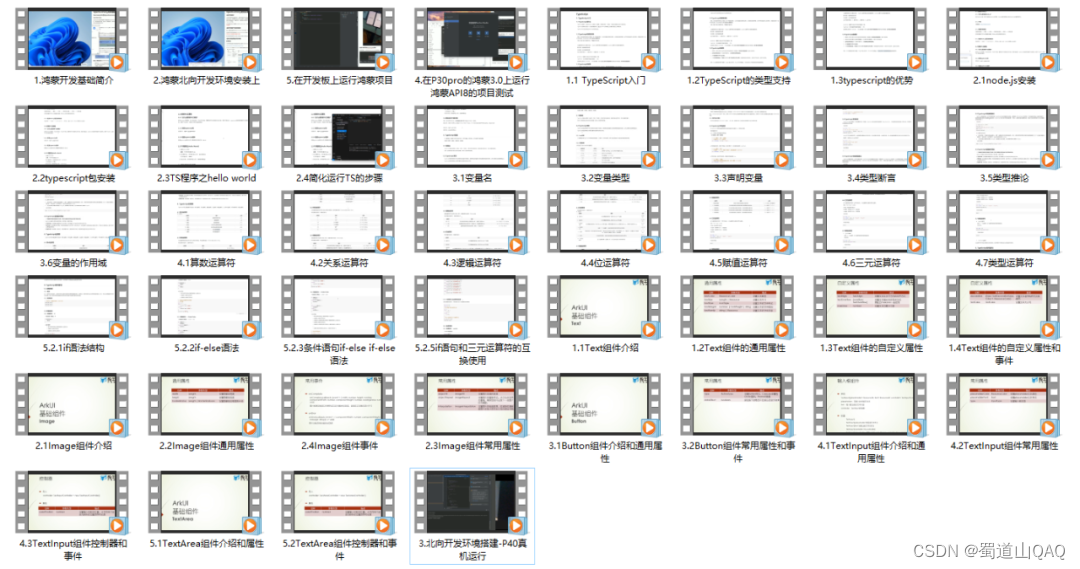
《鸿蒙 (openharmony)开发入门教学视频》
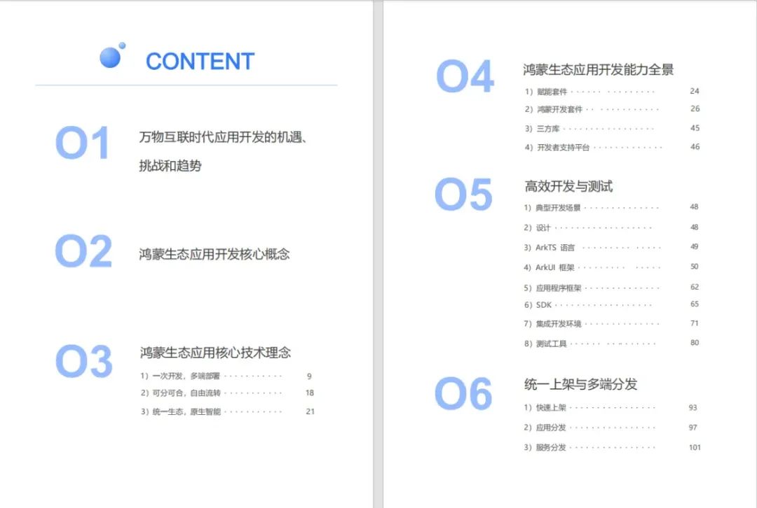
《鸿蒙生态应用开发v2.0白皮书》
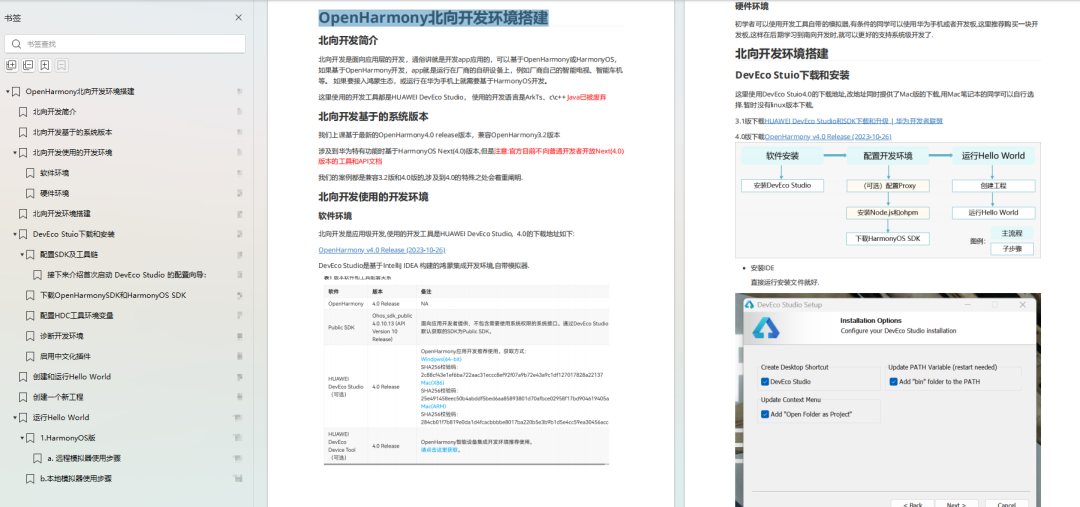
《鸿蒙 (openharmony)开发基础到实战手册》
openharmony北向、南向开发环境搭建
《鸿蒙开发基础》
- arkts语言
- 安装deveco studio
- 运用你的第一个arkts应用
- arkui声明式ui开发
- .……
《鸿蒙开发进阶》
- stage模型入门
- 网络管理
- 数据管理
- 电话服务
- 分布式应用开发
- 通知与窗口管理
- 多媒体技术
- 安全技能
- 任务管理
- webgl
- 国际化开发
- 应用测试
- dfx面向未来设计
- 鸿蒙系统移植和裁剪定制
- ……
《鸿蒙进阶实战》
- arkts实践
- uiability应用
- 网络案例
- ……
获取以上完整鸿蒙harmonyos学习资料,请点击→纯血版全套鸿蒙harmonyos学习资料
总结
总的来说,华为鸿蒙不再兼容安卓,对中年程序员来说是一个挑战,也是一个机会。只有积极应对变化,不断学习和提升自己,他们才能在这个变革的时代中立于不败之地。


发表评论