 我要评论
我要评论一、tabs
tabs组件是一种常见的用户界面(ui)组件,它是一个可以容纳多个选项卡的容器组件。每个选项卡通常包含一个面板和一个标签,用户可以通过点击标签来切换面板。tabs组件通常用于展示多个相关但又不需要同时展示的数据集合或功能集合,以提高页面的可维护性和可用性。
tabs组件的主要功能包括:
- 切换选项卡:用户可以通过点击标签来切换显示面板。
- 激活状态:当前选中的标签会呈现激活状态,以便用户清楚地知道他们当前所在的选项卡。
- 自定义选项卡内容:用户可以通过自定义选项卡内容(例如图片、文本、图标等)来增强页面的可读性和可用性。
- 加载延迟:如果页面需要加载大量数据或内容,tabs组件可以通过延迟加载未激活的面板来提升页面性能。
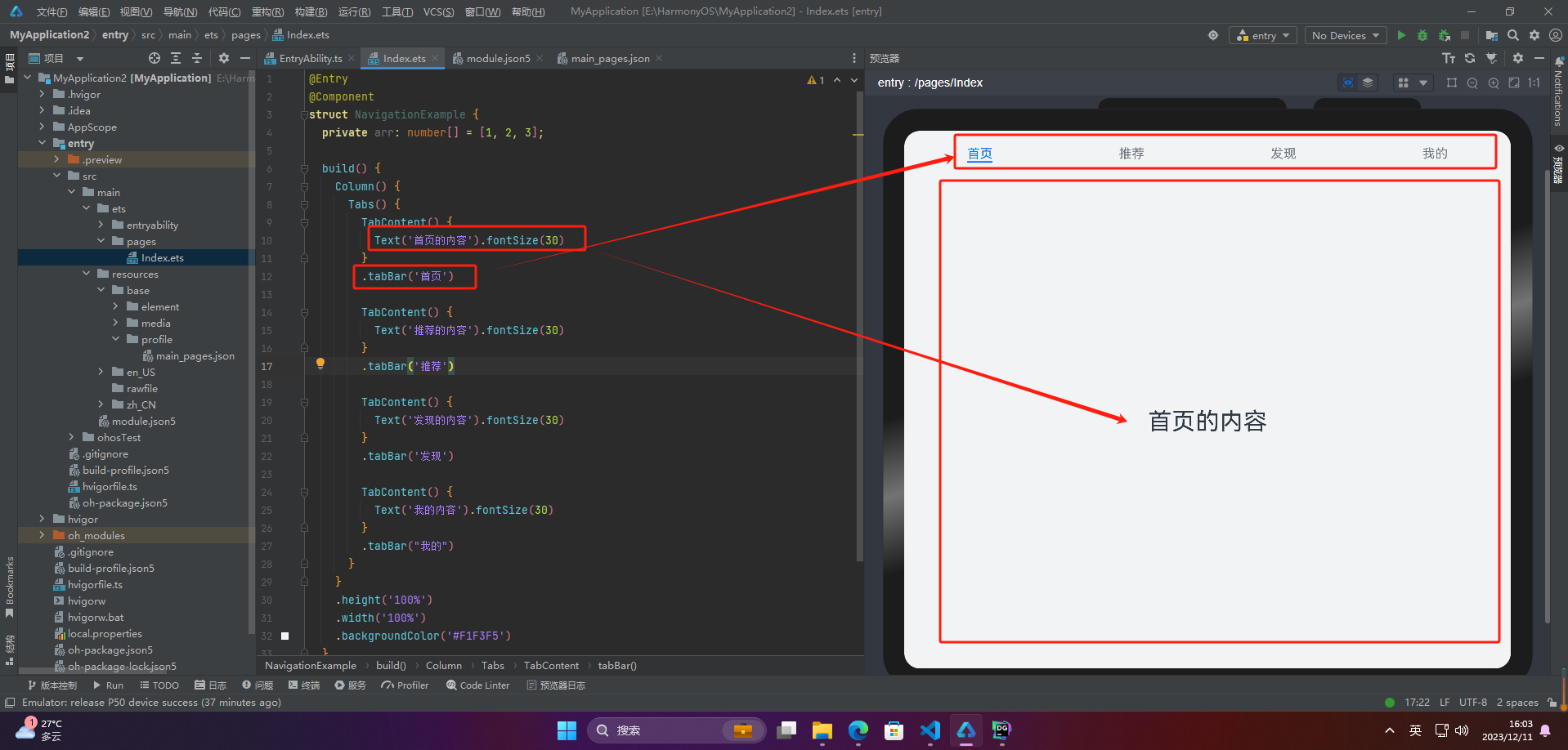
1.基本布局
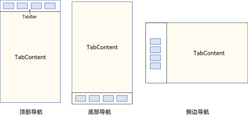
tabs使用花括号包裹tabcontent,每一个tabcontent对应一个tabbar
@entry
@component
struct navigationexample {
  private arr: number[] = [1, 2, 3];

  build() {
    column() {
      tabs() {
        tabcontent() {
          text('首页的内容').fontsize(30)
        }
        .tabbar('首页')

        tabcontent() {
          text('推荐的内容').fontsize(30)
        }
        .tabbar('推荐')

        tabcontent() {
          text('发现的内容').fontsize(30)
        }
        .tabbar('发现')

        tabcontent() {
          text('我的内容').fontsize(30)
        }
        .tabbar("我的")
      }
    }
    .height('100%')
    .width('100%')
    .backgroundcolor('#f1f3f5')
  }
}
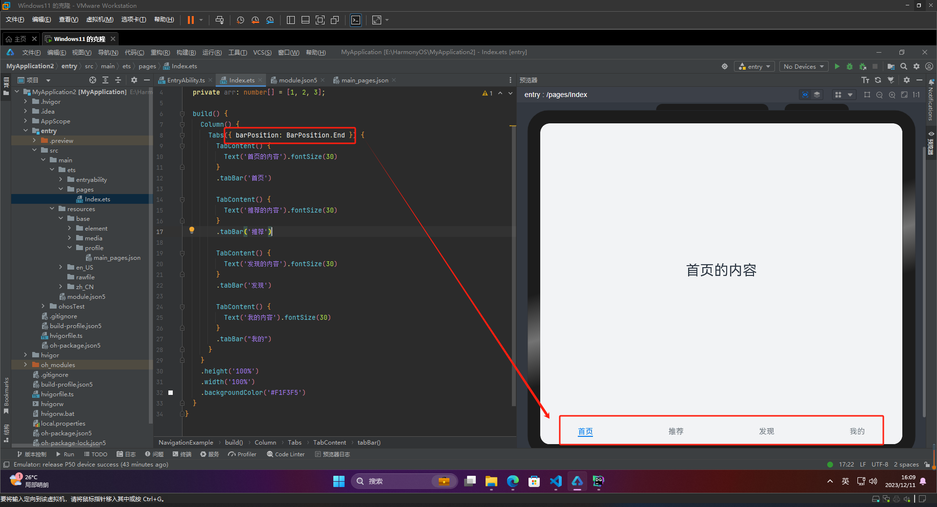
2.导航位置
🦋2.1 底部导航
barposition.end设置底部导航
@entry
@component
struct navigationexample {
  private arr: number[] = [1, 2, 3];

  build() {
    column() {
      tabs({ barposition: barposition.end }) {
        tabcontent() {
          text('首页的内容').fontsize(30)
        }
        .tabbar('首页')

        tabcontent() {
          text('推荐的内容').fontsize(30)
        }
        .tabbar('推荐')

        tabcontent() {
          text('发现的内容').fontsize(30)
        }
        .tabbar('发现')

        tabcontent() {
          text('我的内容').fontsize(30)
        }
        .tabbar("我的")
      }
    }
    .height('100%')
    .width('100%')
    .backgroundcolor('#f1f3f5')
  }
}
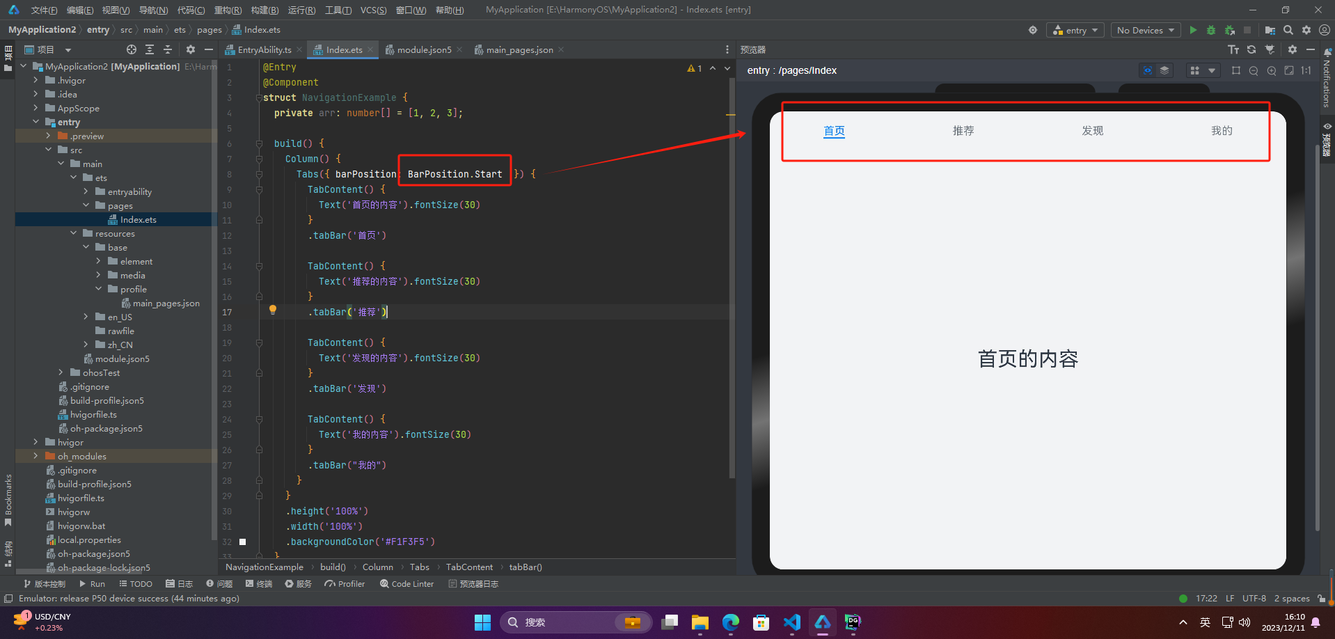
🦋2.2 顶部导航
barposition.start设置顶部导航
@entry
@component
struct navigationexample {
  private arr: number[] = [1, 2, 3];

  build() {
    column() {
      tabs({ barposition: barposition.start  }) {
        tabcontent() {
          text('首页的内容').fontsize(30)
        }
        .tabbar('首页')

        tabcontent() {
          text('推荐的内容').fontsize(30)
        }
        .tabbar('推荐')

        tabcontent() {
          text('发现的内容').fontsize(30)
        }
        .tabbar('发现')

        tabcontent() {
          text('我的内容').fontsize(30)
        }
        .tabbar("我的")
      }
    }
    .height('100%')
    .width('100%')
    .backgroundcolor('#f1f3f5')
  }
}
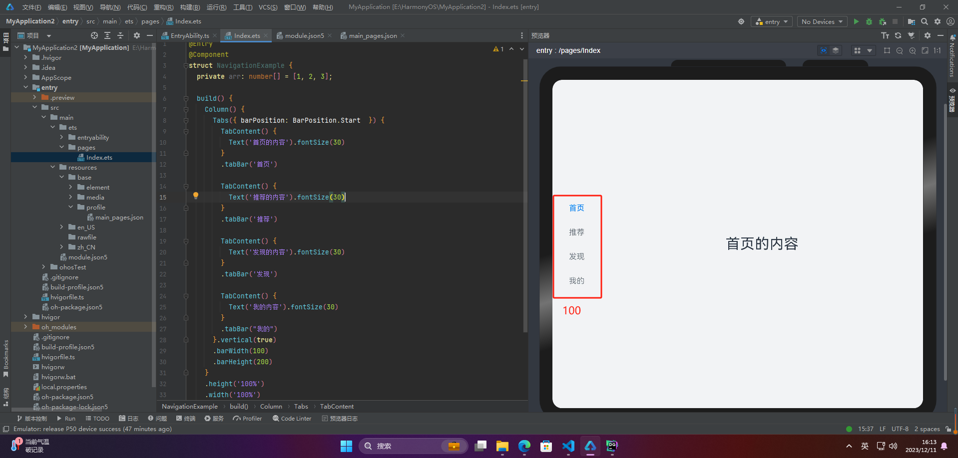
🦋2.3 侧边导航
实现侧边导航栏需要设置tabs的属性vertical为true
-
vertical为false时,tabbar宽度会默认撑满屏幕的宽度,需要设置barwidth为合适值。
-
vertical为true时,tabbar的高度会默认实际内容高度,需要设置barheight为合适值。
@entry
@component
struct navigationexample {
  private arr: number[] = [1, 2, 3];

  build() {
    column() {
      tabs({ barposition: barposition.start  }) {
        tabcontent() {
          text('首页的内容').fontsize(30)
        }
        .tabbar('首页')

        tabcontent() {
          text('推荐的内容').fontsize(30)
        }
        .tabbar('推荐')

        tabcontent() {
          text('发现的内容').fontsize(30)
        }
        .tabbar('发现')

        tabcontent() {
          text('我的内容').fontsize(30)
        }
        .tabbar("我的")
      }.vertical(true)
      .barwidth(100)
      .barheight(200)
    }
    .height('100%')
    .width('100%')
    .backgroundcolor('#f1f3f5')
  }
}
3.导航效果
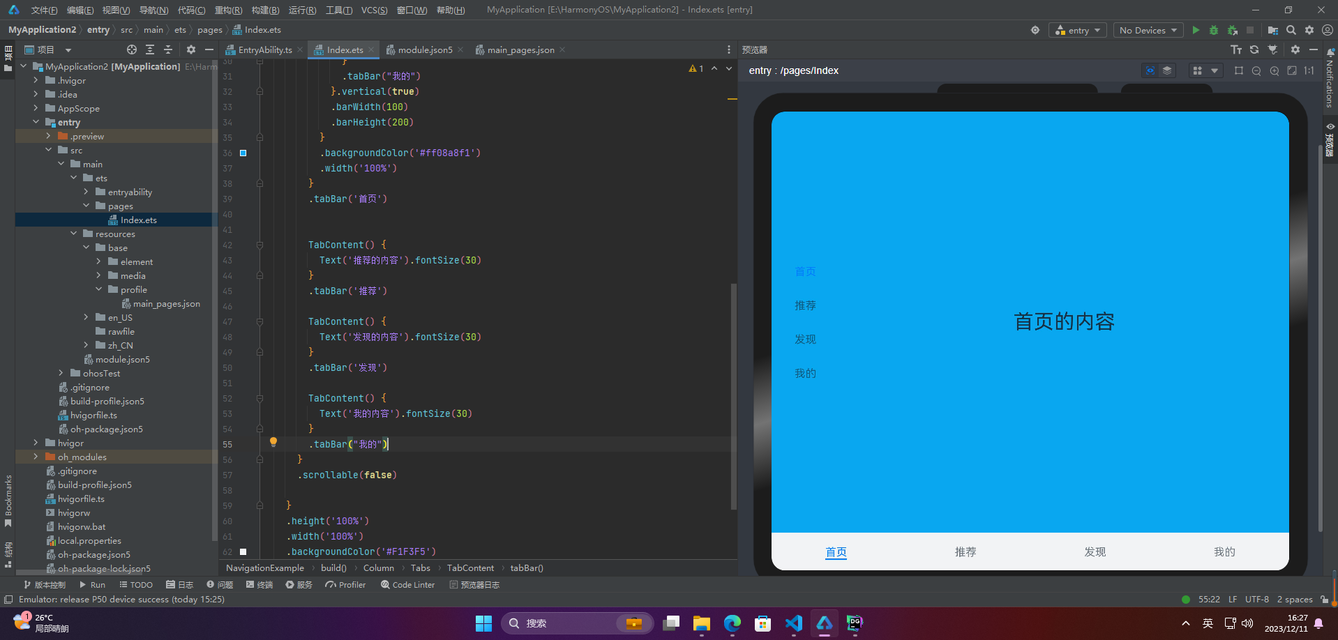
🦋3.1 限制导航栏的滑动切换
在某些需要进行多级分类的页面上,如同时存在底部导航栏和顶部导航栏时,因为默认情况下导航栏都支持滑动切换,所以当底部导航栏的滑动效果与顶部导航栏出现冲突时,需要限制底部导航栏的滑动,以避免给用户带来不好的体验。
@entry
@component
struct navigationexample {
  private arr: number[] = [1, 2, 3];

  build() {
    column() {
      tabs({ barposition: barposition.end }) {
        tabcontent(){
          column(){

            tabs({ barposition: barposition.start  }) {
              tabcontent() {
                text('首页的内容').fontsize(30)
              }
              .tabbar('首页')

              tabcontent() {
                text('推荐的内容').fontsize(30)
              }
              .tabbar('推荐')

              tabcontent() {
                text('发现的内容').fontsize(30)
              }
              .tabbar('发现')

              tabcontent() {
                text('我的内容').fontsize(30)
              }
              .tabbar("我的")
            }.vertical(true)
            .barwidth(100)
            .barheight(200)
          }
          .backgroundcolor('#ff08a8f1')
          .width('100%')
        }
        .tabbar('首页')
        tabcontent() {
          text('推荐的内容').fontsize(30)
        }
        .tabbar('推荐')

        tabcontent() {
          text('发现的内容').fontsize(30)
        }
        .tabbar('发现')

        tabcontent() {
          text('我的内容').fontsize(30)
        }
        .tabbar("我的")
      }
      .scrollable(false)

    }
    .height('100%')
    .width('100%')
    .backgroundcolor('#f1f3f5')
  }
}
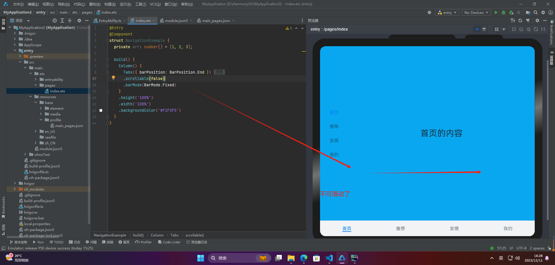
🦋3.2 固定导航栏
tabs的属性barmode是控制导航栏是否可以滚动,默认值为fixed
@entry
@component
struct navigationexample {
  private arr: number[] = [1, 2, 3];

  build() {
    column() {
      tabs({ barposition: barposition.end }) {
        tabcontent(){
          column(){

            tabs({ barposition: barposition.start  }) {
              tabcontent() {
                text('首页的内容').fontsize(30)
              }
              .tabbar('首页')

              tabcontent() {
                text('推荐的内容').fontsize(30)
              }
              .tabbar('推荐')

              tabcontent() {
                text('发现的内容').fontsize(30)
              }
              .tabbar('发现')

              tabcontent() {
                text('我的内容').fontsize(30)
              }
              .tabbar("我的")
            }.vertical(true)
            .barwidth(100)
            .barheight(200)
          }
          .backgroundcolor('#ff08a8f1')
          .width('100%')
        }
        .tabbar('首页')
        tabcontent() {
          text('推荐的内容').fontsize(30)
        }
        .tabbar('推荐')

        tabcontent() {
          text('发现的内容').fontsize(30)
        }
        .tabbar('发现')

        tabcontent() {
          text('我的内容').fontsize(30)
        }
        .tabbar("我的")
      }
      .scrollable(false)
      .barmode(barmode.fixed)
    }
    .height('100%')
    .width('100%')
    .backgroundcolor('#f1f3f5')
  }
}
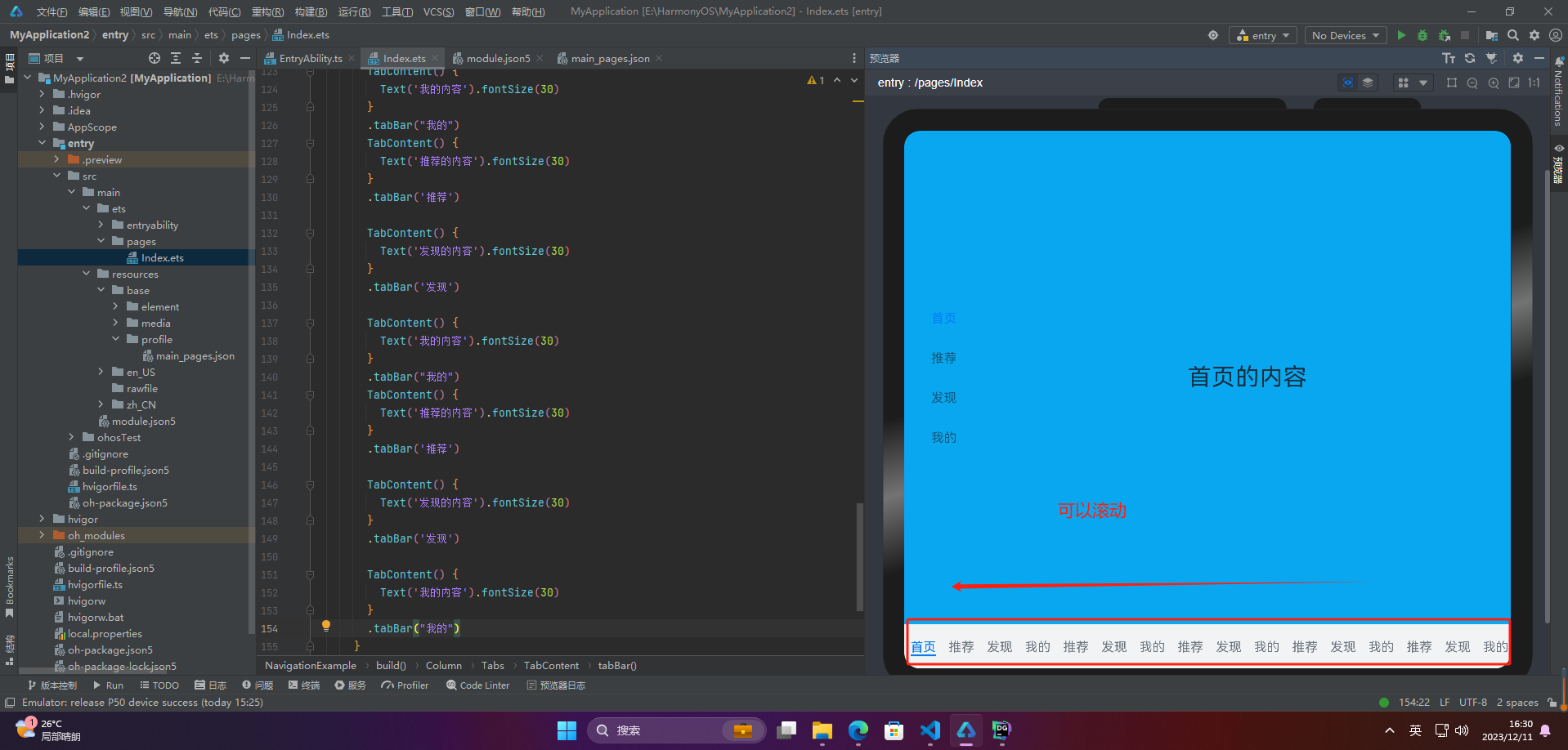
🦋3.3 滚动导航栏
滚动导航栏需要设置tabs组件的barmode属性,默认情况下其值为fixed,表示为固定导航栏,设置为scrollable即可设置为可滚动导航栏
@entry
@component
struct navigationexample {
  private arr: number[] = [1, 2, 3];

  build() {
    column() {
      tabs({ barposition: barposition.end }) {
        tabcontent(){
          column(){

            tabs({ barposition: barposition.start  }) {
              tabcontent() {
                text('首页的内容').fontsize(30)
              }
              .tabbar('首页')

              tabcontent() {
                text('推荐的内容').fontsize(30)
              }
              .tabbar('推荐')

              tabcontent() {
                text('发现的内容').fontsize(30)
              }
              .tabbar('发现')

              tabcontent() {
                text('我的内容').fontsize(30)
              }
              .tabbar("我的")

            }.vertical(true)
            .barwidth(100)
            .barheight(200)
          }
          .backgroundcolor('#ff08a8f1')
          .width('100%')
        }
        .tabbar('首页')
        tabcontent() {
          text('推荐的内容').fontsize(30)
        }
        .tabbar('推荐')

        tabcontent() {
          text('发现的内容').fontsize(30)
        }
        .tabbar('发现')

        tabcontent() {
          text('我的内容').fontsize(30)
        }
        .tabbar("我的")
        tabcontent() {
          text('推荐的内容').fontsize(30)
        }
        .tabbar('推荐')

        tabcontent() {
          text('发现的内容').fontsize(30)
        }
        .tabbar('发现')

        tabcontent() {
          text('我的内容').fontsize(30)
        }
        .tabbar("我的")
        tabcontent() {
          text('推荐的内容').fontsize(30)
        }
        .tabbar('推荐')

        tabcontent() {
          text('发现的内容').fontsize(30)
        }
        .tabbar('发现')

        tabcontent() {
          text('我的内容').fontsize(30)
        }
        .tabbar("我的")
        tabcontent() {
          text('推荐的内容').fontsize(30)
        }
        .tabbar('推荐')

        tabcontent() {
          text('发现的内容').fontsize(30)
        }
        .tabbar('发现')

        tabcontent() {
          text('我的内容').fontsize(30)
        }
        .tabbar("我的")
        tabcontent() {
          text('推荐的内容').fontsize(30)
        }
        .tabbar('推荐')

        tabcontent() {
          text('发现的内容').fontsize(30)
        }
        .tabbar('发现')

        tabcontent() {
          text('我的内容').fontsize(30)
        }
        .tabbar("我的")
        tabcontent() {
          text('推荐的内容').fontsize(30)
        }
        .tabbar('推荐')

        tabcontent() {
          text('发现的内容').fontsize(30)
        }
        .tabbar('发现')

        tabcontent() {
          text('我的内容').fontsize(30)
        }
        .tabbar("我的")
        tabcontent() {
          text('推荐的内容').fontsize(30)
        }
        .tabbar('推荐')

        tabcontent() {
          text('发现的内容').fontsize(30)
        }
        .tabbar('发现')

        tabcontent() {
          text('我的内容').fontsize(30)
        }
        .tabbar("我的")
        tabcontent() {
          text('推荐的内容').fontsize(30)
        }
        .tabbar('推荐')

        tabcontent() {
          text('发现的内容').fontsize(30)
        }
        .tabbar('发现')

        tabcontent() {
          text('我的内容').fontsize(30)
        }
        .tabbar("我的")
      }
      .scrollable(false)
      .barmode(barmode.scrollable)
    }
    .height('100%')
    .width('100%')
    .backgroundcolor('#f1f3f5')
  }
}
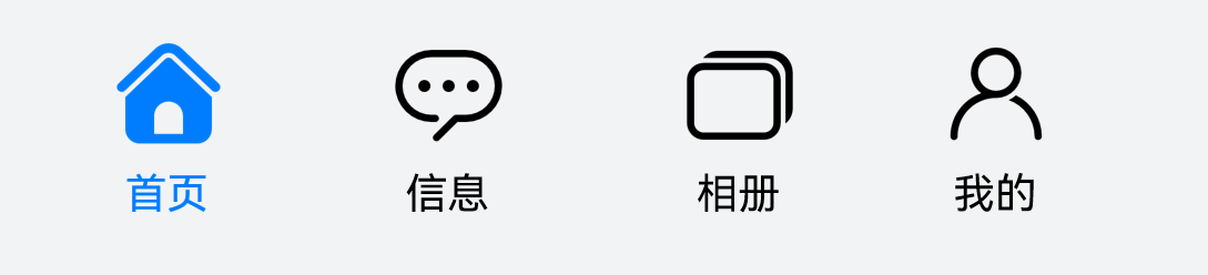
4.自定义导航栏
自定义导航栏是指在应用开发中,开发者使用自己定制的视图代替系统自带的导航栏,以实现更加自由、灵活和符合应用风格的导航栏。自定义导航栏可以包括各种 ui 元素,例如按钮、文本、图片、标签等,以满足不同应用的需求。自定义导航栏可以帮助应用创建独特的风格和品牌形象,提高用户体验和应用的可用性。
@builder tabbuilder(title: string, targetindex: number, selectedimg: resource, normalimg: resource) {
  column() {
    image(this.currentindex === targetindex ? selectedimg : normalimg)
      .size({ width: 25, height: 25 })
    text(title)
      .fontcolor(this.currentindex === targetindex ? '#1698ce' : '#6b6b6b')
  }
  .width('100%')
  .height(50)
  .justifycontent(flexalign.center)
}
tabcontent() {
  column(){
    text('我的内容')
  }
  .width('100%')
  .height('100%')
  .backgroundcolor('#007dff')
}
.tabbar(this.tabbuilder('我的', 0, $r('app.media.mine_selected'), $r('app.media.mine_normal')))
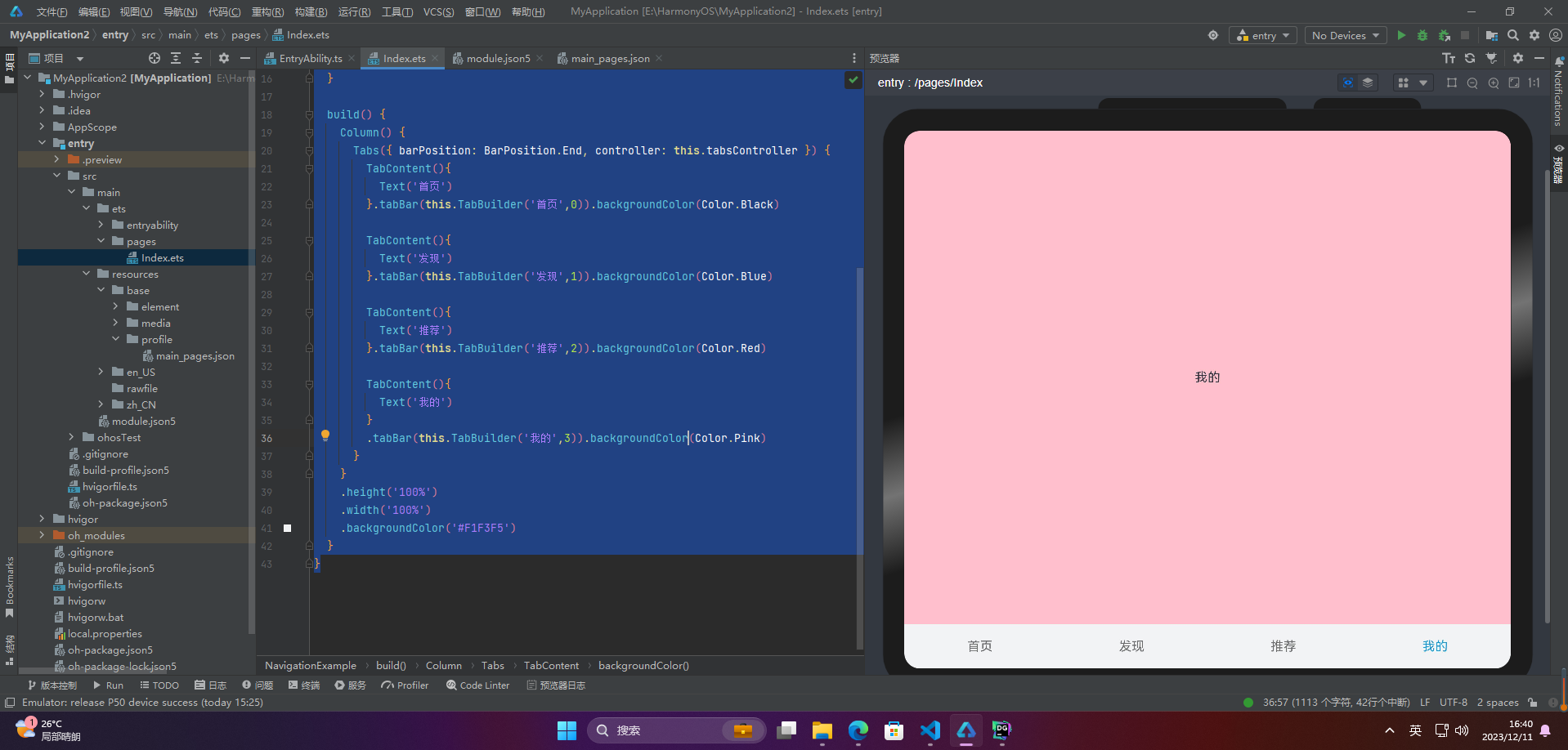
5.切换至指定页签
要想切换特定的标签页,需要使用tabscontroller。tabscontroller是tabs组件的控制器,它用于控制tabs组件进行标签页的切换。使用tabscontroller的changeindex方法,可以实现跳转到指定索引值对应的标签页内容。
@entry
@component
struct navigationexample {
  private tabscontroller : tabscontroller = new tabscontroller()
  @state currentindex:number = 0;

  @builder tabbuilder(title: string, targetindex: number) {
    column() {
      text(title)
        .fontcolor(this.currentindex === targetindex ? '#1698ce' : '#6b6b6b')
    }
    .onclick(() => {
      this.currentindex = targetindex;
      this.tabscontroller.changeindex(this.currentindex);
    })
  }

  build() {
    column() {
      tabs({ barposition: barposition.end, controller: this.tabscontroller }) {
        tabcontent(){
          text('首页')
        }.tabbar(this.tabbuilder('首页',0)).backgroundcolor(color.black)

        tabcontent(){
          text('发现')
        }.tabbar(this.tabbuilder('发现',1)).backgroundcolor(color.blue)

        tabcontent(){
          text('推荐')
        }.tabbar(this.tabbuilder('推荐',2)).backgroundcolor(color.red)

        tabcontent(){
          text('我的')
        }
        .tabbar(this.tabbuilder('我的',3)).backgroundcolor(color.pink)
      }
    }
    .height('100%')
    .width('100%')
    .backgroundcolor('#f1f3f5')
  }
}
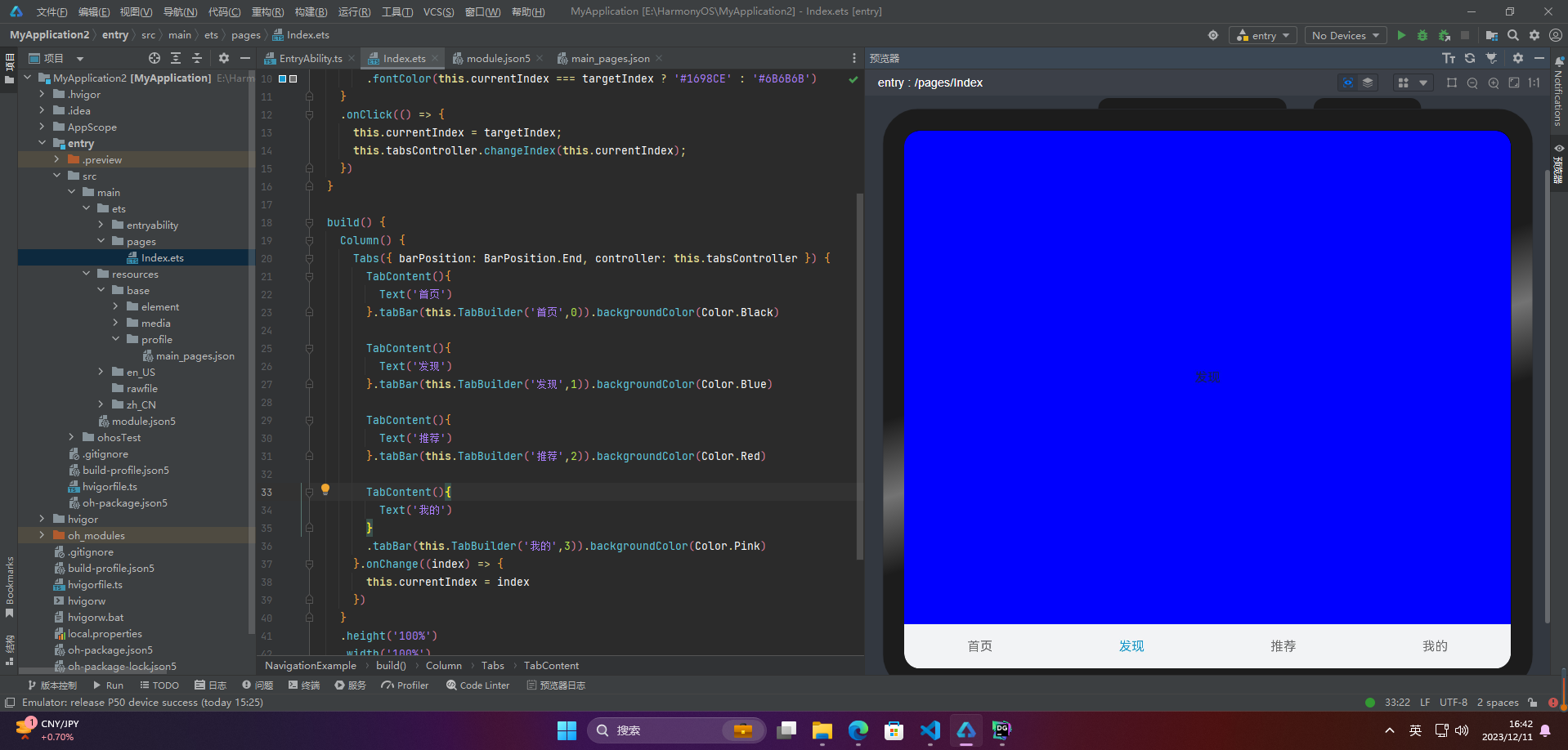
6.滑动切换导航栏
在不使用自定义导航栏的情况下,tabs组件会默认实现tabbar与tabcontent的切换联动。然而,一旦使用了自定义导航栏,就需要使用tabscontroller来实现点击页签与页面内容的联动。但使用tabscontroller无法实现滑动页面时,页面内容对应页签的联动。也就是说,当用户滑动屏幕切换页面内容时,页签栏无法同步切换至对应的页签,这可能会影响用户的体验。
@entry
@component
struct navigationexample {
  private tabscontroller : tabscontroller = new tabscontroller()
  @state currentindex:number = 0;

  @builder tabbuilder(title: string, targetindex: number) {
    column() {
      text(title)
        .fontcolor(this.currentindex === targetindex ? '#1698ce' : '#6b6b6b')
    }
    .onclick(() => {
      this.currentindex = targetindex;
      this.tabscontroller.changeindex(this.currentindex);
    })
  }

  build() {
    column() {
      tabs({ barposition: barposition.end, controller: this.tabscontroller }) {
        tabcontent(){
          text('首页')
        }.tabbar(this.tabbuilder('首页',0)).backgroundcolor(color.black)

        tabcontent(){
          text('发现')
        }.tabbar(this.tabbuilder('发现',1)).backgroundcolor(color.blue)

        tabcontent(){
          text('推荐')
        }.tabbar(this.tabbuilder('推荐',2)).backgroundcolor(color.red)

        tabcontent(){
          text('我的')
        }
        .tabbar(this.tabbuilder('我的',3)).backgroundcolor(color.pink)
      }.onchange((index) => {
        this.currentindex = index
      })
    }
    .height('100%')
    .width('100%')
    .backgroundcolor('#f1f3f5')
  }
}
🚀写在最后
- 如果你觉得这篇内容对你还蛮有帮助,我想邀请你帮我三个小忙:
- 点赞,转发,有你们的 『点赞和评论』,才是我创造的动力。
- 关注小编,同时可以期待后续文章ing🚀,不定期分享原创知识。
- 想要获取个人更多完整鸿蒙最新vip学习资料,请点击→全套鸿蒙harmonyos学习资料
- 或者关注小编后私信回复【666】也可获取资料哦~~


发表评论