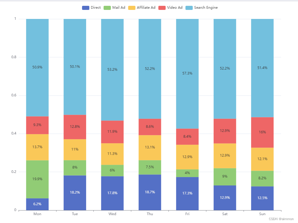
原始效果:
柱状图:https://echarts.apache.org/examples/zh/editor.html?c=bar-stack-normalization
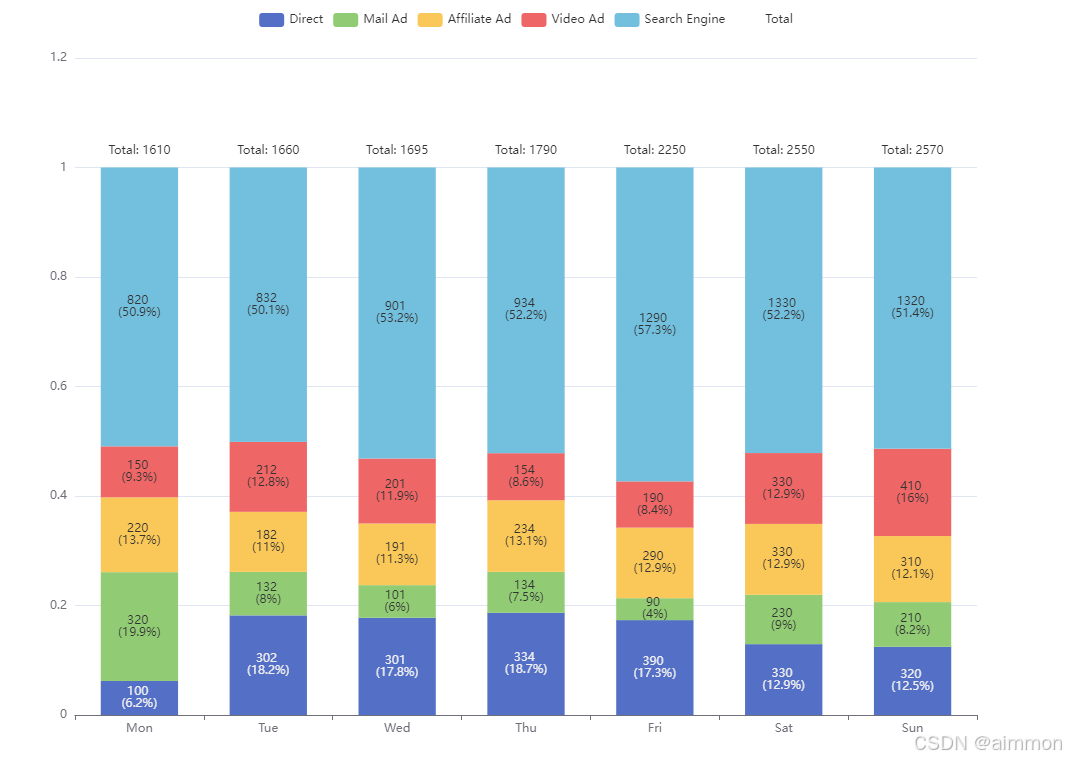
二开效果1:
核心逻辑
同时显示百分比和原始值
 label: {
      show: true,
      position: 'inside',
      formatter: (params) => {
        const rawvalue = rawdata[params.seriesindex][params.dataindex];
        const percentage = math.round(params.value * 1000) / 10;
        return `${rawvalue} \n(${percentage}%)`;
      }
    },
显示汇总值
// add a new series for displaying total values
series.push({
    name: 'total',
    type: 'bar',
    stack: 'total',
    itemstyle: {
        color: 'rgba(0,0,0,0)' // 透明颜色
    },
    label: {
        show: true,
        position: 'top',
        formatter: params => `total: ${totaldata[params.dataindex]}`
    },
    data: totaldata.map(value => 0.01) // 微小的值以便能显示标签但不影响图形
});
代码解释
新增显示总值的系列:
- 您添加了一个名为
'total'的新系列到series数组中。- 这个系列使用
type: 'bar',并且堆叠在名为'total'的堆栈中,这与其他系列使用的堆栈名称一致。这确保了柱状图的对齐,即使该系列是不可见的。透明的柱状图:
itemstyle被设置为color: 'rgba(0,0,0,0)',使得该系列的柱状图完全透明。这是一个巧妙的方法,可以确保这些柱状图不增加任何可见的元素到图表中,但仍然可以在它们上面放置标签。标签配置:
label对象中的show: true确保显示标签。position设置为'top',因此标签显示在每个柱状图堆栈的顶部。formatter函数自定义了标签的文本。它使用params.dataindex获取totaldata中对应的值,并显示为total: {value}。这提供了关于每个类别(星期几)中所有堆叠元素的总值的清晰信息。带有微小值的数据:
- 该系列的
data数组被设置为totaldata.map(value => 0.01)。这将每个数据点设置为一个非常小的值(0.01)。这些微小的值的目的是为标签创建一个占位符,而不影响图表的实际可视化。由于柱状图本身是透明的,这个值确保了标签可以正确地定位和显示,而不会为柱状图增加任何视觉重量。
分析:
- 使用透明的柱状图来显示标签:通过使用透明的柱状图,您可以在柱状图堆栈的顶部放置标签,而不会改变图表的视觉外观。这是一种常见的技术,当您希望添加额外的信息而不影响数据的可视化时。
- 数据中的微小值:使用微小值(0.01)确保标签与柱状图相关联,但不会显著地影响堆叠柱状图的高度。这在echarts中尤其有用,因为标签是与特定的数据点相关联的。
- 堆叠配置:使用相同的堆叠标识符('total')使透明柱状图与其余堆叠柱状图完美对齐,确保标签位置的一致性。
这种方法对于突出显示总值,同时保持数据可视化的完整性非常有效。这是一个为图表提供额外信息而不使其变得混乱或扭曲的巧妙解决方案。
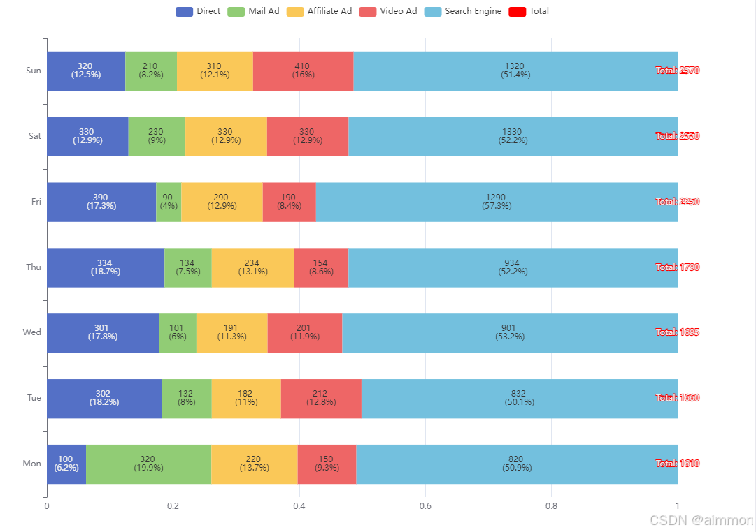
完整版代码
// there should not be negative values in rawdata
const rawdata = [
[100, 302, 301, 334, 390, 330, 320],
[320, 132, 101, 134, 90, 230, 210],
[220, 182, 191, 234, 290, 330, 310],
[150, 212, 201, 154, 190, 330, 410],
[820, 832, 901, 934, 1290, 1330, 1320]
];
const totaldata = [];
for (let i = 0; i < rawdata[0].length; ++i) {
let sum = 0;
for (let j = 0; j < rawdata.length; ++j) {
sum += rawdata[j][i];
}
totaldata.push(sum);
}
const grid = {
left: 100,
right: 100,
top: 50,
bottom: 50
};
const series = [
'direct',
'mail ad',
'affiliate ad',
'video ad',
'search engine'
].map((name, sid) => {
return {
name,
type: 'bar',
stack: 'total',
barwidth: '60%',
label: {
show: true,
position: 'inside',
formatter: (params) => {
const rawvalue = rawdata[params.seriesindex][params.dataindex];
const percentage = math.round(params.value * 1000) / 10;
return `${rawvalue} \n(${percentage}%)`;
}
},
data: rawdata[sid].map((d, did) =>
totaldata[did] <= 0 ? 0 : d / totaldata[did]
)
};
});
// add a new series for displaying total values
series.push({
name: 'total',
type: 'bar',
stack: 'total',
itemstyle: {
color: 'rgba(0,0,0,0)' // 透明颜色
},
label: {
show: true,
position: 'top',
formatter: params => `total: ${totaldata[params.dataindex]}`
},
data: totaldata.map(value => 0.01) // 微小的值以便能显示标签但不影响图形
});
option = {
legend: {
selectedmode: false
},
grid,
yaxis: {
type: 'value'
},
xaxis: {
type: 'category',
data: ['mon', 'tue', 'wed', 'thu', 'fri', 'sat', 'sun']
},
series
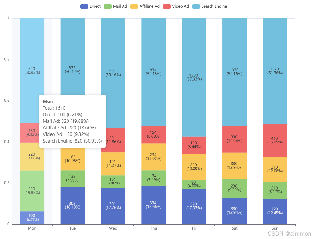
};二开效果2:
完整版代码
// there should not be negative values in rawdata
const rawdata = [
  [100, 302, 301, 334, 390, 330, 320],
  [320, 132, 101, 134, 90, 230, 210],
  [220, 182, 191, 234, 290, 330, 310],
  [150, 212, 201, 154, 190, 330, 410],
  [820, 832, 901, 934, 1290, 1330, 1320]
];

const totaldata = [];
for (let i = 0; i < rawdata[0].length; ++i) {
  let sum = 0;
  for (let j = 0; j < rawdata.length; ++j) {
    sum += rawdata[j][i];
  }
  totaldata.push(sum);
}

const grid = {
  left: 100,
  right: 100,
  top: 50,
  bottom: 50
};

const series = [
  'direct',
  'mail ad',
  'affiliate ad',
  'video ad',
  'search engine'
].map((name, sid) => {
  return {
    name,
    type: 'bar',
    stack: 'total',
    barwidth: '60%',
    label: {
      show: true,
      position: 'inside', // position the labels on top of the bars
      formatter: (params) => {
        const originalvalue = rawdata[sid][params.dataindex];
        const percentage = (originalvalue / totaldata[params.dataindex] * 100).tofixed(2);
        return `${originalvalue} \n(${percentage}%)`;
      },
    },
    data: rawdata[sid].map((d, did) =>
      totaldata[did] <= 0 ? 0 : d / totaldata[did]
    )
  };
});

option = {
  tooltip: {
    trigger: 'axis',
    axispointer: {
      type: 'shadow'
    },
    formatter: (params) => {
      const total = totaldata[params[0].dataindex];
      const header = `<div style="font-weight:bold">${params[0].axisvalue}</div>
                      <div>total: ${total}</div>`;
      const body = params.map(param => {
        const originalvalue = rawdata[param.seriesindex][param.dataindex];
        const percentage = (originalvalue / total * 100).tofixed(2);
        return `<div>${param.seriesname}: ${originalvalue} (${percentage}%)</div>`;
      }).join('');
      return header + body;
    }
  },
  legend: {
    selectedmode: false
  },
  grid,
  yaxis: {
    type: 'value'
  },
  xaxis: {
    type: 'category',
    data: ['mon', 'tue', 'wed', 'thu', 'fri', 'sat', 'sun']
  },
  series
};
实现思路与修改:
计算每天的总访问数:首先遍历
rawdata并计算每一天所有来源的总访问数。这些总数被存储在totaldata数组中。配置每个数据源系列:为每一个数据源创建一个
series对象。每个系列代表一种访问来源,并包含一些配置选项,如类型、堆叠设置、标签显示方式等。配置标签显示:为了让用户在图表上直观地看到原始值和占比,我们需要在每个柱形上添加标签。标签的内容包括原始值和百分比。
配置提示框(tooltip):为了提供更丰富的信息,我们配置了一个提示框,当用户悬停在柱形上时会显示当天的总访问数和各个来源的具体数值及占比。
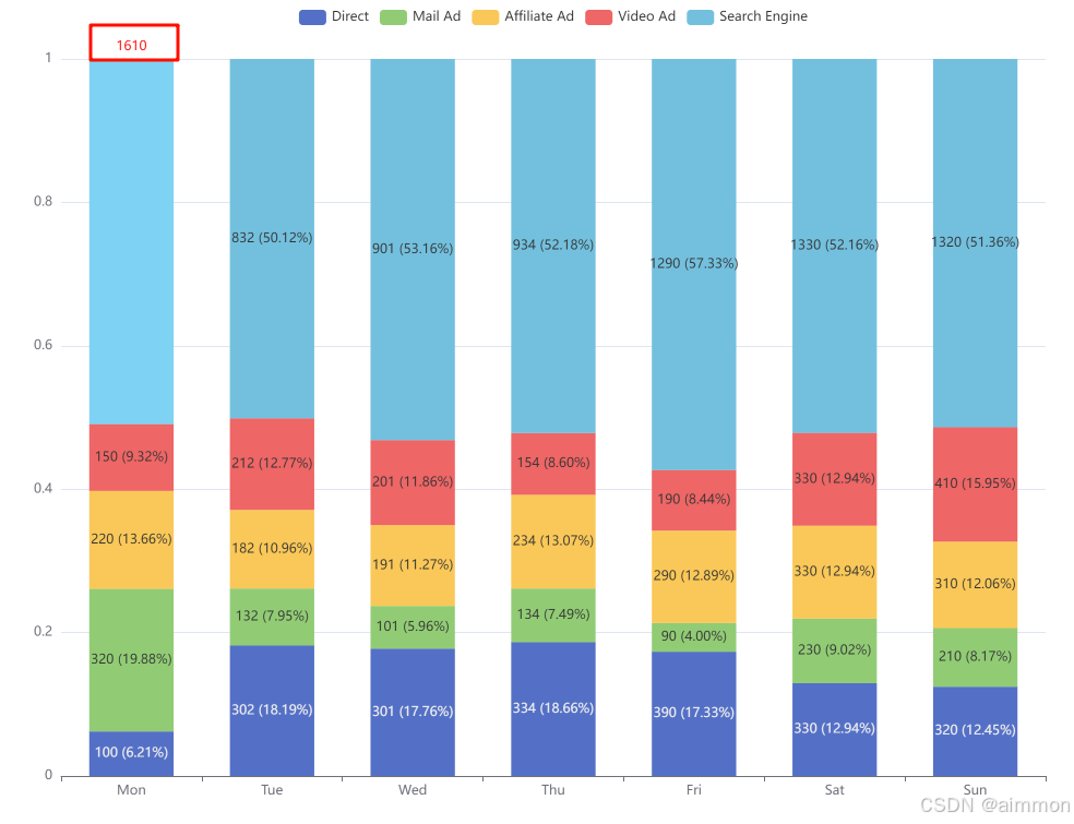
二开效果3:
完整版代码
// there should not be negative values in rawdata
const rawdata = [
  [100, 302, 301, 334, 390, 330, 320],
  [320, 132, 101, 134, 90, 230, 210],
  [220, 182, 191, 234, 290, 330, 310],
  [150, 212, 201, 154, 190, 330, 410],
  [820, 832, 901, 934, 1290, 1330, 1320]
];

const totaldata = [];
for (let i = 0; i < rawdata[0].length; ++i) {
  let sum = 0;
  for (let j = 0; j < rawdata.length; ++j) {
    sum += rawdata[j][i];
  }
  totaldata.push(sum);
}

const grid = {
  left: 100,
  right: 100,
  top: 50,
  bottom: 50
};

const series = [
  'direct',
  'mail ad',
  'affiliate ad',
  'video ad',
  'search engine'
].map((name, sid) => {
  return {
    name,
    type: 'bar',
    stack: 'total',
    barwidth: '60%',
    label: {
      show: true,
      position: 'inside', // position the labels on top of the bars
      formatter: (params) => {
        const originalvalue = rawdata[sid][params.dataindex];
        const percentage = (originalvalue / totaldata[params.dataindex] * 100).tofixed(2);
        return `${originalvalue} (${percentage}%)`;
      },
    },
    itemstyle: {
      emphasis: {
        // focus : 'series',
        label: {
          show: true,
          position: 'top',
          fontsize: 12,
          color: 'red',
          formatter: (params) => totaldata[params.dataindex]
        }
      }
    },
    data: rawdata[sid].map((d, did) =>
      totaldata[did] <= 0 ? 0 : d / totaldata[did]
    )
  };
});

option = {
  legend: {
    selectedmode: false
  },
  grid,
  yaxis: {
    type: 'value'
  },
  xaxis: {
    type: 'category',
    data: ['mon', 'tue', 'wed', 'thu', 'fri', 'sat', 'sun']
  },
  series
};
解释:
- 添加了
itemstyle选项,其中包含了emphasis子项。- 在
emphasis中设置了label,用于在鼠标悬停时显示总值。emphasis.label.show设为true,表示在鼠标悬停时显示标签。emphasis.label.position设为'bottom',使标签显示在柱子底部。emphasis.label.fontsize设为12,调整字体大小。emphasis.label.formatter使用totaldata[params.dataindex]显示当前柱子对应的总值
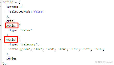
柱状图转换为条形图
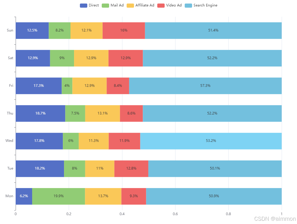
核心代码修改,变更xaxis,yaxis 中的 x y 即可
条形图同时展示百分比、原始值、汇总值功能
// there should not be negative values in rawdata
const rawdata = [
  [100, 302, 301, 334, 390, 330, 320],
  [320, 132, 101, 134, 90, 230, 210],
  [220, 182, 191, 234, 290, 330, 310],
  [150, 212, 201, 154, 190, 330, 410],
  [820, 832, 901, 934, 1290, 1330, 1320]
];
const totaldata = [];
for (let i = 0; i < rawdata[0].length; ++i) {
  let sum = 0;
  for (let j = 0; j < rawdata.length; ++j) {
    sum += rawdata[j][i];
  }
  totaldata.push(sum);
}
const grid = {
  left: 100,
  right: 100,
  top: 50,
  bottom: 50
};
const series = [
  'direct',
  'mail ad',
  'affiliate ad',
  'video ad',
  'search engine'
].map((name, sid) => {
  return {
    name,
    type: 'bar',
    stack: 'total',
    barwidth: '60%',
    label: {
      show: true,
       position: 'inside',
      formatter: (params) => {
        const rawvalue = rawdata[params.seriesindex][params.dataindex];
        const percentage = math.round(params.value * 1000) / 10;
        return `${rawvalue} \n(${percentage}%)`;
      }

    },
    data: rawdata[sid].map((d, did) =>
      totaldata[did] <= 0 ? 0 : d / totaldata[did]
    )
  };
});
series.push({
    name: 'total',
    type: 'bar',
    stack: 'total',
    itemstyle: {
        color: 'red' // 透明颜色
    },
    label: {
        show: true,
        // position: 'middle',
        formatter: params => `total: ${totaldata[params.dataindex]}`
    },
    data: totaldata.map(value => 0.0) // 微小的值以便能显示标签但不影响图形
});
option = {
  legend: {
    selectedmode: false
  },
  grid,
  xaxis: {
    type: 'value'
  },
  yaxis: {
    type: 'category',
    data: ['mon', 'tue', 'wed', 'thu', 'fri', 'sat', 'sun']
  },
  series
};
效果展示
总结
到此这篇关于echarts柱状图实现同时显示百分比+原始值+汇总值效果的文章就介绍到这了,更多相关echarts柱状图同时显示百分比原始值内容请搜索代码网以前的文章或继续浏览下面的相关文章希望大家以后多多支持代码网!


发表评论