 我要评论
我要评论
文章目录
一、组件介绍
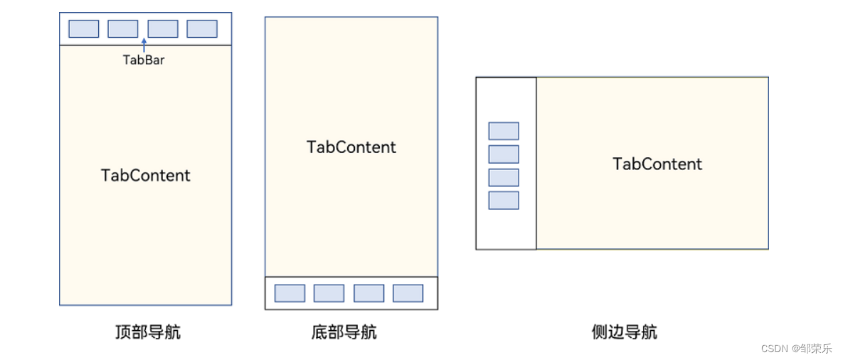
tabs组件的页面组成包含两个部分,分别是tabcontent和tabbar。tabcontent是内容页,tabbar是导航页签栏,页面结构如下图所示,根据不同的导航类型,布局会有区别,可以分为底部导航、顶部导航、侧边导航,其导航栏分别位于底部、顶部和侧边。
1、tabs
通过页签进行内容视图切换的容器组件,每个页签对应一个内容视图。
tabs(value?: {barposition?: barposition, index?: number, controller?: tabscontroller})
参数
| 参数名 | 参数类型 | 必填 | 参数描述 |
|---|---|---|---|
| barposition | barposition | 否 | 设置tabs的页签位置。 默认值:barposition.start |
| index | number | 否 | 设置当前显示页签的索引。 默认值:0 说明: 设置为小于0的值时按默认值显示。 可选值为[0, tabcontent子节点数量-1]。 设置不同值时,默认生效切换动效,可以设置animationduration为0关闭动画。 |
| controller | tabscontroller | 否 | 设置tabs控制器。 |
属性
| 名称 | 参数类型 | 描述 |
|---|---|---|
| vertical | boolean | 设置为false是为横向tabs,设置为true时为纵向tabs。 默认值:false |
| scrollable | boolean | 设置为true时可以通过滑动页面进行页面切换,为false时不可滑动切换页面。 默认值:true |
| barmode | barmode | tabbar布局模式,具体描述见barmode枚举说明。 默认值:barmode.fixed |
| barwidth | number | tabbar的宽度值。 |
| barheight | number | tabbar的高度值。 |
| animationduration | number | 点击tabbar页签切换tabcontent的动画时长。不设置时,点击tabbar页签切换tabcontent无动画。 默认值:300 说明: 该参数不支持百分比设置;设置为小于0时,按默认值300ms显示。 |
事件
onchange(event: (index: number) => void)
tab页签切换后触发的事件。
- index:当前显示的index索引,索引从0开始计算。
触发该事件的条件:
- 1、tabcontent支持滑动时,组件触发滑动时触发。
- 2、通过控制器api接口调用。
- 3、通过状态变量构造的属性值进行修改。
- 4、通过页签处点击触发。
tabscontroller
tabs组件的控制器,用于控制tabs组件进行页签切换。不支持一个tabscontroller控制多个tabs组件。
controller: tabscontroller = new tabscontroller()
changeindex(value: number): void
参数:
| 参数名 | 参数类型 | 必填 | 参数描述 |
|---|---|---|---|
| value | number | 是 | 页签在tabs里的索引值,索引值从0开始。 说明: 设置小于0或大于最大数量的值时,该事件失效。 |
2、子组件
tabcontent()
属性
| 名称 | 参数类型 | 描述 |
|---|---|---|
| tabbar | string | resource |
说明
- tabcontent组件不支持设置通用宽度属性,其宽度默认撑满tabs父组件。
- tabcontent组件不支持设置通用高度属性,其高度由tabs父组件高度与tabbar组件高度决定。
- vertical属性为false值,交换上述2个限制。
- tabcontent组件不支持内容过长时页面的滑动,如需页面滑动,可嵌套list使用。
二、基础示例
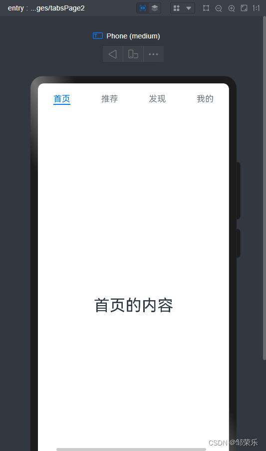
1、基础顶部导航
@entry
@component
struct tabspage2 {
  build() {
    column() {
      tabs() {
        tabcontent() {
          text('首页的内容').fontsize(30)
        }
        .tabbar('首页')

        tabcontent() {
          text('推荐的内容').fontsize(30)
        }
        .tabbar('推荐')

        tabcontent() {
          text('发现的内容').fontsize(30)
        }
        .tabbar('发现')

        tabcontent() {
          text('我的内容').fontsize(30)
        }
        .tabbar("我的")
      }
    }
    .width('100%')
    .height('100%')
  }
}
2、效果
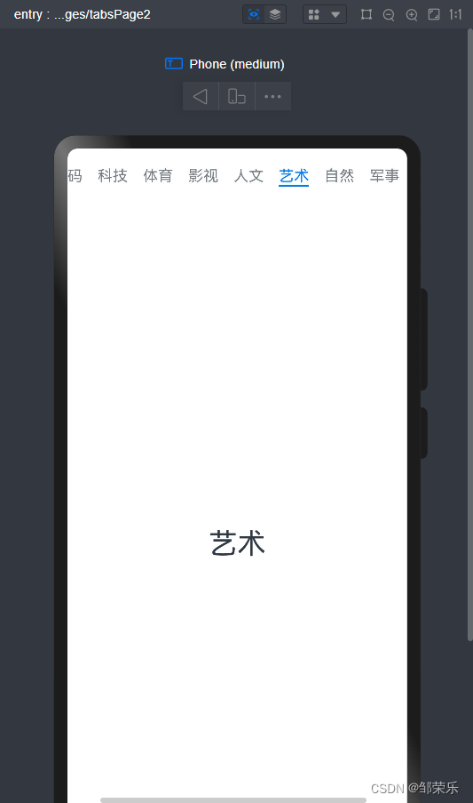
3、可以滚动导航栏
滚动导航栏可以用于顶部导航栏或者侧边导航栏的设置,内容分类较多,屏幕宽度无法容纳所有分类页签的情况下,需要使用可滚动的导航栏,支持用户点击和滑动来加载隐藏的页签内容。
滚动导航栏需要设置tabs组件的barmode属性,默认情况下其值为fixed,表示为固定导航栏,设置为scrollable即可设置为可滚动导航栏。
@entry
@component
struct tabspage2 {
  @state tabslist: array<string> = ['关注', '视频', '游戏', '数码', '科技', '体育', '影视', '人文', '艺术', '自然', '军事'];

  build() {
    column() {
      tabs() {
        foreach(this.tabslist, (item) => {
          tabcontent() {
            text(item).fontsize(30)
          }
          .tabbar(item)
        })
      }.barmode(barmode.scrollable)
    }
    .width('100%')
    .height('100%')
  }
}
2、效果
三、扩展示例
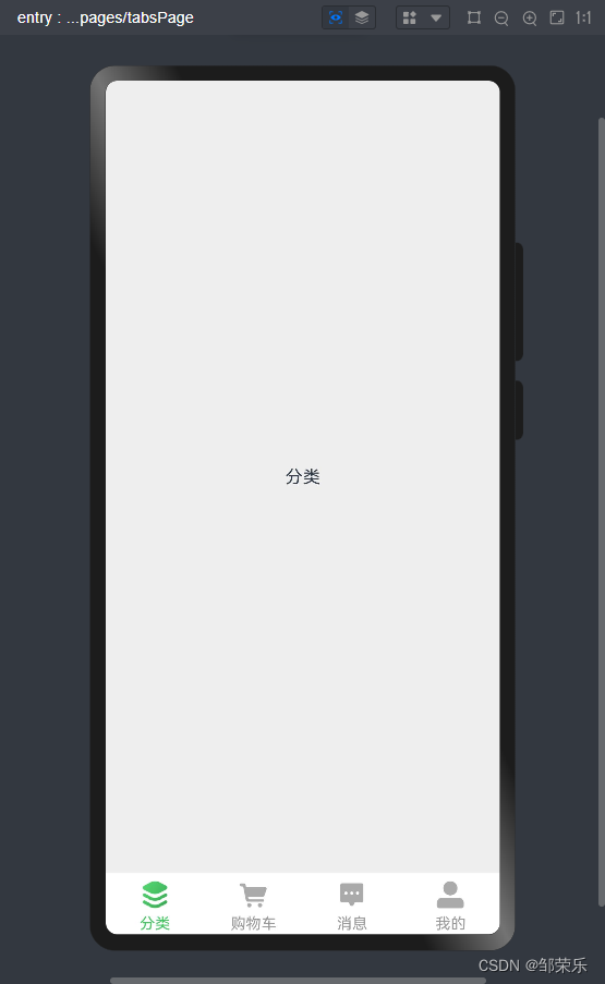
自定义导航栏
对于底部导航栏,一般作为应用主页面功能区分,为了更好的用户体验,会组合文字以及对应语义图标表示页签内容,这种情况下,需要自定义导航页签的样式。
系统默认情况下采用了下划线标志当前活跃的页签,而自定义导航栏需要自行实现相应的样式,用于区分当前活跃页签和未活跃页签。设置自定义导航栏需要使用tabbar的参数,以其支持的custombuilder的方式传入自定义的函数组件样式。例如这里声明tabbuilder的自定义函数组件,传入参数包括页签文字title,对应位置index,以及选中状态和未选中状态的图片资源。通过当前活跃的currentindex和页签对应的targetindex匹配与否,决定ui显示的样式。
-
在tabcontent对应tabbar属性中传入自定义函数组件,并传递相应的参数。
-
在不使用自定义导航栏时,系统默认的tabs会实现切换逻辑。在使用了自定义导航栏后,切换页签的逻辑需要手动实现。即用户点击对应页签时,屏幕需要显示相应的内容页 。
-
切换指定页签需要使用tabscontroller,tabscontroller是tabs组件的控制器,用于控制tabs组件进行页签切换。通过tabscontroller的changeindex方法来实现跳转至指定索引值对应的tabcontent内容。
-
使用自定义导航栏时,在tabbar属性中传入对应的@builder,并传入相应的参数。
1、代码
tabspage.ets
import {cate} from "./tabs/cate"
import {cart} from "./tabs/cart"
import {msg} from "./tabs/msg"
import {user} from "./tabs/user"

@entry
@component
struct tabspage {

  @state currentindex: number = 0

  private tabscontroller: tabscontroller = new tabscontroller()

  @builder tabbuilder(title:string,targetindex:number,normalimg:resource,selectedimg:resource){
    column(){
      image(this.currentindex==targetindex?selectedimg:normalimg)
        .width(28)
        .height(28)
      text(title)
        .fontsize(14)
        .margin({top:4})
        .fontcolor(this.currentindex==targetindex?'#45c461':'#999999')
    }
    .backgroundcolor("#ffffff")
    .width('100%')
    .height(60)
    .justifycontent(flexalign.center)
    .onclick(()=>{
      this.currentindex=targetindex
      this.tabscontroller.changeindex(this.currentindex)
    })
  }

  build() {
    column() {
      tabs({barposition:barposition.end,controller:this.tabscontroller,index:0}){
        tabcontent(){
          cate()
        }.tabbar(this.tabbuilder('分类',0,$r("app.media.tabs_1_off"),$r("app.media.tabs_1_on")))
        tabcontent(){
          cart()
        }.tabbar(this.tabbuilder('购物车',1,$r("app.media.tabs_2_off"),$r("app.media.tabs_2_on")))
        tabcontent(){
          msg()
        }.tabbar(this.tabbuilder('消息',2,$r("app.media.tabs_3_off"),$r("app.media.tabs_3_on")))
        tabcontent(){
          user()
        }.tabbar(this.tabbuilder('我的',3,$r("app.media.tabs_4_off"),$r("app.media.tabs_4_on")))
      }
      .scrollable(false)//去掉左右滑动的效果
      .animationduration(0)//去掉左右滑动的动画
    }
    .backgroundcolor("#eeeeee")
    .width('100%')
    .height('100%')
  }
}
tabs/cart.ets
@component

export struct cart {
  build(){
    text("购物车")
  }
}
其他页面内容都一样,自行编写。
2、效果


发表评论