 我要评论
我要评论介绍
本篇codelab使用常用组件、页面路由router实现购物应用,包含以下功能:
- 使用toolbar、toolbar-item组件实现“首页”,“新品”,“购物车”,“我的”页面切换。
- 使用list组件,展示购物车里的商品。
- 使用swiper组件,实现图片自动轮播。
- 使用panel组件,展示商品规格。
- 使用自定义组件,提高代码的可读性。
相关概念
- [swiper]:滑动容器,提供切换子组件显示的能力。
- [input]:交互式组件,包括单选框,多选框,按钮和单行文本输入框。
- [search]:搜索框组件,用于提供用户搜索内容的输入区域。
- [toolbar]:工具栏。放在界面底部,用于展示针对当前界面的操作选项。
- [toolbar-item]:工具栏[toolbar]子组件。 用于展示工具栏上的一个操作选项。
- [自定义组件]:自定义组件是用户根据业务需求,将已有的组件组合,封装成的新组件,可以在工程中多次调用,从而提高代码的可读性。
环境搭建
软件要求
- [deveco studio]版本:deveco studio 3.1 release及以上版本。
- openharmony sdk版本:api version 9及以上版本。
硬件要求
- 开发板类型:[润和rk3568开发板]。
- openharmony系统:3.2 release及以上版本。
环境搭建
完成本篇codelab我们首先要完成开发环境的搭建,本示例以rk3568开发板为例,参照以下步骤进行:
-
[获取openharmony系统版本]:标准系统解决方案(二进制)。以3.2 release版本为例:
-
搭建烧录环境。
- [完成deveco device tool的安装]
- [完成rk3568开发板的烧录]
-
搭建开发环境。
- 开始前请参考[工具准备],完成deveco studio的安装和开发环境配置。
- 开发环境配置完成后,请参考[使用工程向导]创建工程(模板选择“empty ability”)。
- 工程创建完成后,选择使用[真机进行调测]。
- 鸿蒙开发指导文档:
gitee.com/li-shizhen-skin/harmony-os/blob/master/readme.md点击或者复制转到。
代码结构解读
本篇codelab只对核心代码进行讲解,对于完整代码,我们会在【gitee.com/li-shizhen-skin/harmony-os/blob/master/readme.md】中提供。由于本篇codelab页面较多,因此component和pages目录下只展示“购物主页面”的hml、js、css。
`harmonyos与openharmony鸿蒙文档籽料:mau123789是v直接拿`

├──entry/src/main/js	             // 代码区
│  └──mainability
│     ├──common
│     │  ├──constant
│     │  │  └──commonconstants.js    // 公共常量类
│     │  └──images                   // 图片区
│     ├──component
│     │  ├──backcomponent            // 后退子组件
│     │  ├──commonbutton             // 支付按钮子组件
│     │  ├──commontoolbar            // 导航栏子组件
│     │  ├──home                     // 购物主页子组件
│     │  ├──likedcards               // 猜你喜欢卡片子组件
│     │  ├──myinfo                   // 我的子组件
│     │  ├──newproduct               // 新品子组件
│     │  ├──orderreusablecom         // 用户商品信息子组件
│     │  ├──productbuyinfo           // 购买商品卡片子组件
│     │  ├──shoppingcart             // 购物车子组件
│     │  └──subtitle                 // 副标题子组件
│     ├──i18n
│     │  ├──en-us.json               // 英文国际化
│     │  └──zh-cn.json               // 中文国际化
│     ├──pages
│     │  ├──allorders                // 全部订单页
│     │  ├──homepage                 // 购物主页
│     │  │  ├──homepage.css          // 购物主页面样式
│     │  │  ├──homepage.hml          // 购物主页面
│     │  │  └──homepage.js           // 购物主页面逻辑
│     │  ├──launchpage               // 启动页
│     │  ├──pendingpayment           // 待支付页
│     │  ├──productdetails           // 产品详情页
│     │  └──sureorder                // 确定订单页
│     └──app.js                      // 程序入口
└──entry/src/main/resources          // 应用资源目录
构建购物应用首页
本篇codelab选取购物应用的主页面、购物车页面、以及导航栏进行详细的讲解,对于完整代码,可在gitee源码中进行查看。
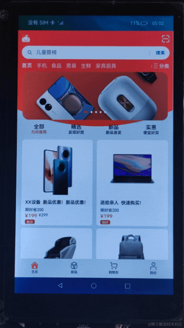
购物应用的主页面主要由界面底部导航栏和导航栏上的内容组成。效果如图所示:
<!-- homepage.hml -->
<element name="home" src="../../component/home/home.hml"></element>
<element name="new-product" src="../../component/newproduct/newproduct.hml"></element>
<element name="shopping-cart" src="../../component/shoppingcart/shoppingcart.hml"></element>
<element name="my-info" src="../../component/myinfo/myinfo.hml"></element>
<element name="common-toolbar" src="../../component/commontoolbar/commontoolbar.hml"></element>

<div class="container">
    <!-- 主页面 -->
    <home if="{{ tag === homepageindex }}"></home>

    <!-- 新品页面 -->
    <new-product if="{{ tag === newproductindex }}"></new-product>

    <!-- 购物车页面 -->
    <shopping-cart if="{{ tag === shoppingcartindex }}"></shopping-cart>

    <!-- 我的页面 -->
    <my-info if="{{ tag === myinfoindex }}"></my-info>

    <!-- 导航栏 -->
    <common-toolbar tag="{{ tag }}" @switch-toolbar="switchtoolbar"></common-toolbar>
</div>
底部导航栏:由“主页”、“新品”、“购物车”以及“我的”页面组成,点击导航栏内容,展示所点击模块的内容。
// homepage.js
import commonconstants from '../../common/constant/commonconstants';

export default {
  data: {
    // 页面默认展示主页,tag是主页面的索引
    tag: 1,
    // 主页面索引
    homepageindex: commonconstants.home_page_index,
    // 新品页面索引
    newproductindex: commonconstants.new_product_index,
    // 购物车页面索引
    shoppingcartindex: commonconstants.shopping_cart_index,
    // 我的页面索引
    myinfoindex: commonconstants.my_info_index
  },

  /**
   * 切换导航栏内容
   *
   * @param value 子组件传过来的索引
   */
  switchtoolbar(value) {
    this.tag = value.detail.index;
  }
}
子组件:导航栏的使用
导航栏由“主页”、“新品”、“购物车”以及“我的”组成,点击导航栏对应的子组件,页面会展示对应模块的内容。效果如图所示:

在父组件homepage.hml中使用@switch-toolbar="switchtoolbar"绑定子组件的事件,用于接收子组件传过来的索引,通过if判断,从而展示索引对应的页面。
<!-- homepage.hml -->
...
<div class="container">
    <!-- 主页面 -->
    <home if="{{ tag === homepageindex }}"></home>

    <!-- 新品页面 -->
    <new-product if="{{ tag === newproductindex }}"></new-product>

    <!-- 购物车页面 -->
    <shopping-cart if="{{ tag === shoppingcartindex }}"></shopping-cart>

    <!-- 我的页面 -->
    <my-info if="{{ tag === myinfoindex }}"></my-info>

    <!-- 导航栏 -->
    <common-toolbar tag="{{ tag }}" @switch-toolbar="switchtoolbar"></common-toolbar>
</div>

<!-- commontoolbar.hml -->
<div class="container">
    <toolbar class="toolbar">
        <toolbar-item value="{{ $t(toolbarname.home) }}" @click="switchtoolbar(homepageindex)"
                      icon="{{ tag === homepageindex ? commonicon.home : commonicon.homedisable }}">
        </toolbar-item>
        <toolbar-item value="{{ $t(toolbarname.newproduct) }}" @click="switchtoolbar(newproductindex)"
                      icon="{{ tag === newproductindex ? commonicon.newproduct : commonicon.newproductdisable }}">
        </toolbar-item>
        <toolbar-item value="{{ $t(toolbarname.shoppingcart) }}" @click="switchtoolbar(shoppingcartindex)"
                      icon="{{ tag === shoppingcartindex ? commonicon.shoppingcart : commonicon.shoppingcartdisable }}">
        </toolbar-item>
        <toolbar-item value="{{ $t(toolbarname.me) }}" @click="switchtoolbar(myinfoindex)"
                      icon="{{ tag === myinfoindex ? commonicon.me : commonicon.medisable }}">
        </toolbar-item>
    </toolbar>
</div>
在子组件commontoolbar.js中通过this.$emit(‘switchtoolbar’, {info: value})触发事件并向上传递参数,homepage.js中的switchtoolbar方法接收子组件传过来的索引。在子组件commontoolbar.js文件中定义props,props用于组件之间的数据通信,当父组件中的tag发生变化的时候,子组件也会随之响应,然后改变toolbar-item中icon的颜色。
// homepage.js
import commonconstants from '../../common/constant/commonconstants';

export default {
  data: {
    // 页面默认展示主页,tag是主页面的索引
    tag: 1,
    ...
  },

  /**
   * 切换导航栏内容
   *
   * @param value 子组件传过来的索引
   */
  switchtoolbar(value) {
    this.tag = value.detail.index;
  }
}

// commontoolbar.js
import commonconstants from '../../common/constant/commonconstants';

export default {
  props: ['tag'],
  data: {
    commonicon: commonconstants.common_toolbar_icon,
    toolbarname: commonconstants.common_toolbar_name,
    // 主页面索引
    homepageindex: commonconstants.home_page_index,
    // 新品页面索引
    newproductindex: commonconstants.new_product_index,
    // 购物车页面索引
    shoppingcartindex: commonconstants.shopping_cart_index,
    // 我的页面索引
    myinfoindex: commonconstants.my_info_index
  },

  /**
   * 向父组件传值
   *
   * @param index 选中子模块的索引
   */
  switchtoolbar(index) {
    this.$emit('switchtoolbar', {
      index: index
    });
  }
}
构建购物车页面
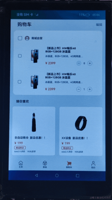
购物车页面由顶部标题栏、购物车商品列表、猜你喜欢的商品列表三部分组成,并以子组件的形式显示在主页面中。其中,购物车商品列表使用list组件和for循环,实现对多条商品数据进行展示。猜你喜欢的商品列表是通过引用自定义组件实现的。效果如图所示:
<!-- shoppingcart.hml -->
<element name="liked-cards" src="../../component/likedcards/likedcards.hml"></element>

<div class="container">
    <div class="top">
        <!-- 顶部导航标题栏 -->
        <div class="top-title">
            <text class="shopping-cart">{{ $t('strings.shopping_cart') }}</text>
            <text class="edit">{{ $t('strings.edit') }}</text>
        </div>
        <!-- 购物车商品列表 -->
        <div class="top-list">
            <div class="list-title">
                <input class="all-checkbox" type="checkbox" checked="{{ isallselect }}" @change="checkboxonchange">
                </input>
                <image class="my-icon-size" src="{{ person }}"></image>
                <text class="mall-self-operated">{{ $t('strings.mall_self_operated') }}</text>
            </div>
            <list class="list">
                <list-item for="{{ (index, item) in shoppinglistdata }}" class="list-item">
                    <div class="list-content">
                        <input class="checkbox" type="checkbox" checked="{{ item.isselect }}"></input>
                        <image class="product-pictures" src="{{ item.image }}"></image>
                        <div class="box-content">
                            <text class="product-title">{{ $t(item.title) }}</text>
                            <text class="product-subtitle">{{ $t(item.subtitle) }}</text>
                            <div class="content-price">
                                <text class="product-price">{{ item.price }}</text>
                                <div class="price-num">
                                    <image class="my-icon-size" @click="subtractnum(index)" src="{{ item.num === 0 ?
                                            commonicon.decreasedisableicon : commonicon.decreaseicon }}">
                                    </image>
                                    <text class="product-num">{{ item.num }}</text>
                                    <image class="my-icon-size" src="{{ commonicon.increaseicon }}"
                                           @click="addnum(index)">
                                    </image>
                                </div>
                            </div>
                        </div>
                    </div>
                </list-item>
            </list>
        </div>
    </div>
    <!-- 猜你喜欢商品列表 -->
    <div class="middle-card">
        <liked-cards></liked-cards>
    </div>
</div>
- 点击“商品自营”头像前的多选框,会触发checkboxonchange()方法,页面会勾选/不勾选购物车的中所有商品。
- 点击“+”按钮会触发addnum()方法,增加单件商品的数量。
- 点击“-”按钮会触发subtractnum()方法,减少单件商品的数量。
// shoppingcart.js
import commonconstants from '../../common/constant/commonconstants';

export default {
  data: {
    isallselect: false,
    shoppinglistdata: commonconstants.shopping_list_data,
    commonicon: commonconstants.shopping_cart_icon,
    person: commonconstants.common_icon.person
  },

  /**
   * 购物车商品全选/非全选
   */
  checkboxonchange() {
    this.isallselect = !this.isallselect;
    this.shoppinglistdata.filter((item) => {
      item.isselect = this.isallselect;
    });
  },

  /**
   * 勾选单个商品
   *
   * @param subscript 选中商品的索引
   * @param event 单选框事件
   */
  singleanswer(subscript, event) {
    // 修改商品的选择状态
    this.shoppinglistdata.foreach((item, index) => {
      if (index === subscript) {
        item.isselect = event.checked;
      }
    })
    // 检查购物车中的所有商品是否都被选中
    let selectall = this.shoppinglistdata.every(item => item.isselect === true);
    if (selectall === true) {
      this.isallselect = true;
    } else {
      this.isallselect = false;
    }
  },

  /**
   * 减少商品数量逻辑
   *
   * @param value 当前商品的数量
   */
  subtractnum(value) {
    if (this.shoppinglistdata[value].num > 0) {
      this.shoppinglistdata[value].num--;
    }
  },

  /**
   * 增加商品数量逻辑
   *
   * @param value 当前商品的数量
   */
  addnum(value) {
    this.shoppinglistdata[value].num++;
  }
}


发表评论