
引言
正文
01-不同度量的聚集聚类
这段代码展示了如何使用python中的scikit-learn库进行凝聚层次聚类(agglomerative clustering)以及可视化聚类结果和距离矩阵。让我们逐步解释每个部分的功能和意图:
数据生成
# generate waveform data
n_features = 2000
t = np.pi * np.linspace(0, 1, n_features)

def sqr(x):
    return np.sign(np.cos(x))

x = list()
y = list()
for i, (phi, a) in enumerate([(.5, .15), (.5, .6), (.3, .2)]):
    for _ in range(30):
        phase_noise = .01 * np.random.normal()
        amplitude_noise = .04 * np.random.normal()
        additional_noise = 1 - 2 * np.random.rand(n_features)
        additional_noise[np.abs(additional_noise) < .997] = 0

        x.append(12 * ((a + amplitude_noise)
                 * (sqr(6 * (t + phi + phase_noise)))
                 + additional_noise))
        y.append(i)

x = np.array(x)
y = np.array(y)
- 这部分代码生成了包含三种波形的合成数据。每种波形重复生成30次,每次添加不同的噪声,最终得到包含三种波形数据的x和对应的标签y。
可视化 ground truth
plt.figure()
plt.axes([0, 0, 1, 1])
for l, c, n in zip(range(n_clusters), 'rgb',
                   labels):
    lines = plt.plot(x[y == l].t, c=c, alpha=.5)
    lines[0].set_label(n)

plt.legend(loc='best')

plt.axis('tight')
plt.axis('off')
plt.suptitle("ground truth", size=20)
plt.savefig("../3.png", dpi=500)
- 这部分代码绘制了数据的地面真实标签(ground truth),显示了每个波形的数据示例。每种波形用不同颜色表示,有助于理解数据的分布和真实标签。
距离矩阵的可视化
for index, metric in enumerate(["cosine", "euclidean", "cityblock"]):
    avg_dist = np.zeros((n_clusters, n_clusters))
    plt.figure(figsize=(5, 4.5))
    for i in range(n_clusters):
        for j in range(n_clusters):
            avg_dist[i, j] = pairwise_distances(x[y == i], x[y == j],
                                                metric=metric).mean()
    avg_dist /= avg_dist.max()
    for i in range(n_clusters):
        for j in range(n_clusters):
            plt.text(i, j, '%5.3f' % avg_dist[i, j],
                     verticalalignment='center',
                     horizontalalignment='center')

    plt.imshow(avg_dist, interpolation='nearest', cmap=plt.cm.gnuplot2,
               vmin=0)
    plt.xticks(range(n_clusters), labels, rotation=45)
    plt.yticks(range(n_clusters), labels)
    plt.colorbar()
    plt.suptitle("interclass %s distances" % metric, size=18)
    plt.tight_layout()
plt.savefig("../4.png", dpi=500)
- 这部分代码计算并绘制了不同距离度量(余弦相似度、欧氏距离、曼哈顿距离)下数据类间的平均距离矩阵。每个距离矩阵显示了数据类别之间的相似度或差异度量,有助于选择合适的距离度量进行聚类。
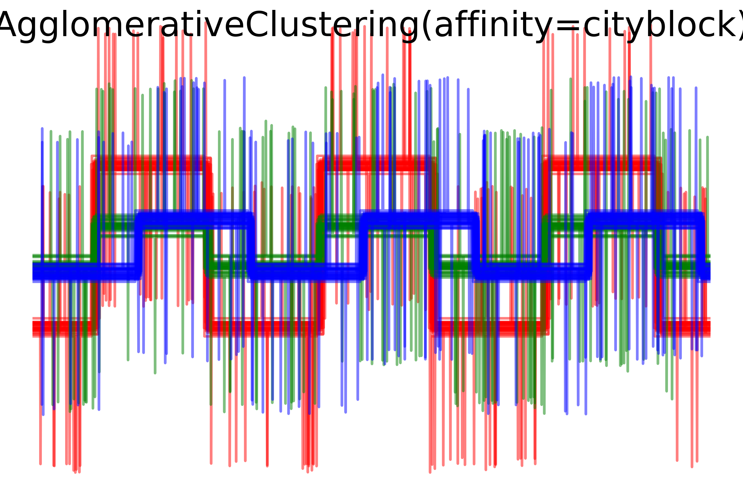
凝聚层次聚类的可视化
- 这部分代码使用凝聚层次聚类算法(agglomerative clustering)对数据进行聚类,并根据不同的距离度量(余弦相似度、欧氏距离、曼哈顿距离)生成聚类结果的可视化。每个子图展示了使用特定距离度量的聚类结果,以及聚类簇的可视化分布。
总结
该代码演示了如何利用python中的scikit-learn库对复杂数据集进行凝聚层次聚类,并通过多种视觉手段展示数据的真实标签、距离度量以及聚类结果。这些步骤帮助理解和分析数据的分布、相似度以及聚类效果,对数据分析和机器学习建模有重要的辅助作用。
import matplotlib.pyplot as plt
import numpy as np

from sklearn.cluster import agglomerativeclustering
from sklearn.metrics import pairwise_distances

np.random.seed(0)

# generate waveform data
n_features = 2000
t = np.pi * np.linspace(0, 1, n_features)


def sqr(x):
    return np.sign(np.cos(x))

x = list()
y = list()
for i, (phi, a) in enumerate([(.5, .15), (.5, .6), (.3, .2)]):
    for _ in range(30):
        phase_noise = .01 * np.random.normal()
        amplitude_noise = .04 * np.random.normal()
        additional_noise = 1 - 2 * np.random.rand(n_features)
        # make the noise sparse
        additional_noise[np.abs(additional_noise) < .997] = 0

        x.append(12 * ((a + amplitude_noise)
                 * (sqr(6 * (t + phi + phase_noise)))
                 + additional_noise))
        y.append(i)

x = np.array(x)
y = np.array(y)

n_clusters = 3

labels = ('waveform 1', 'waveform 2', 'waveform 3')

# plot the ground-truth labelling
plt.figure()
plt.axes([0, 0, 1, 1])
for l, c, n in zip(range(n_clusters), 'rgb',
                   labels):
    lines = plt.plot(x[y == l].t, c=c, alpha=.5)
    lines[0].set_label(n)

plt.legend(loc='best')

plt.axis('tight')
plt.axis('off')
plt.suptitle("ground truth", size=20)
plt.savefig("../3.png", dpi=500)

# plot the distances
for index, metric in enumerate(["cosine", "euclidean", "cityblock"]):
    avg_dist = np.zeros((n_clusters, n_clusters))
    plt.figure(figsize=(5, 4.5))
    for i in range(n_clusters):
        for j in range(n_clusters):
            avg_dist[i, j] = pairwise_distances(x[y == i], x[y == j],
                                                metric=metric).mean()
    avg_dist /= avg_dist.max()
    for i in range(n_clusters):
        for j in range(n_clusters):
            plt.text(i, j, '%5.3f' % avg_dist[i, j],
                     verticalalignment='center',
                     horizontalalignment='center')

    plt.imshow(avg_dist, interpolation='nearest', cmap=plt.cm.gnuplot2,
               vmin=0)
    plt.xticks(range(n_clusters), labels, rotation=45)
    plt.yticks(range(n_clusters), labels)
    plt.colorbar()
    plt.suptitle("interclass %s distances" % metric, size=18)
    plt.tight_layout()
plt.savefig("../4.png", dpi=500)

# plot clustering results
for index, metric in enumerate(["cosine", "euclidean", "cityblock"]):
    model = agglomerativeclustering(n_clusters=n_clusters,
                                    linkage="average", affinity=metric)
    model.fit(x)
    plt.figure()
    plt.axes([0, 0, 1, 1])
    for l, c in zip(np.arange(model.n_clusters), 'rgbk'):
        plt.plot(x[model.labels_ == l].t, c=c, alpha=.5)
    plt.axis('tight')
    plt.axis('off')
    plt.suptitle("agglomerativeclustering(affinity=%s)" % metric, size=20)

plt.savefig("../5.png", dpi=500)
plt.show()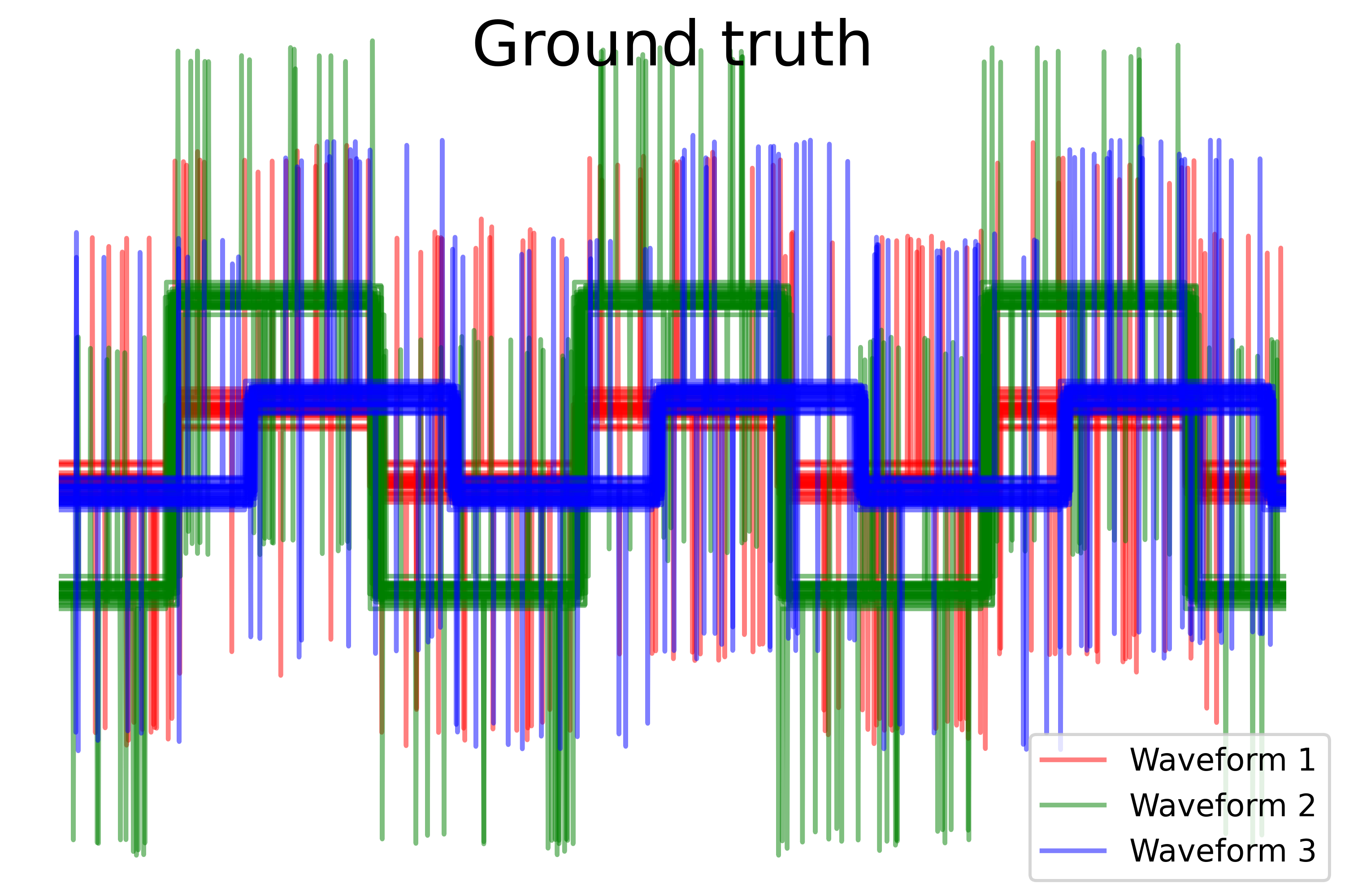

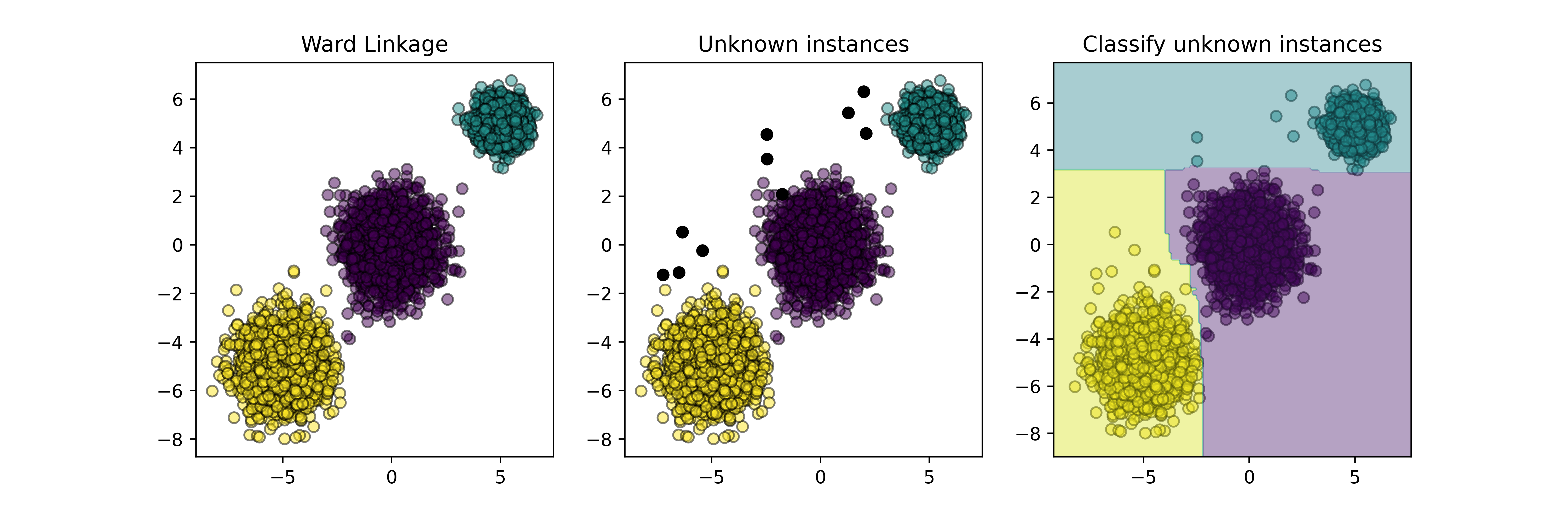
02-归纳聚类
这段代码实现了一个基于归纳学习的聚类器模型,并使用了python中常见的机器学习库进行实现和可视化。让我们逐步解释:
-
导入库和模块:
import numpy as np
import matplotlib.pyplot as plt
from sklearn.base import baseestimator, clone
from sklearn.cluster import agglomerativeclustering
from sklearn.datasets import make_blobs
from sklearn.ensemble import randomforestclassifier
from sklearn.utils.metaestimators import if_delegate_has_method
这里导入了用于数值计算的numpy库,用于绘图的matplotlib库,以及用于机器学习的各种模块和类。
-
定义归纳聚类器类
inductiveclusterer:
这是一个自定义的机器学习模型,继承自baseestimator,具有以下方法:__init__: 初始化方法,接收聚类器和分类器作为参数。fit: 训练方法,使用给定的数据x进行聚类和分类器的训练。predict: 预测方法,用于预测新数据的聚类标签。decision_function: 决策函数方法,用于预测新数据的决策函数值。
-
定义绘图函数
plot_scatter:
这个函数用于绘制散点图,其中x是数据集,color是颜色,alpha是透明度。 -
生成训练数据:
使用make_blobs生成包含三个簇的数据集x和相应的真实标签y。 -
训练聚类器:
使用agglomerativeclustering进行训练,得到训练数据的聚类标签cluster_labels。 -
绘制子图:
使用matplotlib绘制三个子图:- 第一个子图展示了原始数据
x的散点图,并按照聚类标签进行着色。 - 第二个子图在第一个子图的基础上,增加了新生成的数据
x_new的散点图(黑色)。 - 第三个子图展示了原始数据
x的散点图,并根据归纳学习模型对新数据x_new的聚类结果进行了着色,并绘制了决策区域。
- 第一个子图展示了原始数据
-
保存和展示图像:
将绘制的图像保存为文件5.png,并展示出来。
这段代码的目的是演示如何使用归纳学习模型,即通过结合聚类和分类技术来预测新数据点的类别。
import numpy as np
import matplotlib.pyplot as plt
from sklearn.base import baseestimator, clone
from sklearn.cluster import agglomerativeclustering
from sklearn.datasets import make_blobs
from sklearn.ensemble import randomforestclassifier
from sklearn.utils.metaestimators import if_delegate_has_method


n_samples = 5000
random_state = 42


class inductiveclusterer(baseestimator):
    def __init__(self, clusterer, classifier):
        self.clusterer = clusterer
        self.classifier = classifier

    def fit(self, x, y=none):
        self.clusterer_ = clone(self.clusterer)
        self.classifier_ = clone(self.classifier)
        y = self.clusterer_.fit_predict(x)
        self.classifier_.fit(x, y)
        return self

    @if_delegate_has_method(delegate='classifier_')
    def predict(self, x):
        return self.classifier_.predict(x)

    @if_delegate_has_method(delegate='classifier_')
    def decision_function(self, x):
        return self.classifier_.decision_function(x)


def plot_scatter(x,  color, alpha=0.5):
    return plt.scatter(x[:, 0],
                       x[:, 1],
                       c=color,
                       alpha=alpha,
                       edgecolor='k')


# generate some training data from clustering
x, y = make_blobs(n_samples=n_samples,
                  cluster_std=[1.0, 1.0, 0.5],
                  centers=[(-5, -5), (0, 0), (5, 5)],
                  random_state=random_state)


# train a clustering algorithm on the training data and get the cluster labels
clusterer = agglomerativeclustering(n_clusters=3)
cluster_labels = clusterer.fit_predict(x)

plt.figure(figsize=(12, 4))

plt.subplot(131)
plot_scatter(x, cluster_labels)
plt.title("ward linkage")


# generate new samples and plot them along with the original dataset
x_new, y_new = make_blobs(n_samples=10,
                          centers=[(-7, -1), (-2, 4), (3, 6)],
                          random_state=random_state)

plt.subplot(132)
plot_scatter(x, cluster_labels)
plot_scatter(x_new, 'black', 1)
plt.title("unknown instances")


# declare the inductive learning model that it will be used to
# predict cluster membership for unknown instances
classifier = randomforestclassifier(random_state=random_state)
inductive_learner = inductiveclusterer(clusterer, classifier).fit(x)

probable_clusters = inductive_learner.predict(x_new)


plt.subplot(133)
plot_scatter(x, cluster_labels)
plot_scatter(x_new, probable_clusters)

# plotting decision regions
x_min, x_max = x[:, 0].min() - 1, x[:, 0].max() + 1
y_min, y_max = x[:, 1].min() - 1, x[:, 1].max() + 1
xx, yy = np.meshgrid(np.arange(x_min, x_max, 0.1),
                     np.arange(y_min, y_max, 0.1))

z = inductive_learner.predict(np.c_[xx.ravel(), yy.ravel()])
z = z.reshape(xx.shape)

plt.contourf(xx, yy, z, alpha=0.4)
plt.title("classify unknown instances")
plt.savefig("../5.png", dpi=500)
plt.show()
运行结果如下图所示:
03-光学聚类算法的演示
这段代码演示了如何使用optics算法进行聚类,并可视化聚类结果及其相关属性。让我来逐步解释:
-
首先,生成了六个不同形状的聚类簇,每个簇包含250个样本点。这些点被合并成一个数据集x。
-
使用optics算法(在此例中使用了scikit-learn中的optics类)对数据集x进行聚类。参数设置为
min_samples=50,xi=0.05,min_cluster_size=0.05。 -
使用
cluster_optics_dbscan函数基于optics算法的输出,对每个样本点进行dbscan聚类,分别使用了两个不同的epsilon值(0.5和2.0)。 -
通过绘制四个子图,展示了聚类的不同阈值下的效果:
- 第一个子图是“reachability plot”,展示了样本点的可达性。
- 第二个子图展示了optics算法的自动聚类结果。
- 第三个子图展示了dbscan算法在epsilon值为0.5时的聚类结果。
- 第四个子图展示了dbscan算法在epsilon值为2.0时的聚类结果。
-
最后,通过调整布局和保存图像,生成了可视化结果。
这段代码的目的是展示optics算法在不同参数设置下的聚类效果,并对比了其与dbscan算法在不同epsilon值下的表现。
from sklearn.cluster import optics, cluster_optics_dbscan
import matplotlib.gridspec as gridspec
import matplotlib.pyplot as plt
import numpy as np

# generate sample data

np.random.seed(0)
n_points_per_cluster = 250

c1 = [-5, -2] + .8 * np.random.randn(n_points_per_cluster, 2)
c2 = [4, -1] + .1 * np.random.randn(n_points_per_cluster, 2)
c3 = [1, -2] + .2 * np.random.randn(n_points_per_cluster, 2)
c4 = [-2, 3] + .3 * np.random.randn(n_points_per_cluster, 2)
c5 = [3, -2] + 1.6 * np.random.randn(n_points_per_cluster, 2)
c6 = [5, 6] + 2 * np.random.randn(n_points_per_cluster, 2)
x = np.vstack((c1, c2, c3, c4, c5, c6))

clust = optics(min_samples=50, xi=.05, min_cluster_size=.05)

# run the fit
clust.fit(x)

labels_050 = cluster_optics_dbscan(reachability=clust.reachability_,
                                   core_distances=clust.core_distances_,
                                   ordering=clust.ordering_, eps=0.5)
labels_200 = cluster_optics_dbscan(reachability=clust.reachability_,
                                   core_distances=clust.core_distances_,
                                   ordering=clust.ordering_, eps=2)

space = np.arange(len(x))
reachability = clust.reachability_[clust.ordering_]
labels = clust.labels_[clust.ordering_]

plt.figure(figsize=(10, 7))
g = gridspec.gridspec(2, 3)
ax1 = plt.subplot(g[0, :])
ax2 = plt.subplot(g[1, 0])
ax3 = plt.subplot(g[1, 1])
ax4 = plt.subplot(g[1, 2])

# reachability plot
colors = ['g.', 'r.', 'b.', 'y.', 'c.']
for klass, color in zip(range(0, 5), colors):
    xk = space[labels == klass]
    rk = reachability[labels == klass]
    ax1.plot(xk, rk, color, alpha=0.3)
ax1.plot(space[labels == -1], reachability[labels == -1], 'k.', alpha=0.3)
ax1.plot(space, np.full_like(space, 2., dtype=float), 'k-', alpha=0.5)
ax1.plot(space, np.full_like(space, 0.5, dtype=float), 'k-.', alpha=0.5)
ax1.set_ylabel('reachability (epsilon distance)')
ax1.set_title('reachability plot')

# optics
colors = ['g.', 'r.', 'b.', 'y.', 'c.']
for klass, color in zip(range(0, 5), colors):
    xk = x[clust.labels_ == klass]
    ax2.plot(xk[:, 0], xk[:, 1], color, alpha=0.3)
ax2.plot(x[clust.labels_ == -1, 0], x[clust.labels_ == -1, 1], 'k+', alpha=0.1)
ax2.set_title('automatic clustering\noptics')

# dbscan at 0.5
colors = ['g', 'greenyellow', 'olive', 'r', 'b', 'c']
for klass, color in zip(range(0, 6), colors):
    xk = x[labels_050 == klass]
    ax3.plot(xk[:, 0], xk[:, 1], color, alpha=0.3, marker='.')
ax3.plot(x[labels_050 == -1, 0], x[labels_050 == -1, 1], 'k+', alpha=0.1)
ax3.set_title('clustering at 0.5 epsilon cut\ndbscan')

# dbscan at 2.
colors = ['g.', 'm.', 'y.', 'c.']
for klass, color in zip(range(0, 4), colors):
    xk = x[labels_200 == klass]
    ax4.plot(xk[:, 0], xk[:, 1], color, alpha=0.3)
ax4.plot(x[labels_200 == -1, 0], x[labels_200 == -1, 1], 'k+', alpha=0.1)
ax4.set_title('clustering at 2.0 epsilon cut\ndbscan')

plt.tight_layout()
plt.savefig("../5.png", dpi=500)
plt.show()
运行结果如下图所示:

04-birch和minibatchkmeans的比较
这段代码演示了如何使用python中的sklearn库进行聚类分析,比较了birch和minibatchkmeans两种算法在生成的大型数据集上的表现。
1. 数据生成
首先,使用make_blobs函数生成了一个包含10x10个中心点的数据集,共有100,000个样本。这些中心点按照网格状分布在平面上。
xx = np.linspace(-22, 22, 10)
yy = np.linspace(-22, 22, 10)
xx, yy = np.meshgrid(xx, yy)
n_centres = np.hstack((np.ravel(xx)[:, np.newaxis],
                       np.ravel(yy)[:, np.newaxis]))

x, y = make_blobs(n_samples=100000, centers=n_centres, random_state=0)
2. birch算法的使用
接下来,对birch算法进行了两次不同的运行:
- 第一次使用了
n_clusters=none,即没有全局聚类步骤,此时birch算法只生成子簇。 - 第二次使用了
n_clusters=100,包含了全局聚类步骤,即在生成的子簇基础上再进行一次全局聚类。
birch_models = [birch(threshold=1.7, n_clusters=none),
                birch(threshold=1.7, n_clusters=100)]

for ind, (birch_model, info) in enumerate(zip(birch_models, final_step)):
    birch_model.fit(x)
    labels = birch_model.labels_
    centroids = birch_model.subcluster_centers_
    n_clusters = np.unique(labels).size

    # 绘制子图
3. minibatchkmeans算法的使用
最后,使用minibatchkmeans算法进行聚类分析,设置了100个簇,batch大小为100。
mbk = minibatchkmeans(init='k-means++', n_clusters=100, batch_size=100,
                      n_init=10, max_no_improvement=10, verbose=0,
                      random_state=0)
mbk.fit(x)
4. 可视化
使用matplotlib库将聚类结果可视化到一个图形中,包括birch算法的两种运行方式和minibatchkmeans算法的结果。
fig = plt.figure(figsize=(12, 4))
fig.subplots_adjust(left=0.04, right=0.98, bottom=0.1, top=0.9)

# 绘制birch算法的结果
for ind, (birch_model, info) in enumerate(zip(birch_models, final_step)):
    ax = fig.add_subplot(1, 3, ind + 1)
    for this_centroid, k, col in zip(centroids, range(n_clusters), colors_):
        mask = labels == k
        ax.scatter(x[mask, 0], x[mask, 1],
                   c='w', edgecolor=col, marker='.', alpha=0.5)
        if birch_model.n_clusters is none:
            ax.scatter(this_centroid[0], this_centroid[1], marker='+',
                       c='k', s=25)
    ax.set_ylim([-25, 25])
    ax.set_xlim([-25, 25])
    ax.set_autoscaley_on(false)
    ax.set_title('birch %s' % info)

# 绘制minibatchkmeans算法的结果
ax = fig.add_subplot(1, 3, 3)
for this_centroid, k, col in zip(mbk.cluster_centers_,
                                 range(n_clusters), colors_):
    mask = mbk.labels_ == k
    ax.scatter(x[mask, 0], x[mask, 1], marker='.',
               c='w', edgecolor=col, alpha=0.5)
    ax.scatter(this_centroid[0], this_centroid[1], marker='+',
               c='k', s=25)
ax.set_xlim([-25, 25])
ax.set_ylim([-25, 25])
ax.set_title("minibatchkmeans")
ax.set_autoscaley_on(false)

plt.savefig("../5.png", dpi=500)
plt.show()
解释
- birch算法:通过不同的
n_clusters设置,展示了birch算法在生成子簇和全局聚类的效果。 - minibatchkmeans算法:展示了minibatchkmeans算法在大规模数据集上的聚类效果,同时比较了其与birch算法的差异。
整体来说,该代码演示了如何使用python进行聚类分析,并展示了不同算法在大规模数据集上的表现及可视化。
from itertools import cycle
from time import time
import numpy as np
import matplotlib.pyplot as plt
import matplotlib.colors as colors

from sklearn.cluster import birch, minibatchkmeans
from sklearn.datasets import make_blobs


# generate centers for the blobs so that it forms a 10 x 10 grid.
xx = np.linspace(-22, 22, 10)
yy = np.linspace(-22, 22, 10)
xx, yy = np.meshgrid(xx, yy)
n_centres = np.hstack((np.ravel(xx)[:, np.newaxis],
                       np.ravel(yy)[:, np.newaxis]))

# generate blobs to do a comparison between minibatchkmeans and birch.
x, y = make_blobs(n_samples=100000, centers=n_centres, random_state=0)

# use all colors that matplotlib provides by default.
colors_ = cycle(colors.cnames.keys())

fig = plt.figure(figsize=(12, 4))
fig.subplots_adjust(left=0.04, right=0.98, bottom=0.1, top=0.9)

# compute clustering with birch with and without the final clustering step
# and plot.
birch_models = [birch(threshold=1.7, n_clusters=none),
                birch(threshold=1.7, n_clusters=100)]
final_step = ['without global clustering', 'with global clustering']

for ind, (birch_model, info) in enumerate(zip(birch_models, final_step)):
    t = time()
    birch_model.fit(x)
    time_ = time() - t
    print("birch %s as the final step took %0.2f seconds" % (
          info, (time() - t)))

    # plot result
    labels = birch_model.labels_
    centroids = birch_model.subcluster_centers_
    n_clusters = np.unique(labels).size
    print("n_clusters : %d" % n_clusters)

    ax = fig.add_subplot(1, 3, ind + 1)
    for this_centroid, k, col in zip(centroids, range(n_clusters), colors_):
        mask = labels == k
        ax.scatter(x[mask, 0], x[mask, 1],
                   c='w', edgecolor=col, marker='.', alpha=0.5)
        if birch_model.n_clusters is none:
            ax.scatter(this_centroid[0], this_centroid[1], marker='+',
                       c='k', s=25)
    ax.set_ylim([-25, 25])
    ax.set_xlim([-25, 25])
    ax.set_autoscaley_on(false)
    ax.set_title('birch %s' % info)

# compute clustering with minibatchkmeans.
mbk = minibatchkmeans(init='k-means++', n_clusters=100, batch_size=100,
                      n_init=10, max_no_improvement=10, verbose=0,
                      random_state=0)
t0 = time()
mbk.fit(x)
t_mini_batch = time() - t0
print("time taken to run minibatchkmeans %0.2f seconds" % t_mini_batch)
mbk_means_labels_unique = np.unique(mbk.labels_)

ax = fig.add_subplot(1, 3, 3)
for this_centroid, k, col in zip(mbk.cluster_centers_,
                                 range(n_clusters), colors_):
    mask = mbk.labels_ == k
    ax.scatter(x[mask, 0], x[mask, 1], marker='.',
               c='w', edgecolor=col, alpha=0.5)
    ax.scatter(this_centroid[0], this_centroid[1], marker='+',
               c='k', s=25)
ax.set_xlim([-25, 25])
ax.set_ylim([-25, 25])
ax.set_title("minibatchkmeans")
ax.set_autoscaley_on(false)
plt.savefig("../5.png", dpi=500)
plt.show()
运行结果如下图所示:
总结


发表评论