 我要评论
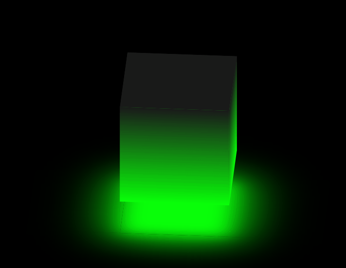
我要评论一.话不多,看效果
二.实现(附完整代码)
1.定义标签:
<div class="container">
      <div class="q1"></div>
      <div class="h2"></div>
      <div class="z3"></div>
      <div class="y4"></div>
      <div class="s5"></div>
      <div class="x6"></div>
    </div>
2.定义外层盒子css:
 * {
        padding: 0;
        margin: 0;
        box-sizing: border-box;
      }
      body {
        height: 100vh;
        display: flex;
        justify-content: center;
        align-items: center;
        background-color: black;
      }
      .container {
        position: relative;
        width: 300px;
        height: 300px;
        transform-style: preserve-3d;
        animation: zuan 6s linear alternate infinite;
      }
      @keyframes zuan {
        0% {
          transform: rotatex(-30deg) rotatey(0deg);
        }

        100% {
          transform: rotatex(-30deg) rotatey(360deg);
        }
      }
transform-style 让转换的子元素保留3d转换
animation 开启动画
不了解3d的可以看我的这篇文章:
3.定义盒子6个面分别的样式:
 .q1,
      .h2,
      .z3,
      .y4 {
        position: absolute;
        width: 100%;
        height: 100%;
        /* opacity: 0.8; */
        /*   border-left: solid 1px rgba(9, 255, 9, 1); */
        background-image: linear-gradient(rgb(26, 26, 26), rgb(9, 255, 9));
      }

      .q1 {
        transform: translatez(150px);
      }
      .h2 {
        transform: rotatey(180deg) translatez(150px);
      }
      .z3 {
        transform: rotatey(-90deg) translatez(150px);
      }
      .y4 {
        transform: rotatey(90deg) translatez(150px);
      }
      .s5,
      .x6 {
        position: absolute;
        width: 100%;
        height: 100%;
      }
      .s5 {
        transform: rotatex(90deg) translatez(150px);
        background-color: rgb(26, 26, 26);
      }
      .x6 {
        background-color: rgb(9, 255, 9);
        transform: rotatex(-90deg) translatez(250px);
        box-shadow: 0 0 150px 30px rgb(9, 255, 9);
        filter: blur(30px);
      }
完整代码:
<!doctype html>
<html lang="zh-cn">
  <head>
    <meta charset="utf-8" />
    <meta name="viewport" content="width=device-width, initial-scale=1.0" />
    <title>document</title>
    <style>
      * {
        padding: 0;
        margin: 0;
        box-sizing: border-box;
      }
      body {
        height: 100vh;
        display: flex;
        justify-content: center;
        align-items: center;
        background-color: black;
      }
      .container {
        position: relative;
        width: 300px;
        height: 300px;
        transform-style: preserve-3d;
        animation: zuan 6s linear alternate infinite;
      }
      @keyframes zuan {
        0% {
          transform: rotatex(-30deg) rotatey(0deg);
        }

        100% {
          transform: rotatex(-30deg) rotatey(360deg);
        }
      }
      .q1,
      .h2,
      .z3,
      .y4 {
        position: absolute;
        width: 100%;
        height: 100%;
        /* opacity: 0.8; */
        /*   border-left: solid 1px rgba(9, 255, 9, 1); */
        background-image: linear-gradient(rgb(26, 26, 26), rgb(9, 255, 9));
      }

      .q1 {
        transform: translatez(150px);
      }
      .h2 {
        transform: rotatey(180deg) translatez(150px);
      }
      .z3 {
        transform: rotatey(-90deg) translatez(150px);
      }
      .y4 {
        transform: rotatey(90deg) translatez(150px);
      }
      .s5,
      .x6 {
        position: absolute;
        width: 100%;
        height: 100%;
      }
      .s5 {
        transform: rotatex(90deg) translatez(150px);
        background-color: rgb(26, 26, 26);
      }
      .x6 {
        background-color: rgb(9, 255, 9);
        transform: rotatex(-90deg) translatez(250px);
        box-shadow: 0 0 150px 30px rgb(9, 255, 9);
        filter: blur(30px);
      }
    </style>
  </head>
  <body>
    <div class="container">
      <div class="q1"></div>
      <div class="h2"></div>
      <div class="z3"></div>
      <div class="y4"></div>
      <div class="s5"></div>
      <div class="x6"></div>
    </div>
  </body>
</html>
到此这篇关于使用html+css制作一个发光立方体特效的文章就介绍到这了,更多相关html+css制作发光立方体特效内容请搜索代码网以前的文章或继续浏览下面的相关文章希望大家以后多多支持代码网!


发表评论