 我要评论
我要评论效果:
实现:
1.定义标签,shu是书本,feng是封面,wen是文字内容。
<div class="shu">
<div class="feng"></div>
<div class="wen">
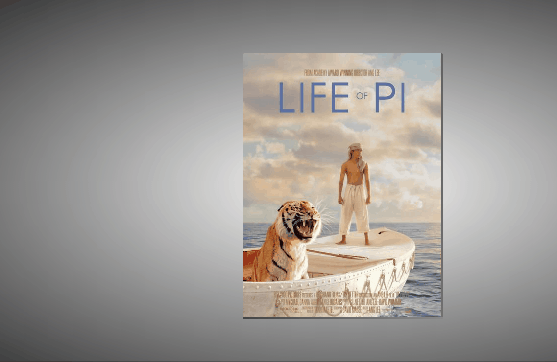
<h3 style="padding-top: 50px;padding-left: 40px;">life of pi</h3>
<p style=" padding-top: 20px; padding-left: 40px;padding-right: 15px;">
he lives in scarborough. he's a small, slim man – nomore than five foot five. dark hair, dark eyes. hair greyingat the temples. can't be older than forty. leasingcoffee-coloured complexion1. mild fall weather, yet puts on abig winter parka with fur-lined hood2 for the walk to thediner.
</p>
</div>
</div>
2.定义书本的基本属性,宽高,阴影等,伪类是下面和右面那两条阴影。
.shu{
position: relative;
width: 300px;
height: 400px;
background-color: rgba(255, 255, 255, 0.774);
transform-style: preserve-3d;
box-shadow: 300px 0px 30px rgb(0, 0, 0,.6) inset;
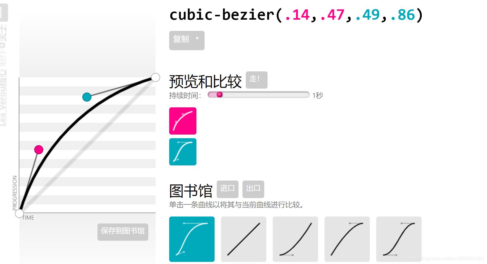
transition: 1s cubic-bezier(.79,.34,.47,.92);
}
.shu::after{
content: '';
position: absolute;
height: 3px;
width: 303px;
left: 0px;
bottom: -3px;
/* background-color: rgb(100, 96, 96); */
background-image: linear-gradient(to right,rgb(71, 68, 68),rgba(124, 120, 120, 0.3) );
border-bottom-left-radius: 5px;
}
.shu::before{
content: '';
position: absolute;
width: 3px;
height: 100%;
right: -3px;
top: 0px;
background-color: rgb(112, 108, 108);
background-image: linear-gradient(to top,rgb(114, 111, 111),rgba(90, 87, 87, 0.5) );;
border-top-right-radius: 3px;
}
transition: 1s cubic-bezier(.79,.34,.47,.92); 变化时间为1s,运动曲线为 cubic-bezier(.79,.34,.47,.92),这个可以去一个网站自定义生成:点我。
3.鼠标经过,阴影变化,然后书本向左旋转:
 .shu:hover{
            box-shadow:   30px 0px 30px  rgb(0, 0, 0,.6) inset;
            transform: rotate(-5deg);

        }
transform: rotate(-5deg);旋转;
4.封面的基本样式:
 .feng{
            position: absolute;
            width: 100%;
            height: 100%;
            z-index: 2;
            background-image: url(4.jpg);
            background-size: 100% ;
            transform-origin: left;
            transition: 1s cubic-bezier(.79,.34,.47,.92);
            border-top-left-radius: 2px;
            border-bottom-left-radius: 2px;


        }
transform-origin: left; 封面旋转的位置,旋转点
5.封面旋转:
 .shu:hover .feng{
            transform: rotatey(-140deg);

        }
文本的基本属性:
 .wen{
            position: absolute;
            top: 0;
            left: 0;
            width: 100%;
            height: 100%;
            font-family: 'fangsong';
            text-align: left;
        }
完整代码:
<!doctype html>
<html lang="en">
<head>
    <meta charset="utf-8">
    <meta name="viewport" content="width=device-width, initial-scale=1.0">
    <title>document</title>
    <style>
        *{
            margin: 0;
            padding: 0;
            box-sizing: border-box;
        }
        body{
            height: 100vh;
            background-image: radial-gradient(white,black);

            display: flex;
            justify-content: center;
            align-items: center;
        }
        .shu{
            position: relative;
            width: 300px;
            height: 400px;
            background-color: rgba(255, 255, 255, 0.774);
            transform-style:  preserve-3d;
            box-shadow:   300px 0px 30px  rgb(0, 0, 0,.6) inset;
            transition: 1s cubic-bezier(.79,.34,.47,.92);
        }
        .shu::after{
            content: '';
            position: absolute;
            height: 3px;
            width: 303px;
            left: 0px;
            bottom: -3px;
           /*  background-color: rgb(100, 96, 96); */
           background-image: linear-gradient(to right,rgb(71, 68, 68),rgba(124, 120, 120, 0.3) );
            border-bottom-left-radius: 5px;
        }
        .shu::before{
            content: '';
            position: absolute;
            width: 3px;
            height: 100%;
            right: -3px;
            top: 0px;
            background-color: rgb(112, 108, 108);
           background-image: linear-gradient(to top,rgb(114, 111, 111),rgba(90, 87, 87, 0.5) );;
            border-top-right-radius: 3px;
        }

        .shu:hover{
            box-shadow:   30px 0px 30px  rgb(0, 0, 0,.6) inset;
            transform: rotate(-5deg);

        }
        .feng{
            position: absolute;
            width: 100%;
            height: 100%;
            z-index: 2;
            background-image: url(4.jpg);
            background-size: 100% ;
            transform-origin: left;
            transition: 1s cubic-bezier(.79,.34,.47,.92);
            border-top-left-radius: 2px;
            border-bottom-left-radius: 2px;


        }
        .shu:hover .feng{
            transform: rotatey(-140deg);

        }


        .wen{
            position: absolute;
            top: 0;
            left: 0;
            width: 100%;
            height: 100%;
            font-family: 'fangsong';
            text-align: left;
        }
    </style>
</head>
<body>
   <div class="shu">
       <div class="feng"></div>
       <div class="wen">
           <h3 style="padding-top: 50px;padding-left: 40px;">life of pi</h3>
           <p style=" padding-top: 20px; padding-left: 40px;padding-right: 15px;">
            he lives in scarborough. he's a small, slim man – nomore than five foot five. dark hair, dark eyes. hair greyingat the temples. can't be older than forty.            leasingcoffee-coloured complexion1. mild fall weather, yet puts on abig winter parka with fur-lined hood2 for the walk to thediner.
           </p>
       </div>
   </div>
</body>
</html>
到此这篇关于使用html+css实现页面书本翻页效果的文章就介绍到这了,更多相关html+css书本翻页内容请搜索代码网以前的文章或继续浏览下面的相关文章希望大家以后多多支持代码网!


发表评论