一、效果图展示
先展示一下实际的效果图
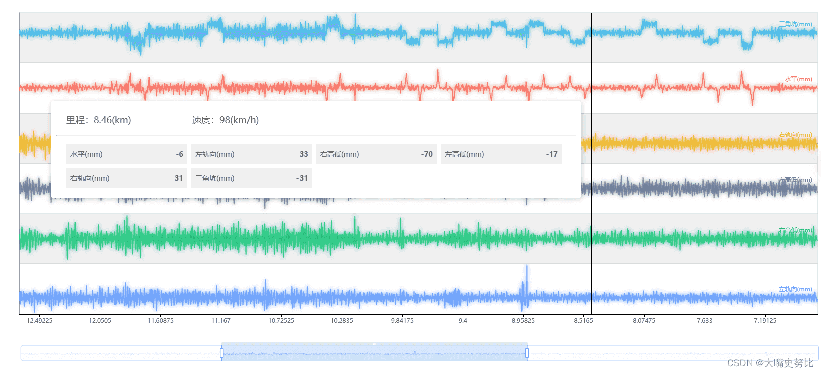
用户选择完需要的波形参数字段之后,页面开始渲染图表,有几个参数就要渲染几个grid,也就是几行波形。
二、绘制逻辑
拿到所选的参数数据之后
1.首先是给横坐标轴的里程-数据注入
2.修改tooltip(跟着竖线走的卡片弹窗)里面的弹出窗的显示,需要返回html模板字符串
3.修改datazoom(最底下的蓝色滑动窗),里面初始的起点和终点
4.按照参数的个数添加grid(每一行的波形),需要叠加计算的是,距离bottom的高度,一个距离100,2个距离200
5.按照参数的个数添加xaxis里面的对象 (需要修改 gridindex 0 1 2 ...)
只有第一个对象,要显示x轴坐标,且同时要判断x轴坐标是否包含车站
第二个对象开始不显示xaxis坐标轴
6.修改y轴 (可显示刻度)(需要修改 gridindex 0 1 2 ...)
7.最后修改series 每个参数是一个对象的配置(包括数据,线条的类型,颜色)
(值得注意的是,这套绘制,建议放置在一个函数里,然后加载时调用,重新绘制时调用,需要注意重新绘制时,除了要mychart.dispose(); //销毁,还要重新配置option)
三、关键代码
绘制逻辑代码:
const self = this;

          //重新给图标赋值数据
          this.tabledata.foreach(function (currentvalue, index, array) {

            // 4.按照参数的个数添加grid,需要叠加计算的是,距离bottom的高度,一个距离100,2个距离200
            let height = (index+1)*100;
            if(index===array.length-1){
              self.option.grid.push({
                show:true,
                left: 50,
                right: 50,
                bottom: height,
                height: 100, //每一个折现图的高度
                backgroundcolor: index % 2 === 1 ? '#f0f0f0' : 'white',  // 背景色
              })
            }else{
              self.option.grid.push({
                show:true,
                left: 50,
                right: 50,
                bottom: height,
                height: 100, //每一个折现图的高度
                backgroundcolor: index % 2 === 1 ? '#f0f0f0' : 'white',  // 背景色
              })
            }

            // 5.按照参数的个数添加xaxis里面的对象   (需要修改 gridindex 0 1 2 ...)
            // !!!只有第一个对象,要显示x轴坐标,且同时要判断x轴坐标是否包含车站
            // 第二个对象开始不显示坐标轴
            if(index==0){
              self.option.xaxis.push({
                  gridindex: 0, //x 轴所在的 grid 的索引
                  type: 'category', //类目轴
                  boundarygap: false, //坐标轴两边留白策略,
                  axisline: {
                    //是否显示坐标轴轴线。
                    onzero: false,
                    linestyle: {
                      color: 'black',
                      width: 2,
                    },
                  },
                  //车站标注
                  axislabel: {
                    // interval: 0,//自适应x轴间距
                    formatter: function (params) {
                      // 自定义div
                      // console.log(typeof(params))
                      let res;
                      if (params.includes('站')) {
                        res = '{abg11|' + params + '}';
                      } else {
                        res = '{abg1|' + params + '}';
                      }

                      return res;
                    },
                    rich: {
                      abg11: {
                        backgroundcolor: '#2b8afd',
                        width: '100%',
                        align: 'right',
                        height: 22,
                        borderradius: 3,
                        padding: [2, 4, 2, 4],
                        color: '#ffffff',
                      },
                      abg1: {
                        color: '#595959',
                      },
                    },
                  },
                  data: xdata,
                  show: true, //是否显示 x 轴。
                })
            }else{
              self.option.xaxis.push({
                  gridindex: index, //x 轴所在的 grid 的索引
                  type: 'category', //类目轴
                  boundarygap: false, //坐标轴两边留白策略,
                  axisline: {
                    onzero: true, //x 轴的轴线是否在另一个轴的 0 刻度上,只有在另一个轴为数值轴且包含 0 刻度时有效。
                    linestyle: {
                      color: '#979797',
                    },
                  },
                  data: xdata,
                  show: true, //是否显示 x 轴。
                  axistick: {
                    //坐标轴刻度相关设置
                    show: false,
                  },
                  axislabel: {
                    //刻度标签
                    show: false,
                  },
                })
            }

            // 6.修改y轴 (可显示刻度)(需要修改 gridindex 0 1 2 ...)
            self.option.yaxis.push({
                  gridindex: index, //y 轴所在的 grid 的索引
                  type: 'value',
                  // name: "pm2.5",//纵坐标名字
                  // namelocation: "middle",//纵坐标名字的位置
                  // namegap: 30,//纵坐标名字与轴线之间的距离
                  position: 'left', //y轴的位置
                  inverse: false,
                  splitline: {
                    //坐标轴在 grid 区域中的分割线
                    show: false,
                  },
                  axisline: {
                    //坐标轴轴线相关设置  竖着那一根
                    show: true,
                    linestyle: {
                      color: '#979797',
                    },
                  },
                  axistick: {
                    //坐标轴刻度相关设置
                    show: false,
                  },
                  axislabel: {
                    //刻度标签
                    show: false,
                  },
                },)

            // 7.最后修改series 每个参数是一个对象
            self.option.series.push({
                  //参数的名字-数据注入
                  name: currentvalue.name,
                  type: 'line',
                  color: self.colorarray[index],
                  // 设置不显示小圆圈
                  symbol: 'none',
                  showsymbol: false,
                  xaxisindex: index, //使用的 x 轴的 index,在单个图表实例中存在多个 x 轴的时候有用。
                  yaxisindex: index, //使用的 y 轴的 index,在单个图表实例中存在多个 x 轴的时候有用。
                  symbolsize: 8, //标记的大小
                  //   hoveranimation: false,
                  smooth: true, //平滑曲线
                  //每个grid的数据-数据注入
                  data: currentvalue.data,
                  markline: {
                    symbol: 'none', //去掉箭头
                    //最大值和最小值
                    data: [
                      {
                        // type: 'median', //中位数。
                        type: 'average', //中位数。
                        symbol: 'none', //去掉开始的原点
                        label: {
                          //字体设置
                          show: 'true',
                          position: 'insideendtop',
                          distance: 10,
                          formatter: currentvalue.name,
                          color: 'inherit',
                        },
                        linestyle: {
                          //横线设置
                          width: 1,
                        },
                      },
                    ],
                  },
                  linestyle: {
                    shadowcolor: self.colorarray[index], //透明的颜色
                    shadowoffsetx: 0,
                    shadowoffsety: 0,
                    opacity: 0.8, //透明度
                    shadowblur: 8, //阴影大小
                    type: "solid", //实线
                    width: 2,
                  },
                })
          });

          this.getheight(this.tabledata.length)//重新获得动态的图表高度
          //折线图
          this.$nexttick(()=>{
            this.getchart();//实际绘制
          })
动态高度函数代码:
//获得动态高度
      getheight(num){
        this.dynamicheight = `${num * 100 + 150}px`;
      },
绘制代码:
//绘制折线图
      getchart() {
        const chartdom = document.getelementbyid('main-echarts');

        if (mychart != null && mychart != '' && mychart != undefined) {
          console.log("销毁了");
          mychart.dispose(); //销毁
        }

        // // 显示加载图
        // mychart.showloading();

        this.$nexttick(()=>{
          mychart = echarts.init(chartdom);
          mychart.setoption(this.option, true);//这里设置true,会每次根据数据重新绘制,设置为false之后,每次新的绘制会在原有图表的基础上再添加(不会有断裂感,会形成流动感)
        })

        window.addeventlistener('resize', function () {
          mychart.resize();
        });
      }
y轴名字显示且竖直放置:
// 6.修改y轴 (可显示刻度)(需要修改 gridindex 0 1 2 ...)
            self.option.yaxis.push({
                  gridindex: index, //y 轴所在的 grid 的索引
                  type: 'value',
                  name: currentvalue.name.tostring().split("").join("\n"),//纵坐标名字竖直从上到下排列
                  namerotate:0,
                  nametextstyle: {
                      padding: 10, // 设置与坐标轴的距离,单位为像素
                      color: 'black', // 这里设置颜色
                  },
                  namelocation: "middle",//纵坐标名字的位置
                  namegap: 40,//纵坐标名字与轴线之间的距离
                  position: 'left', //y轴的位置
                  inverse: false,
                  splitline: {
                    //坐标轴在 grid 区域中的分割线
                    show: false,
                  },
                  axisline: {
                    //坐标轴轴线相关设置  竖着那一根
                    show: true,
                    linestyle: {
                      color: '#979797',
                    },
                  },
                  axistick: {
                    //坐标轴刻度相关设置
                    show: false,
                  },
                  axislabel: {
                    //刻度标签
                    show: true,
                    showminlabel: false, // 隐藏最小值标签
                    showmaxlabel: false, // 隐藏最大值标签
                  },
                },)
弹窗显示为半透明
 this.option = {
          //鼠标放上去显示的弹窗
          tooltip: {
            trigger: 'axis', //坐标系出触发
            backgroundcolor: 'rgba(255, 255, 255, 0.7)', // 设置白色的半透明背景
总结
到此这篇关于前端用echarts绘制含有多个分层的波形图的文章就介绍到这了,更多相关前端echarts绘制波形图内容请搜索代码网以前的文章或继续浏览下面的相关文章希望大家以后多多支持代码网!


发表评论