 我要评论
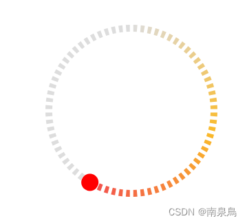
我要评论整体效果
主要原理
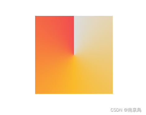
渐变圆环
设置如下css代码可实现出环形渐变效果
.box{
    background:conic-gradient(from 0deg at 50% 50%,#eee 0deg,yelllow 180deg,red 360deg)
}
- 效果图
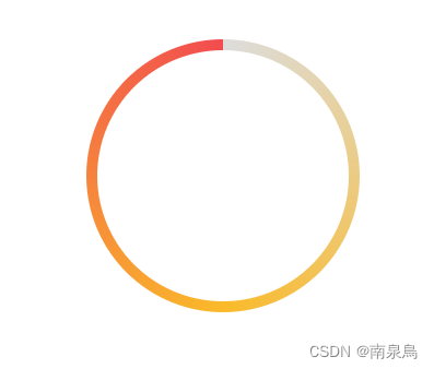
添加圆角以及内部圆形居中遮挡即可实现圆环效果
- 效果图
仪表盘效果
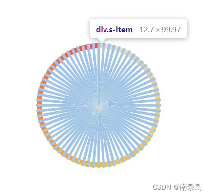
添加若干个环绕圆点旋转的元素,组成仪表盘,融合背景色将底色圆环覆盖掉,就得到了仪表盘效果。
1.div结构
<div class="scale">
    <div
         class="s-item"
         v-for="item in 72"
         :key="'item-' + item"
         >
    </div>
</div>
2.scss
.scale {
    border-radius: 50%;
    width: 100%;
    height: 100%;
    position: absolute;
    .s-item {
        position: absolute;
        width: 1px;
        height: 2px;
        background-color: #fff;
        left:50%;
        top: 0px;
        transform-origin: 0 24px;
    }
    @for $i from 0 through 72 {
        .s-item:nth-child(#{$i + 1}) {
            transform: rotate($i * 5deg);
        }
    }
}- 形式图
- 效果图

全部代码
<template>
  <div
    class="gauge"
    :style="{
      width: diameter + 'px',
      height: diameter + 'px',
      background: bgcolor,
    }"
  >
    <div class="cricle" ref="cricle">
      <!-- 色块圈 -->
      <div
        class="s-color"
        :style="
          follow
            ? {
                background: `conic-gradient(from 0deg at 50% 50%,${
                  rampcolor[0]
                } 0deg,${rampcolor[1]} ${value / 2}deg,${
                  rampcolor[2]
                } ${value}deg,${defaultcolor} ${value}deg)`,
              }
            : {
                background: `conic-gradient(from 0deg at 50% 50%,${rampcolor[0]} 0deg,${rampcolor[1]} 50%,${rampcolor[2]}`,
              }
        "
      >
        <div
          class="follow"
          v-if="!follow"
          :style="{
            background: `conic-gradient(from 0deg at 50% 50%,transparent 0deg,transparent ${value}deg,${defaultcolor} ${value}deg)`,
          }"
        ></div>
        <div
          class="mask"
          :style="{
            width: `calc(100% - ${dotheight}px *2)`,
            height: `calc(100% - ${dotheight}px *2)`,
            background: bgcolor,
          }"
        ></div>
      </div>
      <!-- 拖动按钮 -->
      <div
        class="slider"
        :style="{
          transform: `rotate(${value}deg)`,
          width: sliderdiameter + 'px',
          height: `calc(50% - ${dotheight / 2}px + ${sliderdiameter / 2}px)`,
          left: `calc(50% - ${sliderdiameter / 2}px)`,
          top: `calc((${sliderdiameter / 2}px - ${dotheight / 2}px) *-1)`,
        }"
      >
        <div
          class="btn"
          ref="slider"
          :style="{
            width: sliderdiameter + 'px',
            height: sliderdiameter + 'px',
            background: slidercolor,
          }"
        ></div>
      </div>
      <!-- 仪表盘 -->
      <div class="bar scale">
        <div
          class="s-item"
          v-for="item in dotcount"
          :key="'item-' + item"
          :style="{
            'transform-origin': `2px calc(${diameter}px/2 + 1px)`,
            width: dotwidth + 'px',
            height: diameter / 2 + 'px',
            transform: `rotate(${(item * 360) / dotcount}deg)`,
            background: bgcolor,
          }"
        ></div>
      </div>
    </div>
  </div>
</template>
<script>
export default {
name: "gauge",
/** 组件参数 */
props: {
/** 默认值 */
default: {
type: number,
default: 0,
},
/** 直径 */
diameter: {
type: number,
default: 200,
},
/** 点间隔 */
dotwidth: {
type: number,
default: 4,
},
/** 点高度 */
dotheight: {
type: number,
default: 8,
},
/** 滑块直径 */
sliderdiameter: {
type: number,
default: 20,
},
/** 滑块颜色 */
slidercolor: {
type: string,
default: "red",
},
/** 点数量 */
dotcount: {
type: number,
default: 72,
},
/** 渐变色 */
rampcolor: {
type: array,
default: function () {
return ["#ddd", "#faba2a", "#f24c4f"];
},
},
/** 环形默认颜色 */
defaultcolor: {
type: string,
default: "#ddd",
},
/** 背景颜色 */
bgcolor: {
type: string,
default: "#fff",
},
/** 渐变跟随 */
follow: {
type: boolean,
default: true,
},
},
data() {
return {
value: 0,
};
},
methods: {
/** ## 组件方法 */
/** 获取进度 */
getvalue(){
return this.value/360;
}
},
created() {
this.value = this.default;
},
mounted() {
/** 滑块滑动功能 */
this.$refs.slider.onmousedown = (e) => {
const cricle = this.$refs.cricle;
/** 获取位置(坐标轴原点) */
let client = cricle.getboundingclientrect();
let x0 = client.x + cricle.offsetwidth / 2;
let y0 = client.y + cricle.offsetheight / 2;
/** 阻止默认事件 */
let ev = e || window.event;
ev.preventdefault ? ev.preventdefault() : (ev.returnvalue = false);
/** 鼠标移动 */
document.onmousemove = (el) => {
let move = el ? el : window.event;
/** 鼠标位置 */
let x = move.x - x0;
let y = y0 - move.y;
/** 计算角度 */
let deg = (math.atan(y / x) / 2 / math.pi) * 360;
if (x >= 0) {
if (this.value >= 270) {
/** 象限跳跃优化 */
this.value = 360;
} else {
this.value = 90 - deg;
}
} else {
if (this.value <= 90) {
this.value = 0;
} else {
this.value = 270 - deg;
}
}
};
/** 鼠标松开 */
document.onmouseup = () => {
/** 取消订阅鼠标移动事件 */
document.onmousemove = null;
document.onmouseup = null;
};
};
},
};
</script><style lang="scss" scoped>
.box {
width: 100%;
height: 100%;
position: absolute;
}
.gauge {
padding: 5px;
//background-color: white;
position: relative;
.cricle {
width: calc(100% - 10px);
height: calc(100% - 10px);
position: absolute;
left: 50%;
top: 50%;
transform: translatey(-50%) translate(-50%);
.slider {
//background-color: pink;
width: 20px;
height: calc(50% + 6px);
position: absolute;
z-index: 10;
overflow: hidden;
transform-origin: 50% 100%;
top: -6px;
transform: rotate(140deg);
left: calc(50% - 10px);
.btn {
position: absolute;
cursor: pointer;
top: 0px;
width: 20px;
height: 20px;
// background-color: red;
border-radius: 50%;
}
}
.s-color {
z-index: 5; //5
position: absolute;
width: 100%;
height: 100%;
border-radius: 50%;
.follow{
@extend .box;
// position: absolute;
// width: calc(100% + 2px );
// height: calc(100% + 2px);
left:50%;
top:50%;
transform: translate(-50%,-50%);
z-index: 6;
border-radius: 50%;
}
.mask {
content: "";
display: block;
position: absolute;
//background-color: #fff;
z-index: 9;
left: 50%;
top: 50%;
transform: translate(-50%, -50%);
border-radius: 50%;
}
}
.bar {
transform: rotate(0deg);
transform-origin: 0 100px;
}
.scale {
border-radius: 50%;
width: calc(100% + 2px);
height: calc(100% + 2px);
position: absolute;
z-index: 9;
left: 50%;
top: 50%;
transform: translate(-50%, -50%);
.s-item {
position: absolute;
//background-color: #fff;
left: calc(50% - 2px);
top: 0px;
}
// @for $i from 0 through 72 {
// .s-item:nth-child(#{$i + 1}) {
// transform: rotate($i * 5deg);
// }
// }
}
}
}
</style>总结
以上为个人经验,希望能给大家一个参考,也希望大家多多支持代码网。


发表评论