 我要评论
我要评论在页面中实现自定义头部导航的组件,如果仅是单个页面中需要自定义可在页面的json文件中配置"navigationstyle": “custom”,如果是项目中所有页面都想使用自定义的组件,可在app.json的window中全局配置"navigationstyle": “custom”。
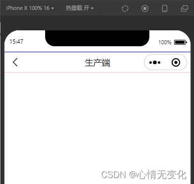
先分析头部导航的组成,可参考图1
其组成主要包含两部分:状态栏、导航区域,下面分别说说这两部分的高度如何获取。
1、获取状态栏高度
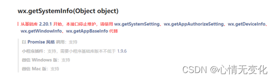
对于不同的机型而言,状态栏的高度是有所差异的,可通过wx.getsysteminfo来获取,但需要注意的是该接口在基础库2.20.1后就停止维护,需要改用wx.getwindowinfo获取。
(1)使用wx.getsysteminfo获取示例代码
wx.getsysteminfo({
    success: (res) => {
        this.setdata({
            statusbarheight: res.statusbarheight
        })
    }
})
(2)使用wx.getwindowinfo示例代码
 constres = wx.getwindowinfo()
 this.setdata({
   statusbarheight: res.statusbarheight
 })
2、导航区域高度
(1)导航区域的高度可自己定义,但考虑到右侧胶囊,为使得标题位置垂直居中,因而导航区域的高度实际也需要计算得出。其公式为:导航区域的高度 = 胶囊的高度 + 胶囊距离状态栏的高度 * 2。
// 获取菜单按钮(右上角胶囊按钮)的布局位置信息。坐标信息以屏幕左上角为原点。
const rect = wx.getmenubuttonboundingclientrect()
console.log('右上角胶囊按钮)布局', rect);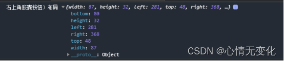
// 获取菜单按钮(右上角胶囊按钮)的布局位置信息。坐标信息以屏幕左上角为原点。
const rect = wx.getmenubuttonboundingclientrect()
console.log('右上角胶囊按钮)布局', rect);
wx.getsysteminfo({
  success: (res) => {
    this.setdata({
      navbarheight: rect.bottom - rect.top + (rect.top - res.statusbarheight) * 2,
	// navbarheight: rect.height + (rect.top - res.statusbarheight) * 2,
    })
  }
})
(2)考虑到胶囊位置,因而导航栏区域可自定义的宽度需减去胶囊的宽度,使用padding-right的方式占用胶囊的宽,注意需要设置为box-sizing: border-box,懂得都懂。
// 获取菜单按钮(右上角胶囊按钮)的布局位置信息。坐标信息以屏幕左上角为原点。
 const rect = wx.getmenubuttonboundingclientrect()
 console.log('右上角胶囊按钮)布局', rect);
 wx.getsysteminfo({
   success: (res) => {
     this.setdata({
       innerpaddingright: `padding-right:${res.windowwidth - rect.left}px`,
     })
   }
 })
(3)剩余的宽度你就可以自由发挥了。
以下是组件参考代码
index.xml
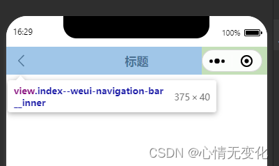
<view class="weui-navigation-bar {{extclass}}">
  <view class="status-bar" style="height: {{statusbarheight}}px; color: {{color}}; background: {{background}}"></view>
  <view class="weui-navigation-bar__inner" style="height: {{navbarheight}}px; color: {{color}}; background: {{background}}; {{displaystyle}}; {{innerpaddingright}}">
    <view class='weui-navigation-bar__left' style="{{leftwidth}}">
      <block wx:if="{{back}}">
        <view class="navigation-bar__buttons" bindtap="back">
          <view class="navigation-bar__button navigation-bar__btn_goback" hover-class="active"></view>
        </view>
      </block>
      <block wx:else>
        <slot name="left"></slot>
      </block>
    </view>
    <view class='weui-navigation-bar__center'>
      <view wx:if="{{loading}}" class="weui-navigation-bar__loading" aria-role="alert">
        <view class="weui-loading" style="width:{{size.width}}rpx;height:{{size.height}}rpx;" aria-role="img" aria-label="加载中"></view>
      </view>
      <block wx:if="{{title}}">
        <text>{{title}}</text>
      </block>
      <block wx:else>
        <slot name="center"></slot>
      </block>
    </view>
    <view class='weui-navigation-bar__right'>
      <slot name="right"></slot>
    </view>
  </view>
</view>
index.wxss
.weui-navigation-bar {
  overflow: hidden;
  color: rgba(0, 0, 0, .9);
  width: 100vw;
}
.status-bar{
  width: 100%;
}
.weui-navigation-bar__placeholder {
  background: #f7f7f7;
  position: relative;
}
.weui-navigation-bar__inner, .weui-navigation-bar__inner .weui-navigation-bar__left {
  display: flex;
  align-items: center;
  flex-direction: row;
}
.weui-navigation-bar__inner {
  position: relative;
  padding-right: 95px;
  width: 100vw;
  box-sizing: border-box;
  padding-top: env(safe-area-inset-top);
}
.weui-navigation-bar__inner .weui-navigation-bar__left {
  position: relative;
  width: 95px;
  padding-left: 16px;
  box-sizing: border-box;
}
.weui-navigation-bar__btn_goback_wrapper {
  padding: 11px 18px 11px 16px;
  margin: -11px -18px -11px -16px;
}
.weui-navigation-bar__inner .weui-navigation-bar__left .navigation-bar__btn_goback {
  font-size: 12px;
  width: 12px;
  height: 24px;
  background: url("data:image/svg+xml;charset=utf8,%3csvg xmlns='http://www.w3.org/2000/svg' width='12' height='24' viewbox='0 0 12 24'%3e %3cpath fill-opacity='.9' fill-rule='evenodd' d='m10 19.438l8.955 20.5l-7.666-7.79a1.02 1.02 0 0 1 0-1.42l8.955 3.5 10 4.563 2.682 12 10 19.438z'/%3e%3c/svg%3e") no-repeat 50% 50%;
  background-size: cover;
}
.weui-navigation-bar__inner .weui-navigation-bar__center {
  font-size: 17px;
  text-align: center;
  position: relative;
  flex: 1;
  display: flex;
  flex-direction: column;
  align-items: center;
  justify-content: center;
  font-weight: bold;
}
@media(prefers-color-scheme: dark) {
  .weui-navigation-bar {
    color: hsla(0, 0%, 100%, .8);
  }
  .weui-navigation-bar__inner {
    background-color: #1f1f1f;
  }
}
index.js
component({
    options: {
      multipleslots: true // 在组件定义时的选项中启用多slot支持
    },
    /**
     * 组件的属性列表
     */
    properties: {
      extclass: {
        type: string,
        value: ''
      },
      title: {
        type: string,
        value: ''
      },
      background: {
        type: string,
        value: '#fff'
      },
      color: {
        type: string,
        value: '#000'
      },
      back: {
        type: boolean,
        value: true
      },
      loading: {
        type: boolean,
        value: false
      },
      animated: {
        // 显示隐藏的时候opacity动画效果
        type: boolean,
        value: true
      },
      show: {
        // 显示隐藏导航,隐藏的时候navigation-bar的高度占位还在
        type: boolean,
        value: true,
        observer: '_showchange'
      },
      // back为true的时候,返回的页面深度
      delta: {
        type: number,
        value: 1
      }
    },
    /**
     * 组件的初始数据
     */
    data: {
      displaystyle: '',
      statusbarheight: 20
    },
    attached() {
      // 获取菜单按钮(右上角胶囊按钮)的布局位置信息。坐标信息以屏幕左上角为原点。
      const rect = wx.getmenubuttonboundingclientrect()
      // console.log('右上角胶囊按钮)布局', rect);
      wx.getsysteminfo({
        success: (res) => {
          this.setdata({
            innerpaddingright: `padding-right:${res.windowwidth - rect.left}px`,
            leftwidth: `width:${res.windowwidth - rect.left}px`,
            // navbarheight: rect.bottom + rect.top  - res.statusbarheight,  //84px
            navbarheight: rect.bottom - rect.top + (rect.top - res.statusbarheight) * 2, //40px
            statusbarheight: res.statusbarheight //44px
          })
        }
      })
    },
    /**
     * 组件的方法列表
     */
    methods: {
      _showchange(show) {
        const animated = this.data.animated
        let displaystyle = ''
        if (animated) {
          displaystyle = `opacity: ${show ? '1' : '0'};transition: opacity 0.5s;`
        } else {
          displaystyle = `display: ${show ? '' : 'none'}`
        }
        this.setdata({
          displaystyle
        })
      },
      back() {
        const data = this.data
        if (data.delta) {
          wx.navigateback({
            delta: data.delta
          })
        }
        this.triggerevent('back', { delta: data.delta }, {})
      }
    }
  })
index.json
{
  "component": true,
  "usingcomponents": {}
}
在页面中使用该组件
page.json
{
  "usingcomponents": {
    "zxm-navigation-bar": "/components/zxm-navigation-bar" //该成你所放组件的路径哟
  },
  "navigationstyle": "custom",
  "disablescroll": true
}
page.wxml
<view>
  <zxm-navigation-bar title="标题"></zxm-navigation-bar>
</view>
代码也可前往这里下载
到此这篇关于小程序中实现自定义头部导航组件的详细过程的文章就介绍到这了,更多相关小程序自定义头部导航组件内容请搜索代码网以前的文章或继续浏览下面的相关文章希望大家以后多多支持代码网!


发表评论