 我要评论
我要评论概要
本文将详细介绍如何使用wpf(windows presentation foundation)开发一个分页控件,并深入解析其实现原理。我们将通过使用xaml和c#代码相结合的方式构建分页控件,并确保它具有高度的可定制性,以便在不同的应用场景中满足各种需求。
一.简介
分页控件是在许多应用程序中常见的一种界面元素,特别是在数据展示的场景中。它允许用户浏览大量数据,并根据需要切换到不同的数据页。
二.需求分析
我们首先来分析一下一个分页控件的基本构成。
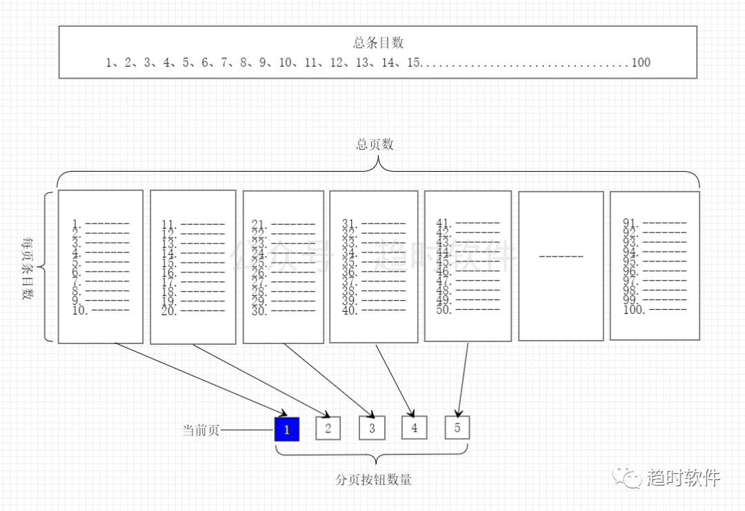
2.1 总条目数(totalitems)
表示总数据量。
2.2 每页条目数(pagesize)
表示每页显示的条目数。
2.3 总页数(pagecount)
表示根据总条目数与每页条目数计算出来的页数。
2.4 分页/页码按钮数量(pagenumbercount)
分页控件中可以点击的页码按钮。
2.5 当前页(currentpage)
当前显示的页,通常高亮显示。
三.控件命令和事件
3.1 页面跳转命令(gotopagecommand)
该命令用于在xaml代码中触发页面跳转操作。
3.2当前页变更事件
当currentpage参数改变后触发该事件,通常在该事件中执行数据查询操作。
四.代码实现
通过以上原理分析,我们提取出了分页控件需要包含的基本要素,下面我们通过这些信息来组装成一个分页控件。
<style targettype="{x:type local:pager}">
    <setter property="template">
        <setter.value>
            <controltemplate targettype="{x:type local:pager}">
                <border background="{templatebinding background}"
                            borderbrush="{templatebinding borderbrush}"
                            borderthickness="{templatebinding borderthickness}">
                    <stackpanel orientation="horizontal" cliptobounds="true">
                        <button command="{x:static local:pager.gotopagecommand}" commandparameter="1" margin="0,0,5,0" content="首页"></button>
                        <button command="{x:static local:pager.gotopagecommand}" commandparameter="-" margin="5,0" content="上一页"></button>
                        <itemscontrol itemssource="{templatebinding pagebuttons}">
                            <itemscontrol.itemspanel>
                                <itemspaneltemplate>
                                    <stackpanel orientation="horizontal"/>
                                </itemspaneltemplate>
                            </itemscontrol.itemspanel>
                            <itemscontrol.itemtemplate>
                                <datatemplate>
                                    <togglebutton minwidth="{binding relativesource={relativesource mode=self},path=actualheight}"
                                                      content="{binding page}"
                                                      ischecked="{binding iscurrentpage}"
                                                      command="{x:static local:pager.gotopagecommand}"
                                                      commandparameter="{binding page}"
                                                      margin="5,0"/>
                                </datatemplate>
                            </itemscontrol.itemtemplate>
                        </itemscontrol>
                        <button command="{x:static local:pager.gotopagecommand}" commandparameter="+" margin="5,0" content="下一页"></button>
                        <button command="{x:static local:pager.gotopagecommand}" commandparameter="尾页" margin="5,0,0,0" content="{dynamicresource lastpage}"></button>
                    </stackpanel>
                </border>
            </controltemplate>
        </setter.value>
    </setter>
</style>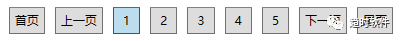
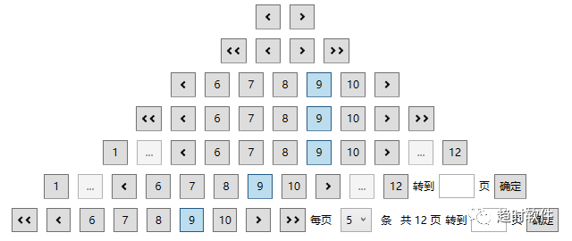
五.多样化需求
在不同的业务场景下需要的分页控件可能不尽相同,那么如何来满足多样化需求呢,答案就是自定义控件模板。下面演示几种常见的分页控件如何实现。
只需要“上一页”、“下一页”的情况
<style targettype="{x:type controls:pager}">
    <setter property="template">
        <setter.value>
            <controltemplate targettype="{x:type controls:pager}">
                <border background="{templatebinding background}"
                            borderbrush="{templatebinding borderbrush}"
                            borderthickness="{templatebinding borderthickness}">
                    <stackpanel orientation="horizontal" cliptobounds="true">
                        <button command="{x:static controls:pager.gotopagecommand}" commandparameter="-" margin="5,0" content="{dynamicresource previouspage}"></button>
                        <button command="{x:static controls:pager.gotopagecommand}" commandparameter="+" margin="5,0" content="{dynamicresource nextpage}"></button>
                    </stackpanel>
                </border>
            </controltemplate>
        </setter.value>
    </setter>
</style>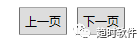
只需要“首页”、“上一页”、“下一页”、“尾页”的情况。
<style targettype="{x:type controls:pager}">
    <setter property="template">
        <setter.value>
            <controltemplate targettype="{x:type controls:pager}">
                <border background="{templatebinding background}"
                            borderbrush="{templatebinding borderbrush}"
                            borderthickness="{templatebinding borderthickness}">
                    <stackpanel orientation="horizontal" cliptobounds="true">
                        <button command="{x:static controls:pager.gotopagecommand}" commandparameter="1" margin="0,0,5,0" content="{dynamicresource firstpage}"></button>
                        <button command="{x:static controls:pager.gotopagecommand}" commandparameter="-" margin="5,0" content="{dynamicresource previouspage}"></button>
                        <button command="{x:static controls:pager.gotopagecommand}" commandparameter="+" margin="5,0" content="{dynamicresource nextpage}"></button>
                        <button command="{x:static controls:pager.gotopagecommand}" commandparameter="{templatebinding pagecount}" margin="5,0,0,0" content="{dynamicresource lastpage}"></button>
                    </stackpanel>
                </border>
            </controltemplate>
        </setter.value>
    </setter>
</style>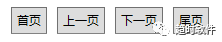
数字显示“首页”、“尾页”的情况。
<style targettype="{x:type controls:pager}">
    <setter property="template">
        <setter.value>
            <controltemplate targettype="{x:type controls:pager}">
                <border background="{templatebinding background}"
                            borderbrush="{templatebinding borderbrush}"
                            borderthickness="{templatebinding borderthickness}">
                    <stackpanel orientation="horizontal" cliptobounds="true">
                        <button command="{x:static controls:pager.gotopagecommand}"
                                        commandparameter="1"
                                        content="1"
                                        minwidth="{binding relativesource={relativesource mode=self},path=actualheight}"
                                        margin="0,0,5,0">
                            <button.visibility>
                                <multibinding converter="{staticresource pagenumbertovisibilityconverter}" converterparameter="first">
                                    <binding relativesource="{relativesource ancestortype=controls:pager}" path="currentpage"/>
                                    <binding relativesource="{relativesource ancestortype=controls:pager}" path="pagenumbercount"/>
                                    <binding relativesource="{relativesource ancestortype=controls:pager}" path="pagecount"/>
                                </multibinding>
                            </button.visibility>
                        </button>
                        <button isenabled="false" margin="5,0" minwidth="{binding relativesource={relativesource mode=self},path=actualheight}" content="...">
                            <button.visibility>
                                <multibinding converter="{staticresource pagenumbertovisibilityconverter}" converterparameter="first">
                                    <binding relativesource="{relativesource ancestortype=controls:pager}" path="currentpage"/>
                                    <binding relativesource="{relativesource ancestortype=controls:pager}" path="pagenumbercount"/>
                                    <binding relativesource="{relativesource ancestortype=controls:pager}" path="pagecount"/>
                                </multibinding>
                            </button.visibility>
                        </button>
                        <button command="{x:static controls:pager.gotopagecommand}" commandparameter="-" margin="5,0" content="{dynamicresource previouspage}"></button>
                        <itemscontrol itemssource="{templatebinding pagebuttons}">
                            <itemscontrol.itemspanel>
                                <itemspaneltemplate>
                                    <stackpanel orientation="horizontal"/>
                                </itemspaneltemplate>
                            </itemscontrol.itemspanel>
                            <itemscontrol.itemtemplate>
                                <datatemplate>
                                    <togglebutton minwidth="{binding relativesource={relativesource mode=self},path=actualheight}"
                        content="{binding page}"
                        margin="5,0"
                        ischecked="{binding iscurrentpage}"
                        command="{x:static controls:pager.gotopagecommand}"
                        commandparameter="{binding page}"/>
                                </datatemplate>
                            </itemscontrol.itemtemplate>
                        </itemscontrol>
                        <button command="{x:static controls:pager.gotopagecommand}" commandparameter="+" margin="5,0" content="{dynamicresource nextpage}"></button>
                        <button isenabled="false" margin="5,0" minwidth="{binding relativesource={relativesource mode=self},path=actualheight}" content="...">
                            <button.visibility>
                                <multibinding converter="{staticresource pagenumbertovisibilityconverter}">
                                    <binding relativesource="{relativesource ancestortype=controls:pager}" path="currentpage"/>
                                    <binding relativesource="{relativesource ancestortype=controls:pager}" path="pagenumbercount"/>
                                    <binding relativesource="{relativesource ancestortype=controls:pager}" path="pagecount"/>
                                </multibinding>
                            </button.visibility>
                        </button>
                        <button command="{x:static controls:pager.gotopagecommand}"
                                        commandparameter="{binding relativesource={relativesource ancestortype=controls:pager},path=pagecount}"
                                        content="{binding relativesource={relativesource ancestortype=controls:pager},path=pagecount}"
                                        minwidth="{binding relativesource={relativesource mode=self},path=actualheight}"
                                        margin="5,0,0,0">
                            <button.visibility>
                                <multibinding converter="{staticresource pagenumbertovisibilityconverter}">
                                    <binding relativesource="{relativesource ancestortype=controls:pager}" path="currentpage"/>
                                    <binding relativesource="{relativesource ancestortype=controls:pager}" path="pagenumbercount"/>
                                    <binding relativesource="{relativesource ancestortype=controls:pager}" path="pagecount"/>
                                </multibinding>
                            </button.visibility>
                        </button>

                        <stackpanel orientation="horizontal" margin="5,0,0,0">
                            <textblock text="转到" verticalalignment="center"/>
                            <textbox x:name="tbox_page" width="40" margin="5,0" padding="5" horizontalcontentalignment="center" verticalalignment="center"/>
                            <textblock text="页" verticalalignment="center"/>
                            <button margin="5,0,0,0" command="{x:static controls:pager.gotopagecommand}" commandparameter="{binding elementname=tbox_page,path=text}">确定</button>
                        </stackpanel>
                    </stackpanel>
                </border>
            </controltemplate>
        </setter.value>
    </setter>
</style>
可以调整每页显示条目,可以显示总页数,可以跳转到指定页的情况。
<style targettype="{x:type controls:pager}">
    <setter property="template">
        <setter.value>
            <controltemplate targettype="{x:type controls:pager}">
                <border background="{templatebinding background}"
                            borderbrush="{templatebinding borderbrush}"
                            borderthickness="{templatebinding borderthickness}">
                    <stackpanel orientation="horizontal" cliptobounds="true">
                        <button command="{x:static controls:pager.gotopagecommand}" commandparameter="1" margin="0,0,5,0" minwidth="{binding relativesource={relativesource mode=self},path=actualheight}" content="{dynamicresource firstpage}"></button>
                        <button command="{x:static controls:pager.gotopagecommand}" commandparameter="-" margin="5,0" minwidth="{binding relativesource={relativesource mode=self},path=actualheight}" content="{dynamicresource previouspage}"></button>
                        <itemscontrol itemssource="{templatebinding pagebuttons}">
                            <itemscontrol.itemspanel>
                                <itemspaneltemplate>
                                    <stackpanel orientation="horizontal"/>
                                </itemspaneltemplate>
                            </itemscontrol.itemspanel>
                            <itemscontrol.itemtemplate>
                                <datatemplate>
                                    <togglebutton minwidth="{binding relativesource={relativesource mode=self},path=actualheight}"
                        content="{binding page}"
                        margin="5,0"
                        ischecked="{binding iscurrentpage}"
                        command="{x:static controls:pager.gotopagecommand}"
                        commandparameter="{binding page}"/>
                                </datatemplate>
                            </itemscontrol.itemtemplate>
                        </itemscontrol>
                        <button command="{x:static controls:pager.gotopagecommand}" commandparameter="+" margin="5,0" minwidth="{binding relativesource={relativesource mode=self},path=actualheight}" content="{dynamicresource nextpage}"></button>
                        <button command="{x:static controls:pager.gotopagecommand}" commandparameter="{templatebinding pagecount}" margin="5,0,0,0" minwidth="{binding relativesource={relativesource mode=self},path=actualheight}" content="{dynamicresource lastpage}"></button>
                        <stackpanel orientation="horizontal" margin="5,0,0,0">
                            <textblock margin="0,0,5,0" text="每页" verticalalignment="center"/>
                            <combobox margin="5,0" selectedindex="0" verticalcontentalignment="center" selecteditem="{binding relativesource={relativesource ancestortype=controls:pager},path=pagesize,mode=onewaytosource}">
                                <sys:int32>5</sys:int32>
                                <sys:int32>10</sys:int32>
                                <sys:int32>15</sys:int32>
                                <sys:int32>20</sys:int32>
                            </combobox>
                            <textblock text="条" verticalalignment="center" margin="5,0"/>
                            <textblock verticalalignment="center" margin="5,0">
                                        <run text="共"/>
                                        <run text="{binding relativesource={relativesource ancestortype=controls:pager},path=pagecount}"/>
                                        <run text="页"/>
                            </textblock>
                            <textblock text="转到" verticalalignment="center"/>
                            <textbox x:name="tbox_page" width="40" margin="5,0" padding="5" horizontalcontentalignment="center" verticalalignment="center"/>
                            <textblock text="页" verticalalignment="center"/>
                            <button margin="5,0,0,0" command="{x:static controls:pager.gotopagecommand}" commandparameter="{binding elementname=tbox_page,path=text}">确定</button>
                        </stackpanel>
                    </stackpanel>
                </border>
            </controltemplate>
        </setter.value>
    </setter>
</style>
除了修改模板实现不同的形态的分页控件以外,还可以用图标替换掉“首页”、“上一页”、“下一页”、”尾页”等文字。
六.个性化控件外观
项目中的界面外观可能多种多样,有自己写的控件样式,也有使用第三方ui库的样式,如何跟它们搭配使用呢。
自定义控件样式
<style targettype="button">
    <setter property="padding" value="5"/>
    <setter property="background" value="red"/>
</style>
<style targettype="togglebutton">
    <setter property="padding" value="5"/>
    <setter property="background" value="red"/>
</style>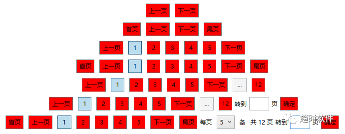
使用第三方ui库
1.handycontrol
<resourcedictionary>
    <resourcedictionary.mergeddictionaries>
        <resourcedictionary source="pack://application:,,,/handycontrol;component/themes/skindefault.xaml" />
        <resourcedictionary source="pack://application:,,,/handycontrol;component/themes/theme.xaml" />
    </resourcedictionary.mergeddictionaries>
</resourcedictionary>
2.materialdesign
以上就是基于wpf开发一个分页控件的详细内容,更多关于wpf分页控件的资料请关注代码网其它相关文章!
以上就是基于wpf开发一个分页控件的详细内容,更多关于wpf分页控件的资料请关注代码网其它相关文章!

发表评论