 我要评论
我要评论前言
driver.js 是一个强大的,轻量级,使用原生 javascript 引擎开发的库,用于在页面聚焦用户的关注点。它支持所有主流浏览器,并且可高度自定义。
driver.js 并不仅仅是一个指南性质的库,其用户场景非常广泛,能够用于任何需要为页面构建浮层的情况,譬如当用户需要与某些元素交互而隐藏其他元素的场景。
特点:
- 简单:使用简单,完全没有外部依赖
- 轻量级:与其他库的压缩量+12kb相比,压缩量仅为5kb
- 高度可定制:拥有强大的api,可以随心所欲地使用
- 突出显示任何内容:突出显示页面上的任何(字面上的任何)元素
- 功能介绍:为您的web应用程序创建强大的功能介绍
- 焦点移位器:为用户添加焦点移位器
- 用户友好:一切都是由键盘控制
- typescript:用typescript编写
- 一致的行为:适用于所有浏览器
- mit授权:个人免费
安装
npm install driver.js
or
<link rel="stylesheet" href="/dist/driver.min.css" rel="external nofollow" >
<script src="/dist/driver.min.js"></script>
示例
基本使用
引入 driverjs:
import { driver } from "driver.js";
import "driver.js/dist/driver.css";
创建实例
const driverobj = driver({
    showprogress: true,
    steps: cls,
    showbuttons: ["next"],
    popoverclass: "driverjs-theme",
    showprogress: false,
    popoveroffset: 50,
    donebtntext: "知道了",
    nextbtntext: "知道了",
  });
实例属性介绍:
- classname:classname用来包装driver.js弹出窗口
- animate:动画时改变突出显示的元素
- opacity:背景不透明度(0表示只有弹出窗口,没有覆盖)
- padding:元素到周围边缘的距离
- popoveroffset:弹窗与元素偏移距离
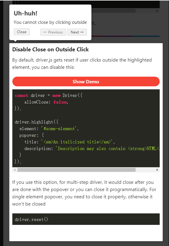
- allowclose:点击覆盖是否应该关闭
- showprogress:是否显示弹窗进度
- overlayclicknext:它应该移动到下一步叠加点击
- donebtntext:最后一个按钮上的文本
- closebtntext:此步骤的关闭按钮上的文本
- nextbtntext:此步骤的下一个按钮文本
- prevbtntext:此步骤的上一个按钮文本
- showbuttons:在页脚不显示控制按钮
- keyboardcontrol:允许通过键盘控制(escape键关闭,箭头键移动)
- scrollintoviewoptions:我们在可能的情况下使用' scrollintoview() ',如果你想要的话,在这里传递它的选项
- showbuttons:显示按钮合集(previous, next, close)
- onhighlightstarted:当元素即将突出显示时调用
- onhighlighted:当元素完全高亮显示时调用
- ondeselected:当元素被取消选中时调用
- onreset:当覆盖即将被清除时调用
- onnext:在任何步骤移动到下一步时调用
- onprevious:在任何步骤移动到上一步时调用
注意,您在驱动程序(step属性)定义中提供的所有按钮选项都可以通过在步骤定义中提供它们来覆盖特定步骤
step 属性:
const stepdefinition = {
  element: '#some-item',
  popover: {
    classname: 'popover-class',
    title: 'title',
    description: 'description',
    showbuttons: false,
    closebtntext: 'close',
    nextbtntext: 'next',
    prevbtntext: 'previous',
    popoverclass: "driverjs-theme",
  }
};- element:要突出显示的查询选择器字符串或节点
- popover
- classname:classname来包装这个特定的步骤弹出窗口,除了驱动程序选项中的一般classname
- title:弹出窗口上的标题
- description:弹出窗口上的描述信息
- showbuttons:在页脚不显示控制按钮
- closebtntext:此步骤的关闭按钮上的文本
- nextbtntext:此步骤的下一个按钮文本
- prevbtntext:此步骤的上一个按钮文本
- popoverclass:弹窗的自定义样式名
api 方法
const driver = new driver(driveroptions);

const isactivated = driver.isactivated;
driver.movenext();
driver.moveprevious();
driver.start(stepnumber = 0);
driver.highlight(string|stepdefinition);
driver.reset();
driver.hashighlightedelement();
driver.hasnextstep();
driver.haspreviousstep();
driver.preventmove();

const activeelement = driver.gethighlightedelement();
const lastactiveelement = driver.getlasthighlightedelement();
activeelement.getcalculatedposition();
activeelement.hidepopover();
activeelement.showpopover();

activeelement.getnode();
- isactivated:检查驱动程序是否激活
- movenext:移动到步骤列表中的下一步
- moveprevious:移动到步骤列表中的上一步
- start:开始执行定义的步骤
- highlight:使用查询选择器或步骤定义突出显示元素
- reset:重置覆盖并清除屏幕
- hashighlightedelement:检查是否有突出显示的元素
- hasnextstep:检查是否有下一步要进行
- haspreviousstep:检查是否有上一步要移动
- preventmove:阻止当前移动。有用的' onnext '或' onprevious ',如果你想;执行一些异步任务并手动移动到下一步
- getcalculatedposition:获取屏幕上当前突出显示的元素
- getcalculatedposition:获取活动元素的屏幕坐标
- hidepopover:隐藏弹出窗口
- showpopover:显示弹出窗口
- getnode:获取该元素背后的dom元素
highlight
突出显示单个元素:
只需传递选择器即可突出显示单个元素。
const driver = new driver();
driver.highlight('#create-post');
一个实际的例子是:使用它来调暗背景并突出显示所需的元素。
突出显示和弹出框:
可以使用弹出窗口在突出显示的元素旁边显示其他详细信息
const driver = new driver();
driver.highlight({
  element: '#some-element',
  popover: {
    title: 'title for the popover',
    description: 'description for it',
  }
});
定位弹出框:
默认情况下,driver.js 会自动找到合适的弹出位置并显示它。也可以使用 position 属性来覆盖它。
const driver = new driver();
driver.highlight({
  element: '#some-element',
  popover: {
    title: 'title for the popover',
    description: 'description for it',
    position: 'left', // 可以使用 `top`, `left`, `right`, `bottom`
  }
});
方法导出:
export function dri(cls, type) {
  // cls dialog节点class, 如果没有dialog 传个undefined
  // type  driver步骤,
  // 开启 这里用不用定时器自己测试,看看去掉之后管不管用
  settimeout(() => {
    driv(cls, type);
  }, 300);
}

function driv(cls, type) {
  cls.map((item) => {
    item.popover.side = item.popover.side ? item.popover.side : "bottom";
    return item;
  });
  const driverobj = driver({
    showprogress: true,
    steps: cls,
    showbuttons: ["next"],
    popoverclass: "driverjs-theme",
    showprogress: false,
    popoveroffset: 50,
    donebtntext: "知道了",
    nextbtntext: "知道了",
  });

  driverobj.drive();
}
使用:
dri([
      {
        element: ".select-element1",
        popover: {
          popoverclass: "driverjs-theme",
          align: "center",
          description: `test`,
        },
      },
      {
        element: ".top-first",
        popover: {
          description: "测试2",
        },
      },
    ]);
弹窗样式修改
这里介绍三种修改样式的方式:
- 通过属性 popoverclass 来自定义属性
- 直接修改插件中的样式
- 在 description 属性中使用模版字符串编写 html
popoverclass
在 step 数据 list 列表的属性中添加 popoverclass 属性,来自定义属性
const driver = [
      {
        element: ".select-element1",
        popover: {
          popoverclass: "driverjs-theme",
          align: "center",
          description: `test`,
        },
      },
    ]
dri(driver)
.driver-popover .driverjs-theme {
background-color: #fde047;
color: #000;
}
.driver-popover .driverjs-theme .driver-popover-title {
display: none;
}样式修改
新手引导元素是建立在body下面,所以样式不能写在当前vue文件中的scoped中
<style lang="less">
div#driver-popover-item{  // 最外面样式
  border-radius: 0;
  padding: 0;
  // width: 260px;
  // height: 160px;
  div.driver-popover-title {
    display: none; // 隐藏标题
  }
  div.driver-popover-footer{
    display: flex!important;
    justify-content: center;
    margin-bottom: 20px;
    button.driver-close-btn {
      display: none; // 隐藏关闭按钮
    }
    .driver-btn-group{
      display: flex;
      justify-content: center;
      button.driver-prev-btn{
      display: none !important; // 隐藏上一步按钮
      }
      button.driver-next-btn {
        width: 74px;
        height: 34px;
        background: #345eef;
        color: #fff;
        text-shadow: none;
      }
    }
  }
  .driver-popover-description{ // 内容样式设置
    font-size: 14px;
    margin: 50px auto 29px;
    .step_two {
      display: flex;
      align-items: center;
      justify-content: center;
      .step_first{
        width: 20px;
        height: 20px;
        background: #345eef;
        border-radius: 50%;
        color: #fff;
        line-height: 20px;
        margin-right: 5px;
        text-align: center;
      }
    }
  }
}
</style>
借助 description 属性
可以在 step 步骤 list 得属性 description 使用模板字符串中编写描述内容的样式,该方法仅限于描述内容中的样式修改,前两个方法适用于整个弹窗的样式修改。
const driver = [
      {
        element: ".select-element1",
        popover: {
          popoverclass: "driverjs-theme",
          align: "center",
          description: `
            <div style='color: red'>222</div>
            <div style='color: red;font-size:0.36rem'>222</div>
            <div style='width:100%; height:0.01rem; background: #4d7ee4'></div>
          `,
        },
      }
]

dri(driver)
总结
到此这篇关于用户引导插件driverjs的基本使用以及弹窗样式修改方法的文章就介绍到这了,更多相关用户引导插件driverjs使用及弹窗样式内容请搜索代码网以前的文章或继续浏览下面的相关文章希望大家以后多多支持代码网!


发表评论