 我要评论
我要评论1.首先在components 里面设置组件名称:van-select(随便取名字);
2.新建文件写代码:
wxml:
<view class="w100 select_all_view">
  <!-- 标题,可以没有 -->
  <view class="mr-10 pt-10 size-28" style="width: {{titlewidth}};" wx:if="{{title}}">{{title}}</view>
  <view class="select_view relative" style="width: {{title ? 'calc(100% - ' + titlewidth + ' - 10rpx)' : '100%'}};max-width: {{title ? 'calc(100% - ' + titlewidth + ' - 10rpx)' : '100%'}};">
    <view class="inputplaceholder h100 w100 radius-10 relative flex_l pd-10 {{ disabled ? 'gray-3' : 'black' }}" bindtap="{{disabled || readonly ? '' : 'changeshow'}}" style="background: {{disabled ?'#f5f7fa' : bgcolor}};border: 2rpx solid #ddd;">
      <block wx:if="{{disabled || readonly}}">
        <view class="flex-1" wx:if="{{selectlabel}}">{{selectlabel}}</view>
        <view class="flex-1 gray-3 line-1" wx:else>{{placeholder}}</view>
        <van-icon class="gray-3" name="arrow-down" />
      </block>
      <block wx:else>
        <block wx:if="{{selectlabel}}">
          <view class="flex-1">{{selectlabel}}</view>
          <van-icon class="gray-3" name="clear" wx:if='{{!show}}' catchtap="clearinput" />
          <van-icon class="gray-3" name="arrow-up" wx:else />
        </block>
        <block wx:else>
          <view class="flex-1 gray-3 line-1">{{placeholder}}</view>
          <van-icon class="gray-3" name="arrow-down" class="transfer {{show ? 'is-reverse' : 'no-reverse' }}" />
        </block>
      </block>
    </view>
    <!-- 下拉展开后的可选择内容 -->
    <block wx:if='{{show}}'>
      <view class="{{totop ? 'trianglebox-top' : 'trianglebox'}}">
        <view class="{{totop ? 'triangle-top' : 'triangle'}}"></view>
      </view>
      <view class="content radius-10 pd-20 size-28" style="{{totop ? 'top: -' + (options.length > 4 ? 150 : (options.length * 30 + 40)) + 'rpx; margin-top: -6rpx;' : 'margin-top: 10rpx;'}}">
        <view class="pd-10 center gray-3" wx:if="{{options.length < 1}}">暂无数据</view>
        <view class="line-1 w100 pd-10 contentitem {{item[valuename] == selectvalue ? 'bold':''}}" wx:for="{{options}}" wx:key="index" bindtap="handlechange" data-item="{{item}}" style="color: {{ item[valuename] == selectvalue ? textcolor : '#000'}}; background: {{item[valuename] == selectvalue ? itembgcolor:''}};">
          {{item[labelname]}}
        </view>
      </view>
    </block>
  </view>
</view>
wxss:
.select_all_view {
  display: flex;
  justify-content: start;
  align-items: start;
  z-index: 999;
  margin-bottom: 20rpx;
}

.select_view {
  /* min-width: 200rpx; */
  min-height: 64rpx;
}

.inputplaceholder {
  font-size: 28rpx;
}
.flex_l{
  display: flex;
}
.flex-1{
  flex: 1;
}
.pd-10{
  padding:20rpx;
}
.relative{
  position: relative;
}
.radius-10{
  border-radius: 10rpx;
}
.icon {
  position: absolute;
  right: 12rpx;
  top: 20rpx;
}

.contentitem {
  height: 30rpx;
  line-height: 30rpx;
  font-size: 24rpx;
}

.content {
  width: calc(100% - 4px);
  margin-left: 2px;
  position: absolute;
  z-index: 999;
  max-height: 150rpx;
  background: #ffffff;
  /* border: 1px solid #ccc; */
  box-shadow: 0 0 4px #ccc;
  opacity: 1;
  /* margin-top: 10rpx; */
  overflow-x: hidden;
  overflow-y: scroll;
}

.trianglebox {
  position: absolute;
  z-index: 1000;
  left: 30rpx;
}

.triangle {
  position: relative;
  border-left: 12rpx solid transparent;
  border-right: 12rpx solid transparent;
  border-bottom: 10rpx solid #ccc;
}

.triangle::after {
  content: '';
  position: absolute;
  top: 3rpx;
  left: -12rpx;
  border-left: 12rpx solid transparent;
  border-right: 12rpx solid transparent;
  border-bottom: 10rpx solid #fff;
}

.trianglebox-top {
  position: absolute;
  z-index: 1000;
  left: 30rpx;
  /* display: none; */
}

.triangle-top {
  position: relative;
  border-left: 12rpx solid transparent;
  border-right: 12rpx solid transparent;
  border-top: 10rpx solid #ccc;
}

.triangle-top::after {
  content: '';
  position: absolute;
  bottom: 3rpx;
  left: -12rpx;
  border-left: 12rpx solid transparent;
  border-right: 12rpx solid transparent;
  border-top: 10rpx solid #fff;
}

.is-reverse {
  transform: rotate(180deg);
}

.transfer {
  transition: transform .3s;
}

.no-reverse {
  transition: rotate(0deg);
}
js:
component({
  options: {
    addglobalclass: true,
  },
  properties: {
    /* --------- 样式参数 --------- */
    titlewidth: { // 标题长度
      type: string,
      value: "60px"
    },
    bgcolor: { // 输入框背景颜色
      type: string,
      value: "#fff"
    },
    itembgcolor: { // 选中的选项背景颜色
      type: string,
      value: "#f5f8fe"
    },
    textcolor: { // 选中的字体颜色
      type: string,
      value: "#ff5733"
    },
    /* --------- 数据参数 --------- */
    title: { // 下拉框标题
      type: string,
      value: ""
    },
    number: { // 下拉框标题
      type: string,
      value: ""
    },
    options: { // 选项数组
      type: array,
      value: [],
    },
    labelname: { // 选项数组-绑定的label名称
      type: string,
      value: "dictlabel",
    },
    valuename: { // 选项数组-绑定的value名称
      type: string,
      value: "dictvalue"
    },
    modelvalue: { // 绑定的value
      type: string,
      value: "",
      observer: function () {
        //如果有默认值,需要匹配出name,所以这里使用obersver,当父组件中值改变时触发
        this.handledata();
      }
    },
    placeholder: { // 输入框为空时占位符
      type: string,
      value: "请选择"
    },
    disabled: { // 是否禁用
      type: boolean,
      value: false
    },
    readonly: { // 是否只读
      type: boolean,
      value: false
    }
  },
  /**
   * 页面的初始数据
   */
  data: {
    show: false, //选项框及图标展示
    selectvalue: "", //选中的value
    selectlabel: "", //选中的label
    totop: false, // 下拉框是否展示在输入框上方
  },
  attached() {
    this.handledata()
  },
  methods: {
    // 清空输入框
    clearinput() {
      this.setdata({
        selectvalue: "", //选中的value
        selectlabel: "", //选中的label
        show: false,
      })
    },
    // 下拉框收起和展开
    changeshow(e) {
      let that = this
      const query = wx.createselectorquery();
      // 选择当前点击的 view 元素
      query.select('.inputplaceholder'+this.data.number).boundingclientrect();
      query.exec(function (res) { // res[0].bottom 是元素距离可视区域顶部的距离加上元素自身的高度; res[1].scrolltop 是页面的滚动距离
        var show = !that.data.show
        if (res[0]) {
          /* that.triggerevent("handleshow", show); // [暂未发现]处理滚动选项区域时背景页面滚动问题 */
          let tobottom = wx.getsysteminfosync().windowheight - res[0].bottom;
          console.log('距离设备底部的距离:', tobottom);
          that.setdata({
            totop: tobottom < 150 ? true : false,
            show: show
          })
        } else {
          that.setdata({ show: show })
        }
      });
    },
    // 选择数据后回显
    handlechange(e) {
      let { item } = e.currenttarget.dataset
      let { labelname, valuename } = this.data
      this.setdata({
        selectvalue: item[valuename],
        selectlabel: item[labelname],
        show: false
      })
      let obj = {}
      obj[valuename] = item[valuename]
      obj[labelname] = item[labelname]
      this.triggerevent("handlechange", obj);// 传参
    },
    // 匹配值并回显
    handledata() {
      let { modelvalue, options, valuename, labelname } = this.properties;
      if (modelvalue) {
        let item = options.find(r => r[valuename] == modelvalue)
        this.setdata({
          selectlabel: item ? item[labelname] : modelvalue,
          selectvalue: modelvalue,
        });
      }
    }
  }
})
json:
{
  "component": true,
  "usingcomponents": {}
}
以上就是组件的全部代码,当然你也可以自己再按照需求改造,接下来就是组件的应用:
组件应用:
1.在所需要用组件的页面中引入组件,在所需页面的json中:
{
  "navigationbartitletext": "",
  "usingcomponents": {
      "wan-select": "../components/van-select/index"
  }
}
2.在wxml里面使用:
<view class="cont-box">
   <wan-select
class="inputplaceholder1"
options="{{options1}}"
number="1"
labelname="text"
valuename="id"
modelvalue="{{selectedid1}}"
placeholder="请选择"
bindhandlechange="handlechange"
title=""
readonly="{{false}}"
disabled="{{options1.length == 0}}"></wan-select>
</view>
说明:
- class="inputplaceholder1" (自己写的类,可以修改样式)
- options="{{options1}}"(下拉框的选项数据)
- labelname="text"(选项数组-绑定的label名称)
- valuename="id"(选项数组-绑定的value名称)
- number="1"(自定义的值,多个select 有关联的情况下,添加,根据自己需求,一个的话没必要)
- modelvalue="{{selectedid1}}"(为了回显下拉框数据中选中的项)
- bindhandlechange="handlechange"(操作事件)
- title="" (下拉框左侧添加名称)
- readonly="{{false}}"(是否只读)
- disabled="“(是否禁用)
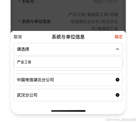
如图所示:
总结
到此这篇关于原生微信小程序中封装一个模拟select下拉框组件的文章就介绍到这了,更多相关微信小程序封装模拟select下拉框组件内容请搜索代码网以前的文章或继续浏览下面的相关文章希望大家以后多多支持代码网!


发表评论