 我要评论
我要评论前言:
deveco studio版本:4.0.0.600
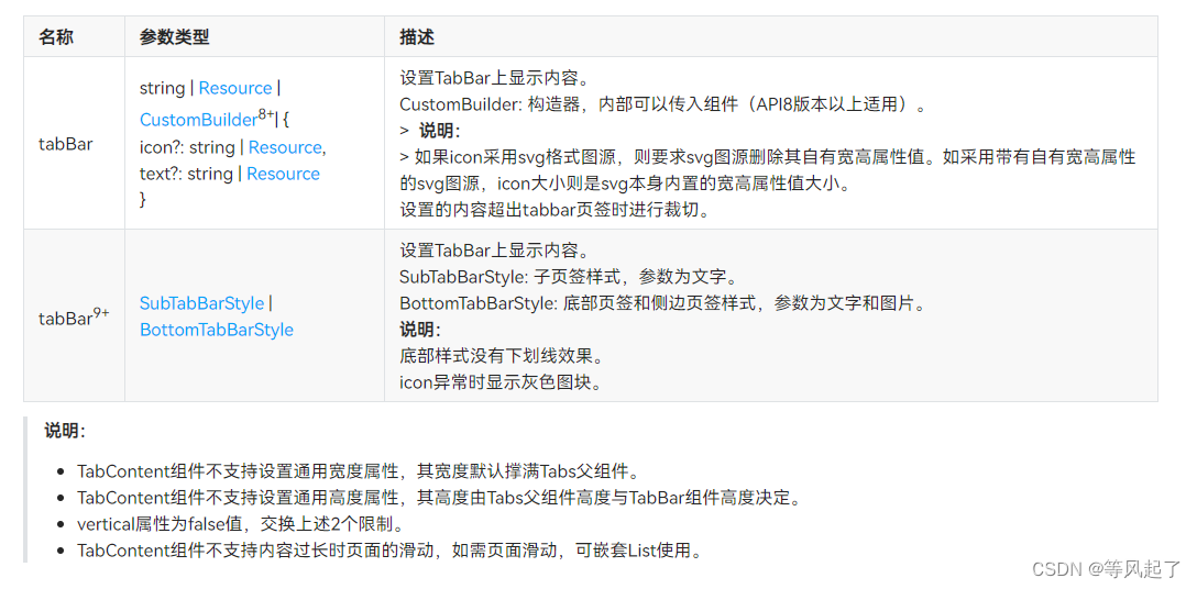
tabs的链接参考:openharmony tabs
tabcontent的链接参考:openharmony tabcontent
通过查看链接参考我们知道可以通过tabcontent的tabbar来实现自定义tabbar样式(custombuilder)
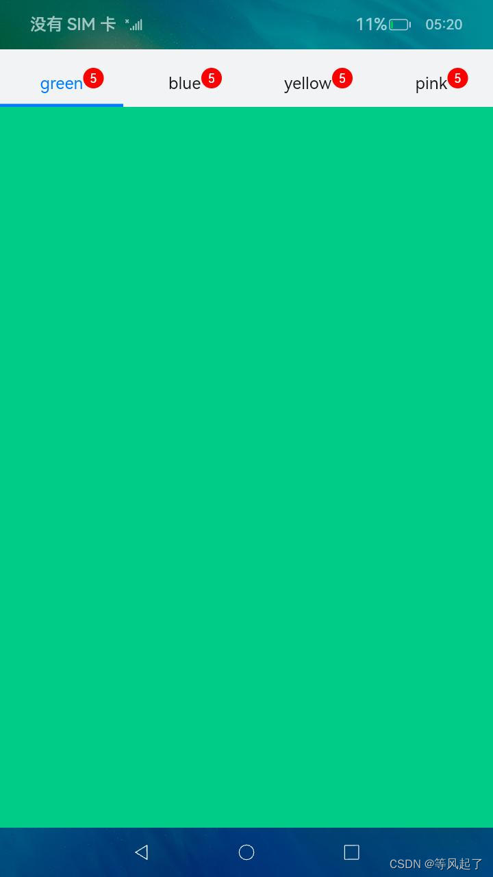
实现效果:
具体实现逻辑:
1、自定义样式
@builder
tabbuilder(index: number, name: string) {
   relativecontainer() {
      text(name)
         .id("texttab")
         .fontcolor(this.currentindex === index ? this.selectedfontcolor : this.fontcolor)
         .fontsize(16)
         .fontweight(this.currentindex === index ? 8 : 4)
         .margin({ top: 17, bottom: 7 })
         .alignrules({
            center: { anchor: '__container__', align: verticalalign.center }, //竖直居中
            middle: { anchor: '__container__', align: horizontalalign.center }//水平居中
         })
      text("5")
         .id("textdot")
         .textalign(textalign.center)
         .backgroundcolor(color.red)
         .borderradius(10)
         .fontsize(12)
         .fontcolor(color.white)
         .width(20)
         .height(20)
         .alignrules({
            left: { anchor: 'texttab', align: horizontalalign.end },
            center: { anchor: 'texttab', align: verticalalign.center }
         })

      divider()
         .id("dividertab")
         .strokewidth(this.strokewidth)
         .color('#007dff')
         .opacity(this.currentindex === index ? 1 : 0)
         .alignrules({
            bottom: { anchor: '__container__', align: verticalalign.bottom }, //竖直居中
            middle: { anchor: '__container__', align: horizontalalign.center }//水平居中
         })
   }.width('100%')
}
2、完整代码:
@entry
@component
struct index {
   @state fontcolor: string = '#111111'
   @state selectedfontcolor: string = '#007dff'
   @state currentindex: number = 0
   private controller: tabscontroller = new tabscontroller()
   @state strokewidth: number = 3 //下划线的宽度

@builder
tabbuilder(index: number, name: string) {
   relativecontainer() {
      text(name)
         .id("texttab")
         .fontcolor(this.currentindex === index ? this.selectedfontcolor : this.fontcolor)
         .fontsize(16)
         .fontweight(this.currentindex === index ? 8 : 4)
         .margin({ top: 17, bottom: 7 })
         .alignrules({
            center: { anchor: '__container__', align: verticalalign.center }, //竖直居中
            middle: { anchor: '__container__', align: horizontalalign.center }//水平居中
         })
      text("5")
         .id("textdot")
         .textalign(textalign.center)
         .backgroundcolor(color.red)
         .borderradius(10)
         .fontsize(12)
         .fontcolor(color.white)
         .width(20)
         .height(20)
         .alignrules({
            left: { anchor: 'texttab', align: horizontalalign.end },
            center: { anchor: 'texttab', align: verticalalign.center }
         })

      divider()
         .id("dividertab")
         .strokewidth(this.strokewidth)
         .color('#007dff')
         .opacity(this.currentindex === index ? 1 : 0)
         .alignrules({
            bottom: { anchor: '__container__', align: verticalalign.bottom }, //竖直居中
            middle: { anchor: '__container__', align: horizontalalign.center }//水平居中
         })
   }.width('100%')
}

   build() {
      column() {
         tabs({ barposition: barposition.start, index: this.currentindex, controller: this.controller }) {
            tabcontent() {
               column().width('100%').height('100%').backgroundcolor('#00cb87')
            }.tabbar(this.tabbuilder(0, 'green'))

            tabcontent() {
               column().width('100%').height('100%').backgroundcolor('#007dff')
            }.tabbar(this.tabbuilder(1, 'blue'))

            tabcontent() {
               column().width('100%').height('100%').backgroundcolor('#ffbf00')
            }.tabbar(this.tabbuilder(2, 'yellow'))

            tabcontent() {
               column().width('100%').height('100%').backgroundcolor('#e67c92')
            }.tabbar(this.tabbuilder(3, 'pink'))
         }
         .vertical(false)
         .barmode(barmode.fixed)
         .barheight(56)
         .animationduration(400)
         .onchange((index: number) => {
            this.currentindex = index
         })
         .width('100%')
         .height('100%')
         .backgroundcolor('#f1f3f5')
      }.width('100%')
   }
}
总结:
上面的逻辑介绍是提供一种思路,根据这个思路我们可以自定义很多的tabbar的样式,来满足我们的业务需求,比如可以修改间距、颜色、大小、宽度、添加红点等。


发表评论