 我要评论
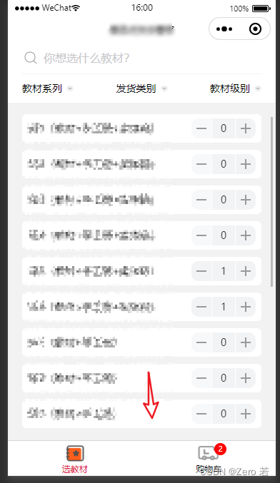
我要评论最终效果
最近在用taro框架开发一个小程序,有一个自定义底部tabbar的需求,最终效果如下
起步
这页是我第一次接触自定义小程序底部tabbar,所有第一选择必然是相看官方文档:微信小程序自定义 tabbar | taro 文档 (如果第一次做,请一定要仔细看这个文档)
按照文档正常配置app.config.js
app.config.js
export default {
  tabbar: {
    custom: true,
    color: '#000000',
    selectedcolor: '#000000',
    backgroundcolor: '#000000',
    list: [
      {
        pagepath: 'page/home/index',
        text: '组件',
      },
      {
        pagepath: 'page/cart/index',
        text: '接口',
      },
    ],
  },
}
配置tab页面usingcomponents
page/home/index.config.js
export default {
  navigationbartitletext: '教材',
  usingcomponents: {},
}
page/cart/index.config.js
export default {
  navigationbartitletext: '购物车',
  usingcomponents: {},
}
开发 custom-tab-bar
设置 custom-tab-bar 组件
demo
import { component, usestate } from 'react';
import { coverimage, coverview } from '@tarojs/components'
import clx from 'classnames'
import taro from '@tarojs/taro';
import { view } from '@tarojs/components';
import ic_book from '@/static/images/ic_book@2x.png';
import ic_car from '@/static/images/ic_car@2x.png';
import ic_bookhover from '@/static/images/ic_book_hover@2x.png';
import ic_carhover from '@/static/images/ic_car_hover@2x.png';
import './index.scss';
function customtabbar() {
  const [tab, settab] = usestate({
    color: '#000000',
    selectedcolor: '#dc143c',
    list: [
      {
        pagepath: '/pages/home/index',
        text: '教材',
        iconpath: ic_book,
        selectediconpath: ic_bookhover
      },
      {
        pagepath: '/pages/shopping-cart/index',
        text: '购物车',
        iconpath: ic_car,
        selectediconpath: ic_carhover
      }
    ]
  });
  function switchtab(index, url) {
    nx.$patch('app/settabindex', index);
    taro.switchtab({ url });
  }

  return (
    <coverview
      classname="tab-bar"
      style={{ height: nx.$get('app.tabheight') + 'px' }}>
      <coverview classname="tab-bar-border"></coverview>
      {tab.list.map((item, index) => {
        return (
          <coverview
            key={index}
            classname="tab-bar-item"
            onclick={() => switchtab(index, item.pagepath)}>
            <coverview classname="ra">
              <coverimage
                classname="cover-image"
                src={
                  nx.$use('app.tabindex') === index
                    ? item.selectediconpath
                    : item.iconpath
                }
              />
              {index === 1 && (
                <coverview classname={clx('null-dot', {
                  'dot': nx.$use('cart.count'),
                })}>{nx.$use('cart.count')}</coverview>
              )}
            </coverview>

            <coverview
              classname="cover-view"
              style={{
                color:
                  nx.$use('app.tabindex') === index
                    ? tab.selectedcolor
                    : tab.color
              }}>
              {item.text}
            </coverview>
          </coverview>
        );
      })}
    </coverview>
  );
}
export default customtabbar;
注意点:
- 上述代码中出现的nx是我同事基于redux toolkit 封装的一个语法糖,你可以忽略,直接理解为你自己全局状态的使用
修复自定义tab点击卡顿、闪烁
请在每个tab页面中调用如下代码,更新tab
home
 const page = usememo(() => taro.getcurrentinstance().page, []);

 usedidshow(() => {const tabbar = taro.gettabbar<any>(page);

 tabbar?.setselected(0);
 });
cart
 const page = usememo(() => taro.getcurrentinstance().page, []);

 usedidshow(() => {const tabbar = taro.gettabbar<any>(page);

 tabbar?.setselected(1);
 });
以上就是我自定义tab的大致过程,详细细节还需要你自己去看文档,官方有相关示例,只要有耐心,你一定可以做的更好
已下是taro官方的示例
react:
https://github.com/nervjs/taro/tree/main/examples/custom-tabbar-react
vue
https://github.com/nervjs/taro/tree/main/examples/custom-tabbar-vue3

发表评论