 我要评论
我要评论
大家好,我是17。
新手礼包一共 3 篇文章,每篇都是描述尽量详细,实例讲解,包会!
本篇介绍了 textfield ui 的常见写法,从textfield的尺寸,border,icon,文本到光标,无所不包!
textfield 的尺寸
默认情况下,textfield 的宽度尽量大,高度包含所有内容并加上 padding。textfield 可以通过 constraints 定义自己的尺寸。
下面的代码规定了 textfield 最大宽度为 200。
textfield(
       decoration: inputdecoration(
          constraints: boxconstraints(maxwidth: 200),
 ));
让 textfiled 在高度上也尽量大,设置 expands: true,同时还必须设置 maxlines,minlines 为 null。
textfield(
      maxlines: null,
      minlines: null,
      expands: true,
    );
需要注意在高度上的约束必须是有限的,否则报错。
column(
      children: [
          textfield(expands: true,)
      ],
    );
这个例子执行会报错。解决办法看下面的代码:
column(
   children: [
     sizedbox(
         height: 200,
         child: textfield(
           expands: true,
           maxlines: null,
           minlines: null,
         )),
     textfield(
       decoration:
           inputdecoration(constraints: boxconstraints(maxheight: 200)),
       expands: true,
       maxlines: null,
       minlines: null,
     ),
     expanded(
         child: textfield(
       expands: true,
       maxlines: null,
       minlines: null,
     ))
   ],
 );
column 中有三个 textfield,一个用 sizedbox 包起来,一个用 inputdecoration 自带的 constraints 限定,一个用 expanded 包起来,都是可以的,都可以让 textfield 在高度上的约束是有限的。
除了 sizedbox,很多 widget 都有修改约束的能力,比如 container,constrainedbox 等。
expanded 的解释可以看这篇 flutter 弹性布局的基石: flex 和 flexible。
默认展示
第一个示例给出全部代码,贴到 main.dart 就能运行。后面的只给出 textfield 相关。
import 'package:flutter/material.dart';
void main() => runapp(const myapp());
class myapp extends statelesswidget {
const myapp({super.key});
widget build(buildcontext context) {
return materialapp(
home: scaffold(
body: center(child: sizedbox(width: 300, child: mywidget()))));
}
}
class mywidget extends statefulwidget {
const mywidget({super.key});
state<mywidget> createstate() => _mywidgetstate();
}
class _mywidgetstate extends state<mywidget> {
var controller = texteditingcontroller(text: "iam17");
void dispose() {
controller.dispose();
super.dispose();
}
widget build(buildcontext context) {
return column(
mainaxissize: mainaxissize.min,
children: [
textfield(),
sizedbox(
height: 20,
),
textfield(),
],
);
}
}
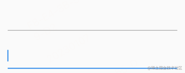
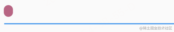
用两个 textfield 是为了方便查看 focus 的效果。上面的为 正常状态的 textfield,下面的为 focus 状态的 textfield。默认配置正常状态下的 textfield 是一条灰线,有焦点的时候变成蓝色。接下来,我们把他变成想要的样子。
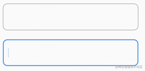
去掉下面的横线
textfield(
    decoration: inputdecoration(
        border: inputborder.none,
    ),
),
下面的横线其实就是 border,去掉后,现在只剩下一个光标了。想怎样装扮可以用其它 widget,比如可以用 container 包起来,自定义 border,也可以用 row 包起来,加各种图标。这是一个方案,如果你对 textfield 不熟悉,可以这样做来快速完成任务,但实际上,textfield 直接就可以完成大多数装扮,还是用优先用 textfield 自带的装扮为好,因为这样可以少写很多代码。
实际上,在设置 border: inputborder.none后还是有 padding 的。为了彻底消除 decoration 的影响,可以把它设置为 null。
textfield(
     decoration: null,
);
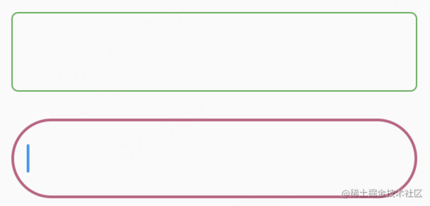
加边框
textfield(
      decoration: inputdecoration(
        border: outlineinputborder(
            gappadding: 4,
            borderside: borderside(
                color: colors.green, width: 2, style: borderstyle.solid),
            borderradius: borderradius.circular(10)),
      ),
    )
我们给 textfield 加上了宽度为 2,圆角为 10 的边框。
- width 是用来定义边框的宽度的,可以用小数,比如
1.5 - style 是线框的样式,目前只有一种可选,就是
borderstyle.solid - color 是线框的颜色
- borderradius 可以定线框的圆角。
- gappadding 定义 labeltext 左右的 padding。
前面几个都好理解,gappadding 我再放一个图就明白了。
gappadding:4 修改为 100 看下效果。
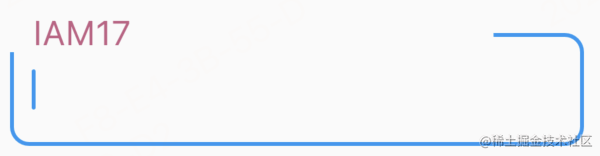
gappadding 是作用于 labeltext 的,为 labeltext 的左右添加空白。虽然在视觉上好像是只给右边加了空白,其实左边也加了,只是左边没那么长的线框可以减,看起来好像是少了一小段,其实左边的上边框已经完全减掉了。
label 也可以拆开写,效果是一样的。
 labeltext:  'iam17',
 labelstyle: textstyle(color:color(0xffc45f84),fontsize: 24),
可能你会想到,要用虚线边框怎么办,需要自定义 decration,本文就不展开说了。
如果你已经运行了示例代码,会发现 width,color 没有生效?确实是没有生效,线框的颜色还是默认的灰色,宽度还是 1。
定义线框的颜色和宽度
定义线框的宽度和颜色不能用 border。inputdecoration 按状态还为我们准备了五种 border,下面示范的是最常用的两种,正常状态下的 enabledborder,和 focus 状态下的 focusedborder。
textfield(
       decoration: inputdecoration(
         enabledborder: outlineinputborder(
           borderradius: borderradius.circular(5),
           borderside: borderside(
             color: colors.green,
             width: 1.0,
           ),
         ),
         focusedborder: outlineinputborder(
           borderradius: borderradius.circular(30),
           borderside: borderside(
             color: color(0xffc45f84),
             width: 2.0,
           ),
         ),
       ),
     )
第三种是 disabledborder,看效果需要 enabled: false 禁用 textfield。禁用后会展示灰色 border,无法 focus。
textfield(
    decoration: inputdecoration(
      enabled: false,
      disabledborder: outlineinputborder(
        borderradius: borderradius.circular(5),
        borderside: borderside(
          color: colors.grey,
          width: 1.0,
        ),
      ),
    ),
);
第四种第五种是 error 相关,errorborder 与 focusederrorborder。 给 errortext 赋值,就会触发 textfield 的错误状态。
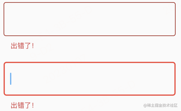
 textfield(
     decoration: inputdecoration(
       errorborder: outlineinputborder(
         borderside: borderside(
           color: color.fromargb(255, 157, 23, 13),
           width: 1.0,
         ),
       ),
       errortext: '出错了!',
       focusederrorborder: outlineinputborder(
         borderradius: borderradius.circular(5),
         borderside: borderside(
           color: colors.red,
           width: 2.0,
         ),
       ),
     ),
   )
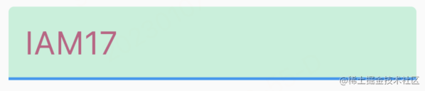
文本样式,背景色
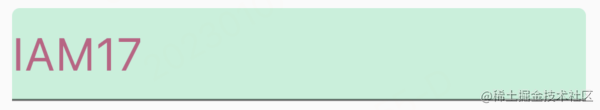
 textfield(
      controller: controller,
      style: textstyle(color: color(0xffc45f84), fontsize: 24),
      decoration: inputdecoration(
          filled: true, fillcolor: color.fromargb(255, 192, 241, 218)));
controller 在最开始的代码中已经给出来了var controller = texteditingcontroller(text: "iam17"); 现在我们用 controller 显示初始文本。
filled 默认为 false,fillcolor 无效,要设置背景色,需要设置 filled: true,然后再设置 fillcolor。
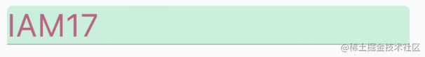
正文文本的样式用 style。可以用 textalign 控制文本的摆放。我们可以把文本摆放在中间。
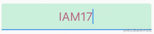
textfield(
        textalign: textalign.center,
        controller: controller,
        style: textstyle(color: color(0xffc45f84), fontsize: 24),
        decoration: inputdecoration(
            filled: true, fillcolor: color.fromargb(255, 192, 241, 218)))
  ]));
除了可以摆放在中间,还可以摆在末尾,一共有 5 个值可选,具体可以查看 textalign
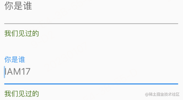
不够生动?用 icon 和 text 来装扮吧!
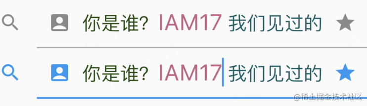
 textfield(
       controller: controller,
       style: textstyle(color: color(0xffc45f84), fontsize: 24),
       decoration: inputdecoration(
         icon: icon(icons.search),
         prefixicon: icon(icons.account_box),
         prefix: text('你是谁?',
             style: textstyle(
                 color: color.fromargb(255, 25, 73, 6), fontsize: 20)),
         suffixicon: icon(icons.star),
         suffix: text('我们见过的',
             style: textstyle(
                 color: color.fromargb(255, 14, 92, 99), fontsize: 20)),
       ))
一共有五个位置用来装饰。最前面的是 icon,在 border 的外面。接下来是 prefixicon,然后是正文,最后是 suffix 和 subffixicon。
这个五个位置虽然从名字上来看是 icon 和 text,但实际上只要是 widget 都可以!但最好是用 icon,text,因为如果用其它 widget,可能享受不到 theme 的福利了。
prefix,suffix 也可以用两个字段替代。
prefixtext: '你是谁?',
prefixstyle: textstyle( color: color.fromargb(255, 25, 73, 6), fontsize: 20),
suffixtext: '我们见过的',
suffixstyle: textstyle( color: color.fromargb(255, 14, 92, 99), fontsize: 20),
自定义 icon 的颜色
当前 icon 的 color 都是默认的,如何修改 icon 的颜色呢?可能你第一时间想到这样修改:
icon: icon(icons.search,color:colors.green),
你一定很高兴,it work! 现在 textfield 的正常状态和 foucs 状态的颜色都是 green。那么,如果想让 textfield 的 focus 状态的 icon 颜色是红色,怎么办?
思考中…
好像很棘手,其实 flutter 已经为我们设计好了如何修改 icon 的颜色,用 theme!
首先定义一个 materialstatecolor。
class iconcolor extends materialstatecolor {
const iconcolor() : super(_defaultcolor);
//绿色
static const int _defaultcolor = 0xff00ff00;
//红色
static const int _focuscolor = 0xffff0000;
color resolve(set<materialstate> states) {
if (states.contains(materialstate.focused)) {
return const color(_focuscolor);
}
return const color(_defaultcolor);
}
}
然后加入到 theme 中,我们需要修改一下之前的代码。
materialapp(
   theme: themedata(
      inputdecorationtheme: inputdecorationtheme(
         iconcolor: iconcolor()
       ),),
   home: scaffold(
       body: center(child: sizedbox(width: 400, child: mywidget()))));
查看效果默认的时候 icon 是绿色的,focus 的时候是红色的。
如果你觉得定义一个类太麻烦,也可以用 resolvewith 方法
materialapp(
    theme: themedata(
      inputdecorationtheme: inputdecorationtheme(iconcolor:
          materialstatecolor.resolvewith((set<materialstate> states) {
        if (states.contains(materialstate.focused)) {
          return colors.red;
        }
        return colors.green;
      })),
    ),
    home: scaffold(
        body: center(child: sizedbox(width: 300, child: mywidget()))));
前面说的 border, 也可以通过 theme 设置。这样就不用每个 textfield 都定一遍了!
inputdecorationtheme: inputdecorationtheme(
         enabledborder: outlineinputborder(borderside: borderside(color: colors.green)),
         focusedborder: outlineinputborder(borderside: borderside(color: colors.red))
 )
inputdecorationtheme 可以设置很多内容。theme 相当于是 css 中的样式表。theme 如果写在 materialapp 中,就相当于是全局样式表了,写在其它地方相当于局部样式表。子级的 theme 的优先级大于父级的 theme。写在 widget 里的相当于 style,优先级最高。
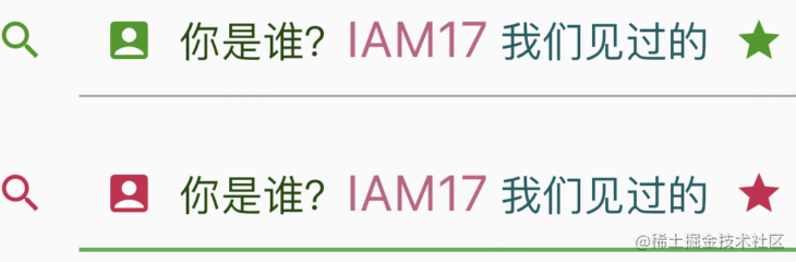
isdense
上面是默认 isdense:false 的效果,下面是 isdense:true 的效果,就是icon变小了一些。
inputdecoration(
     isdense: true,
     icon: icon(icons.search),
     prefixicon: icon(icons.account_box),
     prefix: text('你是谁?',
         style: textstyle(
             color: color.fromargb(255, 25, 73, 6), fontsize: 20)),
     suffixicon: icon(icons.star),
     suffix: text('我们见过的',
         style: textstyle(
             color: color.fromargb(255, 14, 92, 99), fontsize: 20)),
   );
hint text 与 helper text
灰色的是 hinttext,和 html 中 placeholder 差不多。绿色的是 helper text,显示在左下角。
textfield(
   decoration: inputdecoration(
     hinttext: 'iam17',
     hintstyle: textstyle(color: colors.black54),
     hintmaxlines: 1,
     helpertext: '我们见过的',
     helperstyle: textstyle(color: color.fromargb(255, 52, 116, 7)),
     helpermaxlines: 1,
   ))
已经包含 hint text 与 helper text 的所有属性了,比较好理解,就不再解释了。要注意的一点是:focus 对这两个 text 的样式没有影响。error 状态 hint text 没有变化,helper text 被 errortext 取代。
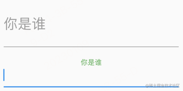
label text
同时有 label text 和 hint text 的时候,正常状态下会优先显示 labeltext。在 focus 状态下,labeltext 缩小到左上角,hint text 显示出来。
label text 远没有这么简单,除 labeltext,labelstyle,还有几个属性需要了解。
floatinglabelstyle 定义 focus 状态下 label 显示在左上角的样式。正常状态下 label text 的颜色用 labelstyle 设置为灰色,浮到左上角后可以用 floatinglabelstyle 设置为绿色。
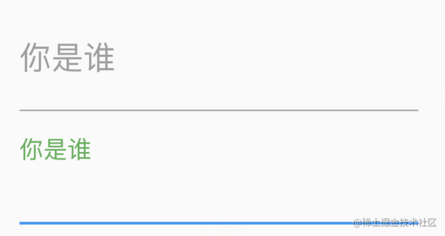
textfield(
    decoration: inputdecoration(
      labeltext: '你是谁',
      labelstyle: textstyle(color: colors.grey),
      floatinglabelstyle: textstyle(color: colors.green),
    ))
)
floatinglabelalignment 可以让左上角的 label 显示在中间。(只有 start 和 center 两个选项)
textfield(
   decoration: inputdecoration(
     labeltext: '你是谁',
     labelstyle: textstyle(color: color.fromargb(255, 194, 52, 101)),
     floatinglabelstyle: textstyle(color: colors.blue),
     floatinglabelalignment: floatinglabelalignment.center
   ));
floatinglabelbehavior 控制 label 的行为,有三个选项
floatinglabelbehavior.auto默认。正常状态覆盖 hint,focus 状态上浮。floatinglabelbehavior.always正常状态 和 focus 状态 都上浮。hint 正常显示。floatinglabelbehavior.never正常状态覆盖 hint,focus 状态不上浮。这时就和 hint 并不多了,唯一不同的是 focus 的时候 hint 不消失,label 消失。
padding
默认情况下,在正文的四周是有 padding 的。
contentpadding: edgeinsets.zero 可以去掉左右的 padding。
decoration: inputdecoration(
    contentpadding: edgeinsets.zero,
    filled: true,
    fillcolor: color.fromargb(255, 192, 241, 218)))
去掉上下的 padding 要用到一个属性,iscollapsed可以把上下左右的 padding 都去掉。
inputdecoration(
    iscollapsed: true,
    filled: true,
    fillcolor: color.fromargb(255, 192, 241, 218))
也可以用inputdecoration.collapsed,但要求必须指定 hinttext,不允许再指定 labeltext,errortext,icon。
inputdecoration.collapsed(
   hinttext: "你是谁",
   filled: true,
   fillcolor: color.fromargb(255, 192, 241, 218))
直接用 iscollapsed: true,可以指定 labeltext,errortext,icon,但 ui 上可能不大理想,所以如果想去掉所有 padding,优先用 inputdecoration.collapsed。
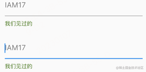
自定义光标
可以自定义光标的宽度,radius,和颜色。
textfield(
     cursorwidth: 16.0,
     cursorradius: radius.circular(18.0),
     cursorcolor: color(0xffc45f84),
   ),
flutter textfield ui 常见写法到这里就结束了,谢谢观看。
欢迎观看下一篇 flutter textfield 交互实例 —— 新手礼包


发表评论