文章目录
一、svm
1.1,常用属性函数
二、决策树
2.1,常用属性函数
2.2,决策树可视化
from sklearn.datasets import load_iris
from sklearn import tree
import matplotlib.pyplot as plt

# 加载鸢尾花数据集
iris = load_iris()

# 创建决策树模型
model = tree.decisiontreeclassifier(max_depth=2)
model.fit(iris.data, iris.target)

# 可视化决策树
feature_names = iris.feature_names
plt.figure(figsize=(12,12))
_ = tree.plot_tree(model, feature_names=feature_names, class_names=iris.target_names, filled=true, rounded=true)
plt.show()
2.3,决策树解释
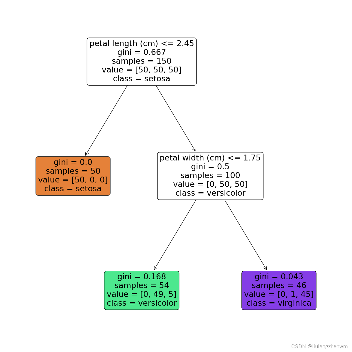
节点含义:
- petal length (cm)<=2.45表示数据特征petal width (cm)<=0.75,当petal width (cm)<=0.75,进入左边分支,否则进入右边分支;
- gini表示该节点的基尼系数;
- samples表示该节点的样本数;
- value表示各分类的样本数,例如,根节点中的[34,32,39]表示分类为setosa的样本数为34,分类为versicolour的样本数为32,分类为virginica的样本数量为39;
- class表示该区块被划分为的类别,它是由value中样本数较多的类别决定的,例如,根节点中分类为virginica的样本数最多,所以该节点的分类为virginica,依此类推。
每一个颜色代表一个分类,随着层数的增加,颜色也会变深。
3,模型评价
3.1,方面一(评价指标)
- 准确率
准确率是分类问题中最常用的评估指标,用于衡量模型的正确预测率。 - 精确率和召回率
精确率和召回率用于评估二分类模型的性能。精确率是指预测为正例的样本中实际为正例的比例,召回率是指实际为正例的样本中被正确预测为正例的比例。 - f1分数
f1分数是精确率和召回率的加权平均值,用于评估二分类模型的性能。
# 其他的指标
def accuracy_precision_recall_f1(y_true, y_pred):
    # 1.准确率
    accuracy = accuracy_score(y_true, y_pred)
    # 2.精确率和召回率
    precision = precision_score(y_true, y_pred)
    recall = recall_score(y_true, y_pred)
    # 3.f1分数
    f1 = f1_score(y_true, y_pred)
    return [accuracy, precision, recall, f1]


print(accuracy_precision_recall_f1(test_label_shulle_scaler, test_data_predict))
- 混淆矩阵
混淆矩阵是一个二维矩阵,用于表示分类模型的性能。它将预测结果分为真正例(true positive)、假正例(false positive)、真反例(true negative)和假反例(false negative)四类,分别对应矩阵的四个象限。
def draw_confusion_matrix(label_true, label_pred, label_name, normlize, title="confusion matrix", pdf_save_path=none,
                          dpi=100):
    """

    @param label_true: 真实标签,比如[0,1,2,7,4,5,...]
    @param label_pred: 预测标签,比如[0,5,4,2,1,4,...]
    @param label_name: 标签名字,比如['cat','dog','flower',...]
    @param normlize: 是否设元素为百分比形式
    @param title: 图标题
    @param pdf_save_path: 是否保存,是则为保存路径pdf_save_path=xxx.png | xxx.pdf | ...等其他plt.savefig支持的保存格式
    @param dpi: 保存到文件的分辨率,论文一般要求至少300dpi
    @return:

    example:
            draw_confusion_matrix(label_true=y_gt,
                          label_pred=y_pred,
                          label_name=["angry", "disgust", "fear", "happy", "sad", "surprise", "neutral"],
                          normlize=true,
                          title="confusion matrix on fer2013",
                          pdf_save_path="confusion_matrix_on_fer2013.png",
                          dpi=300)

    """
    cm1 = confusion_matrix(label_true, label_pred)
    cm = confusion_matrix(label_true, label_pred)
    print(cm)
    if normlize:
        row_sums = np.sum(cm, axis=1)
        cm = cm / row_sums[:, np.newaxis]
    cm = cm.t
    cm1 = cm1.t
    plt.imshow(cm, cmap='blues')
    plt.title(title)
    # plt.xlabel("predict label")
    # plt.ylabel("truth label")
    plt.xlabel("预测标签")
    plt.ylabel("真实标签")

    plt.yticks(range(label_name.__len__()), label_name)
    plt.xticks(range(label_name.__len__()), label_name, rotation=45)

    plt.tight_layout()

    plt.colorbar()

    for i in range(label_name.__len__()):
        for j in range(label_name.__len__()):
            color = (1, 1, 1) if i == j else (0, 0, 0)  # 对角线字体白色,其他黑色
            value = float(format('%.1f' % (cm[i, j] * 100)))
            value1 = str(value) + '%\n' + str(cm1[i, j])
            plt.text(i, j, value1, verticalalignment='center', horizontalalignment='center', color=color)

    plt.show()
    # if not pdf_save_path is none:
    #     plt.savefig(pdf_save_path, bbox_inches='tight', dpi=dpi)


labels_name = ['健康', '故障']
test_data_predict = svc_all.predict(test_data_shuffle_scaler)

draw_confusion_matrix(label_true=test_label_shulle_scaler,
                      label_pred=test_data_predict,
                      label_name=labels_name,
                      normlize=true,
                      title="混淆矩阵",
                      # title="confusion matrix",
                      pdf_save_path="confusion_matrix.jpg",
                      dpi=300)
- auc和roc曲线
roc曲线是一种评估二分类模型性能的方法,它以真正例率(tpr)为纵轴,假正例率(fpr)为横轴,绘制出模型预测结果在不同阈值下的性能。auc是roc曲线下面积,用于评估模型总体性能。
# 画roc曲线函数
def plot_roc_curve(y_true, y_score):
    """
    y_true:真实值
    y_score:预测概率。注意:不要传入预测label!!!
    """
    from sklearn.metrics import roc_curve
    import matplotlib.pyplot as plt
    fpr, tpr, threshold = roc_curve(y_true, y_score)
    # plt.xlabel('false positive rate')
    # plt.ylabel('ture positive rate')
    plt.xlabel('特异度')
    plt.ylabel('灵敏度')
    plt.title('roc曲线')
    # plt.title('roc curve')
    plt.plot(fpr, tpr, color='b', linewidth=0.8)
    plt.plot([0, 1], [0, 1], 'r--')
    plt.show()

# print(np.sum(svc_all.predict(test_data_shuffle_scaler)))
test_data_score = svc_all.decision_function(test_data_shuffle_scaler)
plot_roc_curve(test_label_shulle_scaler, svc_all.predict_proba(test_data_shuffle_scaler)[:,1])
plot_roc_curve(test_label_shulle_scaler, test_data_score)

# 计算auc
from sklearn.metrics import roc_auc_score
print(roc_auc_score(test_label_shulle_scaler, svc_all.predict_proba(test_data_shuffle_scaler)[:,1]))
3.2,方面二(不同数据规模下,模型的性能)
def plot_learning_curve(estimator, title, x, y,
                        ax,  # 选择子图
                        ylim=none,  # 设置纵坐标的取值范围
                        cv=none,  # 交叉验证
                        n_jobs=none  # 设定索要使用的线程
                        ):
    train_sizes, train_scores, test_scores = learning_curve(estimator, x, y
                                                            , cv=cv, n_jobs=n_jobs)

    # learning_curve() 是一个可视化工具,用于评估机器学习模型的性能和训练集大小之间的关系。它可以帮助我们理解模型在不同数据规模下的训练表现,
    # 进而判断模型是否出现了欠拟合或过拟合的情况。该函数会生成一条曲线,横轴表示不同大小的训练集,纵轴表示训练集和交叉验证集上的评估指标(例如
    # 准确率、损失等)。通过观察曲线,我们可以得出以下结论:
    # 1,训练集误差和交叉验证集误差之间的关系:当训练集规模较小时,模型可能过度拟合,训练集误差较低,交叉验证集误差较高;当训练集规模逐渐增大时,
    #    模型可能更好地泛化,两者的误差逐渐趋于稳定。
    # 2,训练集误差和交叉验证集误差对训练集规模的响应:通过观察曲线的斜率,我们可以判断模型是否存在高方差(过拟合)或高偏差(欠拟合)的问题。如果
    #    训练集和交叉验证集的误差都很高,且二者之间的间隔较大,说明模型存在高偏差;如果训练集误差很低而交叉验证集误差较高,且二者的间隔也较大,说
    #    明模型存在高方差。
    # cv : int:交叉验证生成器或可迭代的可选项,确定交叉验证拆分策略。v的可能输入是:
    #            - 无,使用默认的3倍交叉验证,
    #            - 整数,指定折叠数。
    #            - 要用作交叉验证生成器的对象。
    #            - 可迭代的yielding训练/测试分裂。
    #      shufflesplit:我们这里设置cv,交叉验证使用shufflesplit方法,一共取得100组训练集与测试集,
    #      每次的测试集为20%,它返回的是每组训练集与测试集的下标索引,由此可以知道哪些是train,那些是test。
    # n_jobs : 整数,可选并行运行的作业数(默认值为1)。windows开多线程需要
    ax.set_title(title)
    if ylim is not none:
        ax.set_ylim(*ylim)
    # *是可以接受任意数量的参数
    # 而 ** 可以接受任意数量的指定键值的参数
    # def m(*args,**kwargs):
    # 	print(args)
    #     print(kwargs)
    # m(1,2,a=1,b=2)
    # #args:(1,2),kwargs:{'b': 2, 'a': 1}
    ax.set_xlabel("training examples")
    ax.set_ylabel("score")
    ax.grid()  # 显示网格作为背景,不是必须
    ax.plot(train_sizes, np.mean(train_scores, axis=1), 'o-'
            , color="r", label="training score")
    ax.plot(train_sizes, np.mean(test_scores, axis=1), 'o-'
            , color="g", label="test score")
    ax.legend(loc="best")
    return ax


#
# y = y.astype(np.int)
print(x.shape)
print(y.shape)

title = ["naive_bayes", "decisiontree", "svm_rbf_kernel", "randomforest", "logistic"]
# model = [gaussiannb(), dtc(), svc(gamma=0.001)
#     , rfc(n_estimators=50), lr(c=0.1, solver="lbfgs")]
model = [gaussiannb(), dtc(), svc(kernel="rbf")
    , rfc(n_estimators=50), lr(c=0.1, solver="liblinear")]
cv = shufflesplit(n_splits=10, test_size=0.5, random_state=0)
# n_splits:
# 划分数据集的份数,类似于kflod的折数,默认为10份
# test_size:
# 测试集所占总样本的比例,如test_size=0.2即将划分后的数据集中20%作为测试集
# random_state:
# 随机数种子,使每次划分的数据集不变
# train_sizes: 随着训练集的增大,选择在10%,25%,50%,75%,100%的训练集大小上进行采样。
#              比如(cv= 5)10%的意思是先在训练集上选取10%的数据进行五折交叉验证。
# train_sizes:数组类,形状(n_ticks),dtype float或int
# 训练示例的相对或绝对数量,将用于生成学习曲线。如果dtype为float,则视为训练集最大尺寸的一部分
# (由所选的验证方法确定),即,它必须在(0,1]之内,否则将被解释为绝对大小注意,为了进行分类,
# 样本的数量通常必须足够大,以包含每个类中的至少一个样本(默认值:np.linspace(0.1,1.0,5))
# 输出:
# train_sizes_abs:
# 返回生成的训练的样本数,如[ 10 , 100 , 1000 ]
# train_scores:
# 返回训练集分数,该矩阵为( len ( train_sizes_abs ) , cv分割数 )维的分数,
# 每行数据代表该样本数对应不同折的分数
# test_scores:
# 同train_scores,只不过是这个对应的是测试集分数
print("===" * 25)
fig, axes = plt.subplots(1, 5, figsize=(30, 6))
for ind, title_, estimator in zip(range(len(title)), title, model):
    times = time()
    plot_learning_curve(estimator, title_, x_scaler, y,
                        ax=axes[ind], ylim=[0, 1.05], n_jobs=4, cv=cv)
    print("{}:{}".format(title_, datetime.datetime.fromtimestamp(time() - times).strftime("  %m:%s:%f")))
plt.show()
print("===" * 25)
for i in [*zip(range(len(title)), title, model)]:
    print(i)
4,模型保存与读取
4.1,模型的保存
title = ["naive_bayes", "decisiontree", "svm_rbf_kernel", "randomforest", "logistic"]
model = [gaussiannb(), dtc(), svc(gamma=0.001)
    , rfc(n_estimators=50), lr(c=0.1, solver="liblinear")]

import joblib

for i_index, i in enumerate(model):
    i.fit(x, y)
    joblib_file = "model_save/" + title[i_index] + "_model.pkl"
    with open(joblib_file, 'wb') as file:
        joblib.dump(i, joblib_file)
    print(i.score(x, y))
4.2,模型的读取
title = ["naive_bayes", "decisiontree", "svm_rbf_kernel", "randomforest", "logistic"]

for i in title:
    joblib_file = "model_save/" + i + "_model.pkl"
    with open(joblib_file, "rb") as file:
        model = joblib.load(file)
    print(i, ":   ", model.score(x, y))


发表评论