实例如下:
<!doctype html public "-//w3c//dtd xhtml 1.0 strict//en" "http://www.w3.org/tr/xhtml1/dtd/xhtml1-strict.dtd">
<html xmlns="http://www.w3.org/1999/xhtml">
<head>
<meta http-equiv="content-type" content="text/html; charset=gb2312" />
<title>html+js+highcharts绘制圆饼图表的简单实例</title>
<script type="text/javascript" src="jquery-1.4.2.min.js" ></script>
<script type="text/javascript" src="highcharts.js" ></script>
</head>
<body>
<div id="content">
<br><br><br>
<!--demo start-->
<div id="pie_chart" class="chart_combo"></div>
<script type="text/javascript">
var chart;
$(function () {
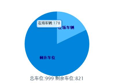
var totalmoney=999
<span style="white-space:pre"> </span>var zccw=178
<span style="white-space:pre"> </span>var sycw=821
$(document).ready(function() {
chart = new highcharts.chart({
chart: {
renderto: 'pie_chart',
plotbackgroundcolor: 'white',//背景颜色
plotborderwidth: 0,
plotshadow: false
},
title: {
text: '总车位:'+totalmoney +' 剩余车位:'+ sycw ,
verticalalign:'bottom',
y:-60
},
tooltip: {//鼠标移动到每个饼图显示的内容
pointformat: '{point.name}: <b>{point.percentage}%</b>',
percentagedecimals: 1,
formatter: function() {
return this.point.name+':'+totalmoney*this.point.percentage/100;
}
},
plotoptions: {
pie: {
size:'60%',
borderwidth: 0,
allowpointselect: true,
cursor: 'pointer',
datalabels: {
enabled: true,
color: '#000',
distance: -50,//通过设置这个属性,将每个小饼图的显示名称和每个饼图重叠
style: {
fontsize: '10px',
lineheight: '10px'
},
formatter: function(index) {
return '<span style="color:#00008b;font-weight:bold">' + this.point.name + '</span>';
}
},
padding:20
}
},
series: [{//设置每小个饼图的颜色、名称、百分比
type: 'pie',
name: null,
data: [
{name:'在场车辆',color:'#3da9ff',y:zccw},
{name:'剩余车位',color:'#008fe0',y:sycw},
]
}]
});
});
});
</script>
</div>
</body>
</html>
以上这篇html+js+highcharts绘制圆饼图表的简单实例就是小编分享给大家的全部内容了,希望能给大家一个参考,也希望大家多多支持代码网。


发表评论