plotly是一个强大的python可视化库,支持创建高质量的静态、动态和交互式图表。它特别擅长于绘制三维图形,能够直观地展示复杂的数据关系。本文将介绍如何使用plotly库实现函数的二维和三维可视化,并提供一些优美的三维函数示例。资源绑定附上完整资源供读者参考学习!
一、库的介绍
plotly提供了两种主要的api:
plotly express:简化的api,适合快速创建常见图表。
plotly graph objects:功能更强大和灵活,适用于复杂的自定义图表。
安装plotly库:
pip install plotly
二、常见函数示例
1. 二维函数示例
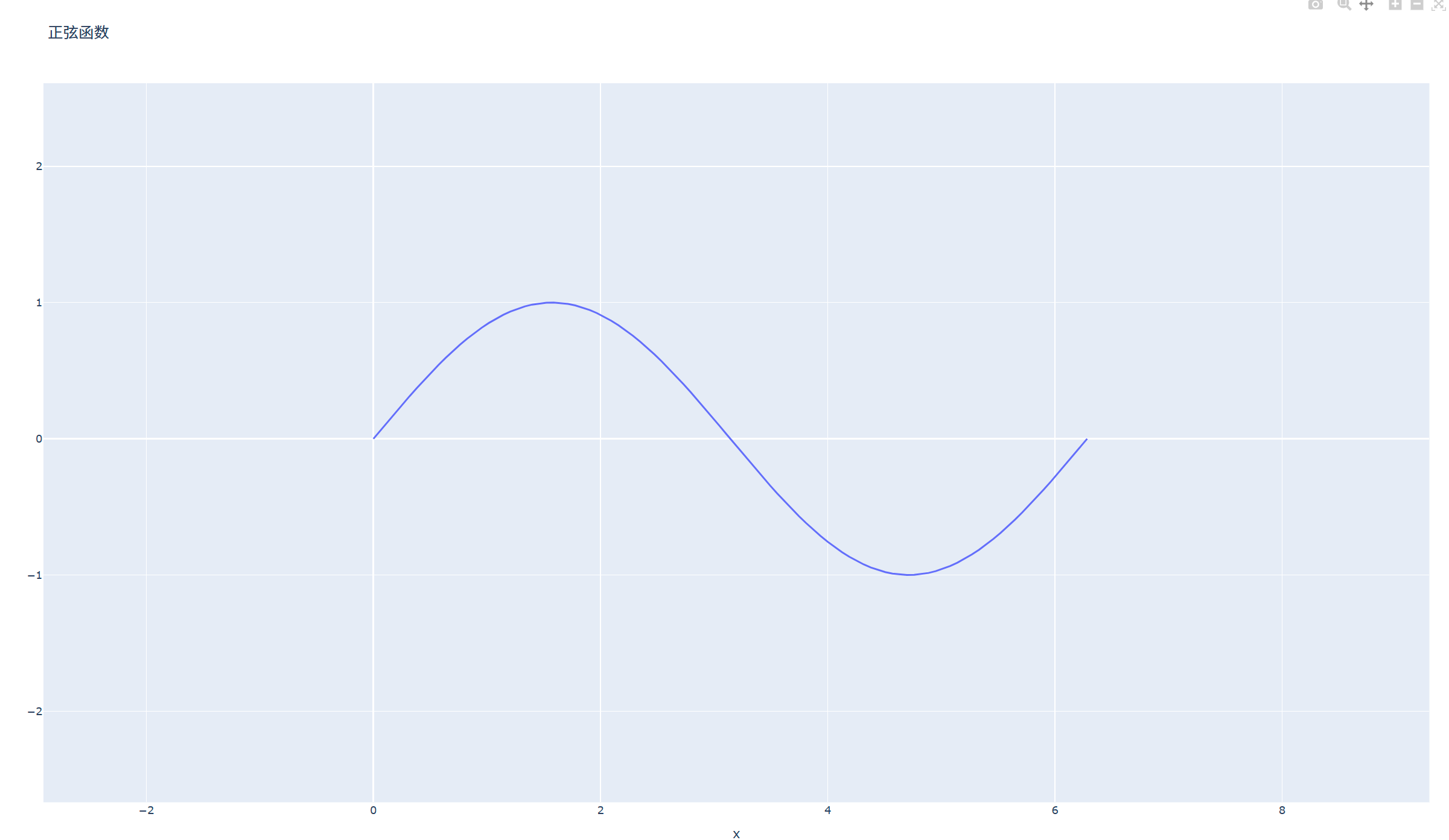
示例1:正弦函数
import plotly.graph_objects as go
import numpy as np

x = np.linspace(0, 2 * np.pi, 100)
y = np.sin(x)

fig = go.figure(data=go.scatter(x=x, y=y, mode='lines'))
fig.update_layout(title='正弦函数', xaxis_title='x', yaxis_title='y')
fig.show()
效果展示
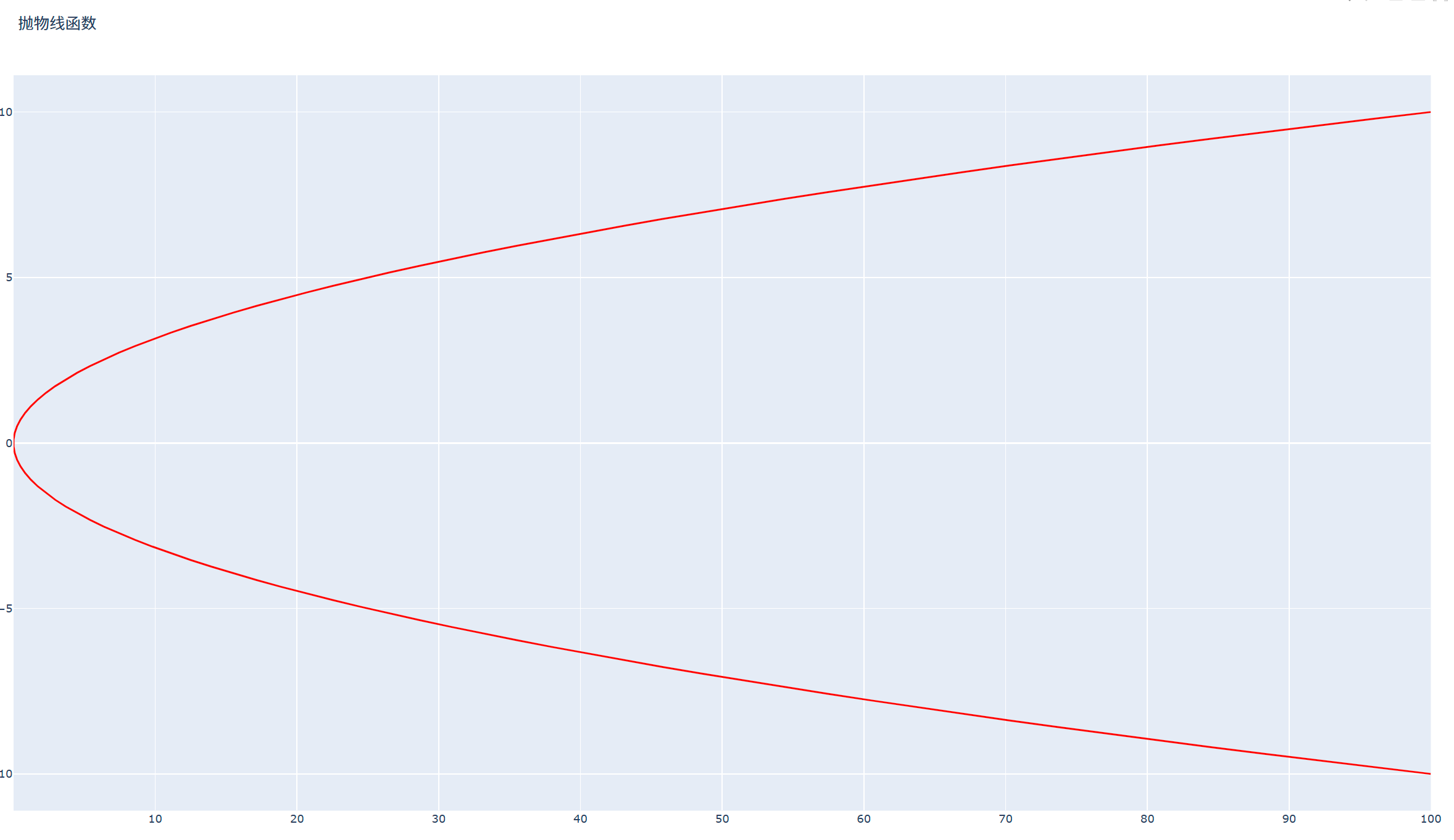
示例2:抛物线函数
import plotly.graph_objects as go
import numpy as np

y = np.linspace(-10, 10, 100)
x= y**2

fig = go.figure(data=go.scatter(x=x, y=y, mode='lines'))
fig.update_traces(line=dict(color='red'))
fig.update_layout(title='抛物线函数', xaxis_title='x', yaxis_title='y')
fig.show()
效果展示
2. 三维函数示例
示例1:三维曲面
import plotly.graph_objects as go
import numpy as np

x = np.linspace(-5, 5, 100)
y = np.linspace(-5, 5, 100)
x, y = np.meshgrid(x, y)
z = np.sin(np.sqrt(x**2 + y**2))

fig = go.figure(data=go.surface(z=z, x=x, y=y))

fig.update_layout(title='三维曲面', scene=dict(xaxis_title='x', yaxis_title='y', zaxis_title='z'))
fig.show()
效果展示

示例2:三维曲线
import plotly.graph_objects as go
import numpy as np
theta = np.linspace(-4 * np.pi, 4 * np.pi, 100)
z = np.linspace(-2, 2, 100)
x = z * np.sin(theta)
y = z * np.cos(theta)

fig = go.figure(data=go.scatter3d(x=x, y=y, z=z, mode='lines'))
fig.update_traces(line=dict(color='orange', width=2))
fig.update_layout(title='三维曲线', scene=dict(xaxis_title='x', yaxis_title='y', zaxis_title='z'))
fig.show()
效果展示

三、优美的三维函数示例
示例1:球面函数
import plotly.graph_objects as go
import numpy as np

u = np.linspace(0, 2 * np.pi, 100)
v = np.linspace(0, np.pi, 100)
x = np.outer(np.cos(u), np.sin(v))
y = np.outer(np.sin(u), np.sin(v))
z = np.outer(np.ones(np.size(u)), np.cos(v))

fig = go.figure(data=go.surface(z=z, x=x, y=y, colorscale='reds'))
fig.update_layout(title='球面', scene=dict(xaxis_title='x', yaxis_title='y', zaxis_title='z'))
fig.show()
效果展示

示例2:莫比乌斯带
import plotly.graph_objects as go
import numpy as np

u = np.linspace(0, 2 * np.pi, 100)
v = np.linspace(-0.5, 0.5, 100)
u, v = np.meshgrid(u, v)
x = (1 + v * np.cos(u / 2)) * np.cos(u)
y = (1 + v * np.cos(u / 2)) * np.sin(u)
z = v * np.sin(u / 2)

fig = go.figure(data=go.surface(z=z, x=x, y=y, colorscale='rainbow'))
fig.update_layout(title='莫比乌斯带', scene=dict(xaxis_title='x', yaxis_title='y', zaxis_title='z'))
fig.show()
效果展示


四、动态和交互式图表示例
示例1:交互式按钮
import plotly.graph_objects as go

fig = go.figure()

# 添加多条折线
fig.add_trace(go.scatter(y=[2, 1, 3], name="line 1"))
fig.add_trace(go.scatter(y=[3, 2, 1], name="line 2"))

# 配置交互按钮
fig.update_layout(
    updatemenus=[
        dict(
            type="buttons",
            direction="right",
            buttons=[
                dict(label="show all", method="update", args=[{"visible": [true, true]}]),
                dict(label="show line 1", method="update", args=[{"visible": [true, false]}]),
                dict(label="show line 2", method="update", args=[{"visible": [false, true]}]),
            ],
        )
    ]
)

fig.show()
效果展示

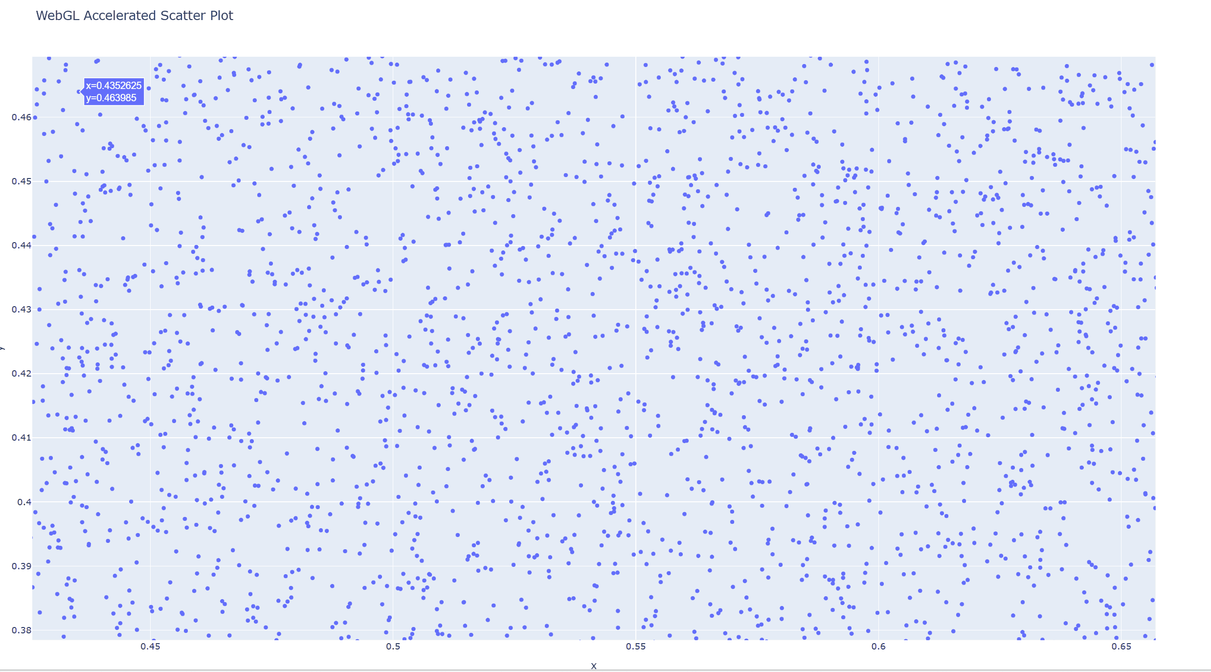
示例2:webgl加速的大数据渲染
import plotly.express as px
import numpy as np

# 模拟大数据
np.random.seed(42)
x = np.random.rand(100_000)
y = np.random.rand(100_000)

# 使用webgl加速的散点图
fig = px.scatter(x=x, y=y, render_mode='webgl', title="webgl accelerated scatter plot")
fig.show()
效果展示
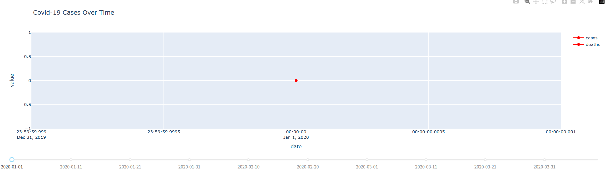
示例3:实时疫情数据仪表盘
from dash import dash, dcc, html, input, output
import plotly.graph_objects as go
import pandas as pd

# 模拟疫情数据
data = {
    "date": pd.date_range(start="2020-01-01", periods=100),
    "cases": [i ** 2 for i in range(100)],
    "deaths": [i * 5 for i in range(100)]
}
df = pd.dataframe(data)

app = dash(__name__)

app.layout = html.div([
    dcc.graph(id="graph"),
    dcc.slider(
        id="year-slider",
        min=0,
        max=len(df) - 1,
        value=0,
        marks={i: str(df["date"][i].date()) for i in range(0, len(df), 10)},
        step=none
    )
])


@app.callback(output("graph", "figure"), [input("year-slider", "value")])
def update_graph(selected_index):
    filtered_df = df.iloc[:selected_index + 1]

    # 使用go.scatter同时显示折线和数据点
    fig = go.figure()
    for col in ["cases", "deaths"]:
        fig.add_trace(go.scatter(
            x=filtered_df["date"],
            y=filtered_df[col],
            mode='lines+markers',
            marker=dict(size=8, color='red'),
            name=col
        ))

    fig.update_layout(title="covid-19 cases over time", xaxis_title="date", yaxis_title="value")
    return fig


if __name__ == "__main__":
    app.run(debug=true)
效果展示
五、plotly与matplotlib的比较
plotly和matplotlib都是python中广泛使用的可视化库,但它们在某些方面有所不同:
| 特性 | plotly | matplotlib |
|---|---|---|
| 交互性 | 生成交互式图表,支持缩放、悬停等 | 生成静态图表 |
| 易用性 | api较为复杂,但提供了丰富的功能 | api简单直观,适合初学者 |
| 适用场景 | 适合创建动态和交互式图表,如web应用 | 适合创建静态图表,如科学论文 |
| 学习曲线 | 较陡峭,需要时间熟悉api | 较平缓,易于上手 |
通过这些比较,可以看出plotly和matplotlib各有优缺点,选择哪个库取决于你的具体需求。
六、函数参数用法总结
以下是plotly中常用函数的参数用法总结:
| 函数 | 参数 | 描述 |
|---|---|---|
scatter | x, y | 绘制二维散点图或折线图 |
scatter3d | x, y, z | 绘制三维散点图或曲线 |
surface | x, y, z | 绘制三维曲面图 |
bar3d | x, y, z, dx, dy, dz | 绘制三维条形图 |
updatemenus | buttons, direction, type | 配置交互按钮 |
render_mode | webgl | 使用webgl加速渲染 |
通过这些函数,你可以轻松实现各种数学函数的可视化,为数据分析和建模提供强大的工具。
到此这篇关于python-plotly库实现数据动态可视化的示例代码的文章就介绍到这了,更多相关python plotly库数据动态可视化内容请搜索代码网以前的文章或继续浏览下面的相关文章希望大家以后多多支持代码网!


发表评论