引言
在现代 web 应用中,数据可视化是一个重要的组成部分。它不仅能够帮助用户更好地理解复杂的数据,还能提升用户体验。
技术背景
vue.js
vue.js 是一个渐进式 javascript 框架,用于构建用户界面。它易于上手,同时提供了强大的功能来构建复杂的单页应用。vue 的响应式系统使得数据绑定变得简单高效。
echarts
echarts 是一个基于 javascript 的开源可视化库,由百度前端技术部开发。它提供了丰富的图表类型和高度可定制的配置选项,适用于各种数据可视化需求。
项目搭建
首先,需要创建一个新的 vue 项目。如果还没有安装 vue cli,可以通过以下命令进行安装:
npm install -g @vue/cli
然后,创建一个新的 vue 项目:
vue create my-chart-app
cd my-chart-app
接下来,安装 echarts:
npm install echarts
代码说明
图表容器:
- 使用
ref获取图表容器的 dom 元素。 - 在
onmounted生命周期钩子中初始化 echarts 实例并调用updatechart方法更新图表配置。
- 使用
图表类型选择:
- 使用
v-model绑定图表类型,并在选择改变时调用updatechart方法更新图表。
- 使用
数据编辑:
- 提供两个模态对话框,一个用于编辑单个数据点,另一个用于编辑所有数据点。
- 使用计算属性
selectedxaxisvalue和selectedseriesvalue来同步选中的数据点的 x 轴值和系列数据值。 - 提供
adddatapoint和deletedatapoint方法来添加和删除数据点,并在操作后调用updatechart方法更新图表。
图表配置:
- 根据不同的图表类型(折线图、柱状图、饼图、散点图),设置不同的图表配置。
- 使用
label属性常驻显示数值标签,并在饼图中使用labelline属性设置连接线的样式。
代码实现
<script setup lang="ts">
import { definecomponent, onmounted, ref, computed } from 'vue'
import * as echarts from 'echarts'
// 定义图表容器引用
const chartref = ref<htmldivelement | null>(null)
let chartinstance: echarts.echarts | null = null
// 定义图表数据
const xaxisdata = ref(["初始阶段", "开发阶段", "完成阶段"])
const seriesdata = ref([10, 50, 80])
const charttype = ref('line')
// 初始化图表
const initchart = () => {
if (!chartref.value) return
chartinstance = echarts.init(chartref.value)
updatechart()
}
// 更新图表配置
const updatechart = () => {
if (!chartinstance) return
let option;
switch (charttype.value) {
case 'line':
case 'bar':
option = {
tooltip: {
trigger: 'axis',
formatter: '{b}: {c}'
},
legend: {
orient: 'vertical',
left: 'left',
textstyle: { color: '#666' }
},
xaxis: {
show: true,
type: 'category',
data: xaxisdata.value,
axisline: { linestyle: { color: '#999' } },
axislabel: { color: '#666' }
},
yaxis: {
show: true,
type: 'value',
axisline: { linestyle: { color: '#999' } },
splitline: { linestyle: { color: ['#eaeaea'], width: 1, type: 'dashed' } },
axislabel: { color: '#666' }
},
series: [
{
data: seriesdata.value,
type: charttype.value,
itemstyle: { color: '#5470c6' },
label: { // 常驻显示数值标签
show: true,
position: 'top', // 标签位置
color: '#666'
},
...(charttype.value === 'line' ? { areastyle: { color: 'rgba(84, 112, 198, 0.3)' } } : {})
}
],
grid: { left: '5%', right: '5%', bottom: '10%' }
};
break;
case 'pie':
option = {
tooltip: {
trigger: 'item',
formatter: '{a} <br/>{b}: {c} ({d}%)'
},
legend: {
orient: 'vertical',
left: 'left',
textstyle: { color: '#666' }
},
xaxis: {
show: false // 明确禁用 x 轴
},
yaxis: {
show: false // 明确禁用 y 轴
},
series: [
{
name: '数据',
type: 'pie',
radius: ['40%', '70%'],
avoidlabeloverlap: false,
label: {
show: true, // 常驻显示数值标签
position: 'outside', // 标签位置
formatter: '{b}: {c} ({d}%)', // 自定义标签格式
color: '#666'
},
emphasis: {
label: { show: true, fontsize: '20', fontweight: 'bold' }
},
data: xaxisdata.value.map((name, index) => ({
name,
value: seriesdata.value[index],
itemstyle: { color: ['#5470c6', '#91cc75', '#fac858'][index % 3] }
}))
}
]
};
break;
case 'scatter':
option = {
tooltip: {
trigger: 'item',
formatter: '{b}: {c}'
},
legend: {
orient: 'vertical',
left: 'left',
textstyle: { color: '#666' }
},
xaxis: {
show: true,
type: 'category',
data: xaxisdata.value,
axisline: { linestyle: { color: '#999' } },
axislabel: { color: '#666' }
},
yaxis: {
show: true,
type: 'value',
axisline: { linestyle: { color: '#999' } },
splitline: { linestyle: { color: ['#eaeaea'], width: 1, type: 'dashed' } },
axislabel: { color: '#666' }
},
series: [
{
symbolsize: 20,
data: xaxisdata.value.map((name, index) => [index, seriesdata.value[index]]),
type: 'scatter',
label: { // 常驻显示数值标签
show: true,
position: 'top', // 标签位置
color: '#666'
},
itemstyle: { color: '#5470c6' }
}
]
};
break;
default:
option = {};
}
chartinstance.setoption(option)
console.log('option',option)
}
// 监听图表点击事件
onmounted(() => {
initchart()
chartinstance?.on('click', (params) => {
showmodalsingle.value = true;
selecteddataindex.value = params.dataindex ?? -1;
});
})
// 处理 x 轴数据变化
const handlexaxischange = (index: number, value: string) => {
xaxisdata.value[index] = value
updatechart()
}
// 处理系列数据变化
const handleserieschange = (index: number, value: string) => {
seriesdata.value[index] = parsefloat(value)
updatechart()
}
// 模态对话框状态
const showmodalsingle = ref(false);
const showmodalall = ref(false);
const selecteddataindex = ref(-1);
// 计算属性:获取选中的 x 轴值
const selectedxaxisvalue = computed({
get: () => xaxisdata.value[selecteddataindex.value],
set: (newvalue) => handlexaxischange(selecteddataindex.value, newvalue)
});
// 计算属性:获取选中的系列数据值
const selectedseriesvalue = computed({
get: () => seriesdata.value[selecteddataindex.value].tostring(),
set: (newvalue) => handleserieschange(selecteddataindex.value, newvalue)
});
// 添加数据点
const adddatapoint = () => {
xaxisdata.value.push(`新数据点 ${xaxisdata.value.length + 1}`);
seriesdata.value.push(0);
updatechart(); // 更新图表以反映新增的数据点
};
// 删除数据点
const deletedatapoint = (index: number) => {
xaxisdata.value.splice(index, 1);
seriesdata.value.splice(index, 1);
updatechart();
};
</script>
<template>
<!-- 图表容器 -->
<div ref="chartref" :style="{ width: '100%', height: '400px', backgroundcolor: '#fff', borderradius: '8px', boxshadow: '0 2px 4px rgba(0, 0, 0, 0.1)' }"></div>
<!-- 图表类型选择 -->
<select v-model="charttype" @change="updatechart" style="margin-top: 20px; padding: 8px; border: 1px solid #ccc; border-radius: 4px;">
<option value="line">折线图</option>
<option value="bar">柱状图</option>
<option value="pie">饼图</option>
<option value="scatter">散点图</option>
</select>
<!-- 编辑所有数据按钮 -->
<button @click="showmodalall = true" style="margin-top: 20px; margin-left: 10px; padding: 8px 16px; background-color: #5470c6; color: #fff; border: none; border-radius: 4px; cursor: pointer;">
编辑所有数据
</button>
<!-- 单个数据点模态对话框 -->
<div v-if="showmodalsingle" style="position: fixed; top: 0; left: 0; right: 0; bottom: 0; background-color: rgba(0, 0, 0, 0.5); display: flex; justify-content: center; align-items: center;">
<div style="background-color: white; padding: 20px; border-radius: 8px; box-shadow: 0 2px 4px rgba(0, 0, 0, 0.1);">
<h3>编辑数据点 {{ selecteddataindex + 1 }}</h3>
<div>
<label>x轴数据:</label>
<input
:value="selectedxaxisvalue"
@input="selectedxaxisvalue = ($event.target as htmlinputelement).value"
style="width: 100%; padding: 8px; margin-top: 5px; border: 1px solid #ccc; border-radius: 4px;"
/>
</div>
<div>
<label>系列数据:</label>
<input
:value="selectedseriesvalue"
@input="selectedseriesvalue = ($event.target as htmlinputelement).value"
style="width: 100%; padding: 8px; margin-top: 5px; border: 1px solid #ccc; border-radius: 4px;"
/>
</div>
<button @click="showmodalsingle = false" style="margin-top: 10px; padding: 8px 16px; background-color: #5470c6; color: #fff; border: none; border-radius: 4px; cursor: pointer;">
关闭
</button>
</div>
</div>
<!-- 所有数据模态对话框 -->
<div v-if="showmodalall" style="position: fixed; top: 0; left: 0; right: 0; bottom: 0; background-color: rgba(0, 0, 0, 0.5); display: flex; justify-content: center; align-items: center;">
<div style="background-color: white; padding: 20px; border-radius: 8px; box-shadow: 0 2px 4px rgba(0, 0, 0, 0.1); width: 80%; max-width: 600px;">
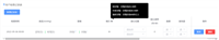
<h3>编辑所有数据</h3>
<table style="width: 100%; border-collapse: collapse;">
<thead>
<tr>
<th style="padding: 8px; text-align: left; background-color: #f2f2f2; color: #333;">序号</th>
<th style="padding: 8px; text-align: left; background-color: #f2f2f2; color: #333;">x轴数据</th>
<th style="padding: 8px; text-align: left; background-color: #f2f2f2; color: #333;">系列数据</th>
<th style="padding: 8px; text-align: left; background-color: #f2f2f2; color: #333;">操作</th>
</tr>
</thead>
<tbody>
<tr v-for="(item, index) in xaxisdata" :key="index">
<td style="border-bottom: 1px solid #ddd; padding: 8px;">{{ index + 1 }}</td>
<td style="border-bottom: 1px solid #ddd; padding: 8px;">
<input
:value="xaxisdata[index]"
@input="handlexaxischange(index, ($event.target as htmlinputelement).value)"
style="width: 100%; padding: 8px; border: 1px solid #ccc; border-radius: 4px;"
/>
</td>
<td style="border-bottom: 1px solid #ddd; padding: 8px;">
<input
:value="seriesdata[index]"
@input="handleserieschange(index, ($event.target as htmlinputelement).value)"
style="width: 100%; padding: 8px; border: 1px solid #ccc; border-radius: 4px;"
/>
</td>
<td style="border-bottom: 1px solid #ddd; padding: 8px;">
<button @click="deletedatapoint(index)" style="padding: 8px 16px; background-color: #ff4d4f; color: #fff; border: none; border-radius: 4px; cursor: pointer;">
删除
</button>
</td>
</tr>
</tbody>
</table>
<button @click="adddatapoint" style="margin-top: 10px; padding: 8px 16px; background-color: #5470c6; color: #fff; border: none; border-radius: 4px; cursor: pointer;">
添加数据点
</button>
<button @click="showmodalall = false" style="margin-top: 10px; padding: 8px 16px; background-color: #5470c6; color: #fff; border: none; border-radius: 4px; cursor: pointer;">
关闭
</button>
</div>
</div>
</template>
到此这篇关于使用vue和echarts创建交互式图表的代码示例的文章就介绍到这了,更多相关vue echarts交互式图表内容请搜索代码网以前的文章或继续浏览下面的相关文章希望大家以后多多支持代码网!


发表评论