通过plotly实现交互式数据可视化的步骤
在数据科学和数据分析领域,数据可视化是一种非常重要的技术。plotly 是一个功能强大的 python 可视化库,它可以帮助我们创建交互式的数据可视化图表。本文将介绍如何使用 plotly 实现交互式数据可视化,包括数据准备、图表创建和交互功能的添加。
步骤
1. 安装 plotly
首先,确保已经安装了 plotly。如果没有安装,可以使用 pip 进行安装:
pip install plotly
2. 准备数据
在进行数据可视化之前,需要准备好要可视化的数据。在本示例中,我们将使用一个简单的数据集。
import pandas as pd

# 创建示例数据
data = {
    'year': [2015, 2016, 2017, 2018, 2019],
    'sales': [100, 150, 200, 250, 300]
}

df = pd.dataframe(data)
3. 创建交互式图表
使用 plotly 来创建交互式图表非常简单。下面是一个简单的例子,创建一个折线图:
import plotly.graph_objs as go

# 创建折线图
trace = go.scatter(x=df['year'], y=df['sales'], mode='lines', name='sales')

# 创建布局
layout = go.layout(title='yearly sales', xaxis=dict(title='year'), yaxis=dict(title='sales'))

# 创建图表对象
fig = go.figure(data=[trace], layout=layout)

# 显示图表
fig.show()
4. 添加交互功能
plotly 提供了丰富的交互功能,可以让用户与图表进行互动。例如,我们可以添加鼠标悬停提示信息:
# 添加鼠标悬停提示信息
trace = go.scatter(x=df['year'], y=df['sales'], mode='lines', name='sales',
                   hoverinfo='x+y', line=dict(color='blue'))

# 创建布局
layout = go.layout(title='yearly sales', xaxis=dict(title='year'), yaxis=dict(title='sales'))

# 创建图表对象
fig = go.figure(data=[trace], layout=layout)

# 显示图表
fig.show()
5. 更多交互功能
除了鼠标悬停提示信息之外,plotly 还支持许多其他交互功能,如缩放、平移、选择和标记等。你可以根据需要添加这些功能来提升用户体验。
import pandas as pd
import plotly.graph_objs as go

# 创建示例数据
data = {
    'year': [2015, 2016, 2017, 2018, 2019],
    'sales': [100, 150, 200, 250, 300]
}

df = pd.dataframe(data)

# 创建折线图
trace = go.scatter(x=df['year'], y=df['sales'], mode='lines', name='sales',
                   hoverinfo='x+y', line=dict(color='blue'))

# 创建布局
layout = go.layout(title='yearly sales', xaxis=dict(title='year'), yaxis=dict(title='sales'))

# 创建图表对象
fig = go.figure(data=[trace], layout=layout)

# 显示图表
fig.show()
6. 导出图表
一旦你创建了交互式的图表,你可能想要将它导出到文件中以供分享或嵌入到网页中。plotly 提供了多种导出图表的方法,包括静态图片和交互式 html 文件。
导出静态图片
# 导出为静态图片
fig.write_image("sales_plot.png")
导出为 html 文件
# 导出为 html 文件
fig.write_html("sales_plot.html")
这样,你就可以轻松地将交互式图表分享给其他人或者嵌入到网页中。
import pandas as pd
import plotly.graph_objs as go

# 创建示例数据
data = {
    'year': [2015, 2016, 2017, 2018, 2019],
    'sales': [100, 150, 200, 250, 300]
}

df = pd.dataframe(data)

# 创建折线图
trace = go.scatter(x=df['year'], y=df['sales'], mode='lines', name='sales',
                   hoverinfo='x+y', line=dict(color='blue'))

# 创建布局
layout = go.layout(title='yearly sales', xaxis=dict(title='year'), yaxis=dict(title='sales'))

# 创建图表对象
fig = go.figure(data=[trace], layout=layout)

# 添加交互功能
fig.update_layout(
    xaxis=dict(
        rangeselector=dict(
            buttons=list([
                dict(count=1, label="1年", step="year", stepmode="backward"),
                dict(count=2, label="2年", step="year", stepmode="backward"),
                dict(count=3, label="3年", step="year", stepmode="backward"),
                dict(count=4, label="4年", step="year", stepmode="backward"),
                dict(step="all")
            ])
        ),
        rangeslider=dict(visible=true),
        type="date"
    )
)

# 导出为静态图片
fig.write_image("sales_plot.png")

# 导出为 html 文件
fig.write_html("sales_plot.html")

# 显示图表
fig.show()
通过以上步骤,你可以轻松地创建、定制并分享交互式的数据可视化图表,为数据分析工作增添更多的乐趣和效率!
7. 自定义图表样式
plotly 允许你对图表样式进行高度定制,以满足特定需求或者提升可视化效果。
修改线条样式
# 修改线条样式
trace = go.scatter(x=df['year'], y=df['sales'], mode='lines+markers', name='sales',
                   hoverinfo='x+y', line=dict(color='blue', width=2), marker=dict(size=8, color='red'))
调整布局
# 调整布局
layout = go.layout(title='yearly sales', xaxis=dict(title='year', showgrid=false), yaxis=dict(title='sales', showgrid=false))
添加标题和标签
# 添加标题和标签
fig.update_layout(title_text="yearly sales", xaxis_title="year", yaxis_title="sales")
通过以上调整,你可以根据需要自定义图表的外观和布局。
import pandas as pd
import plotly.graph_objs as go

# 创建示例数据
data = {
    'year': [2015, 2016, 2017, 2018, 2019],
    'sales': [100, 150, 200, 250, 300]
}

df = pd.dataframe(data)

# 创建折线图
trace = go.scatter(x=df['year'], y=df['sales'], mode='lines+markers', name='sales',
                   hoverinfo='x+y', line=dict(color='blue', width=2), marker=dict(size=8, color='red'))

# 创建布局
layout = go.layout(title='yearly sales', xaxis=dict(title='year', showgrid=false), yaxis=dict(title='sales', showgrid=false))

# 创建图表对象
fig = go.figure(data=[trace], layout=layout)

# 添加交互功能
fig.update_layout(
    xaxis=dict(
        rangeselector=dict(
            buttons=list([
                dict(count=1, label="1年", step="year", stepmode="backward"),
                dict(count=2, label="2年", step="year", stepmode="backward"),
                dict(count=3, label="3年", step="year", stepmode="backward"),
                dict(count=4, label="4年", step="year", stepmode="backward"),
                dict(step="all")
            ])
        ),
        rangeslider=dict(visible=true),
        type="date"
    )
)

# 添加标题和标签
fig.update_layout(title_text="yearly sales", xaxis_title="year", yaxis_title="sales")

# 导出为静态图片
fig.write_image("sales_plot.png")

# 导出为 html 文件
fig.write_html("sales_plot.html")

# 显示图表
fig.show()
通过以上步骤,你可以更加灵活地定制和分享交互式的数据可视化图表!
总结
在这篇文章中,我们学习了如何使用 plotly 实现交互式数据可视化的步骤。以下是我们探讨的主要内容:
安装 plotly:首先,我们确保安装了 plotly 库,它是一个功能强大的 python 可视化库。
准备数据:在进行数据可视化之前,我们需要准备好要可视化的数据。我们使用了一个简单的示例数据集作为演示。
创建交互式图表:我们使用 plotly 创建了一个交互式折线图,并学习了如何调整布局和添加交互功能,例如鼠标悬停提示信息和范围选择器。
导出图表:我们还学习了如何将交互式图表导出为静态图片或 html 文件,以便分享或嵌入到网页中。
自定义图表样式:最后,我们探讨了如何自定义图表样式,包括修改线条样式、调整布局以及添加标题和标签,以满足特定需求或提升可视化效果。
通过以上步骤,你可以轻松地创建、定制并分享交互式的数据可视化图表,为数据分析工作增添更多的乐趣和效率!
拓展:plotly实现数据可视化的五种动图形式
启动
如果你还没安装 plotly,只需在你的终端运行以下命令即可完成安装:
pip install plotly
安装完成后,就开始使用吧!
动画
在研究这个或那个指标的演变时,我们常涉及到时间数据。plotly 动画工具仅需一行代码就能让人观看数据随时间的变化情况,如下图所示:
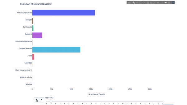
代码如下:
import plotly.express as px
from vega\_datasets import data
df = data.disasters()
df = df\[df.year > 1990\]
fig = px.bar(df,
             y="entity",
             x="deaths",
             animation\_frame="year",
             orientation='h',
             range\_x=\[0, df.deaths.max()\],
             color="entity")
# improve aesthetics (size, grids etc.)
fig.update\_layout(width=1000,
                  height=800,
                  xaxis\_showgrid=false,
                  yaxis\_showgrid=false,
                  paper\_bgcolor='rgba(0,0,0,0)',
                  plot\_bgcolor='rgba(0,0,0,0)',
                  title\_text='evolution of natural disasters',
                  showlegend=false)
fig.update\_xaxes(title\_text='number of deaths')
fig.update\_yaxes(title\_text='')
fig.show()
只要你有一个时间变量来过滤,那么几乎任何图表都可以做成动画。下面是一个制作散点图动画的例子:
import plotly.express as px
df = px.data.gapminder()
fig = px.scatter(
    df,
    x="gdppercap",
    y="lifeexp",
    animation\_frame="year",
    size="pop",
    color="continent",
    hover\_name="country",
    log\_x=true,
    size\_max=55,
    range\_x=\[100, 100000\],
    range\_y=\[25, 90\],

    #   color\_continuous\_scale=px.colors.sequential.emrld
)
fig.update\_layout(width=1000,
                  height=800,
                  xaxis\_showgrid=false,
                  yaxis\_showgrid=false,
                  paper\_bgcolor='rgba(0,0,0,0)',
                  plot\_bgcolor='rgba(0,0,0,0)')
太阳图
太阳图(sunburst chart)是一种可视化 group by 语句的好方法。如果你想通过一个或多个类别变量来分解一个给定的量,那就用太阳图吧。
假设我们想根据性别和每天的时间分解平均小费数据,那么相较于表格,这种双重 group by 语句可以通过可视化来更有效地展示。
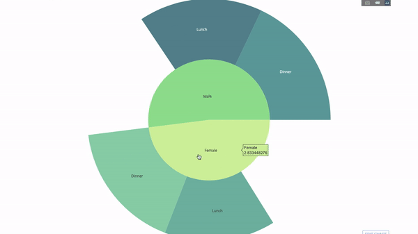
这个图表是交互式的,让你可以自己点击并探索各个类别。你只需要定义你的所有类别,并声明它们之间的层次结构(见以下代码中的 parents 参数)并分配对应的值即可,这在我们案例中即为 group by 语句的输出。
import plotly.graph\_objects as go
import plotly.express as px
import numpy as np
import pandas as pd
df = px.data.tips()
fig = go.figure(go.sunburst(
    labels=\["female", "male", "dinner", "lunch", 'dinner ', 'lunch '\],
    parents=\["", "", "female", "female", 'male', 'male'\],
    values=np.append(
        df.groupby('sex').tip.mean().values,
        df.groupby(\['sex', 'time'\]).tip.mean().values),
    marker=dict(colors=px.colors.sequential.emrld)),
                layout=go.layout(paper\_bgcolor='rgba(0,0,0,0)',
                                 plot\_bgcolor='rgba(0,0,0,0)'))

fig.update\_layout(margin=dict(t=0, l=0, r=0, b=0),
                  title\_text='tipping habbits per gender, time and day')
fig.show()
现在我们向这个层次结构再添加一层:
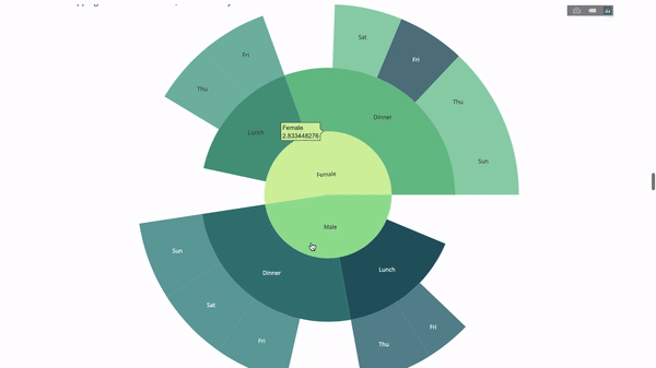
为此,我们再添加另一个涉及三个类别变量的 group by 语句的值。
import plotly.graph\_objects as go
import plotly.express as px
import pandas as pd
import numpy as np
df = px.data.tips()
fig = go.figure(go.sunburst(labels=\[
    "female", "male", "dinner", "lunch", 'dinner ', 'lunch ', 'fri', 'sat',
    'sun', 'thu', 'fri ', 'thu ', 'fri  ', 'sat  ', 'sun  ', 'fri   ', 'thu   '
\],
                            parents=\[
                                "", "", "female", "female", 'male', 'male',
                                'dinner', 'dinner', 'dinner', 'dinner',
                                'lunch', 'lunch', 'dinner ', 'dinner ',
                                'dinner ', 'lunch ', 'lunch '
                            \],
                            values=np.append(
                                np.append(
                                    df.groupby('sex').tip.mean().values,
                                    df.groupby(\['sex',
                                                'time'\]).tip.mean().values,
                                ),
                                df.groupby(\['sex', 'time',
                                            'day'\]).tip.mean().values),
                            marker=dict(colors=px.colors.sequential.emrld)),
                layout=go.layout(paper\_bgcolor='rgba(0,0,0,0)',
                                 plot\_bgcolor='rgba(0,0,0,0)'))
fig.update\_layout(margin=dict(t=0, l=0, r=0, b=0),
                  title\_text='tipping habbits per gender, time and day')

fig.show()
平行类别
另一种探索类别变量之间关系的方法是以下这种流程图。你可以随时拖放、高亮和浏览值,非常适合演示时使用。
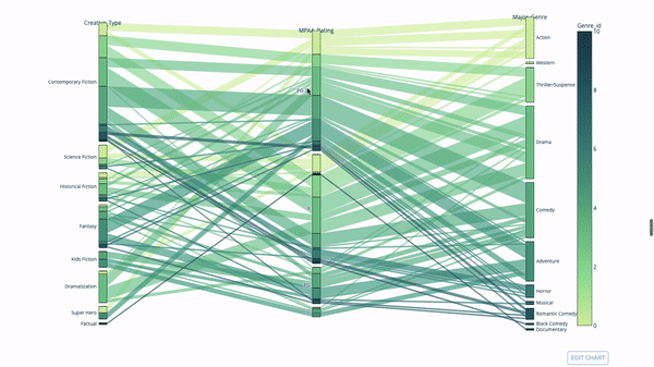
代码如下:
import plotly.express as px
from vega\_datasets import data
import pandas as pd
df = data.movies()
df = df.dropna()
df\['genre\_id'\] = df.major\_genre.factorize()\[0\]
fig = px.parallel\_categories(
    df,
    dimensions=\['mpaa\_rating', 'creative\_type', 'major\_genre'\],
    color="genre\_id",
    color\_continuous\_scale=px.colors.sequential.emrld,
)
fig.show()
平行坐标图
平行坐标图是上面的图表的连续版本。这里,每一根弦都代表单个观察。这是一种可用于识别离群值(远离其它数据的单条线)、聚类、趋势和冗余变量(比如如果两个变量在每个观察上的值都相近,那么它们将位于同一水平线上,表示存在冗余)的好用工具。
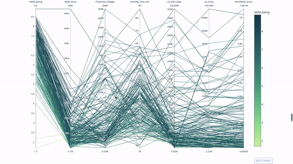
代码如下:
 import plotly.express as px
from vega\_datasets import data
import pandas as pd
df = data.movies()
df = df.dropna()
df\['genre\_id'\] = df.major\_genre.factorize()\[0\]
fig = px.parallel\_coordinates(
    df,
    dimensions=\[
        'imdb\_rating', 'imdb\_votes', 'production\_budget', 'running\_time\_min',
        'us\_gross', 'worldwide\_gross', 'us\_dvd\_sales'
    \],
    color='imdb\_rating',
    color\_continuous\_scale=px.colors.sequential.emrld)
fig.show()
量表图和指示器
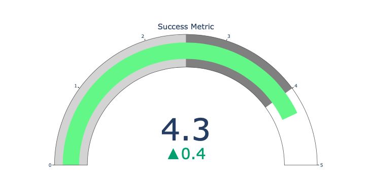
量表图仅仅是为了好看。在报告 kpi 等成功指标并展示其与你的目标的距离时,可以使用这种图表。
指示器在业务和咨询中非常有用。它们可以通过文字记号来补充视觉效果,吸引观众的注意力并展现你的增长指标。
import plotly.graph\_objects as go
fig = go.figure(go.indicator(
    domain = {'x': \[0, 1\], 'y': \[0, 1\]},
    value = 4.3,
    mode = "gauge+number+delta",
    title = {'text': "success metric"},
    delta = {'reference': 3.9},
    gauge = {'bar': {'color': "lightgreen"},
        'axis': {'range': \[none, 5\]},
             'steps' : \[
                 {'range': \[0, 2.5\], 'color': "lightgray"},
                 {'range': \[2.5, 4\], 'color': "gray"}\],
          }))
fig.show()
到此这篇关于通过plotly实现交互式数据可视化的流程步骤的文章就介绍到这了,更多相关plotly交互式数据可视化内容请搜索代码网以前的文章或继续浏览下面的相关文章希望大家以后多多支持代码网!


发表评论