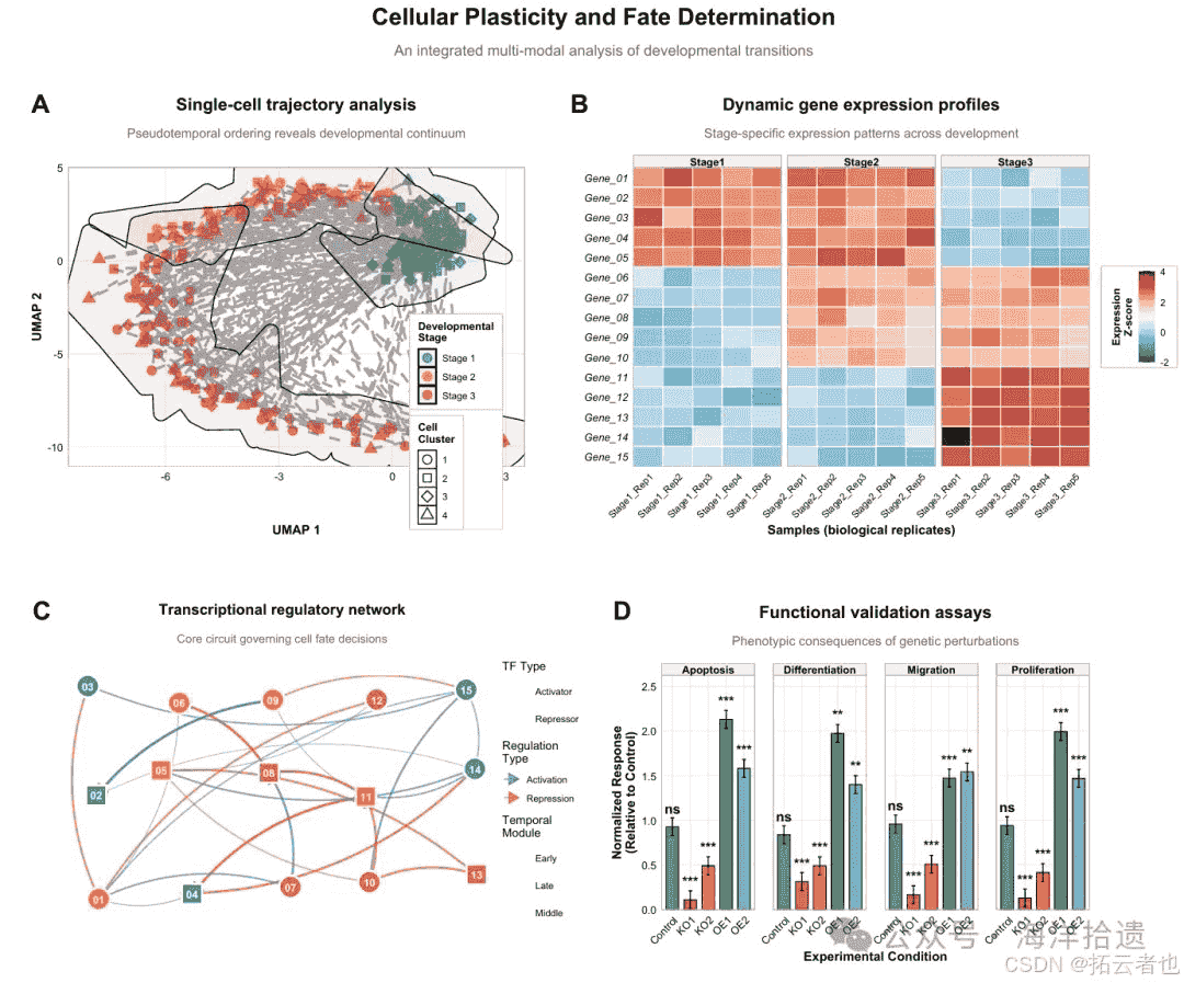
尝试用r来绘制生物方面的统计图(热图、柱状图等),绘图如下:
绘制上图所需的r语言代码如下:
# ======================
# 1. 安装与加载必要包
# ======================
# 定义所需的r包名称向量
required_packages <- c("tidyverse", "patchwork", "ggrepel", "viridis",
                       "ggsci", "rcolorbrewer", "ggforce", "ggtext", "scales")

# 检查哪些包尚未安装:比较required_packages与已安装包的差异
new_packages <- required_packages[!(required_packages %in% installed.packages()[,"package"])]
# 如果有未安装的包,则安装它们
if(length(new_packages)) install.packages(new_packages)

# 加载所有必需的包到当前r
library(tidyverse)     # 数据处理和可视化核心套件(含ggplot2、dplyr等)
library(patchwork)     # 用于组合多个ggplot图形
library(ggrepel)       # 提供避免重叠的智能文本标签
library(viridis)       # 提供科学、美观且色盲友好的颜色渐变
library(ggsci)         # 提供基于顶级期刊(如nature、science)的调色板
library(rcolorbrewer)  # 提供经典colorbrewer调色板
library(ggforce)       # 扩展ggplot2功能(如geom_mark_hull用于标注区域)
library(ggtext)        # 支持在图形标题、标签中使用markdown/html格式文本
library(scales)        # 提供调整坐标轴和图例格式的函数

# ======================
# 2. 设置全局图形主题(符合nature标准)
# ======================
# 自定义一个名为nature_theme的函数,用于定义全局图形样式
nature_theme <- function(base_size = 11, base_family = "sans") {
  # 以theme_minimal为基础,用%+replace%运算符完全替换其部分元素
  theme_minimal(base_size = base_size, base_family = base_family) %+replace%
    theme(
      # 文本元素
      plot.title = element_text(size = 16, face = "bold", hjust = 0.5,
                                margin = margin(b = 12)), # 主标题:加粗、居中,下边距12点
      plot.subtitle = element_text(size = 12, hjust = 0.5, color = "gray40",
                                   margin = margin(b = 15)), # 副标题:灰色、居中,下边距15点
      axis.title = element_text(size = 12, face = "bold"), # 坐标轴标题:加粗
      axis.text = element_text(size = 10, color = "black"), # 坐标轴刻度标签
      legend.title = element_text(face = "bold", size = 10), # 图例标题:加粗
      legend.text = element_text(size = 9), # 图例项目文本

      # 网格与背景
      panel.grid.major = element_line(color = "gray90", linewidth = 0.3), # 主网格线:浅灰色,细线
      panel.grid.minor = element_blank(), # 隐藏次网格线,使图表更简洁
      panel.border = element_rect(fill = na, color = "gray70", linewidth = 0.5), # 为每个绘图面板添加细边框
      plot.background = element_rect(fill = "white", color = na), # 设置整个图形背景为纯白

      # 边距(上、右、下、左)
      plot.margin = margin(15, 20, 15, 20), # 为图形四周留出适当空白

      # 图例样式
      legend.background = element_rect(fill = "white", color = "gray80"), # 图例背景框
      legend.box.background = element_rect(color = "gray80", fill = "white"), # 当有多个图例时的外框
      legend.margin = margin(5, 8, 5, 8), # 图例内部的边距
      legend.key = element_rect(fill = "white"), # 图例中颜色键(小方块)的背景

      # 分面(facet)标签样式
      strip.text = element_text(face = "bold", size = 10), # 分面标签文字:加粗
      strip.background = element_rect(fill = "gray95", color = "gray70") # 分面标签背景:浅灰
    )
}

# 应用自定义主题为后续所有ggplot图形的默认主题
theme_set(nature_theme())

# 设置随机数种子,确保每次运行代码时随机生成的数据和图形布局完全相同
set.seed(2024)

# ======================
# 3. 模拟数据生成
# ======================
# 3.1 模拟单细胞轨迹数据 (子图a)
n_cells <- 300 # 定义模拟的细胞数量
pseudotime <- runif(n_cells, 0, 10) # 为每个细胞生成0到10之间的随机伪时间值
# 根据伪时间将细胞划分为三个阶段
cell_stages <- cut(pseudotime, breaks = c(0, 3, 6, 10),
                   labels = c("stage 1", "stage 2", "stage 3"))
# 创建一个包含所有单细胞数据的tibble(现代数据框)
trajectory_data <- tibble(
  cell_id = sprintf("cell_%04d", 1:n_cells), # 生成格式化的细胞id
  pseudotime = pseudotime, # 伪时间值
  # 基于伪时间计算umap坐标(加入螺旋趋势和随机噪声),模拟真实的降维轨迹
  umap_1 = pseudotime * cos(pseudotime/2) + rnorm(n_cells, 0, 0.5),
  umap_2 = pseudotime * sin(pseudotime/2) + rnorm(n_cells, 0, 0.5),
  stage = cell_stages, # 细胞所属阶段
  cluster = sample(1:4, n_cells, replace = true, prob = c(0.3, 0.25, 0.25, 0.2)) # 随机分配聚类
)

# 3.2 模拟基因表达热图数据 (子图b)
genes <- paste0("gene_", sprintf("%02d", 1:15)) # 生成15个基因的名称
# 生成样本名称:3个阶段,每个阶段5个生物学重复
samples <- paste0("stage", rep(1:3, each = 5), "_rep", rep(1:5, 3))

set.seed(123) # 为热图数据设置特定种子,确保这部分数据稳定
# 初始化一个15行(基因)×15列(样本)的零矩阵
expression_matrix <- matrix(0, nrow = length(genes), ncol = length(samples))
rownames(expression_matrix) <- genes # 设置行名为基因
colnames(expression_matrix) <- samples # 设置列名为样本

# 创建生物学上合理的表达模式:模拟基因在不同阶段特异性高表达
expression_matrix[1:5, 1:10] <- expression_matrix[1:5, 1:10] + 2.5  # 基因1-5在早期(样本1-10)高表达
expression_matrix[6:10, 6:15] <- expression_matrix[6:10, 6:15] + 2.0  # 基因6-10在中期高表达
expression_matrix[11:15, 11:15] <- expression_matrix[11:15, 11:15] + 3.0  # 基因11-15在晚期高表达

# 添加随机噪声,模拟真实实验数据中的技术变异
expression_matrix <- expression_matrix + matrix(rnorm(length(genes)*length(samples), 0, 0.3),
                                                nrow = length(genes))

# 将宽格式矩阵转换为长格式数据框,这是ggplot绘制热图所需的结构
heatmap_data <- as.data.frame(expression_matrix) %>%
  rownames_to_column(var = "gene") %>% # 将行名转换为"gene"列
  pivot_longer(cols = -gene, names_to = "sample", values_to = "expression") %>% # 转换列
  mutate(
    stage = str_extract(sample, "stage[123]"), # 从样本名中提取阶段信息
    stage = factor(stage, levels = c("stage1", "stage2", "stage3")), # 转换为因子并指定顺序
    gene = factor(gene, levels = rev(genes)) # 将基因转为因子,并反转顺序使热图从上到下基因1开始
  )

# 3.3 模拟调控网络数据 (子图c - 简版)
set.seed(123) # 为网络数据设置种子
n_nodes <- 15 # 定义节点数量,减少节点数使图形更清晰

# 在固定网格上创建节点坐标
network_nodes <- tibble(
  node_id = paste0("tf_", sprintf("%02d", 1:n_nodes)), # 转录因子节点id
  # 将节点大致放置在5×3的网格上
  x = rep(1:5, each = 3, length.out = n_nodes),
  y = rep(c(1, 2, 3), times = 5, length.out = n_nodes),
  type = sample(c("activator", "repressor"), n_nodes, replace = true, prob = c(0.6, 0.4)),
  module = sample(c("early", "middle", "late"), n_nodes, replace = true, prob = c(0.4, 0.3, 0.3))
) %>%
  # 添加轻微随机抖动,避免节点在网格上完全对齐,使图形更自然
  mutate(
    x = x + runif(n(), -0.2, 0.2),
    y = y + runif(n(), -0.2, 0.2)
  )

# 创建边数据(确保from和to不同)
set.seed(456) # 为边的生成使用不同的种子
n_edges <- 25 # 定义边的数量
edge_list <- list() # 初始化一个空列表来存储边

# 使用循环生成边,确保连接不重复且不是自连接
for(i in 1:n_edges) {
  repeat { # 重复抽样直到找到符合条件的节点对
    from_idx <- sample(1:n_nodes, 1) # 随机选取一个起始节点索引
    to_idx <- sample(1:n_nodes, 1) # 随机选取一个终止节点索引
    if(from_idx != to_idx) { # 确保不是同一个节点(避免自环)
      # 检查是否已存在完全相同的连接
      existing <- sapply(edge_list, function(e)
        e$from == from_idx && e$to == to_idx)
      if(!any(existing)) { # 如果此连接尚不存在
        edge_list[[i]] <- list( # 将此边信息添加到列表中
          from_idx = from_idx,
          to_idx = to_idx,
          weight = runif(1, 0.4, 1), # 边的权重(强度)
          type = sample(c("activation", "repression"), 1, prob = c(0.7, 0.3)) # 调控类型
        )
        break # 找到有效边,退出当前repeat循环
      }
    }
  }
}

network_edges <- bind_rows(edge_list) # 将边列表转换为一个tibble数据框

# 将索引转换为实际的节点id和坐标,方便绘图时映射
network_edges <- network_edges %>%
  mutate(
    from = network_nodes$node_id[from_idx], # 根据索引获取起始节点名称
    to = network_nodes$node_id[to_idx], # 根据索引获取终止节点名称
    from_x = network_nodes$x[from_idx], # 起始节点的x坐标
    from_y = network_nodes$y[from_idx], # 起始节点的y坐标
    to_x = network_nodes$x[to_idx], # 终止节点的x坐标
    to_y = network_nodes$y[to_idx] # 终止节点的y坐标
  )

# 3.4 模拟功能验证数据 (子图d)
# 创建所有条件与检测指标的组合
validation_data <- expand.grid(
  condition = c("control", "ko1", "ko2", "oe1", "oe2"), # 实验条件:对照、两个敲低、两个过表达
  assay = c("proliferation", "differentiation", "migration", "apoptosis"), # 功能检测指标
  stringsasfactors = false # 返回字符向量而非因子
)

validation_data <- validation_data %>%
  mutate(
    # 根据条件分配不同的模拟测量值,反映预期的生物学效应
    value = case_when(
      condition == "control" ~ rnorm(n(), 1.0, 0.1), # 对照组的基准值
      condition == "ko1" ~ rnorm(n(), 0.3, 0.15), # 敲低1:值较低
      condition == "ko2" ~ rnorm(n(), 0.6, 0.12), # 敲低2:值中等
      condition == "oe1" ~ rnorm(n(), 1.8, 0.18), # 过表达1:值较高
      condition == "oe2" ~ rnorm(n(), 1.4, 0.14) # 过表达2:值稍高
    ),
    # 模拟p值:对照设为1,处理组根据效应大小生成不同显著水平的p值
    p_value = case_when(
      condition == "control" ~ 1.0,
      condition %in% c("ko1", "ko2") ~ 10^(-runif(n(), 3, 8)), # 敲低通常效应强,p值很小
      condition %in% c("oe1", "oe2") ~ 10^(-runif(n(), 2, 6)) # 过表达效应稍弱,p值稍大
    ),
    # 根据p值范围转换为显著性标记符号
    significance = case_when(
      p_value > 0.05 ~ "ns", # 不显著
      p_value > 0.01 ~ "*", # p < 0.05
      p_value > 0.001 ~ "**", # p < 0.01
      true ~ "***" # p < 0.001
    )
  )

# ======================
# 4. 绘制各个子图(带a、b、c、d标号)
# ======================
# 4.1 子图a:单细胞轨迹图
p_a <- ggplot(trajectory_data, aes(x = umap_1, y = umap_2)) + # 初始化ggplot,设置x和y轴美学映射
  # 绘制散点:颜色和填充根据stage,形状根据cluster
  geom_point(aes(color = stage, fill = stage, shape = as.factor(cluster)),
             size = 3.5, alpha = 0.85, stroke = 0.8) + # size点大小,alpha透明度,stroke边框粗细
  # 绘制一条连接所有点的路径,用于指示轨迹方向
  geom_path(aes(group = 1), color = "gray40", alpha = 0.6,
            linewidth = 1.2, linetype = "dashed") +
  # 使用ggforce的geom_mark_hull为每个stage绘制凸包区域并进行标注
  geom_mark_hull(aes(fill = stage, label = stage),
                 alpha = 0.1, expand = unit(8, "mm"), # alpha区域透明度,expand区域扩展范围
                 concavity = 2, size = 0.5) + # concavity控制凸包形状
  # 手动设置颜色标度(适用于分类变量)
  scale_color_manual(values = c("stage 1" = "#4e79a7",
                                "stage 2" = "#f28e2b",
                                "stage 3" = "#e15759"),
                     name = "developmental\nstage") + # \n在图例标题中换行
  scale_fill_manual(values = c("stage 1" = "#4e79a7",
                               "stage 2" = "#f28e2b",
                               "stage 3" = "#e15759"),
                    name = "developmental\nstage") +
  scale_shape_manual(values = c(21, 22, 23, 24), name = "cell\ncluster") + # 设置形状编号
  # 添加图形标题和坐标轴标签
  labs(title = "single-cell trajectory analysis",
       subtitle = "pseudotemporal ordering reveals developmental continuum",
       x = "umap 1", y = "umap 2",
       tag = "a") + # 添加"a"标号
  # 精细控制图例的顺序和外观
  guides(
    color = guide_legend(order = 1), # 颜色图例排第一
    fill = guide_legend(order = 1), # 填充图例与颜色图例顺序相同(合并显示)
    shape = guide_legend(order = 2) # 形状图例排第二
  ) +
  # 调整主题元素:将图例放置在图形内部
  theme(
    legend.position = c(0.85, 0.15), # 图例位置(相对坐标:0到1之间)
    legend.box = "vertical", # 多个图例垂直排列
    legend.spacing.y = unit(0.2, "cm"), # 图例项之间的垂直间距
    plot.tag = element_text(size = 24, face = "bold"), # 设置标号样式:大号加粗
    plot.tag.position = c(0.02, 0.98) # 标号位置:左上角(x=2%,y=98%)
  )

# 4.2 子图b:基因表达热图
p_b <- ggplot(heatmap_data, aes(x = sample, y = gene, fill = expression)) +
  # 使用geom_tile绘制热图:每个单元格是一个瓷砖
  geom_tile(color = "white", linewidth = 0.5) + # 设置瓷砖间的白色缝隙
  # 设置填充颜色梯度:使用rdbu(红-蓝)渐变色,但用rev()反转,使高表达为红,低表达为蓝
  scale_fill_gradientn(
    colors = rev(brewer.pal(11, "rdbu")), # 从rcolorbrewer包获取11个颜色的rdbu渐变
    limits = c(-2, 4), # 固定颜色映射的值域范围
    breaks = c(-2, 0, 2, 4), # 在图例上显示这几个刻度
    labels = c("-2", "0", "2", "4"), # 图例刻度标签
    name = "expression\nz-score", # 图例标题
    guide = guide_colorbar( # 自定义连续型图例(颜色条)的外观
      barwidth = unit(0.5, "cm"), # 颜色条宽度
      barheight = unit(3, "cm"), # 颜色条高度
      title.position = "left", # 标题位置
      title.hjust = 0.5 # 标题水平对齐方式
    )
  ) +
  # 调整坐标轴:取消x轴和y轴的默认扩展(使瓷砖紧贴坐标轴)
  scale_x_discrete(expand = expansion(mult = 0)) +
  scale_y_discrete(expand = expansion(mult = 0)) +
  # 添加图形标题和坐标轴标签
  labs(title = "dynamic gene expression profiles",
       subtitle = "stage-specific expression patterns across development",
       x = "samples (biological replicates)", y = "",
       tag = "b") + # 添加"b"标号
  # 进一步自定义主题
  theme(
    axis.text.x = element_text(angle = 45, hjust = 1, size = 9), # x轴标签旋转45度
    axis.text.y = element_text(size = 10, face = "italic"), # y轴(基因名)用斜体
    panel.grid = element_blank(), # 热图中不需要网格线
    legend.position = "right", # 图例在右侧
    legend.title = element_text(angle = 90, vjust = 0.5, hjust = 0.5), # 图例标题旋转90度
    plot.tag = element_text(size = 24, face = "bold"), # 设置标号样式:大号加粗
    plot.tag.position = c(0.02, 0.98) # 标号位置:左上角
  ) +
  # 按stage对样本进行分面,使不同阶段的样本在x轴上分组显示
  facet_grid(. ~ stage, scales = "free_x", space = "free_x") # 每个分面x轴独立,空间自由分配

# 4.3 子图c:简版调控网络图 (使用 geom_curve)
p_c <- ggplot() + # 初始化一个空的ggplot,因为我们将分图层添加网络边和节点
  # 第一层:绘制曲线边,使用geom_curve
  geom_curve(data = network_edges,
             aes(x = from_x, xend = to_x,
                 y = from_y, yend = to_y,
                 color = type, alpha = weight), # 颜色和透明度根据边属性映射
             curvature = 0.2, # 设置曲线弯曲度
             linewidth = network_edges$weight * 1.2, # 线宽与权重成正比(注意:此映射在aes外)
             arrow = arrow(length = unit(0.15, "inches"), type = "closed")) + # 添加箭头表示方向
  # 第二层:在边的上方绘制节点,防止边覆盖节点
  geom_point(data = network_nodes,
             aes(x = x, y = y, fill = module, shape = type),
             size = 9, color = "white", stroke = 1.5) + # 节点:大尺寸,白色边框
  # 第三层:在节点上添加文本标签
  geom_text(data = network_nodes,
            aes(x = x, y = y, label = str_remove(node_id, "tf_")), # 标签只显示编号
            size = 3.5, fontface = "bold", color = "white") +
  # 设置边的颜色标度
  scale_color_manual(values = c("activation" = alpha("#4e79a7", 0.8), # 激活边用半透明蓝色
                                "repression" = alpha("#e15759", 0.8)), # 抑制边用半透明红色
                     name = "regulation\ntype") + # 添加图例标题
  # 设置节点的填充颜色标度
  scale_fill_manual(values = c("early" = "#4e79a7",
                               "middle" = "#f28e2b",
                               "late" = "#e15759"),
                    name = "temporal\nmodule") + # 添加图例标题
  # 设置节点的形状标度
  scale_shape_manual(values = c("activator" = 21, "repressor" = 22), # 21和22是带填充的形状
                     name = "tf type") + # 添加图例标题
  # 设置边的透明度标度,但不显示对应的图例(guide = "none")
  scale_alpha_continuous(range = c(0.4, 0.9), guide = "none") +
  # 添加图形标题和副标题
  labs(title = "transcriptional regulatory network",
       subtitle = "core circuit governing cell fate decisions",
       x = "", y = "", # 清空坐标轴标签,网络图通常不需要
       tag = "c") + # 添加"c"标号
  theme_void() + # 使用完全空白的主题(无坐标轴、网格、背景等)
  theme(
    # 在void主题基础上,添加回标题和副标题的样式
    plot.title = element_text(size = 14, face = "bold", hjust = 0.5, margin = margin(b = 5)),
    plot.subtitle = element_text(size = 11, hjust = 0.5, color = "gray40", margin = margin(b = 10)),
    legend.position = "right", # 图例在右侧
    legend.box = "vertical", # 多个图例垂直排列
    legend.spacing.y = unit(0.2, "cm"), # 图例项间距
    plot.margin = margin(10, 10, 10, 10), # 图形边距
    plot.tag = element_text(size = 24, face = "bold"), # 设置标号样式:大号加粗
    plot.tag.position = c(0.02, 0.98) # 标号位置:左上角
  ) +
  coord_fixed(ratio = 1) # 固定纵横比为1:1,防止图形拉伸变形

# 4.4 子图d:功能验证条形图
p_d <- ggplot(validation_data, aes(x = condition, y = value, fill = condition)) +
  # 绘制条形图
  geom_bar(stat = "identity", width = 0.7, color = "black", linewidth = 0.4) + # stat='identity'表示直接使用y值
  # 在条形顶端添加误差条(此处为固定值的模拟误差)
  geom_errorbar(aes(ymin = value - 0.1, ymax = value + 0.1),
                width = 0.2, linewidth = 0.5, color = "black") + # width误差条两端短横线的宽度
  # 在条形上方添加显著性标记
  geom_text(aes(label = significance, y = value + 0.15),
            size = 4.5, fontface = "bold", vjust = 0) + # vjust=0使文本底部对齐指定y位置
  # 为每个条件手动指定填充色
  scale_fill_manual(values = c("control" = "#4e79a7",
                               "ko1" = "#e15759", "ko2" = "#f28e2b",
                               "oe1" = "#59a14f", "oe2" = "#76b7b2"),
                    name = "condition") +
  # 调整y轴:底部从0开始,顶部扩展15%的空间用于放置显著性标记
  scale_y_continuous(expand = expansion(mult = c(0, 0.15)),
                     breaks = seq(0, 2.5, 0.5)) + # 设置y轴刻度间隔为0.5
  # 添加图形标题和坐标轴标签
  labs(title = "functional validation assays",
       subtitle = "phenotypic consequences of genetic perturbations",
       x = "experimental condition",
       y = "normalized response\n(relative to control)",
       tag = "d") + # 添加"d"标号
  # 按检测指标(assay)进行分面,在一行中显示所有指标
  facet_wrap(~ assay, nrow = 1) +
  theme(
    axis.text.x = element_text(angle = 45, hjust = 1, size = 10), # x轴标签旋转
    strip.text = element_text(size = 10, face = "bold"), # 分面标签加粗
    panel.spacing.x = unit(1.2, "lines"), # 增加分面之间的水平间距
    legend.position = "none", # 隐藏图例(颜色信息已通过x轴和条形本身展示)
    plot.tag = element_text(size = 24, face = "bold"), # 设置标号样式:大号加粗
    plot.tag.position = c(0.02, 0.98) # 标号位置:左上角
  )

# ======================
# 5. 组合子图并添加主标题
# ======================
# 使用patchwork语法组合图形:| 表示并排,/ 表示换行
final_plot <-
  (p_a | p_b) /  # 第一行:a和b并列
  (p_c | p_d) +  # 第二行:c和d并列

  # 使用plot_annotation添加整个组合图的主标题、副标题和脚注
  plot_annotation(
    title = '<span style="font-size:22pt; font-weight:bold;">cellular plasticity and fate determination</span>',
    subtitle = 'an integrated multi-modal analysis of developmental transitions',
    caption = '**fig. 1 |** single-cell trajectory analysis reveals developmental continuum (a). \ndynamic gene expression profiles show stage-specific patterns (b). \ncore transcriptional network regulates cell fate decisions (c). \nfunctional validation confirms phenotypic consequences of genetic perturbations (d).',
    theme = theme(
      # 主标题使用ggtext的element_markdown以解析html标签(如<span>)
      plot.title = element_markdown(hjust = 0.5, margin = margin(t = 5, b = 10)),
      # 副标题
      plot.subtitle = element_text(hjust = 0.5, size = 14, color = "gray40",
                                   margin = margin(b = 20)),
      # 脚注也使用element_markdown以解析加粗标记(** **)
      plot.caption = element_markdown(hjust = 0, size = 10, color = "gray30",
                                      lineheight = 1.4, margin = margin(t = 20)),
      plot.background = element_rect(fill = "white", color = na) # 确保组合图背景为白色
    )
  )

# ======================
# 6. 保存高质量图片
# ======================
# 保存为高分辨率png(用于在文档、ppt中查看或初步提交)
ggsave("nature_main_figure_with_labels.png", plot = final_plot,
       width = 16, height = 14, dpi = 600, bg = "white") # 尺寸宽16英寸高14英寸,分辨率600dpi

# 保存为矢量pdf(强烈推荐用于期刊投稿,可无限缩放不失真)
ggsave("nature_main_figure_with_labels.pdf", plot = final_plot,
       width = 16, height = 14, device = cairo_pdf) # 使用cairo_pdf设备确保字体嵌入

# 在r控制台输出提示信息
cat("✅ 主图已生成完成!\n")
cat("📁 已保存文件:\n")
cat("   • nature_main_figure_with_labels.png (600 dpi png)\n")
cat("   • nature_main_figure_with_labels.pdf (矢量pdf,推荐投稿使用)\n")
cat("\n💡 图片特点:\n")
cat("   • 符合nature期刊图形规范\n")
cat("   • 四面板科学叙事结构(a、b、c、d标号清晰)\n")
cat("   • 一致的配色方案和视觉风格\n")
cat("   • 专业标注和科学图注\n")
总结
到此这篇关于如何使用r语言绘制nature级别图片的文章就介绍到这了,更多相关r语言绘制nature级别图片内容请搜索代码网以前的文章或继续浏览下面的相关文章希望大家以后多多支持代码网!


发表评论