 我要评论
我要评论效果
原理
- 提示内容的定位:子绝父相
- 鼠标悬浮前,提示内容
visibility: hidden; - 通过
:hover触发鼠标悬浮样式,提示内容变为visibility: visible;
代码
<!doctype html>
<html lang="en">
<head>
<meta charset="utf-8" />
<meta name="viewport" content="width=device-width, initial-scale=1.0" />
<title>css 模拟 html title 效果(兼容旧浏览器)</title>
<style>
/* 基本样式设置 */
.tipbox {
position: relative;
display: inline-block;
}
/* 定义提示框样式,初始隐藏 */
.tipbox .tipcontent {
position: absolute;
top: 100%;
left: 50%;
color: rgb(105, 100, 100);
background-color: #f9f9f9;
border: 1px solid #ccc;
border-radius: 2px;
font-size: 12px;
padding: 2px 4px;
box-shadow: 3px 3px 3px rgba(0, 0, 0, 0.3);
white-space: nowrap;
visibility: hidden;
}
/* 鼠标悬停时显示提示框 */
.tipbox:hover .tipcontent {
visibility: visible;
}
</style>
</head>
<body style="padding: 40px">
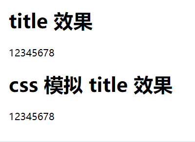
<h1>title 效果</h1>
<div title="12345678">12345678</div>
<h1>css 模拟 title 效果</h1>
<div class="tipbox">
12345678
<div class="tipcontent">12345678</div>
</div>
</body>
</html>到此这篇关于css模拟 html 的 title 属性(鼠标悬浮显示提示文字效果)的文章就介绍到这了,更多相关css html title属性内容请搜索代码网以前的文章或继续浏览下面的相关文章,希望大家以后多多支持代码网!


发表评论