1. 前言
桑基图是一种用于直观显示流向数据的可视化工具,特别适合展示复杂的网络关系和资源流动。在前端项目中,通过结合 vue 3 和 echarts,可以快速实现交互性强、样式美观的桑基图。本文将通过完整的代码示例,带你一步步完成一个桑基图的实现。
2. 项目准备
2.1 安装必要的依赖
在 vue 3 项目中使用 echarts,首先需要安装 echarts 包:
npm install echarts
2.2 创建项目结构
在项目中创建一个组件文件,例如 sankeychart.vue,用于封装桑基图的实现逻辑和展示。
3. 代码实现
以下是完整的代码实现,包括模板、脚本和样式。
<!--
* @author: 彭麒
* @date: 2025/1/20
* @email: 1062470959@qq.com
* @description: 此源码版权归吉檀迦俐所有,可供学习和借鉴或商用。
-->
<template>
<div class="w-full justify-start flex h-[180px] items-center pl-10">
<backbutton @click="goback"/>
</div>
<div class="font-bold text-[24px]">在vue3中使用echarts实现桑基图</div>
<div class="chart-container">
<div ref="chartref" class="sankey-chart"></div>
</div>
</template>
<script setup lang="ts">
import { ref, onmounted, onunmounted } from 'vue'
import * as echarts from 'echarts'
import backbutton from "@/views/components/backbutton.vue";
import router from "@/router";
const goback = () => {
settimeout(() => {
router.push('/echarts')
}, 1000)
}
const chartref = ref<htmlelement | null>(null)
let chart: echarts.echarts | null = null
const initchart = () => {
if (!chartref.value) return
chart = echarts.init(chartref.value)
const option = {
color: ['#7bc074', '#709ef1', '#f59363'],
series: [{
type: 'sankey',
draggable: false,
left: '8%',
right: '8%',
data: [
// 左点
{ name: '安徽', label: { position: 'left' } },
{ name: '广西', label: { position: 'left' } },
{ name: '江西', label: { position: 'left' } },
{ name: '青海', label: { position: 'left' } },
{ name: '湖南', label: { position: 'left' } },
{ name: '四川', label: { position: 'left' } },
{ name: '湖北', label: { position: 'left' } },
// 右点
{ name: '江苏 ', label: { position: 'right' } },
{ name: '广东 ', label: { position: 'right' } },
{ name: '浙江 ', label: { position: 'right' } },
{ name: '重庆', label: { position: 'right' } }
],
links: [
{ source: '安徽', target: '江苏 ', value: 18.68 },
{ source: '安徽', target: '浙江 ', value: 12.38 },
{ source: '广西', target: '广东 ', value: 30.36 },
{ source: '江西', target: '广东 ', value: 12.48 },
{ source: '江西', target: '浙江 ', value: 12.67 },
{ source: '青海', target: '广东 ', value: 13.47 },
{ source: '青海', target: '浙江 ', value: 11.03 },
{ source: '湖南', target: '广东 ', value: 19.11 },
{ source: '四川', target: '重庆 ', value: 15.02 },
{ source: '湖北', target: '广东 ', value: 11.66 }
],
label: {
normal: {
color: 'rgba(9, 27, 61, 0.6)',
fontsize: 14,
fontweight: '400'
}
},
itemstyle: {
normal: {
borderwidth: 1,
bordercolor: '#aaa'
}
},
linestyle: {
normal: {
color: 'gradient',
bordercolor: 'black',
borderwidth: 0,
opacity: 0.3,
curveness: 0.6
}
}
}]
}
chart.setoption(option)
}
const handleresize = () => {
chart?.resize()
}
onmounted(() => {
initchart()
window.addeventlistener('resize', handleresize)
})
onunmounted(() => {
chart?.dispose()
window.removeeventlistener('resize', handleresize)
})
</script>
<style scoped>
.chart-container {
width: 100%;
height: 70%;
min-height: 600px;
background-color: #fff;
}
.sankey-chart {
width: 100%;
height: 100%;
}
@media screen and (max-width: 768px) {
.chart-container {
min-height: 400px;
}
}
@media screen and (max-width: 480px) {
.chart-container {
min-height: 300px;
}
}
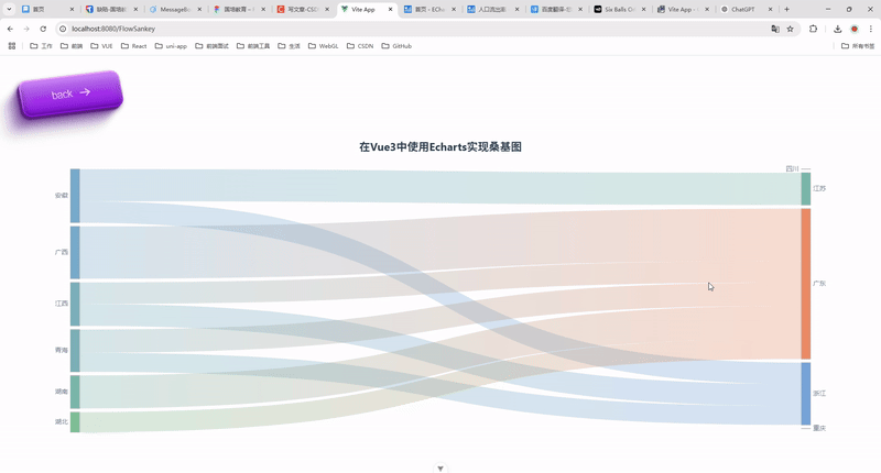
</style>4. 运行效果
运行项目后,访问相应页面,即可看到一个动态的桑基图,展示了各省份之间的流向数据。
5. 功能扩展
数据动态更新
- 将图表数据通过 api 获取,并动态更新图表内容。
- 示例:
chart.setoption({ series: [{ data: newdata, links: newlinks }] });交互功能
- 添加鼠标悬停事件,展示详细信息。
- 使用
tooltip配置实现:
tooltip: { trigger: 'item', formatter: '{b}: {c}', }6. 总结
本文通过完整的代码示例,展示了如何使用 vue 3 和 echarts 实现桑基图。从项目搭建到细节优化,都进行了详细讲解。希望这篇文章对你有所帮助!
到此这篇关于vue3使用echarts实现桑基图的代码示例的文章就介绍到这了,更多相关vue3 echarts桑基图内容请搜索代码网以前的文章或继续浏览下面的相关文章希望大家以后多多支持代码网!


发表评论