 我要评论
我要评论需求:
有现在这样一段使用 echarts 的 vue3 代码:
<template>
<div ref="chartref" style="width: 600px; height: 400px;"></div>
</template>
<script setup>
import {getcurrentinstance, onmounted, onunmounted, ref} from 'vue';
const chartref = ref(null);
let chartinstance = null;
// 通过 getcurrentinstance 访问全局属性
const {proxy} = getcurrentinstance();
onmounted(() => {
chartinstance = proxy.$echarts.init(chartref.value);
chartinstance.setoption({
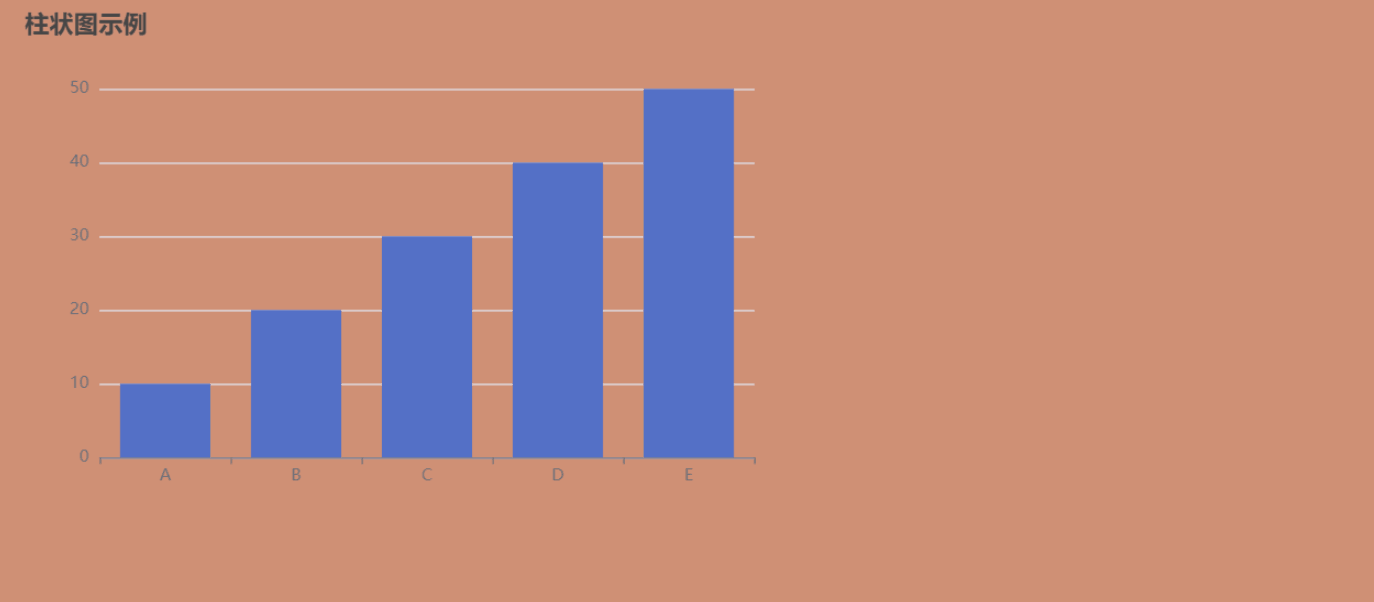
title: {text: '柱状图示例'},
tooltip: {},
xaxis: {data: ['a', 'b', 'c', 'd', 'e']},
yaxis: {},
series: [{type: 'bar', data: [10, 20, 30, 40, 50]}]
});
});
onunmounted(() => {
chartinstance?.dispose(); // 销毁实例
});
</script>作用是在界面显示一个柱状图:

问题是在页面缩放时,图表大小始终固定:
希望图表能够根据页面宽度自动调整,特别是在页面缩放时。
解决:
在代码中,chartref的div被固定设置为600px宽和400px高,现在需要修改这部分,让图表始终占据页面的宽度,并能够响应窗口大小的变化。
为实现自适应宽度。通常可以通过css来设置容器的宽度为100%,这样它会填充父容器的宽度。
但仅仅设置css可能不够,因为echarts实例在初始化后不会自动调整大小,除非显式调用图表实例的 resize 方法。
所以,解决方案的大致步骤应该是:
- 修改模板中的div样式,将宽度设置为100%,这样它会根据父容器自适应。
- 在vue组件中添加一个监听窗口大小变化的事件,当窗口resize时,触发echarts实例的resize方法。
- 确保在组件卸载时移除事件监听,避免内存泄漏。
代码:
<template>
<!-- 外层容器用于控制图表宽度,高度可根据需求调整 -->
<div class="chart-container">
<div ref="chartref" class="chart"></div>
</div>
</template>
<script setup>
import { getcurrentinstance, onmounted, onunmounted, ref } from 'vue';
const chartref = ref(null);
let chartinstance = null;
const { proxy } = getcurrentinstance();
// 处理窗口缩放
const handleresize = () => {
if (chartinstance) {
// 添加防抖优化性能(可选)
chartinstance.resize();
}
};
onmounted(() => {
// 初始化图表
chartinstance = proxy.$echarts.init(chartref.value);
chartinstance.setoption({
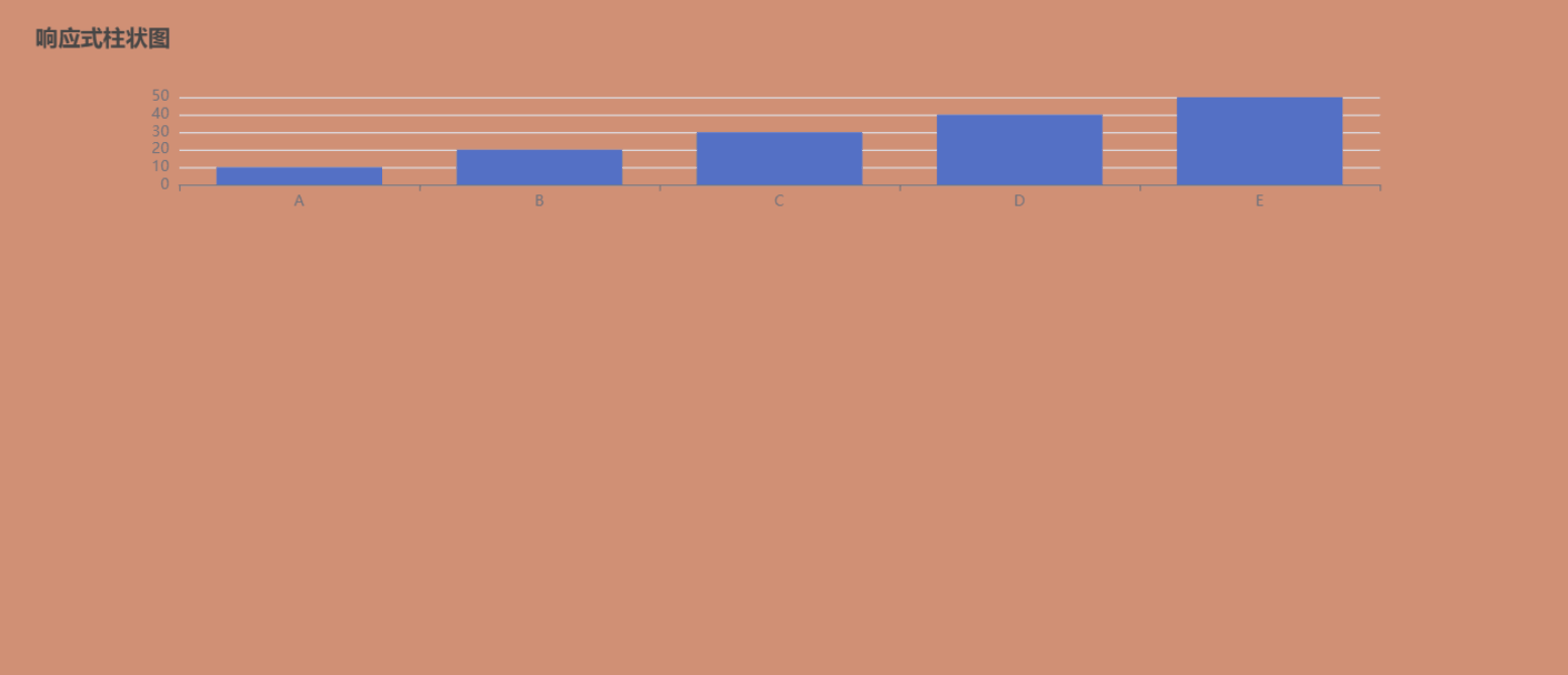
title: { text: '响应式柱状图' },
tooltip: {},
xaxis: { data: ['a', 'b', 'c', 'd', 'e'] },
yaxis: {},
series: [{ type: 'bar', data: [10, 20, 30, 40, 50] }]
});
// 监听窗口变化
window.addeventlistener('resize', handleresize);
// 初始执行一次确保尺寸正确
settimeout(handleresize, 0);
});
onunmounted(() => {
window.removeeventlistener('resize', handleresize);
chartinstance?.dispose();
});
</script>
<style scoped>
.chart-container {
width: 100%;
padding: 20px; /* 可根据需求调整 */
}
.chart {
width: 100%;
height: 200px; /* 固定高度,可改为 min-height 或使用 calc 动态计算 */
/* 可选:添加最大宽度限制 */
max-width: 1200px;
margin: 0 auto;
}
/* 移动端适配 */
@media (max-width: 768px) {
.chart {
height: 300px;
}
}
</style>效果如下:
主要修改点说明:
1,容器结构优化:
- 添加外层容器 .chart-container 控制布局
- 图表元素使用百分比宽度 width: 100%
2,响应式处理:
window.addeventlistener('resize', handleresize);监听窗口缩放事件,触发图表 resize 方法
3,自动调整逻辑:
const handleresize = () => {
  chartinstance?.resize();
};
调用 echarts 实例的 resize() 方法自适应容器
4,css 增强:
- 添加响应式高度(通过媒体查询)
- 限制最大宽度避免过宽
- 添加安全间距(padding/margin)
如果需要高度也自适应,可以:
// 在 handleresize 中动态计算高度
const containerwidth = chartref.value.offsetwidth;
const aspectratio = 9 / 16; // 16:9 比例
chartref.value.style.height = `${containerwidth * aspectratio}px`;
chartinstance.resize();
响应式断点:
/* 在样式中添加更多断点 */
@media (max-width: 480px) {
  .chart {
    height: 250px;
  }
}
父容器控制:确保外层父元素有正确的布局设置
/* 在父组件中 */
.parent-container {
  width: 100%;
  display: flex;
  justify-content: center;
}
扩展:
1,防抖处理
是否需要考虑防抖处理,避免频繁触发resize导致性能问题。但echarts的resize方法本身有一定的优化,可能不需要额外处理,但根据具体情况可以添加。
// 防抖版 resize(在 handleresize 顶部添加)
let resizetimer;
cleartimeout(resizetimer);
resizetimer = settimeout(() => {
  chartinstance.resize();
}, 200);
2,多图表并列缩放问题
以两个图表并排并考虑缩放为例,这涉及到布局和响应式处理两个方面。
布局方面,我需要考虑使用css flexbox或者grid来实现并排。
响应式方面,需要确保每个图表都能在窗口大小变化时正确调整尺寸,并且可能需要在移动设备上切换为垂直排列。
接下来,我需要回忆echarts的resize方法是否正确应用,是否需要为每个图表实例单独调用resize。需要确保每个图表容器都有正确的宽度设置,比如各占50%或者使用flexbox的自动调整。
<template>
  <!-- 使用 flex 布局容器 -->
  <div class="charts-container">
    <!-- 单个图表容器 -->
    <div class="chart-wrapper">
      <div ref="chartref1" class="chart"></div>
    </div>
    <!-- 第二个图表容器 -->
    <div class="chart-wrapper">
      <div ref="chartref2" class="chart"></div>
    </div>
  </div>
</template>
<script setup>
import { getcurrentinstance, onmounted, onunmounted, ref } from 'vue';
const chartref1 = ref(null);
const chartref2 = ref(null);
let chartinstance1 = null;
let chartinstance2 = null;
const { proxy } = getcurrentinstance();
// 公共配置项
const baseoption = {
  tooltip: {},
  xaxis: { data: ['a', 'b', 'c', 'd', 'e'] },
  yaxis: {},
};
// 初始化图表
const initchart = (ref, option) => {
  const chart = proxy.$echarts.init(ref.value);
  chart.setoption(option);
  return chart;
};
// 带防抖的 resize 处理
let resizetimer;
const handleresize = () => {
  cleartimeout(resizetimer);
  resizetimer = settimeout(() => {
    chartinstance1?.resize();
    chartinstance2?.resize();
  }, 200);
};
onmounted(() => {
  // 初始化两个图表
  chartinstance1 = initchart(chartref1, {
    ...baseoption,
    title: { text: '图表1' },
    series: [{ type: 'bar', data: [10, 20, 30, 40, 50] }]
  });
  chartinstance2 = initchart(chartref2, {
    ...baseoption,
    title: { text: '图表2' },
    series: [{ type: 'bar', data: [50, 40, 30, 20, 10] }]
  });
  // 监听窗口变化
  window.addeventlistener('resize', handleresize);
  // 初始调整
  handleresize();
});
onunmounted(() => {
  window.removeeventlistener('resize', handleresize);
  chartinstance1?.dispose();
  chartinstance2?.dispose();
});
</script>
<style scoped>
/* 主容器:flex 布局 */
.charts-container {
  display: flex;
  gap: 20px; /* 图表间距 */
  width: 100%;
  padding: 20px;
  box-sizing: border-box;
}
/* 单个图表容器 */
.chart-wrapper {
  flex: 1; /* 平分剩余空间 */
  min-width: 0; /* 解决 flex 容器溢出问题 */
}
.chart {
  width: 100%;
  height: 400px; /* 统一高度 */
  background: #fff;
  border-radius: 8px;
  box-shadow: 0 2px 12px rgba(0,0,0,0.1);
}
/* 移动端响应式 */
@media (max-width: 768px) {
  .charts-container {
    flex-direction: column; /* 垂直排列 */
  }
  .chart {
    height: 300px;
  }
}
</style>
效果如下:

1,布局方案:
使用 display: flex 创建弹性容器gap: 20px 设置图表间距flex: 1 使两个图表容器平分可用空间min-width: 0 修复 flex 容器溢出问题
2,响应式控制:
媒体查询 @media (max-width: 768px) 实现移动端垂直布局统一高度设置保证视觉一致性容器宽度始终为 100% 适配父元素
3,图表控制:
封装 initchart 方法复用初始化逻辑使用防抖函数优化频繁 resize 性能同时处理两个图表的 resize 事件
4,样式增强:
添加阴影和圆角提升视觉效果设置 box-sizing: border-box 避免布局错位背景色设置保证图表可见性
到此这篇关于在vue 3中使 echarts 图表宽度自适应变化的文章就介绍到这了,更多相关vue echarts 图表内容请搜索代码网以前的文章或继续浏览下面的相关文章希望大家以后多多支持代码网!


发表评论