 我要评论
我要评论前言
首先抛开 vue 本身,假设需要给某个 dom 元素实现一些过渡动画,那么下面这些事是必须的:
- 实现目标元素不同时刻下的样式,常见做法就是抽取在不同的 css 选择器中
- 根据不同时刻切换不同的 css 选择器以达到样式的变化
- 设置样式过度的方式和时间,如:transition: all .5s ease
而在 vue 中实现过渡动画,那就不得不提到其内置的 transition 组件,而 transition 组件帮我们实现了第一件事,就是对组件不同时刻设置不同的 css 选择器,甚至于可以对这个选择器进行自定义,因此,我们只需要完成后面两件事即可,当然这里对 transition 组件的用法就不过多进行介绍.
当然这里的实现动画的方式,会从下面几个方面来实现:
css3 transition属性css3 @keyframes帧动画- 第三方库
animate.css - 第三方库
gsap —— greensock animation platform,在官方文档中有提及的
<transition> 组件 + css3 transition 属性
话不多说,直接来实现一个简单的 显示/隐藏 的过渡动画:
- 显示时:从左侧滑入,且透明度增大
- 隐藏时:从右侧滑出,且透明度减小
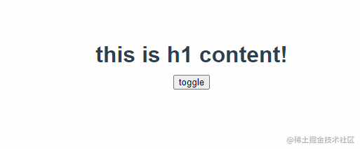
// toggle.vue
<script setup lang="ts">
import { ref } from 'vue'

const isshow = ref(true)

const toggle = () => {
  isshow.value = !isshow.value
}

</script>

<template>
  <transition name="fade">
    <h1 v-if="isshow">this is h1 content!</h1>
  </transition>
  <div>
    <button @click="toggle">toggle</button>
  </div>
</template>

<style>
.fade-enter-from,
.fade-leave-to {
  opacity: 0;
}

.fade-enter-from {
  transform: translatex(-30px);
}

.fade-enter-to ,
.fade-leave-to {
  transform: translatex(30px);
}

.fade-enter-to,
.fade-leave-from {
  opacity: 1;
}

.fade-enter-active,
.fade-leave-active {
  transition: all .5s ease;
}

h1 {
  width: 300px;
  margin: 10px auto;
}
</style>
<transition> 组件 + css3 @keyframes 帧动画
css 中除了使用 transition 属性实现不同样式间的过渡,也可以直接使用 @keyframes 来实现帧动画.

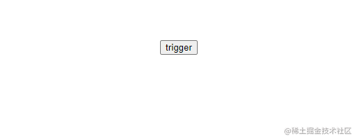
// hang.vue
<script setup lang="ts">
import { ref } from 'vue'

const isshow = ref(true)

const hang = () => {
  isshow.value = !isshow.value
}

</script>

<template>
  <transition name="fade">
    <h1 v-if="isshow">this is h1 content!</h1>
  </transition>
  <div>
    <button @click="hang">trigger</button>
  </div>
</template>

<style>
.fade-enter-active {
  animation: hang 0.5s 1 ease;
}

.fade-leave-active {
  animation: hang 0.5s 1 ease reverse;
}

@keyframes hang {
  0% {
    transform: translatey(30px) rotatez(30deg);
    opacity: 0;
  }

  25% {
    transform: translatey(24px) rotatez(24deg);
    opacity: 0.3;
  }

  50% {
    transform: translatey(18px) rotatez(18deg);
    opacity: 0.6;
  }

  75% {
    transform: translatey(12px) rotatez(12deg);
    opacity: 0.8;
  }

  100% {
    transform: translatey(-5px) rotatez(0deg);
    opacity: 1;
  }
}

h1 {
  width: 300px;
  margin: 10px auto;
}
</style>
<transition> 组件 + 第三方库 animate.css
直接使用 animate.css 中对应效果的动画名,配合 animation 属性进行使用即可.
对应的效果和动画名可通过 animat.style 效果预览 查看
// animate.vue
<script setup lang="ts">
import { ref } from 'vue'
import './animate.css'

const isshow = ref(true)

const hang = () => {
  isshow.value = !isshow.value
}

</script>

<template>
  <transition name="fade">
    <h1 v-if="isshow">this is h1 content!</h1>
  </transition>
  <div>
    <button @click="hang">trigger</button>
  </div>
</template>

<style>
.fade-enter-active {
  animation: flip 0.5s 1 ease;
}

.fade-leave-active {
  animation: flip 0.5s 1 ease reverse;
}

h1 {
  width: 300px;
  margin: 10px auto;
}
</style>
<transition> 组件 + 第三方库 gsap
通过上面几个简单的动画例子,其实不难发现,无论是自己实现动画,还是使用已有的 css 样式库都有一个缺点,就是不够灵活,比如:某些 css 属性值只能是一个不变的值
如果有些场景需要一些更复杂和灵活的 css 样式,那么显然前面提到的方式并不符合实际需求,换句话说,如果需要在 js 中实现样式的过渡,以及设置动态的 css 样式属性值时,就有必要使用一些第三方库,如:gsap,帮助我们更方便的实现需求.
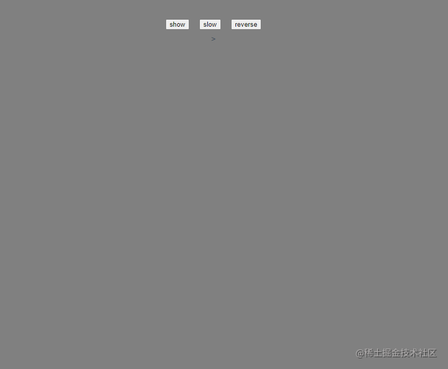
// gsap.vue
<script setup>
import { ref } from "vue";
import gsap from "gsap";

let timescaletween = null;

const enter = (el) => {
  const tl = gsap.timeline(),
    atom = el,
    dur = 2,
    del = 0.5;

  tl.fromto(
    ".electron",
    { rotationx: 90 },
    {
      rotationz: -360,
      rotationx: 90,
      ease: "none",
      duration: dur,
      stagger: {
        each: -del,
        repeat: -1,
      },
    },
    0
  );
  tl.to(
    ".path",
    {
      rotationz: 360,
      ease: "none",
      duration: dur,
      stagger: {
        each: -del,
        repeat: -1,
      },
    },
    0
  );

  // add a rotation to the whole atom
  gsap.set(atom, { transformorigin: "center center" });
  gsap.to(atom, { rotation: 360, ease: "none", repeat: -1, duration: 300 });

  // skip the loading
  tl.progress(0.9999);

  timescaletween = gsap.to(tl, {
    duration: 0.75,
    timescale: 0.1,
    paused: true,
  });
};

const slow = () => {
  timescaletween.play()
}

const reverse = () => {
  timescaletween.reverse()
}

const isshow = ref(false);

const show = () => {
  isshow.value = true
};
</script>

<template>
  <transition name="fade" @enter="enter">
    <div class="atom" v-if="isshow">
      <div class="orbit">
        <div class="path">
          <div class="electron"></div>
        </div>
      </div>
      <div class="orbit">
        <div class="path">
          <div class="electron"></div>
        </div>
      </div>
      <div class="orbit">
        <div class="path">
          <div class="electron"></div>
        </div>
      </div>
      <div class="orbit">
        <div class="path">
          <div class="electron"></div>
        </div>
      </div>
      <div class="nucleus"></div>
    </div>
  </transition>
  <div>
    <button @click="show">show</button>
    <button @click="slow">slow</button>
    <button @click="reverse">reverse</button>
  </div>
</template>

<style>
@import url("https://fonts.googleapis.com/css?family=signika+negative:300,400&display=swap");
body {
  font-family: "signika negative", sans-serif;
  font-weight: 300;
  background: grey;
  overflow: hidden;
  color: white;
  text-align: center;
}

.atom {
  position: absolute;
  top: 50%;
  left: 50%;
  width: 300px;
  height: 300px;
  perspective: 1000;
  margin-left: -170px;
  margin-top: -146px;
  transform-style: preserve-3d;
}

.nucleus {
  position: absolute;
  top: 50%;
  left: 50%;
  margin: -10px 0 0 -10px;
  width: 25px;
  height: 25px;
  border-radius: 50%;
  background: #272727;
}

.orbit {
  position: absolute;
  top: 0;
  left: 0;
  width: 300px;
  height: 300px;
  border-radius: 300px;
  border: 5px solid #ccc;
  transform-style: preserve-3d;
  transform: rotatex(80deg) rotatey(20deg);
}

.orbit:nth-child(2) {
  transform: rotatex(80deg) rotatey(70deg);
}
.orbit:nth-child(3) {
  transform: rotatex(80deg) rotatey(-20deg);
}
.orbit:nth-child(4) {
  transform: rotatex(80deg) rotatey(-50deg);
}

.path {
  width: 300px;
  height: 300px;
  position: relative;
  transform-style: preserve-3d;
}

.electron {
  position: absolute;
  top: -5px;
  left: 50%;
  margin-left: -5px;
  width: 10px;
  height: 10px;
  border-radius: 10px;
  background: #ccc;
}
button{
  margin: 10px;
}
</style>
本文通过四种方式实现了一些简单动画,但其实在 vue 中实现动画也不一定要使用 transition 组件,具体场景还是得具体分析.
以上就是vue3中实现过渡动画的方法小结的详细内容,更多关于vue3过渡动画的资料请关注代码网其它相关文章!


发表评论