 我要评论
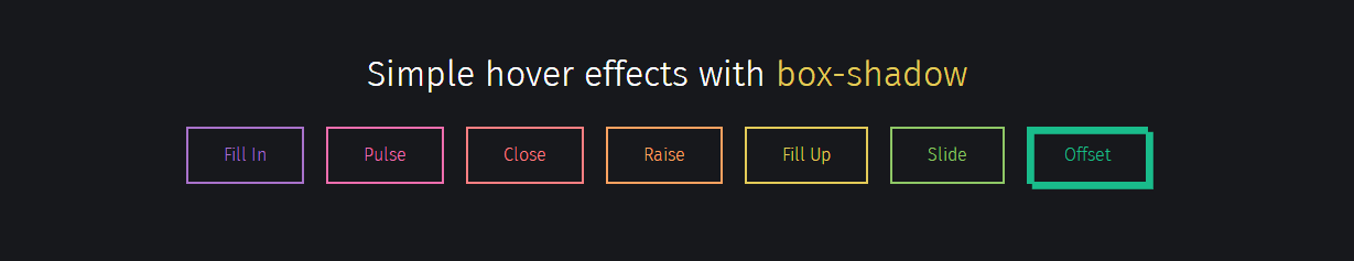
我要评论实现效果:
实现代码:
html
<div class="buttons">
  <h1>simple hover effects with <code>box-shadow</code></h1>
  <button class="fill">fill in</button>
  <button class="pulse">pulse</button>
  <button class="close">close</button>
  <button class="raise">raise</button>
  <button class="up">fill up</button>
  <button class="slide">slide</button>
  <button class="offset">offset</button>
</div>
css
/*
  https://developer.mozilla.org/en/docs/web/css/box-shadow
  box-shadow: [inset?] [top] [left] [blur] [size] [color];

  tips:
    - we're setting all the blurs to 0 since we want a solid fill.
    - add the inset keyword so the box-shadow is on the inside of the element
    - animating the inset shadow on hover looks like the element is filling in from whatever side you specify ([top] and [left] accept negative values to become [bottom] and [right])
    - multiple shadows can be stacked
    - if you're animating multiple shadows, be sure to keep the same number of shadows so the animation is smooth. otherwise, you'll get something choppy.
*/
.fill:hover,
.fill:focus {
  box-shadow: inset 0 0 0 2em var(--hover);
}

.pulse:hover,
.pulse:focus {
  -webkit-animation: pulse 1s;
          animation: pulse 1s;
  box-shadow: 0 0 0 2em rgba(255, 255, 255, 0);
}

@-webkit-keyframes pulse {
  0% {
    box-shadow: 0 0 0 0 var(--hover);
  }
}

@keyframes pulse {
  0% {
    box-shadow: 0 0 0 0 var(--hover);
  }
}
.close:hover,
.close:focus {
  box-shadow: inset -3.5em 0 0 0 var(--hover), inset 3.5em 0 0 0 var(--hover);
}

.raise:hover,
.raise:focus {
  box-shadow: 0 0.5em 0.5em -0.4em var(--hover);
  transform: translatey(-0.25em);
}

.up:hover,
.up:focus {
  box-shadow: inset 0 -3.25em 0 0 var(--hover);
}

.slide:hover,
.slide:focus {
  box-shadow: inset 6.5em 0 0 0 var(--hover);
}

.offset {
  box-shadow: 0.3em 0.3em 0 0 var(--color), inset 0.3em 0.3em 0 0 var(--color);
}
.offset:hover, .offset:focus {
  box-shadow: 0 0 0 0 var(--hover), inset 6em 3.5em 0 0 var(--hover);
}

.fill {
  --color: #a972cb;
  --hover: #cb72aa;
}

.pulse {
  --color: #ef6eae;
  --hover: #ef8f6e;
}

.close {
  --color: #ff7f82;
  --hover: #ffdc7f;
}

.raise {
  --color: #ffa260;
  --hover: #e5ff60;
}

.up {
  --color: #e4cb58;
  --hover: #94e458;
}

.slide {
  --color: #8fc866;
  --hover: #66c887;
}

.offset {
  --color: #19bc8b;
  --hover: #1973bc;
}

button {
  color: var(--color);
  transition: 0.25s;
}
button:hover, button:focus {
  border-color: var(--hover);
  color: #fff;
}

body {
  color: #fff;
  background: #17181c;
  font: 300 1em "fira sans", sans-serif;
  justify-content: center;
  align-content: center;
  align-items: center;
  text-align: center;
  min-height: 100vh;
  display: flex;
}

button {
  background: none;
  border: 2px solid;
  font: inherit;
  line-height: 1;
  margin: 0.5em;
  padding: 1em 2em;
}

h1 {
  font-weight: 400;
}

code {
  color: #e4cb58;
  font: inherit;
}
以上就是css3 制作的彩虹按钮样式的详细内容,更多关于css3 按钮样式的资料请关注代码网其它相关文章!


发表评论