 我要评论
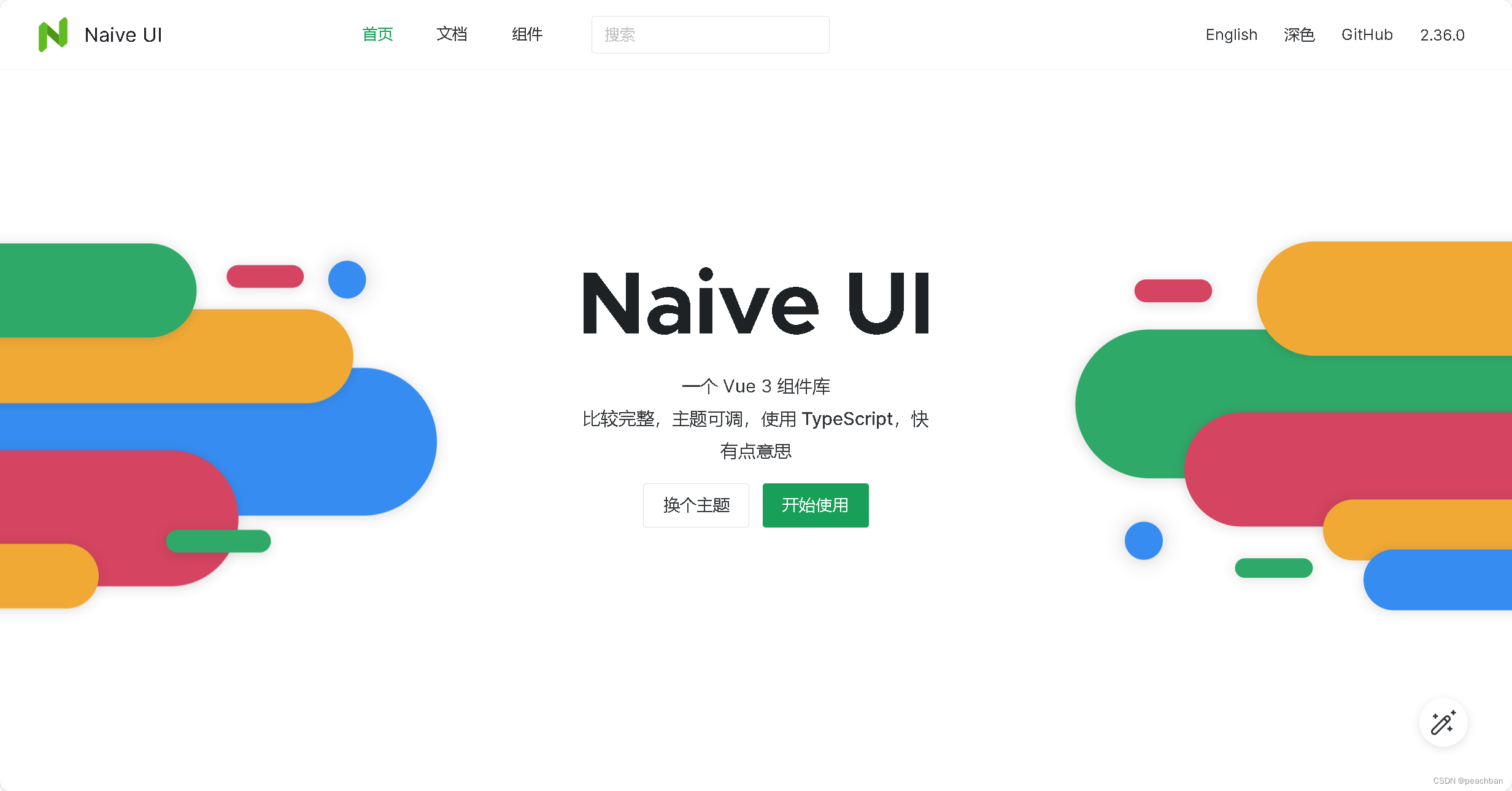
我要评论一.naiveui 一个vue3组件库
naive ui
注意:naive-ui 仅支持 vue3。如果你在使用 vue2,可以去看看别的库。
二.安装
1.npm
使用npm 安装。
npm i -d naive-ui2.字体
npm i -d vfonts(1) 配置字体
naive ui 可以和 vfonts 配合,你可以简单的引入 vfonts 中的字体,包含常规字体和等宽字体。只需要在你 app 的入口文件导入字体,即可调整 naive ui 的字体。
// 你 app 的入口 js 文件
// ...

// 通用字体
import 'vfonts/lato.css'
// 等宽字体
import 'vfonts/firacode.css'

const app = createapp()
app.use(naive)

// ...
注意:不同 vfonts 字体提供的字重不同,在使用 lato、opensans 的时候你需要全局调整 naive-ui 的字重配置。
<!-- 调整 naive-ui 的字重配置 -->
<n-config-provider :theme-overrides="{ common: { fontweightstrong: '600' } }">
  <app />
</n-config-provider>
3.图标
naive-ui 建议使用 xicons 作为图标库。
<template>
  <n-icon size="40">
    <game-controller-outline />
  </n-icon>
  <n-icon size="40" color="#0e7a0d">
    <game-controller />
  </n-icon>
  <n-icon size="40" :component="gamecontroller" />
</template>

<script lang="ts">
import { gamecontrolleroutline, gamecontroller } from '@vicons/ionicons5'
import { definecomponent } from 'vue'

export default definecomponent({
  components: {
    gamecontroller,
    gamecontrolleroutline
  },
  setup () {
    return {
      gamecontroller
    }
  }
})
</script>
三.按需引入
naive ui 支持 tree shaking,组件、语言、主题均可 tree-shaking。
默认情况组件主题为亮色,语言为英文,无需额外导入。
1.手动引入
<script>
  import { definecomponent } from 'vue'
  import { nconfigprovider, ninput, ndatepicker, nspace } from 'naive-ui'
  // theme
  import { createtheme, inputdark, datepickerdark } from 'naive-ui'
  // locale & datelocale
  import { zhcn, datezhcn } from 'naive-ui'

  export default definecomponent({
    components: {
      nconfigprovider,
      ninput,
      ndatepicker,
      nspace
    },
    setup() {
      return {
        darktheme: createtheme([inputdark, datepickerdark]),
        zhcn,
        datezhcn
      }
    }
  })
</script>

<template>
  <n-config-provider :theme="darktheme" :locale="zhcn" :date-locale="datezhcn">
    <n-space vertical>
      <n-input />
      <n-date-picker />
    </n-space>
  </n-config-provider>
</template>

<style>
  body {
    background: black;
  }
</style>
2.自动引入
可以使用 unplugin-auto-import 插件来自动导入 api。
如果使用模板方式进行开发,可以使用 unplugin-vue-components 插件来按需自动加载组件,插件会自动解析模板中的使用到的组件,并导入组件。
// vite.config.ts
import { defineconfig } from 'vite'
import vue from '@vitejs/plugin-vue'
import autoimport from 'unplugin-auto-import/vite'
import components from 'unplugin-vue-components/vite'
import { naiveuiresolver } from 'unplugin-vue-components/resolvers'

// https://vitejs.dev/config/
export default defineconfig({
  plugins: [
    vue(),
    autoimport({
      imports: [
        'vue',
        {
          'naive-ui': [
            'usedialog',
            'usemessage',
            'usenotification',
            'useloadingbar'
          ]
        }
      ]
    }),
    components({
      resolvers: [naiveuiresolver()]
    })
  ]
})
3.按需全局安装组件(手动)
import { createapp } from 'vue'
import {
  // create naive ui
  create,
  // component
  nbutton
} from 'naive-ui'

const naive = create({
  components: [nbutton]
})

const app = createapp()
app.use(naive)
安装后,你可以这样在 sfc 中使用你安装的组件。
<template>
  <n-button>naive-ui</n-button>
</template>
四.调整主题
naive ui 通过使用 n-config-provider 调整主题。
默认情况下所有组件均为亮色主题,无需任何配置。
1.使用暗色主题
将 n-config-provider 的 theme 设为从 naive-ui 导入的 darktheme 来设定暗色主题。
若 theme 为 undefined 则不会影响内部组件的主题。
<template>
  <n-config-provider :theme="darktheme">
    <app />
  </n-config-provider>
</template>

<script>
  import { definecomponent } from 'vue'
  import { darktheme } from 'naive-ui'

  export default definecomponent({
    setup() {
      return {
        darktheme
      }
    }
  })
</script>
2.调整主题变量
你不需要写任何 css(scss、less...)。
配置的全局主题变量会对后代组件生效的主题变量覆盖。
通过设定 n-config-provider 的 theme-overrides 来调整主题变量。naive-ui 导出了 globalthemeoverrides 类型帮助你定义主题。
具体可使用变量请参考 globalthemeoverrides 类型提示。
如果想要查看更多的主题变量,可在 naive ui 主页的右下角的 edit 按钮查看。
可以修改对应的主题变量,导出后可以拿到 themeoverrides 对象。
<script>
  import { nconfigprovider } from 'naive-ui'

  /**
   * js 文件下使用这个做类型提示
   * @type import('naive-ui').globalthemeoverrides
   */
  const themeoverrides = {
    common: {
      primarycolor: '#ff0000'
    },
    button: {
      textcolor: '#ff0000'
    },
    select: {
      peers: {
        internalselection: {
          textcolor: '#ff0000'
        }
      }
    }
    // ...
  }

  // ...
</script>

<template>
  <n-config-provider :theme-overrides="themeoverrides">
    <my-app />
  </n-config-provider>
</template>
<template>
  <n-input
     v-model:value="forminline.password"
     type="password"
     @keyup.enter="handlesubmit"
     maxlength="16"
     show-password-on="click"
     :placeholder="$t('global.form_password')"
     :theme-overrides="inputthemeoverrides">
   </n-input>
  <n-checkbox v-model:checked="autologin" :theme-overrides="checkboxthemeoverrides">复选框</n-checkbox>
   <n-button
     type="primary"
     @click="handlesubmit"
     size="large"
     :loading="loading"
     block
     class="button-text"
     :theme-overrides="buttonthemeoverrides">按钮</n-button>
</template>


<script lang='ts' setup>
    import { inputprops, checkboxprops, buttonprops } from 'naive-ui'

    type inputthemeoverrides = nonnullable<inputprops['themeoverrides']>
    type checkboxthemeoverrides = nonnullable<checkboxprops['themeoverrides']>
    type buttonthemeoverrides = nonnullable<buttonprops['themeoverrides']>

    const inputthemeoverrides: inputthemeoverrides = {
      textcolor: 'rgb(51, 54, 57)',
      color: 'rgba(255, 255, 255, 1)',
      colorfocus: 'rgba(255, 255, 255, 1)',
      iconcolor: 'rgba(194, 194, 194, 1)'
    }

    const checkboxthemeoverrides: checkboxthemeoverrides = {
      checkmarkcolor: '#fff'
    }
    const buttonthemeoverrides: buttonthemeoverrides = {
      textcolorprimary: 'rgba(255, 255, 255, 1)',
      textcolorhoverprimary: 'rgba(255, 255, 255, 1)'
    }
</script>
3.ts 下使用主题变量
如果你正在使用 ts 写代码,这块比较适合你。
<script lang="ts">
  import { nconfigprovider, globalthemeoverrides } from 'naive-ui'

  const themeoverrides: globalthemeoverrides = {
    common: {
      primarycolor: '#ff0000'
    },
    button: {
      textcolor: '#ff0000'
    }
  }

  // ...
</script>

<template>
  <n-config-provider :theme-overrides="themeoverrides">
    <my-app />
  </n-config-provider>
</template>
4.调整组件主题变量
组件主题变量使用方法同全局主题变量使用方法,并且组件主题变量会覆盖全局主题变量。
<script lang="ts">
  import { selectprops, buttonprops } from 'naive-ui'

  type selectthemeoverrides = nonnullable<selectprops['themeoverrides']>
  type buttonthemeoverrides = nonnullable<buttonprops['themeoverrides']>

  const selectthemeoverrides: selectthemeoverrides = {
    menuboxshadow:
      '0 6px 16px -9px rgba(0, 0, 0, .08), 0 9px 28px 0 rgba(0, 0, 0, .05), 0 12px 48px 16px rgba(0, 0, 0, .03)',
    peers: {
      internalselection: {
        textcolor: '#ff0000',
        heightmedium: '42px'
      }
    }
  }
  const buttonthemeoverrides: buttonthemeoverrides = {
    heightmedium: '40px',
    textcolor: 'rgba(24, 127, 231, 1)'
  }

  // ...
</script>

<template>
  <n-select
    v-model:value="value"
    :options="options"
    :theme-overrides="selectthemeoverrides"
  />
  <n-button :theme-overrides="buttonthemeoverrides">theme</n-button>
</template>
5.不同主题下调整主题变量
如果你想要在亮色和暗色上同时使用不同的主题变量,可以来看看这个。
<script>
  import { nconfigprovider, darktheme } from 'naive-ui'

  /**
   * @type import('naive-ui').globalthemeoverrides
   */
  const lightthemeoverrides = {
    common: {
      primarycolor: '#000000'
    }
    // ...
  }

  const darkthemeoverrides = {
    common: {
      primarycolor: '#ffffff'
    }
    // ...
  }

  const theme = null
  // ...
</script>

<template>
  <n-config-provider
    :theme="theme"
    :theme-overrides="theme === null ? lightthemeoverrides : darkthemeoverrides"
  >
    <my-app />
  </n-config-provider>
</template>
6.使用 peers 主题变量
很多时候组件内部都会复用另一个组件,因此出现了 peers 的主题变量。
peers 相关的主题变量还没有暴露,使用 globalthemeoverrides 可以查看对应组件的 peers 变量。
具体哪些可使用的 peers 后续会更新。
<script lang="ts">
  import { nconfigprovider, globalthemeoverrides } from 'naive-ui'

  const themeoverrides: globalthemeoverrides = {
    select: {
      peers: {
        internalselection: {
          textcolor: '#ff0000'
        },
        internalselectmenu: {
          borderradius: '6px'
        }
      }
    },
    datatable: {
      paginationmargin: '40px 0 0 0',
      peers: {
        empty: {
          textcolor: '#ccc'
        },
        pagination: {
          itemtextcolor: '#ccc'
        }
      }
    }
    // ...
  }
  // ...
</script>

<template>
  <n-config-provider :theme-overrides="themeoverrides">
    <my-app />
  </n-config-provider>
</template>
7.同步 body 元素的样式
出于以下原因,你可能需要将某些样式设定在 document.body 上。
- naive-ui 会设定一些非响应式的全局样式(例如字体),它们在默认状况下工作良好,但是不能响应主题的变化。
n-config-provider无法将全局样式同步到它以外的地方(例如 body 背景色)。
通过使用 n-global-style 可以将常见的全局样式同步到 body 上。在下面的例子中,n-global-style 会将 n-config-provider 提供的主题同步到 document.body 上。
<template>
<n-config-provider>
<app />
<n-global-style />
</n-config-provider>
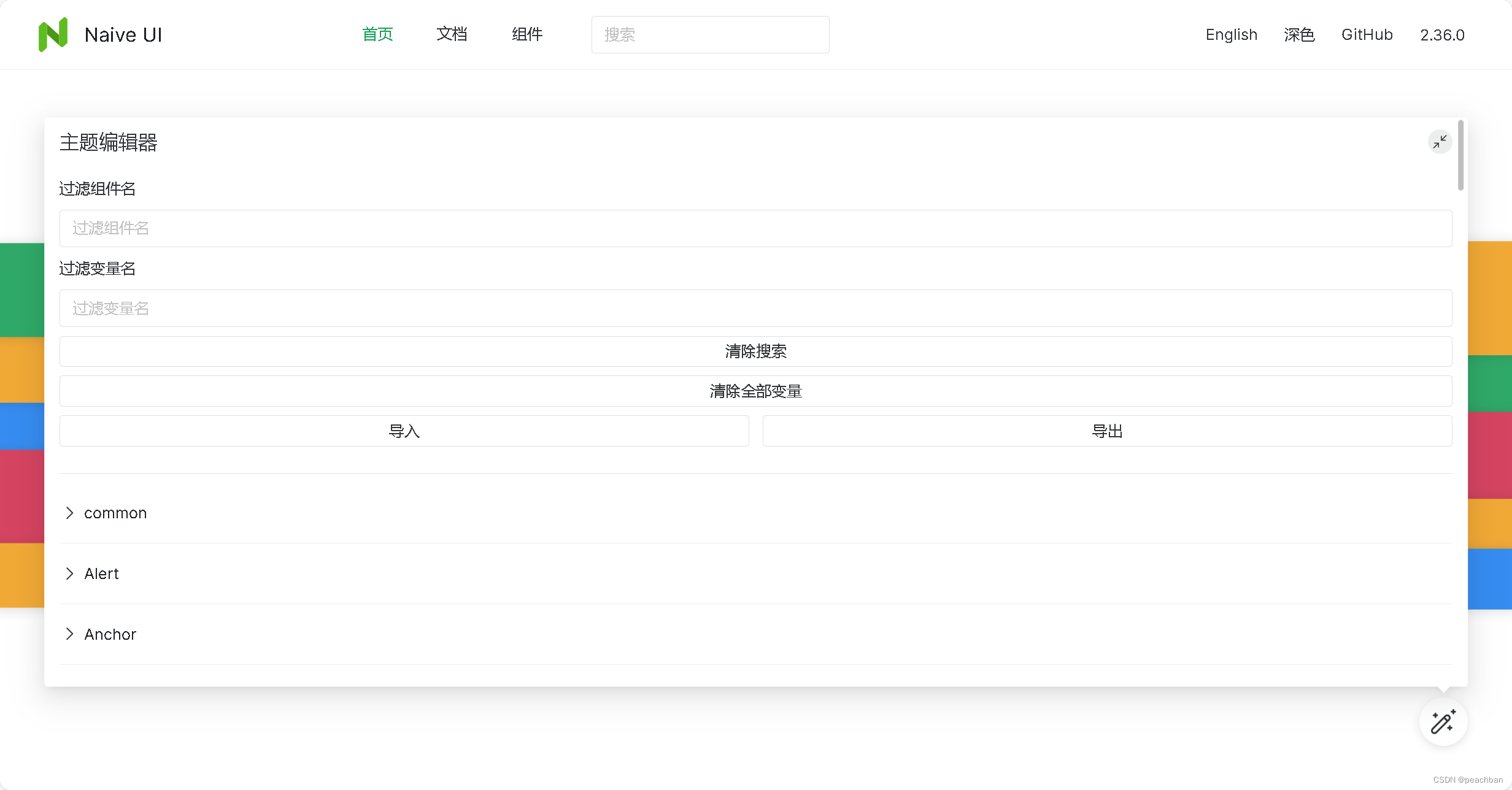
</template>8.主题编辑器
naive-ui 提供主题编辑器帮助你方便的编辑主题并导出对应配置。它可以被嵌套于 n-config-provider 中。
主题编辑器不包含在全局安装中(app.use(naive))。你需要显式引入来使用它。
<template>
  <n-theme-editor>
    <app />
  </n-theme-editor>
</template>

<script>
  import { definecomponent } from 'vue'
  import { nthemeeditor } from 'naive-ui'

  export default definecomponent({
    components: {
      nthemeeditor
    }
  })
</script>
了解更多关于 n-config-provider 的信息,参见 全局化配置。
五.全局化配置 config provider
全局化配置设置内部组件的主题、语言和组件卸载于其他位置的 dom 的类名。
1.设置 n-config-provider 内部组件的主题。
<template>
  <n-config-provider :theme="theme">
    <n-card>
      <n-space>
        <n-button @click="theme = darktheme">
          深色
        </n-button>
        <n-button @click="theme = null">
          浅色
        </n-button>
      </n-space>
    </n-card>
  </n-config-provider>
</template>

<script lang="ts">
import { definecomponent, ref } from 'vue'
import { darktheme } from 'naive-ui'
import type { globaltheme } from 'naive-ui'

export default definecomponent({
  setup () {
    return {
      darktheme,
      theme: ref<globaltheme | null>(null)
    }
  }
})
</script>
2.api
| 名称 | 类型 | 默认值 | 说明 | 版本 |
|---|---|---|---|---|
| abstract | boolean | false | 是否不存在 dom 包裹 | |
| breakpoints | { [k: string]: number } | { xs: 0, s: 640, m: 1024, l: 1280, xl: 1536, xxl: 1920 } | 屏幕响应式断点,对 n-grid 生效。这个属性不是响应式的,你需要在组件第一次挂载时就设定好 | |
| cls-prefix | string | n | 内部所有组件的类的前缀,仅首次设定会生效 | |
| date-locale | datelocale | null | undefined | 对后代组件生效的日期语言对象,为 null 时会使用默认 dateenus,为 undefined 时会继承上级 n-config-provider | |
| inline-theme-disabled | boolean | false | 是否禁用 inline css 主题变量,如果你不会频繁调整主题变量,并且需要 ssr 或者想让 devtools 看起来更干净,可以打开这个选项。注意,这个属性不是响应式的 | 2.26.0 |
| katex | object | undefined | 公式组件需要的 katex 对象 | 2.34.0 |
| locale | locale | null | undefined | 对后代组件生效的语言对象,为 null 时会使用默认 enus,为 undefined 时会继承上级 n-config-provider | |
| namespace | string | undefined | n-config-provider 内部组件被卸载于其他位置的 dom 的类名 | |
| preflight-style-disabled | boolean | false | 是否禁用默认样式,如果你禁用了它,便可以完全控制全局样式。你也可以使用 n-global-style 去挂载全局样式(推荐,样式是响应式的) | 2.29.0 |
| tag | string | 'div' | n-config-provider 被渲染成的元素 | |
| theme | theme | null | undefined | 对后代组件生效的主题对象,为 null 时会使用默认亮色,为 undefined 时会继承上级 n-config-provider。更多信息参见调整主题 | |
| theme-overrides | themeoverrides | null | undefined | 对后代组件生效的主题变量覆盖,为 null 时会清除全部覆盖变量,为 undefined 时会继承上级 n-config-provider。更多信息参见调整主题 |
六.支持的平台
1.浏览器
不支持 ie 浏览器。
edge、firefox、chrome、safari 等现代浏览器的最新的 2 个版本确保会被支持。
对于这些浏览器的其他版本中,由于开发资源的限制并没有做过严格的测试。但是我们预期 naive-ui 应该在这些浏览器不算太老的版本上能正常的运行(比如 2 年之内的版本)。如果你发现了任何问题欢迎来提 issue。
2.vue
只支持 vue 3(>3.0.5)。
3.typescript
需要版本 > 4.1。


发表评论