 我要评论
我要评论先自我介绍一下,小编浙江大学毕业,去过华为、字节跳动等大厂,目前阿里p7
深知大多数程序员,想要提升技能,往往是自己摸索成长,但自己不成体系的自学效果低效又漫长,而且极易碰到天花板技术停滞不前!
因此收集整理了一份《2024年最新harmonyos鸿蒙全套学习资料》,初衷也很简单,就是希望能够帮助到想自学提升又不知道该从何学起的朋友。
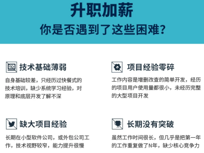

既有适合小白学习的零基础资料,也有适合3年以上经验的小伙伴深入学习提升的进阶课程,涵盖了95%以上鸿蒙开发知识点,真正体系化!
由于文件比较多,这里只是将部分目录截图出来,全套包含大厂面经、学习笔记、源码讲义、实战项目、大纲路线、讲解视频,并且后续会持续更新
如果你需要这些资料,可以添加v获取:vip204888 (备注鸿蒙)

正文
- 开始前请参考工具准备,完成deveco studio的安装和开发环境配置。
- 开发环境配置完成后,请参考使用工程向导创建工程(模板选择“empty ability”)。
- 工程创建完成后,选择使用真机进行调测。
代码结构解读
本篇codelab只对核心代码进行讲解,完整代码可以直接从gitee获取。
├──entry/src/main/ets // 代码区
│ ├──common // 公共文件目录
│ │ └──constants
│ │ └──constants.ets // 常量
│ ├──entryability
│ │ └──entryability.ts // 应用的入口
│ ├──model
│ │ └──datamodel.ets // 模拟数据
│ ├──pages
│ │ └──rankpage.ets // 入口页面
│ ├──view // 自定义组件目录
│ │ ├──listheadercomponent.ets
│ │ ├──listitemcomponent.ets
│ │ └──titlecomponent.ets
│ └──viewmodel
│ ├──rankdata.ets // 实体类
│ └──rankviewmodel.ets // 视图业务逻辑类
└──entry/src/main/resources // 资源文件目录
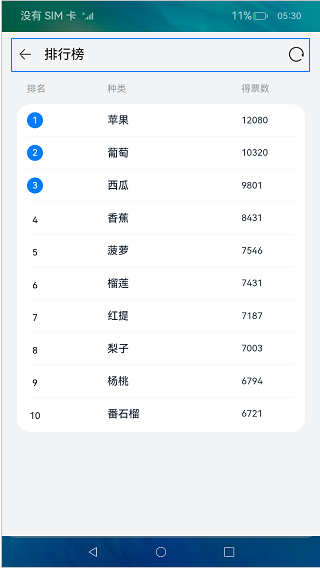
使用@link封装标题组件
在titlecomponent文件中,首先使用struct对象创建自定义组件,然后使用@link修饰器管理titlecomponent组件内的状态变量isrefreshdata,状态变量isrefreshdata值发生改变后,通过@link装饰器通知页面刷新list中的数据。代码如下:
// titlecomponent.ets
…
@component
export struct titlecomponent {
@link isrefreshdata: boolean; // 判断是否刷新数据
@state title: resource = $r(‘app.string.title_default’);
build() {
row() {
…
row() {
image($r(‘app.media.loading’))
.height(titlebarstyle.image_loading_size)
.width(titlebarstyle.image_loading_size)
.onclick(() => {
this.isrefreshdata = !this.isrefreshdata;
})
}
.width(titlebarstyle.weight)
.height(weight)
.justifycontent(flexalign.end)
}
…
}
}
效果如图所示:
封装列表头部样式组件
在listheadercomponent文件中,我们使用常规成员变量来设置自定义组件listheadercomponent的widthvalue和paddingvalue,代码如下:
// listheadercomponent.ets
…
@component
export struct listheadercomponent {
paddingvalue: padding | length = 0;
widthvalue: length = 0;
build() {
row() {
text(
r
(
′
a
p
p
.
s
t
r
i
n
g
.
p
a
g
e
n
u
m
b
e
r
′
)
)
.
f
o
n
t
s
i
z
e
(
f
o
n
t
s
i
z
e
.
s
m
a
l
l
)
.
w
i
d
t
h
(
l
i
s
t
h
e
a
d
e
r
s
t
y
l
e
.
l
a
y
o
u
t
w
e
i
g
h
t
l
e
f
t
)
.
f
o
n
t
w
e
i
g
h
t
(
l
i
s
t
h
e
a
d
e
r
s
t
y
l
e
.
f
o
n
t
w
e
i
g
h
t
)
.
f
o
n
t
c
o
l
o
r
(
r('app.string.page_number')) .fontsize(fontsize.small) .width(listheaderstyle.layout_weight_left) .fontweight(listheaderstyle.font_weight) .fontcolor(
r(′app.string.pagenumber′)).fontsize(fontsize.small).width(listheaderstyle.layoutweightleft).fontweight(listheaderstyle.fontweight).fontcolor(r(‘app.color.font_description’))
text(
r
(
′
a
p
p
.
s
t
r
i
n
g
.
p
a
g
e
t
y
p
e
′
)
)
.
f
o
n
t
s
i
z
e
(
f
o
n
t
s
i
z
e
.
s
m
a
l
l
)
.
w
i
d
t
h
(
l
i
s
t
h
e
a
d
e
r
s
t
y
l
e
.
l
a
y
o
u
t
w
e
i
g
h
t
c
e
n
t
e
r
)
.
f
o
n
t
w
e
i
g
h
t
(
l
i
s
t
h
e
a
d
e
r
s
t
y
l
e
.
f
o
n
t
w
e
i
g
h
t
)
.
f
o
n
t
c
o
l
o
r
(
r('app.string.page_type')) .fontsize(fontsize.small) .width(listheaderstyle.layout_weight_center) .fontweight(listheaderstyle.font_weight) .fontcolor(
r(′app.string.pagetype′)).fontsize(fontsize.small).width(listheaderstyle.layoutweightcenter).fontweight(listheaderstyle.fontweight).fontcolor(r(‘app.color.font_description’))
text(
r
(
′
a
p
p
.
s
t
r
i
n
g
.
p
a
g
e
v
o
t
e
′
)
)
.
f
o
n
t
s
i
z
e
(
f
o
n
t
s
i
z
e
.
s
m
a
l
l
)
.
w
i
d
t
h
(
l
i
s
t
h
e
a
d
e
r
s
t
y
l
e
.
l
a
y
o
u
t
w
e
i
g
h
t
r
i
g
h
t
)
.
f
o
n
t
w
e
i
g
h
t
(
l
i
s
t
h
e
a
d
e
r
s
t
y
l
e
.
f
o
n
t
w
e
i
g
h
t
)
.
f
o
n
t
c
o
l
o
r
(
r('app.string.page_vote')) .fontsize(fontsize.small) .width(listheaderstyle.layout_weight_right) .fontweight(listheaderstyle.font_weight) .fontcolor(
r(′app.string.pagevote′)).fontsize(fontsize.small).width(listheaderstyle.layoutweightright).fontweight(listheaderstyle.fontweight).fontcolor(r(‘app.color.font_description’))
}
.width(this.widthvalue)
.padding(this.paddingvalue)
}
}
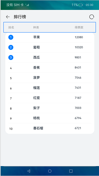
效果如图所示:
创建listitemcomponent
为了体现@prop单向绑定功能,我们在listitemcomponent组件中添加了一个@prop修饰的字段isswitchdatasource,当通过点击改变listitemcomponent组件中isswitchdatasource状态时,listitemcomponent作为list的子组件,并不会通知其父组件list刷新状态。
在代码中,我们使用@state管理listitemcomponent中的 ischange 状态,当用户点击listitemcomponent时,listitemcomponent组件中的文本颜色发生变化。我们使用条件渲染控制语句,创建的圆型文本组件。
// listitemcomponent.ets
…
@component
export struct listitemcomponent {
index?: number;
private name?: resource;
@prop vote: string = ‘’;
@prop isswitchdatasource: boolean = false;
// 判断是否改变listitemcomponent字体颜色
@state ischange: boolean = false;
build() {
row() {
column() {
if (this.isrendercircletext()) {
if (this.index !== undefined) {
this.circletext(this.index);
}
} else {
text(this.index?.tostring())
.lineheight(itemstyle.text_layout_size)
.textalign(textalign.center)
.width(itemstyle.text_layout_size)
.fontweight(fontweight.bold)
.fontsize(fontsize.small)
}
}
.width(itemstyle.layout_weight_left)
.alignitems(horizontalalign.start)
text(this.name)
.width(itemstyle.layout_weight_center)
.fontweight(fontweight.bolder)
.fontsize(fontsize.middle)
.fontcolor(this.ischange ? itemstyle.color_blue : itemstyle.color_black)
text(this.vote)
.width(itemstyle.layout_weight_right)
.fontweight(fontweight.bold)
.fontsize(fontsize.small)
.fontcolor(this.ischange ? itemstyle.color_blue : itemstyle.color_black)
}
.height(itemstyle.bar_height)
.width(weight)
.onclick(() => {
this.isswitchdatasource = !this.isswitchdatasource;
this.ischange = !this.ischange;
})
}
…
}
效果如图所示:

创建ranklist
为了简化代码,提高代码的可读性,我们使用@builder描述排行列表布局内容,使用循环渲染组件foreach创建listitem。代码如下:
// rankpage.ets
…
build() {
column() {
// 顶部标题组件
titlecomponent({ isrefreshdata: katex parse error: expected 'eof', got '}' at position 34: …, title: title }̲) // 列表头部样式 lis…r(‘app.color.background’))
.height(weight)
.width(weight)
}
@builder ranklist(widthvalue: length) {
column() {
list() {
foreach(this.isswitchdatasource ? this.datasource1 : this.datasource2,
(item: rankdata, index?: number) => {
listitem() {
listitemcomponent({ index: (number(index) + 1), name: item.name, vote: item.vote,
isswitchdatasource: this.isswitchdatasource
})
}
}, (item: rankdata) => json.stringify(item))
}
.width(weight)
.height(style.list_height)
.divider({ strokewidth: style.stroke_width })
}
.padding({
left: style.rank_padding,
right: style.rank_padding
})
.borderradius(style.border_radius)
.width(widthvalue)
.alignitems(horizontalalign.center)
.backgroundcolor(color.white)
}
…
效果如图所示:

使用自定义组件生命周期函数
我们通过点击系统导航返回按钮来演示onbackpress回调方法的使用,在指定的时间段内,如果满足退出条件,onbackpress将返回false,系统默认关闭当前页面。否则,提示用户需要再点击一次才能退出,同时onbackpress返回true,表示用户自己处理导航返回事件。代码如下:
// rankpage.ets
…
@entry
@component
struct rankpage {
…
onbackpress() {
if (this.isshowtoast()) {
prompt.showtoast({
message: $r(‘app.string.prompt_text’),
duration: time
});
this.clickbacktimerecord = new date().gettime();
return true;
}
return false;
}
…
}
最后
有很多小伙伴不知道学习哪些鸿蒙开发技术?不知道需要重点掌握哪些鸿蒙应用开发知识点?而且学习时频繁踩坑,最终浪费大量时间。所以有一份实用的鸿蒙(harmonyos next)资料用来跟着学习是非常有必要的。
这份鸿蒙(harmonyos next)资料包含了鸿蒙开发必掌握的核心知识要点,内容包含了(**arkts、arkui开发组件、stage模型、多端部署、分布式应用开发、音频、视频、webgl、openharmony****多媒体技术、napi组件、openharmony内核、harmony南向开发、鸿蒙项目实战等等)鸿蒙(harmonyos next)**技术知识点。
希望这一份鸿蒙学习资料能够给大家带来帮助,有需要的小伙伴自行领取,限时开源,先到先得~无套路领取!!
如果你是一名有经验的资深android移动开发、java开发、前端开发、对鸿蒙感兴趣以及转行人员,可以直接领取这份资料
获取这份完整版高清学习路线,请点击→纯血版全套鸿蒙harmonyos学习资料****
鸿蒙(harmonyos next)最新学习路线

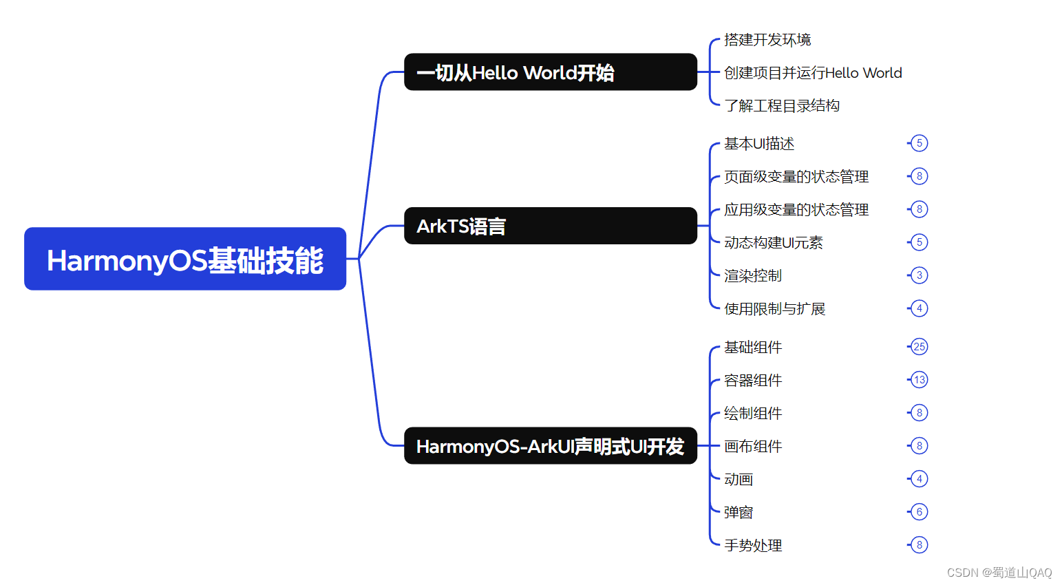
- harmonos基础技能
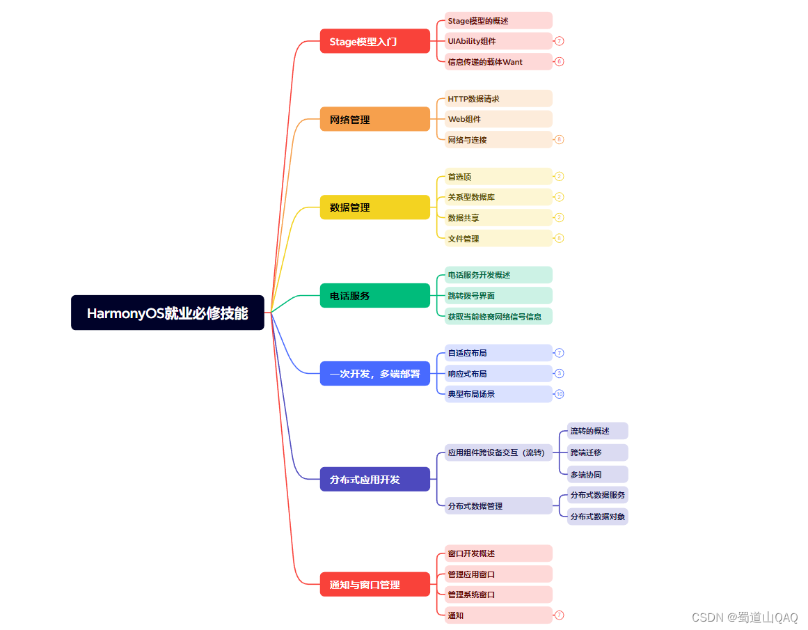
- harmonos就业必备技能
- harmonos多媒体技术
- 鸿蒙napi组件进阶
网上学习资料一大堆,但如果学到的知识不成体系,遇到问题时只是浅尝辄止,不再深入研究,那么很难做到真正的技术提升。
需要这份系统化的资料的朋友,可以添加v获取:vip204888 (备注鸿蒙)
一个人可以走的很快,但一群人才能走的更远!不论你是正从事it行业的老鸟或是对it行业感兴趣的新人,都欢迎加入我们的的圈子(技术交流、学习资源、职场吐槽、大厂内推、面试辅导),让我们一起学习成长!
(https://images.3wcode.com/3wcode/20240731/b_0_202407312321097871.jpg)
- 鸿蒙napi组件进阶
网上学习资料一大堆,但如果学到的知识不成体系,遇到问题时只是浅尝辄止,不再深入研究,那么很难做到真正的技术提升。
需要这份系统化的资料的朋友,可以添加v获取:vip204888 (备注鸿蒙)
[外链图片转存中…(img-2yiblchk-1713147402120)]
一个人可以走的很快,但一群人才能走的更远!不论你是正从事it行业的老鸟或是对it行业感兴趣的新人,都欢迎加入我们的的圈子(技术交流、学习资源、职场吐槽、大厂内推、面试辅导),让我们一起学习成长!


发表评论