Plotly 是一个广受欢迎且功能强大的 Python 库,因其丰富的交互式和动态图表功能而备受推崇。无论是基本的线图和柱状图,还是更复杂的地理空间可视化和三维图表,Plotly 都能轻松应对。其灵活性和可定制性使得数据科学家、分析师和开发者能够创建既美观又实用的可视化。
接下来将分享一些 Plotly 代码示例,帮助理解Plotly 的使用方式和特点。
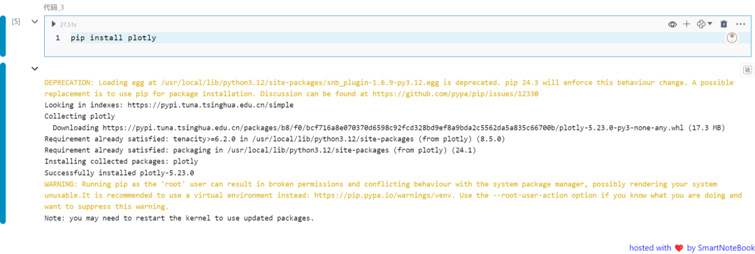
安装Plotly
pip install plotly
 一:基本折线图
这个示例使用 Plotly 创建一个简单的折线图。我们使用 NumPy 生成样本数据,并使用 Plotly 的 go.Scatter 来创建图表。
import plotly.graph_objects as go
import numpy as np


x = np.linspace(0, 10, 100)
y = np.sin(x)


fig = go.Figure(data=go.Scatter(x=x, y=y, mode='lines'))
fig.update_layout(title='Basic Line Plot', xaxis_title='X-axis', yaxis_title='Y-axis')
fig.show()
在这个示例中,我们使用 Plotly Express 创建了一个带有颜色渐变的散点图。通过大小和颜色参数展示了第三维度的信息:
import plotly.express as px
import pandas as pd
np.random.seed(42)


df = pd.DataFrame({'X': np.random.rand(50), 'Y': np.random.rand(50),
                  'Size': np.random.rand(50) * 30})
fig = px.scatter(df, x='X', y='Y', size='Size', color='Size',
                  title='Scatter Plot with Color Gradient')


fig.show()
3D 表面图显示了三个变量在三维空间中的关系。数据点被映射到三维坐标系统中的一个表面上,通过表面的形状、高度或颜色展示特征和趋势。
import plotly.graph_objects as go
import numpy as np


x = np.linspace(-5, 5, 100)
y = np.linspace(-5, 5, 100)
x, y = np.meshgrid(x, y)
z = np.sin(np.sqrt(x**2 + y**2))


fig = go.Figure(data=[go.Surface(z=z, x=x, y=y)])
fig.update_layout(title='3D Surface Plot',
        scene=dict(xaxis_title='X-axis', yaxis_title='Y-axis', zaxis_title='Z-axis'))


fig.show()
气泡图是散点图的一种变体,其中每个点的大小反映了数据的第三维度。创建气泡图的示例代码:
import plotly.express as px


df = px.data.gapminder().query("year == 2007")
fig = px.scatter_geo(df, locatinotallow='iso_alpha', size='pop',
                    hover_name='country', title='Bubble Map')


fig.show()
小提琴图是一种绘制数值数据的方法。它类似于箱线图,但每侧都有一个旋转的核密度图。创建小提琴图的示例代码:
import plotly.express as px
import seaborn as sns


tips = sns.load_dataset( 'tips' )
fig = px.violin(tips, y= 'total_bill' , x= 'day' , box= True ,
                points= "all" , title= 'Violin Plot' )


fig.show()
旭日图用于显示分层数据。这种图表通常是二维的,但也可以是三维的。旭日图建立在一个圆圈上,层次结构的每个级别都显示为一个环。外环显示汇总数据,内环显示子类别信息。将鼠标悬停在内环上可显示其包含的所有子集。以下是一个例子:
import plotly.express as px


df = px.data.tips()
fig = px.sunburst(df, path=[ 'sex' , 'day' , 'time' ], values= 'total_bill' ,
                  title= 'Sunburst Chart' )


fig.show()
热图,也称为相关矩阵,使用颜色编码的方块显示变量之间的相关性。颜色强度表示相关性的强度。以下是一个例子:
import plotly.express as px
import numpy as np


np.random.seed( 42 )
corr_matrix = np.random.rand( 10 , 10 )
fig = px.imshow(corr_matrix,
                labels= dict (x= "X-axis" , y= "Y-axis" , color= "Correlation" ),
                title= 'Heatmap with Annotations' )


fig.show()
雷达图显示多维数据。它将多个数据点映射到从同一中心点开始到周长结束的轴上。连接这些点形成雷达图。以下是一个例子:
import plotly.graph_objects as go
import pandas as pd
categories = [ '速度' , '可靠性' , '舒适度' , '安全性' , '效率' ]
values = [ 90 , 60 , 85 , 70 , 80 ]
fig = go.Figure()
fig.add_trace(go.Scatterpolar(
      r=values,   theta=categories,
      fill= 'toself' ,     name= '产品 A'
 ))


fig.update_layout(title= '雷达图' )
fig.show()
3D 散点图显示三维数据点。每个点都绘制在具有 X、Y 和 Z 轴的 3D 坐标系中。以下是一个例子:
import plotly.graph_objects as go
import numpy as np


np.random.seed( 42 )
x = np.random.rand( 100 )
y = np.random.rand( 100 )
z = np.random.rand( 100 )


fig = go.Figure(data=[go.Scatter3d(x=x, y=y, z=z, mode= 'markers' , marker= dict (size= 8 , color=z, colorscale= 'Viridis' ))])
fig.update_layout(title= '3D Scatter Plot' , scene= dict (xaxis_title= 'X-axis' , yaxis_title= 'Y-axis' , zaxis_title= 'Z-axis' ))


fig.show()
漏斗图用于单流程分析,展示多个阶段的业务流程,使用梯形面积将每个阶段的业务数据与上一个阶段的业务数据进行比较。以下是一个例子:
import plotly.graph_objects as go


values = [ 500 , 450 , 350 , 300 , 200 ]


fig = go.Figure(go.Funnel(y=[ 'Stage 1' , 'Stage 2' , 'Stage 3' , 'Stage 4' , 'Stage 5' ], x=values, textinfo= 'value+percent initial' ))
fig.update_layout(title= 'Funnel Chart' )


fig.show()
Plotly 是一个功能强大、用途广泛的 Python 数据可视化库。本文展示了各种基本示例,演示了不同的绘图类型和交互功能。通过这些代码示例来探索 Plotly 的功能并提高您的数据可视化技能。


发表评论