 我要评论
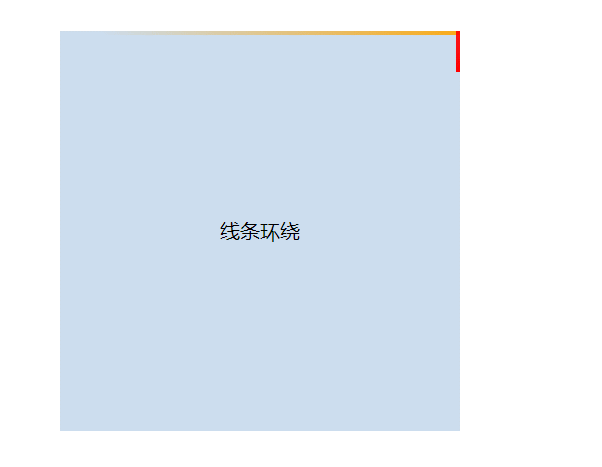
我要评论效果:
代码:
<!doctype html>
<html lang="en">
<head>
    <meta charset="utf-8">
    <meta http-equiv="x-ua-compatible" content="ie=edge">
    <meta name="viewport" content="width=device-width, initial-scale=1.0">
    <title>document</title>
    <style>
        body {
            padding: 120px;
        }
        .mainbox {
            width: 320px;
            height: 320px;
            position: relative;
            /* 超出隐藏需要加上 */
            overflow: hidden;
        }
        .content {
            width: 320px;
            height: 320px;
            line-height: 320px;
            text-align: center;
            background-color: #cde;
        }
        .line {
            /* 结合外层元素的相对定位 */
            position: absolute;
        }
        .line:nth-child(1) {
            top: 0;
            left: 0;
            width: 100%;
            height: 3px;
            /* 加上渐变效果,方可形成拖尾效果 */
            background: linear-gradient(90deg, transparent, orange);
            animation: animate1 8s linear infinite;
        }
        /* 分别控制其上下左右的定位距离,从而形成线条跟随效果 */
        @keyframes animate1 {
            0% {
                left: -100%;
            }
            50%,
            100% {
                left: 100%;
            }
        }
        .line:nth-child(2) {
            top: -100%;
            right: 0;
            width: 3px;
            height: 100%;
            background: linear-gradient(180deg, transparent, red);
            animation: animate2 8s linear infinite;
            /* 注意要加上延时触发动画效果,这样线条才会依次触发 */
            animation-delay: 2s;
        }
        @keyframes animate2 {
            0% {
                top: -100%;
            }
            50%,
            100% {
                top: 100%;
            }
        }
        .line:nth-child(3) {
            bottom: 0;
            right: 0;
            width: 100%;
            background: linear-gradient(270deg, transparent, green);
            animation: animate3 8s linear infinite;
            animation-delay: 4s;
        }
        @keyframes animate3 {
            0% {
                right: -100%;
                height: 3px;
            }
            50%,
            100% {
                height: 2px;
                right: 100%;
            }
        }
        .line:nth-child(4) {
            bottom: -100%;
            left: 0;
            width: 3px;
            height: 100%;
            background: linear-gradient(360deg, transparent, #3a86ff);
            animation: animate4 8s linear infinite;
            animation-delay: 6s;
        }
        @keyframes animate4 {
            0% {
                bottom: -100%;
            }
            50%,
            100% {
                bottom: 100%;
            }
        }
    </style>
</head>
<body>
    <div class="mainbox">
        <span class="line"></span>
        <span class="line"></span>
        <span class="line"></span>
        <span class="line"></span>
        <div class="content">线条环绕</div>
    </div>
</body>
</html>
到此这篇关于css3实现四周线条环绕流动效果的文章就介绍到这了,更多相关css3线条环绕流动内容请搜索代码网以前的文章或继续浏览下面的相关文章,希望大家以后多多支持代码网!


发表评论