 我要评论
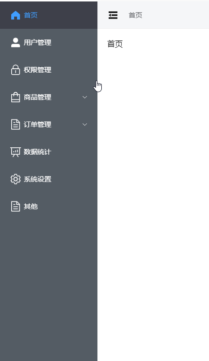
我要评论效果如下所示:
1. 导航外层布局 asideview.vue
<template>
  <el-menu
    :default-active="defaultactive"
    class="my-menu"
    :collapse="iscollapse"
    :collapse-transition="false"
    @open="handleopen"
    @close="handleclose"
  >
    <menu-item :menulist="menulist"></menu-item>
  </el-menu>
</template>
<script lang="ts" setup>
import { useroute } from "vue-router";
import menuitem from "./components/menuitem.vue";
const collapsestore = usecollapsestore();
const iscollapse = computed(() => collapsestore.collapse);
const store = usemenustore();
const menulist = store.menulist;
const flattenmenulist = store.flattenmenulist();
const defaultactive = ref("");
onmounted(() => {
  const route = useroute();
  watch(
    () => route.fullpath,
    (newpath, oldpath) => {
      getdefaultactive(newpath);
    },
    {
      immediate: true,
    }
  );
});
const getdefaultactive = (path) => {
  const currentmenu = flattenmenulist.find((item) => item.path === path);
  if (currentmenu) {
    defaultactive.value = currentmenu.id;
  }
  console.log("defaultactive", defaultactive.value);
};
const handleopen = (key: string, keypath: string[]) => {
  console.log(key, keypath);
};
const handleclose = (key: string, keypath: string[]) => {
  console.log(key, keypath);
};
</script>
<style lang="scss">
.icon-collapse {
  cursor: pointer;
  width: 64px;
  height: 30px;
  margin: 0 auto;
}
.my-menu {
  background-color: #545c64;
  border-right: none;
  color: #fff;
  height: 100%;
  overflow-x: hidden;
  overflow-y: auto;
}
.el-menu-item,
.el-sub-menu__title {
  background-color: #545c64;
  color: #fff;
}
.el-menu-item:hover,
.el-sub-menu__title:hover {
  background: rgb(62, 64, 74);
}
.el-menu-item.is-active,
.el-sub-menu__title.is-active {
  background: rgb(62, 64, 74);
}
/* 滚动条 */
::-webkit-scrollbar {
  /*滚动条整体样式*/
  width: 7px; /*高宽分别对应横竖滚动条的尺寸*/
  height: 7px;
  &-thumb {
    /*滚动条里面小方块*/
    border-radius: 7px;
    background-color: #d0d0d0;
    &:hover {
      /*滚动条里面小方块*/
      background-color: #b7b7b7;
    }
  }
  &-track {
    /*滚动条里面轨道*/
    border-radius: 7px;
    background-color: #fff;
  }
}
</style>
2. 单个导航菜单封装 menuitem.vue
<template>
  <template v-for="item in menulist" :key="item.id">
    <el-sub-menu
      :index="item.id"
      v-if="item.children && item.children.length > 0"
    >
      <template #title>
        <el-icon :size="30">
          <component class="fold-menu" :is="item.icon"></component>
        </el-icon>
        <span>{{ item.name }}</span>
      </template>
      <menu-item :menulist="item.children"></menu-item>
    </el-sub-menu>
    <el-menu-item :index="item.id" v-else @click="handlejump(item)">
      <el-icon :size="30">
        <component class="fold-menu" :is="item.icon"></component>
      </el-icon>
      <template #title>{{ item.name }}</template>
    </el-menu-item>
  </template>
</template>
<script setup lang="ts">
import { userouter } from "vue-router";
import type { menuinfo } from "~/types/menu";
const router = userouter();
const props = defineprops({
  menulist: {
    type: array<menuinfo>,
  },
});
const handlejump = (item: menuinfo) => {
  if (item.path) {
    router.push(item.path);
  }
};
</script>
<style lang="scss" scoped></style>
3. 控制导航收缩 stores/collapse.ts
import { ref } from 'vue'
import { definestore } from 'pinia'
export const usecollapsestore = definestore('collapse', () => {
  const collapse = ref(false)
  const changecollapse = function changecollapse() {
    collapse.value = !collapse.value
  }
  return { collapse, changecollapse }
})
4. 菜单数据格式示例
  const menulist = ref<menuinfo[]>([
    {
      id: '1',
      name: '首页',
      path: '/',
      icon: 'homefilled',
    },
    {
      id: '2',
      name: '用户管理',
      path: '/user-manage',
      icon: 'userfilled',
    },
    {
      id: '3',
      name: '权限管理',
      path: '/permission',
      icon: 'lock',
    },
    {
      id: '4',
      name: '商品管理',
      path: '/product',
      icon: 'shoppingbag',
      children: [
        {
          id: '4-1',
          name: '商品列表',
          path: '/product/list',
          icon: 'shoppingbag'
        }
      ]
    },
    {
      id: '5',
      name: '订单管理',
      path: '/order',
      icon: 'document',
      children: [
        {
          id: '5-1',
          name: '订单列表',
          path: '/order/list',
          icon: 'document'
        }
      ]
    },
    {
      id: '6',
      name: '数据统计',
      path: '/data',
      icon: 'dataanalysis'
    },
    {
      id: '7',
      name: '系统设置',
      path: '/system',
      icon: 'setting'
    },
    {
      id: '8',
      name: '其他',
      path: '/other',
      icon: 'document'
    }
  ])
到此这篇关于vue3封装element导航菜单的文章就介绍到这了,更多相关vue3封装element导航菜单内容请搜索代码网以前的文章或继续浏览下面的相关文章希望大家以后多多支持代码网!


发表评论