 我要评论
我要评论yeah,关注我的读者应该知道,上一篇文章了解 angular 开发的内容,我们已经概览了 angular 的相关内容。在自定义指令的部分,我们已经能够实现编写,但是,在实际场景中,我们还需要标准化的管理。
angular 是 angular.js 的升版
so,本文,我们就以 tooltip 来讲解下自定义指令的内容。
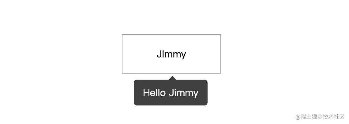
线上效果图,如下:
目录结构
在上一篇文章的实现的代码项目基础上,执行命令行:
# 进入 directives 文件夹
$ cd directives

# 创建 tooltip 文件夹
$ mkdir tooltip

# 进入 tooltip 文件夹
$ cd tooltip

# 创建 tooltip 组件
$ ng generate component tooltip

# 创建 tooltip 指令
$ ng generate directive tooltip
执行完上面的命令行之后,你会得到 app/directive/tooltip 的文件目录结构如下:
tooltip
├── tooltip // tooltip 组件
│ ├── user-list.component.html // 页面骨架
│ ├── user-list.component.scss // 页面独有样式
│ ├── user-list.component.spec.ts // 测试文件
│ └── user-list.component.ts // javascript 文件
├── tooltip.directive.spec.ts // 测试文件
└── tooltip.directive.ts // 指令文件
嗯,这里我将组件放在 tooltip 的同级,主要是方便管理。当然,这个因人而异,你可以放在公共组件 components 文件夹内。
编写 tooltip 组件
在 html 文件中,有:
<div class="caret"></div>
<div class="tooltip-content">{{data.content}}</div>
在样式文件 .scss 中,有:
$black: #000000;
$white: #ffffff;
$caret-size: 6px;
$tooltip-bg: transparentize($black, 0.25); // transparentize 是 sass 的语法
$grid-gutter-width: 30px;
$body-bg-color: $white;
$app-anim-time: 200ms;
$app-anim-curve: ease-out;
$std-border-radius: 5px;
$zindex-max: 100;

// :host 伪类选择器,给组件元素本身设置样式
:host {
  position: fixed;
  padding: $grid-gutter-width/3 $grid-gutter-width/2;
  background-color: $tooltip-bg;
  color: $body-bg-color;
  opacity: 0;
  transition: all $app-anim-time $app-anim-curve;
  text-align: center;
  border-radius: $std-border-radius;
  z-index: $zindex-max;
}

.caret { // 脱字符
  width: 0;
  height: 0;
  border-left: 6px solid transparent;
  border-right: 6px solid transparent;
  border-bottom: 6px solid $tooltip-bg;
  position: absolute;
  top: -$caret-size;
  left: 50%;
  margin-left: -$caret-size/2;
  border-bottom-color: $tooltip-bg;
}
嗯~,css 是一个神奇的东西,之后会安排一篇文章来讲解下 sass 相关的内容...
然后,在 javascript 文件 tooltip.component.ts 内容如下:
import {
  component,
  elementref, // 元素指向
  hostbinding,
  ondestroy,
  oninit
} from '@angular/core';

@component({
  selector: 'app-tooltip', // 标识符,表明我这个组件叫做啥,这里是 app-tooltip
  templateurl: './tooltip.component.html', // 本组件的骨架
  styleurls: ['./tooltip.component.scss'] // 本组件的私有样式
})
export class tooltipcomponent implements oninit {

  public data: any; // 在 directive 上赋值
  private displaytimeout:any;

  // 组件本身 host 绑定相关的装饰器
  @hostbinding('style.top')  hoststyletop!: string;
  @hostbinding('style.left') hoststyleleft!: string;
  @hostbinding('style.opacity') hoststyleopacity!: string;

  constructor(
    private elementref: elementref
  ) { }

  ngoninit(): void {
    this.hoststyletop = this.data.elementposition.bottom + 'px';

    if(this.displaytimeout) {
      cleartimeout(this.displaytimeout)
    }

    this.displaytimeout = settimeout((_: any) => {
      // 这里计算 tooltip 距离左侧的距离,这里计算公式是:tooltip.left + 目标元素的.width - (tooltip.width/2)
      this.hoststyleleft = this.data.elementposition.left + this.data.element.clientwidth / 2 - this.elementref.nativeelement.clientwidth / 2 + 'px'
      this.hoststyleopacity = '1';
      this.hoststyletop = this.data.elementposition.bottom + 10 + 'px'
    }, 500)
  }


  // 组件销毁
  ngondestroy() {
    // 组件销毁后,清除定时器,防止内存泄露
    if(this.displaytimeout) {
      cleartimeout(this.displaytimeout)
    }
  }
}
编写 tooltip 指令
这是本文的重点,具体的说明,我在代码上标注出来~
相关的文件 tooltip.directive.ts 内容如下:
import {
  applicationref, // 全局性调用检测
  componentfactoryresolver, // 创建组件对象
  componentref, // 组件实例的关联和指引,指向 componentfactory 创建的元素
  directive, elementref,
  embeddedviewref, // embeddedviewref 继承于 viewref,用于表示模板元素中定义的 ui 元素。
  hostlistener, // dom 事件监听
  injector, // 依赖注入
  input
} from '@angular/core';

import { tooltipcomponent } from './tooltip/tooltip.component';

@directive({
  selector: '[apptooltip]'
})
export class tooltipdirective {
  @input("apptooltip") apptooltip!: string;

  private componentref!: componentref<tooltipcomponent>;

  // 获取目标元素的相关位置,比如 left, right, top, bottom
  get elementposition() {
    return this.elementref.nativeelement.getboundingclientrect();
  }

  constructor(
    protected elementref: elementref,
    protected appref: applicationref,
    protected componentfactoryresolver: componentfactoryresolver,
    protected injector: injector
  ) { }

  // 创建 tooltip
  protected createtooltip() {
    this.componentref = this.componentfactoryresolver
      .resolvecomponentfactory(tooltipcomponent) // 绑定 tooltip 组件
      .create(this.injector);

    this.componentref.instance.data = { // 绑定 data 数据
      content: this.apptooltip,
      element: this.elementref.nativeelement,
      elementposition: this.elementposition
    }

    this.appref.attachview(this.componentref.hostview); // 添加视图
    const domelem = (this.componentref.hostview as embeddedviewref<any>).rootnodes[0] as htmlelement;
    document.body.appendchild(domelem);
  }

  // 删除 tooltip
  protected destroytooltip() {
    if(this.componentref) {
      this.appref.detachview(this.componentref.hostview); // 移除视图
      this.componentref.destroy();
    }
  }

  // 监听鼠标移入
  @hostlistener('mouseover')
  onenter() {
    this.createtooltip();
  }

  // 监听鼠标移出
  @hostlistener('mouseout')
  onout() {
    this.destroytooltip();
  }
}
到这里,已经完成了 99% 的功能了,下面我们在页面上调用即可。
页面上调用
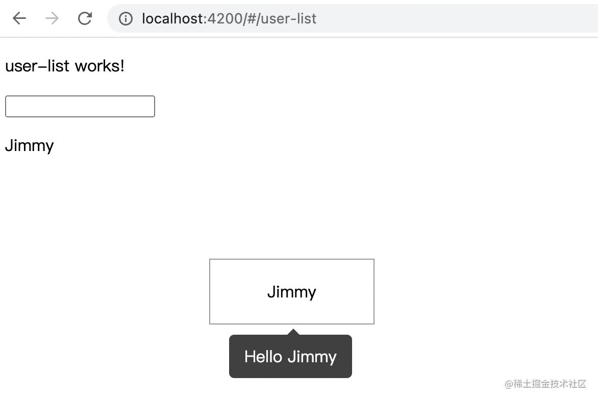
我们在 user-list.component.html 上添加下面的内容:
<p style="margin-top: 100px;">
  <!-- [apptooltip]="'hello jimmy'" 是重点 -->
  <span
    [apptooltip]="'hello jimmy'"
    style="margin-left: 200px; width: 160px; text-align: center; padding: 20px 0; display: inline-block; border: 1px solid #999;"
  >jimmy</span>
</p>
tooltipdirective 这个指令我们已经在 app.module.ts 上进行声明,我们直接调用即可。目前的效果如下:
我们实现的 tooltip 是底部居中展示,也就是我们平常使用框架,比如 angular ant design 中 tooltip 的 bottom 属性。对于其他属性,读者感兴趣的话,可以进行扩展。
至此,我们可以很好的维护自己编写的指令文件了。
总结
到此这篇关于angular自定义指令tooltip的文章就介绍到这了,更多相关angular自定义指令tooltip内容请搜索代码网以前的文章或继续浏览下面的相关文章希望大家以后多多支持代码网!


发表评论