 我要评论
我要评论简要教程

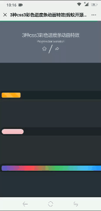
这是一款css3彩色进度条动画特效。该css3进度条动画特效中包含了三种动画特效,它们通过hmtl代码和简单的css3来实现彩色进度条的不同动画效果。
使用方法
html结构
<div class="container">
  <div class="progress progress-striped">
    <div class="progress-bar">
    </div>
  </div>
</div>

<div class="container">
  <div class="progress2 progress-moved">
    <div class="progress-bar2" >
    </div>
  </div>
</div>

<div class="container">
  <div class="progress progress-infinite">
    <div class="progress-bar3" >
    </div>
  </div>
</div>
css结构
body {
  font-family: 'montserrat', sans-serif;
  background: #2c303a;
}

.container {
  margin: 100px auto;
  width: 500px;
  text-align: center;
}

.progress {
  padding: 6px;
  background: rgba(0, 0, 0, 0.25);
  border-radius: 6px;
  box-shadow: inset 0 1px 2px rgba(0, 0, 0, 0.25), 0 1px rgba(255, 255, 255, 0.08);
}

.progress-bar {
  height: 18px;
  background-color: #ee303c;
  border-radius: 4px;
  transition: 0.4s linear;
  transition-property: width, background-color;
}

.progress-striped .progress-bar {
  background-color: #fcbc51;
  width: 100%;
  background-image: linear-gradient(45deg, #fca311 25%, transparent 25%, transparent 50%, #fca311 50%, #fca311 75%, transparent 75%, transparent);
  animation: progressanimationstrike 6s;
}

@keyframes progressanimationstrike {
  from {
    width: 0;
  }
  to {
    width: 100%;
  }
}
.progress2 {
  padding: 6px;
  border-radius: 30px;
  background: rgba(0, 0, 0, 0.25);
  box-shadow: inset 0 1px 2px rgba(0, 0, 0, 0.25), 0 1px rgba(255, 255, 255, 0.08);
}

.progress-bar2 {
  height: 18px;
  border-radius: 30px;
  background-image: linear-gradient(to bottom, rgba(255, 255, 255, 0.3), rgba(255, 255, 255, 0.05));
  transition: 0.4s linear;
  transition-property: width, background-color;
}

.progress-moved .progress-bar2 {
  width: 85%;
  background-color: #ef476f;
  animation: progressanimation 6s;
}

@keyframes progressanimation {
  0% {
    width: 5%;
    background-color: #f9bcca;
  }
  100% {
    width: 85%;
    background-color: #ef476f;
  }
}
.progress-bar3 {
  height: 18px;
  border-radius: 4px;
  background-image: linear-gradient(to right, #4cd964, #5ac8fa, #007aff, #7dc8e8, #5856d6, #ff2d55);
  transition: 0.4s linear;
  transition-property: width, background-color;
}

.progress-infinite .progress-bar3 {
  width: 100%;
  background-image: linear-gradient(to right, #4cd964, #5ac8fa, #007aff, #7dc8e8, #5856d6, #ff2d55);
  animation: coloranimation 1s infinite;
}

@keyframes coloranimation {
  0% {
    background-image: linear-gradient(to right, #4cd964, #5ac8fa, #007aff, #7dc8e8, #5856d6, #ff2d55);
  }
  20% {
    background-image: linear-gradient(to right, #5ac8fa, #007aff, #7dc8e8, #5856d6, #ff2d55, #4cd964);
  }
  40% {
    background-image: linear-gradient(to right, #007aff, #7dc8e8, #5856d6, #ff2d55, #4cd964, #5ac8fa);
  }
  60% {
    background-image: linear-gradient(to right, #7dc8e8, #5856d6, #ff2d55, #4cd964, #5ac8fa, #007aff);
  }
  100% {
    background-image: linear-gradient(to right, #5856d6, #ff2d55, #4cd964, #5ac8fa, #007aff, #7dc8e8);
  }
}
以上就是css3实现彩色进度条动画的示例的详细内容,更多关于css3 彩色进度条的资料请关注代码网其它相关文章!


发表评论