 我要评论
我要评论渐变色圆角边框(内容区域圆角)
<!doctype html>
<html lang="en">
<head>
  <meta charset="utf-8">
  <title>渐变色圆角边框(内容区域圆角)</title>
  <style>
      #container {
          width: 800px;
          height: 400px;
          border-radius: 30px;
          background-color: white;
          position: relative;
          padding: 20px;
          margin: 50px;
      }
      #container::before {
          content: '';
          position: absolute;
          top: -30px;
          right: -30px;
          bottom: -30px;
          left: -30px;
          border-radius: inherit;
          background: linear-gradient(96deg, #26d2e0 0%, #437bb3 97%);
          z-index: -1;
      }
  </style>
</head>
<body>
<div id="container">内容</div>
</body>
</html>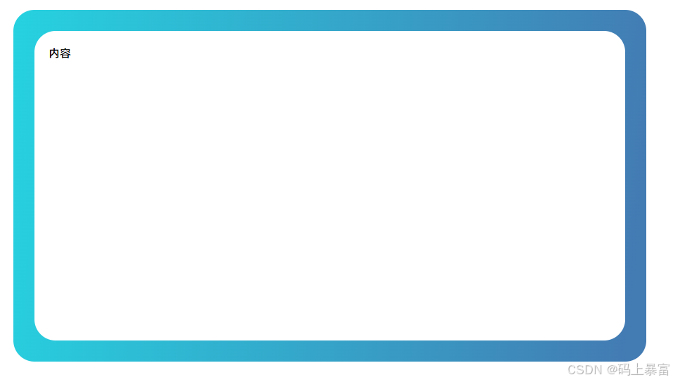
渐变色圆角边框(内容区域直角)
<!doctype html>
<html lang="en">
<head>
  <meta charset="utf-8">
  <title>渐变色圆角边框(内容区域直角)</title>
  <style>
      #container {
          position: relative;
          width: 800px;
          height: 400px;
          border: 30px solid;
          border-image: linear-gradient(45deg, #26d2e0, #437bb3) 1;
          clip-path: inset(0 round 30px);
          margin: 50px;
      }
  </style>
</head>
<body>
<div id="container">内容</div>
</body>
</html>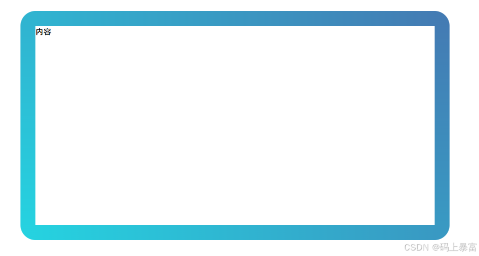
到此这篇关于css实现渐变色圆角边框的文章就介绍到这了,更多相关css渐变色圆角边框内容请搜索代码网以前的文章或继续浏览下面的相关文章,希望大家以后多多支持代码网!


发表评论