 我要评论
我要评论vue开发自定义的全局公共组件
这里我主要介绍两种自定义全局公共组件的方法
第一种
首先在components中新建一个文件夹,我这里做的是全局加载动画组件所以命名的是loading文件夹
如图:
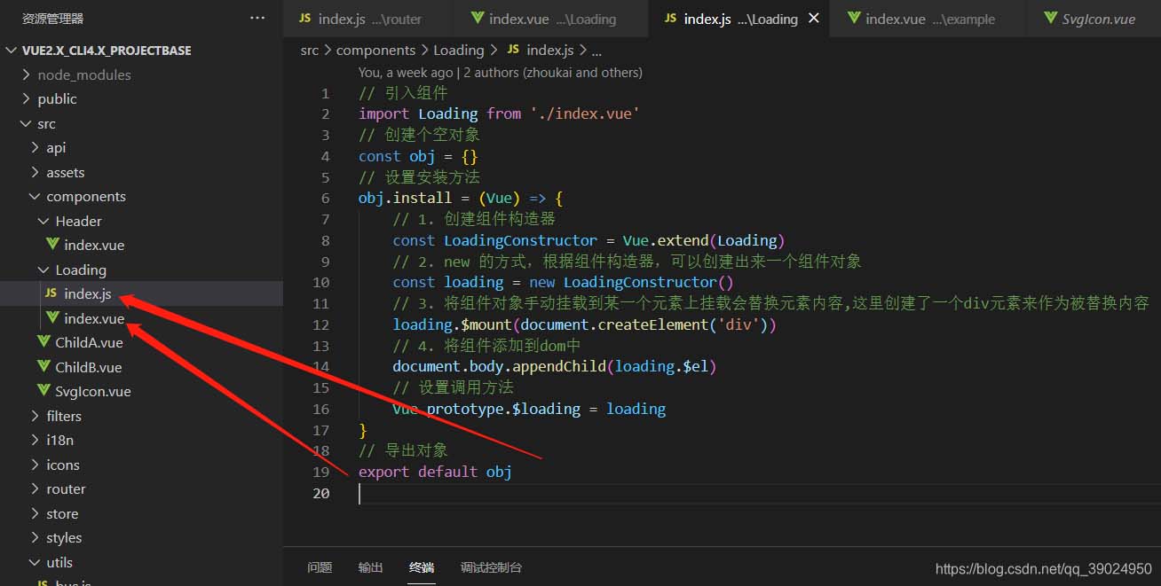
其中index.js为组件加载文件,index.vue为组件模板文件
index.js文件:
// 引入组件
import loading from './index.vue'
// 创建个空对象
const obj = {}
// 设置安装方法
obj.install = (vue) => {
    // 1. 创建组件构造器
    const loadingconstructor = vue.extend(loading)
    // 2. new 的方式,根据组件构造器,可以创建出来一个组件对象
    const loading = new loadingconstructor()
    // 3. 将组件对象手动挂载到某一个元素上挂载会替换元素内容,这里创建了一个div元素来作为被替换内容
    loading.$mount(document.createelement('div'))
    // 4. 将组件添加到dom中
    document.body.appendchild(loading.$el)
    // 5. 将$loading挂载到vue的原型上
    vue.prototype.$loading = loading
}
// 导出对象
export default obj
index.vue文件:
<template>
<div class="loading-wrap" v-if="block || bar || water">
<!-- 条状加载动画 -->
<div class="bar-load" v-if="bar">
<span class="item"></span>
<span class="item"></span>
<span class="item"></span>
<span class="item"></span>
<span class="item"></span>
</div>
<!-- 方块状加载动画 -->
<div class="block-load" v-if="block">
<span></span>
<span></span>
<span></span>
<span></span>
<span></span>
</div>
<!-- 水波加载动画 -->
<div class="water-load" v-if="water">
<span class="circle circle1"></span>
<span class="circle circle2"></span>
</div>
</div>
</template>
<script>
export default {
data() {
return {
block: false,
bar: false,
water: false
}
},
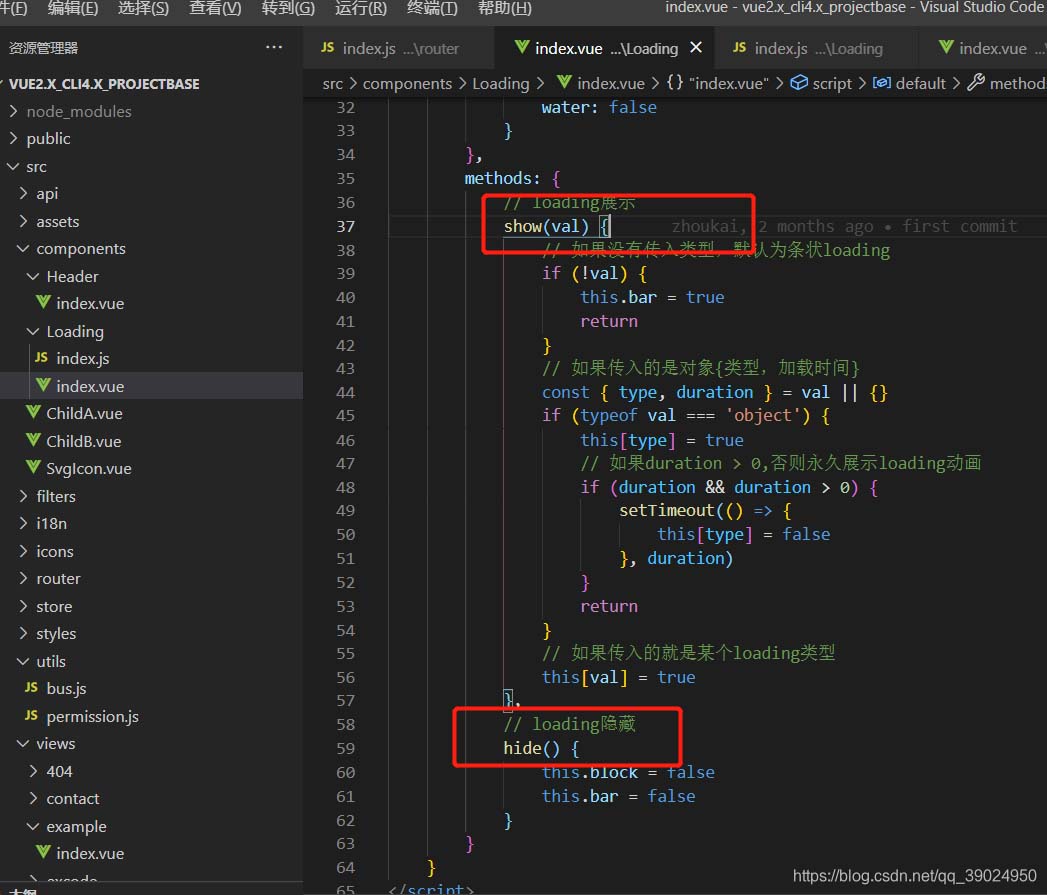
methods: {
// loading展示
show(val) {
// 如果没有传入类型,默认为条状loading
if (!val) {
this.bar = true
return
}
// 如果传入的是对象{类型,加载时间}
const { type, duration } = val || {}
if (typeof val === 'object') {
this[type] = true
// 如果duration > 0,否则永久展示loading动画
if (duration && duration > 0) {
settimeout(() => {
this[type] = false
}, duration)
}
return
}
// 如果传入的就是某个loading类型
this[val] = true
},
// loading隐藏
hide() {
this.block = false
this.bar = false
}
}
}
</script>
<style lang="scss">
.loading-wrap{
position: fixed;
top: 0;
left: 0;
z-index: 999;
height: 100%;
width: 100%;
background: rgba(0,0,0,0.35);
display: flex;
align-items: center;
justify-content: center;
}
</style>
<!-- 条状loading -->
<style lang="scss">
.loading-wrap{
.bar-load{
width: 100px;
height: 100px;
text-align: center;
line-height: 100px;
position: relative;
.item{
display: inline-block;
opacity: 0;
width: 6px;
height: 30px;
margin: 0 5px;
border-radius: 4px;
position: relative;
animation: move 1s ease infinite;
background: linear-gradient(to bottom, rgb(160, 192, 150), #1989fa, #ffd01e);
&:nth-child(2){
animation-delay: .2s;
}
&:nth-child(3){
animation-delay: .4s;
}
&:nth-child(4){
animation-delay: .6s;
}
&:nth-child(5){
animation-delay: .8s;
}
}
}
@keyframes move {
0% {
height: 20px;
opacity: 0;
background: linear-gradient(to bottom, rgb(160, 192, 150), #1989fa, #ffd01e);
}
50% {
height: 50px;
margin: -15px 5px;
opacity: 1;
background: linear-gradient(to bottom, rgb(160, 192, 150), #ffd01e, #1989fa);
}
100% {
height: 20px;
opacity: 0;
background: linear-gradient(to bottom, rgb(160, 192, 150), #1989fa, #ffd01e);
}
}
}
</style>
<!-- 方块转loading -->
<style lang="scss">
.loading-wrap{
.block-load{
width: 150px;
height: 15px;
margin: 0 auto;
text-align: center;
span{
display: inline-block;
opacity: 0;
width: 15px;
height: 100%;
margin-right: 5px;
background: #1989fa;
-webkit-transform-origin: right bottom;
transform-origin: right bottom;
-webkit-animation: load 1s ease infinite;
animation: load 1s ease infinite;
&:last-child{
margin-right: 0px;
}
&:nth-child(1){
-webkit-animation-delay: 0.13s;
animation-delay: 0.13s;
}
&:nth-child(2){
-webkit-animation-delay: 0.26s;
animation-delay: 0.26s;
}
&:nth-child(3){
-webkit-animation-delay: 0.39s;
animation-delay: 0.39s;
}
&:nth-child(4){
-webkit-animation-delay: 0.52s;
animation-delay: 0.52s;
}
&:nth-child(5){
-webkit-animation-delay: 0.65s;
animation-delay: 0.65s;
}
}
}
@-webkit-keyframes load{
0%{
opacity: 1;
-webkit-transform: scale(1);
}
100%{
opacity: 0;
-webkit-transform: rotate(90deg) scale(.3);
}
}
@keyframes load{
0%{
opacity: 1;
-webkit-transform: scale(1);
}
100%{
opacity: 0;
-webkit-transform: rotate(90deg) scale(.3);
}
}
}
</style>
<!-- 水波加载loading -->
<style lang="scss" scoped>
.loading-wrap{
.water-load{
width: 100px;
height: 100px;
margin: 0 auto;
text-align: center;
background: rgb(41, 134, 196);
border-radius: 50%;
position: relative;
display: flex;
align-items: center;
justify-content: center;
.circle{
display: inline-block;
position: absolute;
width: 90px;
height: 90px;
border-radius: 50%;
// border: 5px solid rgb(246, 247, 248);
box-shadow: 0 0 0 3px rgb(41, 134, 196);
overflow: hidden;
}
.circle1{
&::before{
content: '';
position: absolute;
top: 0;
left: 50%;
width: 150%;
height: 150%;
border-radius: 40%;
background: rgb(240, 228, 228);
animation: moveingone 5s linear infinite;
}
&::after{
content: '';
position: absolute;
top: 0;
left: 50%;
width: 150%;
height: 150%;
border-radius: 45%;
background: rgba(240, 228, 228, 0.2);
animation: moveingtwo 8s linear infinite;
}
}
.circle2{
&::before{
content: '';
position: absolute;
top: 0;
left: 50%;
width: 150%;
height: 150%;
border-radius: 42%;
background: rgb(240, 228, 228);
animation: moveingthree 11s linear infinite;
}
&::after{
content: '';
position: absolute;
top: 0;
left: 50%;
width: 150%;
height: 150%;
border-radius: 40%;
background: rgba(240, 228, 228, 0.2);
animation: moveingfour 14s linear infinite;
}
}
@keyframes moveingone{
0%{
transform: translate(-55%,-65%) rotate(0deg);
}
100%{
transform: translate(-55%,-65%) rotate(360deg);
}
}
@keyframes moveingtwo{
0%{
transform: translate(-50%,-60%) rotate(0deg);
}
100%{
transform: translate(-50%,-60%) rotate(360deg);
}
}
@keyframes moveingthree{
0%{
transform: translate(-50%,-65%) rotate(0deg);
}
100%{
transform: translate(-50%,-65%) rotate(360deg);
}
}
@keyframes moveingfour{
0%{
transform: translate(-45%,-60%) rotate(0deg);
}
100%{
transform: translate(-45%,-60%) rotate(360deg);
}
}
}
}
</style>这是我自己开发的加载动画,各位可直接复制使用
组件模板开发好后,接下来就是在vue的入口文件main.js中进行引入
main.js文件里加入以下代码:
import vue from 'vue'

// 导入组件
import loading from '@/components/loading'

// 使用
vue.use(loading)
接下来等项目跑起来后我们就可以根据在组件加载文件index.js里面设置的调用方法进行全局调用了
我设置的是:
    // 将$loading挂载到vue的原型上
vue.prototype.$loading = loading再看index.vue文件里methods设置的方法,
因此全局调用的方法就是:
// 显示
this.$loading.show()
// show({ obj }) 可接受传参
// this.$loading.show(arguments) // 显示
// arguments为参数可传:对象、字符串、或者不传
// 对象:{
//     type: 'bar' || 'block' || 'water', // loading形状:(bar: 条状,block:方块状, water: 水波状),
//    duration: 3000 // loading展示时间,不传或者传0就一直展示
// }
// 例如:this.$loading.show({
//      type: 'bar',
//     duration: 3000
// })
// 字符串:this.$loading.show('bar')
// 或者不传:this.$loading.show() // 不传默认loading展示类型为bar
// this.$loading.hide() // 隐藏
// 隐藏
this.$loading.hide()
第一种全局公共组件就这么开发好了,接下来是另外一种
第二种此处不做介绍
就跟普通的父子组件开发模式类似,不同的是,需要在main.js里面进行引入和自定义注册组件,全局自定义组件使用
vue.component("loading", loading)总结
以上为个人经验,希望能给大家一个参考,也希望大家多多支持代码网。


发表评论