 我要评论
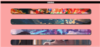
我要评论实现的效果

实现代码
html
<div class="scene">
  <div class="wrapper">
    <ul class="tunnel">
      <li class="ring"></li>
      <li class="ring"></li>
      <li class="ring"></li>
      <li class="ring"></li>
      <li class="ring"></li>
      <li class="ring"></li>
      <li class="ring"></li>
      <li class="ring"></li>
      <li class="ring"></li>
      <li class="ring"></li>
      <li class="ring"></li>
      <li class="ring"></li>
      <li class="ring"></li>
      <li class="ring"></li>
      <li class="ring"></li>
      <li class="ring"></li>
      <li class="ring"></li>
      <li class="ring"></li>
      <li class="ring"></li>
      <li class="ring"></li>
      <li class="ring"></li>
      <li class="ring"></li>
      <li class="ring"></li>
      <li class="ring"></li>
      <li class="ring"></li>
      <li class="ring"></li>
      <li class="ring"></li>
      <li class="ring"></li>
      <li class="ring"></li>
      <li class="ring"></li>
      <li class="ring"></li>
      <li class="ring"></li>
      <li class="ring"></li>
      <li class="ring"></li>
      <li class="ring"></li>
      <li class="ring"></li>
      <li class="ring"></li>
      <li class="ring"></li>
      <li class="ring"></li>
      <li class="ring"></li>
      <li class="ring"></li>
      <li class="ring"></li>
      <li class="ring"></li>
      <li class="ring"></li>
      <li class="ring"></li>
      <li class="ring"></li>
      <li class="ring"></li>
      <li class="ring"></li>
      <li class="ring"></li>
      <li class="ring"></li>
      <li class="ring"></li>
      <li class="ring"></li>
      <li class="ring"></li>
      <li class="ring"></li>
      <li class="ring"></li>
      <li class="ring"></li>
      <li class="ring"></li>
      <li class="ring"></li>
      <li class="ring"></li>
      <li class="ring"></li>
      <li class="ring"></li>
      <li class="ring"></li>
      <li class="ring"></li>
      <li class="ring"></li>
      <li class="ring"></li>
      <li class="ring"></li>
      <li class="ring"></li>
      <li class="ring"></li>
      <li class="ring"></li>
      <li class="ring"></li>
      <li class="ring"></li>
      <li class="ring"></li>
    </ul>
  </div>
</div>
css3
@keyframes roundandround {
  to {
    transform: rotatex(360deg);
  }
}
body {
  background-color: #000000;
}

.scene {
  width: 600px;
  height: 600px;
  margin: 0 auto;
  perspective: 500px;
}

.wrapper {
  width: 100%;
  height: 100%;
  transform-style: preserve-3d;
  transform: rotatey(0deg) translatez(300px);
}

.tunnel {
  position: relative;
  width: 200px;
  height: 200px;
  margin: 0 auto;
  transform-style: preserve-3d;
  animation: roundandround 10s infinite linear;
}

.tunnel .ring {
  position: absolute;
  top: 0;
  left: 0;
  width: 100%;
  height: 100%;
  border: 6px;
  border-style: dashed;
  border-radius: 50%;
  transform-origin: 50% 50%;
  color: #8df435;
  transform: translatey(-200px);
}

/* sass optimisation thanks to @imjared */
.ring:nth-child(1) {
  color: #ff1500;
  transform: rotatex(5deg) translatey(-200px);
}

.ring:nth-child(2) {
  color: #ff2b00;
  transform: rotatex(10deg) translatey(-200px);
}

.ring:nth-child(3) {
  color: #ff4000;
  transform: rotatex(15deg) translatey(-200px);
}

.ring:nth-child(4) {
  color: #ff5500;
  transform: rotatex(20deg) translatey(-200px);
}

.ring:nth-child(5) {
  color: #ff6a00;
  transform: rotatex(25deg) translatey(-200px);
}

.ring:nth-child(6) {
  color: #ff8000;
  transform: rotatex(30deg) translatey(-200px);
}

.ring:nth-child(7) {
  color: #ff9500;
  transform: rotatex(35deg) translatey(-200px);
}

.ring:nth-child(8) {
  color: #ffaa00;
  transform: rotatex(40deg) translatey(-200px);
}

.ring:nth-child(9) {
  color: #ffbf00;
  transform: rotatex(45deg) translatey(-200px);
}

.ring:nth-child(10) {
  color: #ffd500;
  transform: rotatex(50deg) translatey(-200px);
}

.ring:nth-child(11) {
  color: #ffea00;
  transform: rotatex(55deg) translatey(-200px);
}

.ring:nth-child(12) {
  color: yellow;
  transform: rotatex(60deg) translatey(-200px);
}

.ring:nth-child(13) {
  color: #eaff00;
  transform: rotatex(65deg) translatey(-200px);
}

.ring:nth-child(14) {
  color: #d5ff00;
  transform: rotatex(70deg) translatey(-200px);
}

.ring:nth-child(15) {
  color: #bfff00;
  transform: rotatex(75deg) translatey(-200px);
}

.ring:nth-child(16) {
  color: #aaff00;
  transform: rotatex(80deg) translatey(-200px);
}

.ring:nth-child(17) {
  color: #95ff00;
  transform: rotatex(85deg) translatey(-200px);
}

.ring:nth-child(18) {
  color: #80ff00;
  transform: rotatex(90deg) translatey(-200px);
}

.ring:nth-child(19) {
  color: #6aff00;
  transform: rotatex(95deg) translatey(-200px);
}

.ring:nth-child(20) {
  color: #55ff00;
  transform: rotatex(100deg) translatey(-200px);
}

.ring:nth-child(21) {
  color: #40ff00;
  transform: rotatex(105deg) translatey(-200px);
}

.ring:nth-child(22) {
  color: #2bff00;
  transform: rotatex(110deg) translatey(-200px);
}

.ring:nth-child(23) {
  color: #15ff00;
  transform: rotatex(115deg) translatey(-200px);
}

.ring:nth-child(24) {
  color: lime;
  transform: rotatex(120deg) translatey(-200px);
}

.ring:nth-child(25) {
  color: #00ff15;
  transform: rotatex(125deg) translatey(-200px);
}

.ring:nth-child(26) {
  color: #00ff2b;
  transform: rotatex(130deg) translatey(-200px);
}

.ring:nth-child(27) {
  color: #00ff40;
  transform: rotatex(135deg) translatey(-200px);
}

.ring:nth-child(28) {
  color: #00ff55;
  transform: rotatex(140deg) translatey(-200px);
}

.ring:nth-child(29) {
  color: #00ff6a;
  transform: rotatex(145deg) translatey(-200px);
}

.ring:nth-child(30) {
  color: #00ff80;
  transform: rotatex(150deg) translatey(-200px);
}

.ring:nth-child(31) {
  color: #00ff95;
  transform: rotatex(155deg) translatey(-200px);
}

.ring:nth-child(32) {
  color: #00ffaa;
  transform: rotatex(160deg) translatey(-200px);
}

.ring:nth-child(33) {
  color: #00ffbf;
  transform: rotatex(165deg) translatey(-200px);
}

.ring:nth-child(34) {
  color: #00ffd5;
  transform: rotatex(170deg) translatey(-200px);
}

.ring:nth-child(35) {
  color: #00ffea;
  transform: rotatex(175deg) translatey(-200px);
}

.ring:nth-child(36) {
  color: cyan;
  transform: rotatex(180deg) translatey(-200px);
}

.ring:nth-child(37) {
  color: #00eaff;
  transform: rotatex(185deg) translatey(-200px);
}

.ring:nth-child(38) {
  color: #00d5ff;
  transform: rotatex(190deg) translatey(-200px);
}

.ring:nth-child(39) {
  color: deepskyblue;
  transform: rotatex(195deg) translatey(-200px);
}

.ring:nth-child(40) {
  color: #00aaff;
  transform: rotatex(200deg) translatey(-200px);
}

.ring:nth-child(41) {
  color: #0095ff;
  transform: rotatex(205deg) translatey(-200px);
}

.ring:nth-child(42) {
  color: #0080ff;
  transform: rotatex(210deg) translatey(-200px);
}

.ring:nth-child(43) {
  color: #006aff;
  transform: rotatex(215deg) translatey(-200px);
}

.ring:nth-child(44) {
  color: #0055ff;
  transform: rotatex(220deg) translatey(-200px);
}

.ring:nth-child(45) {
  color: #0040ff;
  transform: rotatex(225deg) translatey(-200px);
}

.ring:nth-child(46) {
  color: #002bff;
  transform: rotatex(230deg) translatey(-200px);
}

.ring:nth-child(47) {
  color: #0015ff;
  transform: rotatex(235deg) translatey(-200px);
}

.ring:nth-child(48) {
  color: blue;
  transform: rotatex(240deg) translatey(-200px);
}

.ring:nth-child(49) {
  color: #1500ff;
  transform: rotatex(245deg) translatey(-200px);
}

.ring:nth-child(50) {
  color: #2b00ff;
  transform: rotatex(250deg) translatey(-200px);
}

.ring:nth-child(51) {
  color: #4000ff;
  transform: rotatex(255deg) translatey(-200px);
}

.ring:nth-child(52) {
  color: #5500ff;
  transform: rotatex(260deg) translatey(-200px);
}

.ring:nth-child(53) {
  color: #6a00ff;
  transform: rotatex(265deg) translatey(-200px);
}

.ring:nth-child(54) {
  color: #8000ff;
  transform: rotatex(270deg) translatey(-200px);
}

.ring:nth-child(55) {
  color: #9500ff;
  transform: rotatex(275deg) translatey(-200px);
}

.ring:nth-child(56) {
  color: #aa00ff;
  transform: rotatex(280deg) translatey(-200px);
}

.ring:nth-child(57) {
  color: #bf00ff;
  transform: rotatex(285deg) translatey(-200px);
}

.ring:nth-child(58) {
  color: #d500ff;
  transform: rotatex(290deg) translatey(-200px);
}

.ring:nth-child(59) {
  color: #ea00ff;
  transform: rotatex(295deg) translatey(-200px);
}

.ring:nth-child(60) {
  color: magenta;
  transform: rotatex(300deg) translatey(-200px);
}

.ring:nth-child(61) {
  color: #ff00ea;
  transform: rotatex(305deg) translatey(-200px);
}

.ring:nth-child(62) {
  color: #ff00d5;
  transform: rotatex(310deg) translatey(-200px);
}

.ring:nth-child(63) {
  color: #ff00bf;
  transform: rotatex(315deg) translatey(-200px);
}

.ring:nth-child(64) {
  color: #ff00aa;
  transform: rotatex(320deg) translatey(-200px);
}

.ring:nth-child(65) {
  color: #ff0095;
  transform: rotatex(325deg) translatey(-200px);
}

.ring:nth-child(66) {
  color: #ff0080;
  transform: rotatex(330deg) translatey(-200px);
}

.ring:nth-child(67) {
  color: #ff006a;
  transform: rotatex(335deg) translatey(-200px);
}

.ring:nth-child(68) {
  color: #ff0055;
  transform: rotatex(340deg) translatey(-200px);
}

.ring:nth-child(69) {
  color: #ff0040;
  transform: rotatex(345deg) translatey(-200px);
}

.ring:nth-child(70) {
  color: #ff002b;
  transform: rotatex(350deg) translatey(-200px);
}

.ring:nth-child(71) {
  color: #ff0015;
  transform: rotatex(355deg) translatey(-200px);
}

.ring:nth-child(72) {
  color: red;
  transform: rotatex(360deg) translatey(-200px);
}
以上就是css3实现的3d隧道效果的详细内容,更多关于css3 3d隧道效果的资料请关注代码网其它相关文章!


发表评论