 我要评论
我要评论交互事件按照触发类型来分类,包括触屏事件、键鼠事件和焦点事件。
-
触屏事件:手指或手写笔在触屏上的单指或单笔操作。
-
键鼠事件:包括外设鼠标或触控板的操作事件和外设键盘的按键事件。
鼠标事件是指通过连接和使用外设鼠标/触控板操作时所响应的事件。
按键事件是指通过连接和使用外设键盘操作时所响应的事件。 -
焦点事件:通过以上方式控制组件焦点的能力和响应的事件。
手势事件由绑定手势方法和绑定的手势组成,绑定的手势可以分为单一手势和组合手势两种类型,根据手势的复杂程度进行区分。
-
绑定手势方法:用于在组件上绑定单一手势或组合手势,并声明所绑定的手势的响应优先级。
-
单一手势:手势的基本单元,是所有复杂手势的组成部分。
-
组合手势:由多个单一手势组合而成,可以根据声明的类型将多个单一手势按照一定规则组合成组合手势,并进行使用。
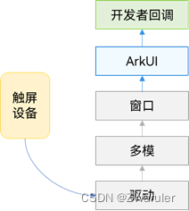
1. 触屏事件
触屏事件指当手指/手写笔在组件上按下、滑动、抬起时触发的回调事件。包括点击事件、拖拽事件和触摸事件。
触摸事件原理
1.1 点击事件
点击事件是指通过手指或手写笔做出一次完整的按下和抬起动作。当发生点击事件时,会触发以下回调函数:
onclick(event: (event?: clickevent) => void)
event参数提供点击事件相对于窗口或组件的坐标位置,以及发生点击的事件源。
例如通过按钮的点击事件控制图片的显示和隐藏。
@entry
@component
struct ifelsetransition {
  @state flag: boolean = true;
  @state btnmsg: string = 'show';

  build() {
    column() {
      button(this.btnmsg).width(80).height(30).margin(30)
        .onclick(() => {
          if (this.flag) {
            this.btnmsg = 'hide';
          } else {
            this.btnmsg = 'show';
          }
          // 点击button控制image的显示和消失
          this.flag = !this.flag;
        })
      if (this.flag) {
        image($r('app.media.icon')).width(200).height(200)
      }
    }.height('100%').width('100%')
  }
}
1.2 拖拽事件
拖拽事件指手指/手写笔长按组件(>=500ms),并拖拽到接收区域释放的事件。拖拽事件触发流程:
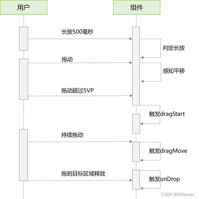
拖拽事件的触发通过长按、拖动平移判定,手指平移的距离达到5vp即可触发拖拽事件。arkui支持应用内、跨应用的拖拽事件。
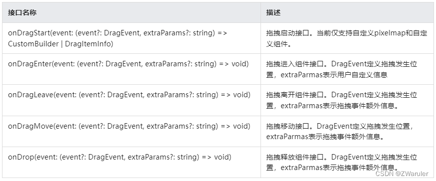
拖拽事件提供以下接口:
如下是跨窗口拖拽,拖出窗口示例:
import image from '@ohos.multimedia.image';

@entry
@component
struct index {
  @state visible: visibility = visibility.visible
  private pixelmapreader = undefined

  abouttoappear() {
    console.info('begin to create pixmap has info message: ')
    this.createpixelmap()
  }

  createpixelmap() {
    let color = new arraybuffer(4 * 96 * 96);
    var buffer = new uint8array(color);
    for (var i = 0; i < buffer.length; i++) {
      buffer[i] = (i + 1) % 255;
    }
    let opts = {
      alphatype: 0,
      editable: true,
      pixelformat: 4,
      scalemode: 1,
      size: { height: 96, width: 96 }
    }
    const promise = image.createpixelmap(color, opts);
    promise.then((data) => {
      console.info('create pixmap has info message: ' + json.stringify(data))
      this.pixelmapreader = data;
    })
  }

  @builder pixelmapbuilder() {
    text('drag item')
      .width('100%')
      .height(100)
      .fontsize(16)
      .textalign(textalign.center)
      .borderradius(10)
      .backgroundcolor(0xffffff)
  }

  build() {
    flex({ direction: flexdirection.column, alignitems: itemalign.center, justifycontent: flexalign.center }) {
      text('app1')
        .width('40%')
        .height(80)
        .fontsize(20)
        .margin(30)
        .textalign(textalign.center)
        .backgroundcolor(color.pink)
        .visibility(visibility.visible)

      text('across window drag this')
        .width('80%')
        .height(80)
        .fontsize(16)
        .margin(30)
        .textalign(textalign.center)
        .backgroundcolor(color.pink)
        .visibility(this.visible)
        .ondragstart(() => {                    //启动跨窗口拖拽
          console.info('text ondrag start')
          return { pixelmap: this.pixelmapreader, extrainfo: 'custom extra info.' }
        })
        .ondrop((event: dragevent, extraparams: string) => {
          console.info('text ondragdrop,  ')
          this.visible = visibility.none                    //拖动结束后,使源不可见
        })
    }

    .width('100%')
    .height('100%')
  }
}
跨窗口拖拽,拖入示例:
@entry
@component
struct index {
  @state number: string[] = ['drag here']
  @state text: string = ''
  @state bool1: boolean = false
  @state bool2: boolean = false
  @state visible: visibility = visibility.visible
  @state visible2: visibility = visibility.none
  scroller: scroller = new scroller()

  build() {
    flex({ direction: flexdirection.column, alignitems: itemalign.center, justifycontent: flexalign.center }) {
      text('app2')
        .width('40%')
        .height(80)
        .fontsize(20)
        .margin(30)
        .textalign(textalign.center)
        .backgroundcolor(color.pink)
        .visibility(visibility.visible)

      list({ space: 20, initialindex: 0 }) {
        foreach(this.number, (item) => {
          listitem() {
            text('' + item)
              .width('100%')
              .height(80)
              .fontsize(16)
              .borderradius(10)
              .textalign(textalign.center)
              .backgroundcolor(0xffffff)
          }
        }, item => item)

        listitem() {
          text('across window drag this')
            .width('80%')
            .height(80)
            .fontsize(16)
            .margin(30)
            .textalign(textalign.center)
            .backgroundcolor(color.pink)
            .visibility(this.visible2)
        }
      }
      .height('50%')
      .width('90%')
      .border({ width: 1 })
      .divider({ strokewidth: 2, color: 0xffffff, startmargin: 20, endmargin: 20 })
      .ondragenter((event: dragevent, extraparams: string) => {                         //拖拽进去组件
        console.info('list ondragenter, ' + extraparams)
      })
      .ondragmove((event: dragevent, extraparams: string) => {                          //拖拽时移动
        console.info('list ondragmove, ' + extraparams)
      })
      .ondragleave((event: dragevent, extraparams: string) => {                         //拖拽离开组件
        console.info('list ondragleave, ' + extraparams)
      })
      .ondrop((event: dragevent, extraparams: string) => {                              //释放组件
        console.info('list ondragdrop, ' + extraparams)
        this.visible2 = visibility.visible                                              //拖拽完成使拖入目标可见
      })
    }
    .width('100%')
    .height('100%')
  }
}
1.3 触摸事件
当手指或手写笔在组件上触碰时,会触发不同动作所对应的事件响应,包括按下(down)、滑动(move)、抬起(up)事件:
ontouch(event: (event?: touchevent) => void)
-
event.type为touchtype.down:表示手指按下。
-
event.type为touchtype.up:表示手指抬起。
-
event.type为touchtype.move:表示手指按住移动。
触摸事件可以同时多指触发,通过event参数可获取触发的手指位置、手指唯一标志、当前发生变化的手指和输入的设备源等信息。
// xxx.ets
@entry
@component
struct touchexample {
  @state text: string = '';
  @state eventtype: string = '';

  build() {
    column() {
      button('touch').height(40).width(100)
        .ontouch((event: touchevent) => {
          if (event.type === touchtype.down) {
            this.eventtype = 'down';
          }
          if (event.type === touchtype.up) {
            this.eventtype = 'up';
          }
          if (event.type === touchtype.move) {
            this.eventtype = 'move';
          }
          this.text = 'touchtype:' + this.eventtype + '\ndistance between touch point and touch element:\nx: '
          + event.touches[0].x + '\n' + 'y: ' + event.touches[0].y + '\ncomponent globalpos:('
          + event.target.area.globalposition.x + ',' + event.target.area.globalposition.y + ')\nwidth:'
          + event.target.area.width + '\nheight:' + event.target.area.height
        })
      button('touch').height(50).width(200).margin(20)
        .ontouch((event: touchevent) => {
          if (event.type === touchtype.down) {
            this.eventtype = 'down';
          }
          if (event.type === touchtype.up) {
            this.eventtype = 'up';
          }
          if (event.type === touchtype.move) {
            this.eventtype = 'move';
          }
          this.text = 'touchtype:' + this.eventtype + '\ndistance between touch point and touch element:\nx: '
          + event.touches[0].x + '\n' + 'y: ' + event.touches[0].y + '\ncomponent globalpos:('
          + event.target.area.globalposition.x + ',' + event.target.area.globalposition.y + ')\nwidth:'
          + event.target.area.width + '\nheight:' + event.target.area.height
        })
      text(this.text)
    }.width('100%').padding(30)
  }
}
2. 键鼠事件
2.1 鼠标事件
支持的鼠标事件包含通过外设鼠标、触控板触发的事件。
鼠标事件可触发以下回调:
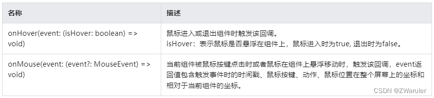
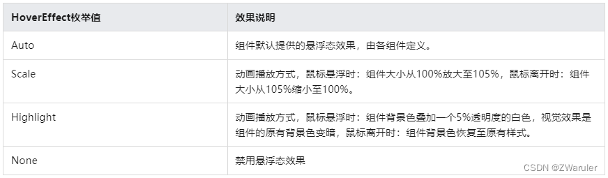
当组件绑定onhover回调时,可以通过hovereffect属性设置该组件的鼠标悬浮态显示效果。
鼠标事件数据流
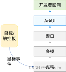
鼠标事件传递到arkui之后,会先判断鼠标事件是否是左键的按下/抬起/移动,然后做出不同响应:
-
是:鼠标事件先转换成相同位置的触摸事件,执行触摸事件的碰撞测试、手势判断和回调响应。接着去执行鼠标事件的碰撞测试和回调响应。
-
否:事件仅用于执行鼠标事件的碰撞测试和回调响应。
所有单指可响应的触摸事件/手势事件,均可通过鼠标左键来操作和响应。例如当我们需要开发单击button跳转页面的功能、且需要支持手指点击和鼠标左键点击,那么只绑定一个点击事件(onclick)就可以实现该效果。若需要针对手指和鼠标左键的点击实现不一样的效果,可以在onclick回调中,使用回调参数中的source字段即可判断出当前触发事件的来源是手指还是鼠标。
2.2 onhover
onhover(event: (ishover?: boolean) => void)
鼠标悬浮事件回调。参数ishover类型为boolean,表示鼠标进入组件或离开组件。该事件不支持自定义冒泡设置,默认父子冒泡。
若组件绑定了该接口,当鼠标指针从组件外部进入到该组件的瞬间会触发事件回调,参数ishover等于true;鼠标指针离开组件的瞬间也会触发该事件回调,参数ishover等于false。
// xxx.ets
@entry
@component
struct mouseexample {
  @state ishovered: boolean = false;

  build() {
    column() {
      button(this.ishovered ? 'hovered!' : 'not hover')
        .width(200).height(100)
        .backgroundcolor(this.ishovered ? color.green : color.gray)
        .onhover((ishover: boolean) => { // 使用onhover接口监听鼠标是否悬浮在button组件上
          this.ishovered = ishover;
        })
    }.width('100%').height('100%').justifycontent(flexalign.center)
  }
}
2.3 onmouse
onmouse(event: (event?: mouseevent) => void)
鼠标事件回调。绑定该api的组件每当鼠标指针在该组件内产生行为(mouseaction)时,触发事件回调,参数为mouseevent对象,表示触发此次的鼠标事件。该事件支持自定义冒泡设置,默认父子冒泡。常见用于开发者自定义的鼠标行为逻辑处理。
开发者可以通过回调中的mouseevent对象获取触发事件的坐标(screenx/screeny/x/y)、按键(mousebutton)、行为(mouseaction)、时间戳(timestamp)、交互组件的区域(eventtarget)、事件来源(sourcetype)等。mouseevent的回调函数stoppropagation用于设置当前事件是否阻止冒泡。
按键(mousebutton)的值:left/right/middle/back/forward 均对应鼠标上的实体按键,当这些按键被按下或松开时触发这些按键的事件。none表示无按键,会出现在鼠标没有按键按下或松开的状态下,移动鼠标所触发的事件中。
// xxx.ets
@entry
@component
struct mouseexample {
  @state ishovered: boolean = false;
  @state buttontext: string = '';
  @state columntext: string = '';

  build() {
    column() {
      button(this.ishovered ? 'hovered!' : 'not hover')
        .width(200)
        .height(100)
        .backgroundcolor(this.ishovered ? color.green : color.gray)
        .onhover((ishover: boolean) => {
          this.ishovered = ishover
        })
        .onmouse((event: mouseevent) => {    // 给button组件设置onmouse回调
          this.buttontext = 'button onmouse:\n' + '' +
          'button = ' + event.button + '\n' +
          'action = ' + event.action + '\n' +
          'x,y = (' + event.x + ',' + event.y + ')' + '\n' +
          'screenxy=(' + event.screenx + ',' + event.screeny + ')';
        })
      divider()
      text(this.buttontext).fontcolor(color.green)
      divider()
      text(this.columntext).fontcolor(color.red)
    }
    .width('100%')
    .height('100%')
    .justifycontent(flexalign.center)
    .borderwidth(2)
    .bordercolor(color.red)
    .onmouse((event: mouseevent) => {    // 给column组件设置onmouse回调
      this.columntext = 'column onmouse:\n' + '' +
      'button = ' + event.button + '\n' +
      'action = ' + event.action + '\n' +
      'x,y = (' + event.x + ',' + event.y + ')' + '\n' +
      'screenxy=(' + event.screenx + ',' + event.screeny + ')';
    })
  }
}
如果需要阻止鼠标事件冒泡,可以通过调用stoppropagation()方法进行设置。
button(this.ishovered ? 'hovered!' : 'not hover')
  .width(200)
  .height(100)
  .backgroundcolor(this.ishovered ? color.green : color.gray)
  .onhover((ishover: boolean) => {
    this.ishovered = ishover;
  })
  .onmouse((event: mouseevent) => {
    event.stoppropagation(); // 在button的onmouse事件中设置阻止冒泡
    this.buttontext = 'button onmouse:\n' + '' +
    'button = ' + event.button + '\n' +
    'action = ' + event.action + '\n' +
    'x,y = (' + event.x + ',' + event.y + ')' + '\n' +
    'screenxy=(' + event.screenx + ',' + event.screeny + ')';
  })
效果是:当鼠标在button组件上操作时,仅button的onmouse回调会响应,column的onmouse回调不会响应。
2.4 hovereffect
hovereffect(value: hovereffect)
鼠标悬浮态效果设置的通用属性。参数类型为hovereffect,hovereffect提供的auto、scale、highlight效果均为固定效果,开发者无法自定义设置效果参数。
// xxx.ets
@entry
@component
struct hoverexample {
  build() {
    column({ space: 10 }) {
      button('auto')
        .width(170).height(70)
      button('scale')
        .width(170).height(70)
        .hovereffect(hovereffect.scale)
      button('highlight')
        .width(170).height(70)
        .hovereffect(hovereffect.highlight)
      button('none')
        .width(170).height(70)
        .hovereffect(hovereffect.none)
    }.width('100%').height('100%').justifycontent(flexalign.center)
  }
}
3. 按键事件
按键事件数据流
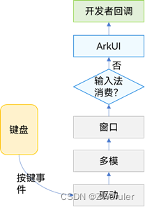
按键事件由外设键盘等设备触发,经驱动和多模处理转换后发送给当前获焦的窗口。窗口获取到事件后,会先给输入法分发(输入法会消费按键用作输入),若输入法未消费该按键事件,才会将事件发给arkui框架。因此,当某输入框组件获焦,且打开了输入法,此时大部分按键事件均会被输入法消费,例如字母键会被输入法用来往输入框中输入对应字母字符、方向键会被输入法用来切换选中备选词。
按键事件到arkui框架之后,会先找到完整的父子节点获焦链。从叶子节点到根节点,逐一发送按键事件。
3.1 onkeyevent
onkeyevent(event: (event?: keyevent) => void)
按键事件回调,当绑定该方法的组件处于获焦状态下,外设键盘的按键事件会触发该api的回调响应,回调参数为keyevent,可由该参数获得当前按键事件的按键行为(keytype)、键码(keycode)、按键英文名称(keytext)、事件来源设备类型(keysource)、事件来源设备id(deviceid)、元键按压状态(metakey)、时间戳(timestamp)、阻止冒泡设置(stoppropagation)。
// xxx.ets
@entry
@component
struct keyeventexample {
  @state buttontext: string = '';
  @state buttontype: string = '';
  @state columntext: string = '';
  @state columntype: string = '';

  build() {
    column() {
      button('onkeyevent')
        .width(140).height(70)
        .onkeyevent((event: keyevent) => { // 给button设置onkeyevent事件
          if (event.type === keytype.down) {
            this.buttontype = 'down';
          }
          if (event.type === keytype.up) {
            this.buttontype = 'up';
          }
          this.buttontext = 'button: \n' +
          'keytype:' + this.buttontype + '\n' +
          'keycode:' + event.keycode + '\n' +
          'keytext:' + event.keytext;
        })

      divider()
      text(this.buttontext).fontcolor(color.green)

      divider()
      text(this.columntext).fontcolor(color.red)
    }.width('100%').height('100%').justifycontent(flexalign.center)
    .onkeyevent((event: keyevent) => { // 给父组件column设置onkeyevent事件
      if (event.type === keytype.down) {
        this.columntype = 'down';
      }
      if (event.type === keytype.up) {
        this.columntype = 'up';
      }
      this.columntext = 'column: \n' +
      'keytype:' + this.buttontype + '\n' +
      'keycode:' + event.keycode + '\n' +
      'keytext:' + event.keytext;
    })
  }
}
打开应用后,依次在键盘上按这些按键:“空格、回车、左ctrl、左shift、字母a、字母z”。
-
由于onkeyevent事件默认是冒泡的,所以button和column的onkeyevent都可以响应。
-
每个按键都有2次回调,分别对应keytype.down和keytype.up,表示按键被按下、然后抬起。
如果要阻止冒泡,即仅button响应键盘事件,column不响应,在button的onkeyevent回调中加入event.stoppropagation()方法即可
4. 焦点事件
4.1 基本概念
-
焦点
指向当前应用界面上唯一的一个可交互元素,当用户使用键盘、电视遥控器、车机摇杆/旋钮等非指向性输入设备与应用程序进行间接交互时,基于焦点的导航和交互是重要的输入手段。 -
默认焦点
应用打开或切换页面后,若当前页上存在可获焦的组件,则树形结构的组件树中第一个可获焦的组件默认获得焦点。可以使用自定义默认焦点进行自定义指定。 -
获焦
指组件获得了焦点,同一时刻,应用中最多只有1个末端组件是获焦的,且此时它的所有祖宗组件(整个组件链)均是获焦的。当期望某个组件获焦,须确保该组件及其所有的祖宗节点均是可获焦的(focusable属性为true)。 -
失焦
指组件从获焦状态变成了非获焦状态,失去了焦点。组件失焦时,它的所有祖宗组件(失焦组件链)与新的获焦组件链不相同的节点都会失焦。 -
走焦
表示焦点在当前应用中转移的过程,走焦会带来原焦点组件的失焦和新焦点组件的获焦。应用中焦点发生变化的方式按行为可分为两类:-
主动走焦:指开发者/用户主观的行为导致焦点移动,包含:外接键盘上按下tab/方向键、使用requestfocus主动给指定组件申请焦点、组件focusontouch属性为true后点击组件。
-
被动走焦:指组件焦点因其他操作被动的转移焦点,此特性为焦点系统默认行为,无法由开发者自由设定,例如当使用if-else语句将处于获焦的组件删除/将处于获焦的组件(或其父组件)置成不可获焦时、当页面切换时。
-
-
焦点态
获焦组件的样式,不同组件的焦点态样式大同小异,默认情况下焦点态不显示,仅使用外接键盘按下tab键/方向键时才会触发焦点态样式出现。首次触发焦点态显示的tab键/方向键不会触发走焦。当应用接收到点击事件时(包括手指触屏的按下事件和鼠标左键的按下事件),自动隐藏焦点态样式。焦点态样式由后端组件定义,开发者无法修改。
4.2 走焦规则
走焦规则是指用户使用“tab键/shift+tab键/方向键”主动进行走焦,或焦点系统在执行被动走焦时的顺序规则。组件的走焦规则默认由走焦系统定义,由焦点所在的容器决定。
-
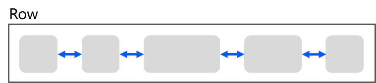
线性走焦:常见的容器有flex、row、column、list,这些都是典型的单方向容器,组件在这些容器内的排列都是线性的,那么走焦规则也是线性的。走焦的方向和方向键的方向一致。
线性走焦示意图
-
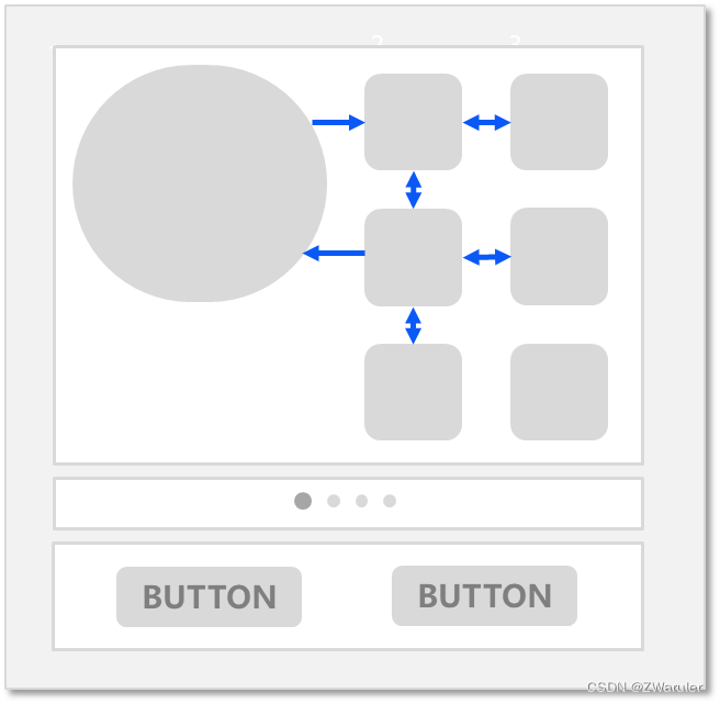
十字走焦:使用方向键上(↑)下(↓)左(←)右(→)可以使焦点在相邻的组件上切换。典型的是grid容器,
grid组件十字走焦示意图
-
tab/shift+tab键在以上两种走焦规则上的功能和方向键一致。tab键等同于“先执行方向键右,若无法走焦,再执行方向键下”,shift+tab键等同于“先执行方向键左,若无法走焦,再执行方向键上”。
-
触发走焦的按键是按下的事件(down事件)。
-
删除组件、设置组件无法获焦后,会使用线性走焦规则,自动先往被删除/unfocusable组件的前置兄弟组件上走焦,无法走焦的话,再往后置兄弟组件上走焦。
-
tabindex走焦:给组件设置tabindex通用属性,自定义组件的tab键/shift+tab键的走焦顺序。
-
区域走焦:给容器组件设置tabindex通用属性,再结合groupdefaultfocus通用属性,自定义容器区域的tab键/shift+tab键的走焦顺序和默认获焦组件。
-
走焦至容器组件规则:当焦点走焦到容器(该容器没有配置groupdefaultfocus)上时,若该容器组件为首次获焦,则会先计算目标容器组件的子组件的区域位置,得到距离目标容器中心点最近的子组件,焦点会走到目标容器上的该子组件上。若该容器非首次获焦,焦点会自动走焦到上一次目标容器中获焦的子组件。
-
焦点交互:当某组件获焦时,该组件的固有点击任务或开发者绑定的onclick回调任务,会自动挂载到空格/回车按键上,当按下按键时,任务就和手指/鼠标点击一样被执行。
本文涉及到的焦点均为组件焦点,另外一个焦点的概念是:窗口焦点,指向当前获焦的窗口。当窗口失焦时,该窗口应用中的所有获焦组件全部失焦。
4.3 监听组件的焦点变化
获焦事件回调,绑定该api的组件获焦时,回调响应。
onfocus(event: () => void)
失焦事件回调,绑定该api的组件失焦时,回调响应。
onblur(event:() => void)
onfocus和onblur两个接口通常成对使用,来监听组件的焦点变化。
以下示例代码展示获焦/失焦回调的使用方法:
// xxx.ets
@entry
@component
struct focuseventexample {
  @state onebuttoncolor: color = color.gray;
  @state twobuttoncolor: color = color.gray;
  @state threebuttoncolor: color = color.gray;

  build() {
    column({ space: 20 }) {
      // 通过外接键盘的上下键可以让焦点在三个按钮间移动,按钮获焦时颜色变化,失焦时变回原背景色
      button('first button')
        .width(260)
        .height(70)
        .backgroundcolor(this.onebuttoncolor)
        .fontcolor(color.black)
          // 监听第一个组件的获焦事件,获焦后改变颜色
        .onfocus(() => {
          this.onebuttoncolor = color.green;
        })
          // 监听第一个组件的失焦事件,失焦后改变颜色
        .onblur(() => {
          this.onebuttoncolor = color.gray;
        })

      button('second button')
        .width(260)
        .height(70)
        .backgroundcolor(this.twobuttoncolor)
        .fontcolor(color.black)
          // 监听第二个组件的获焦事件,获焦后改变颜色
        .onfocus(() => {
          this.twobuttoncolor = color.green;
        })
          // 监听第二个组件的失焦事件,失焦后改变颜色
        .onblur(() => {
          this.twobuttoncolor = color.grey;
        })

      button('third button')
        .width(260)
        .height(70)
        .backgroundcolor(this.threebuttoncolor)
        .fontcolor(color.black)
          // 监听第三个组件的获焦事件,获焦后改变颜色
        .onfocus(() => {
          this.threebuttoncolor = color.green;
        })
          // 监听第三个组件的失焦事件,失焦后改变颜色
        .onblur(() => {
          this.threebuttoncolor = color.gray ;
        })
    }.width('100%').margin({ top: 20 })
  }
}
4.4 设置组件是否获焦
通过focusable接口设置组件是否可获焦:
focusable(value: boolean)
按照组件的获焦能力可大致分为三类:
-
默认可获焦的组件,通常是有交互行为的组件,例如button、checkbox,textinput组件,此类组件无需设置任何属性,默认即可获焦。
-
有获焦能力,但默认不可获焦的组件,典型的是text、image组件,此类组件缺省情况下无法获焦,若需要使其获焦,可使用通用属性focusable(true)使能。
-
无获焦能力的组件,通常是无任何交互行为的展示类组件,例如blank、circle组件,此类组件即使使用focusable属性也无法使其可获焦。
-
focusable为false表示组件不可获焦,同样可以使组件变成不可获焦的还有通用属性enabled。
-
当某组件处于获焦状态时,将其的focusable属性或enabled属性设置为false,会自动使该组件失焦,然后焦点按照走焦规则将焦点转移给其他组件。
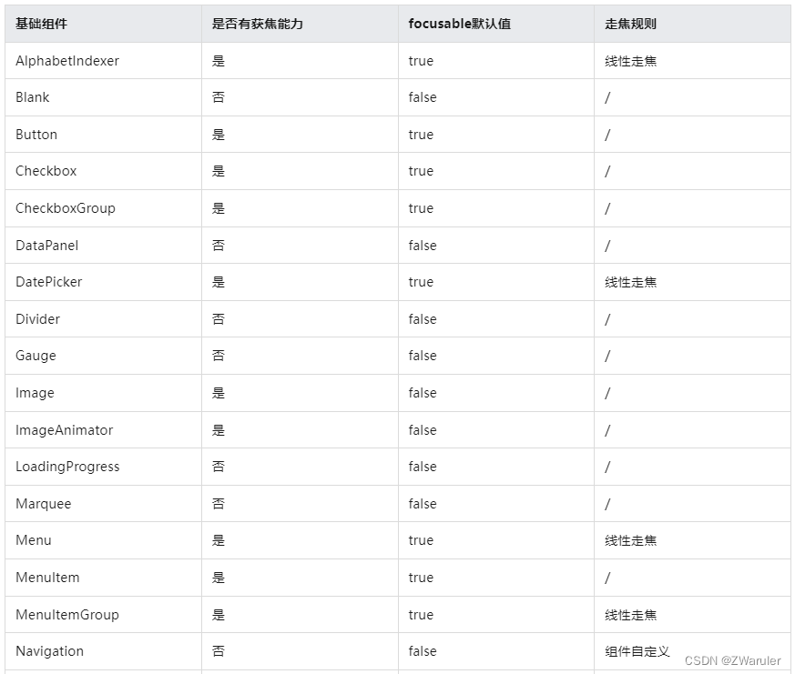
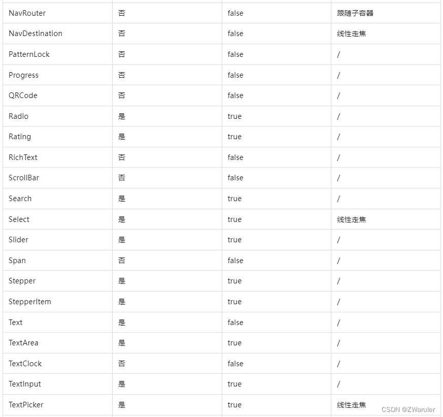
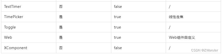
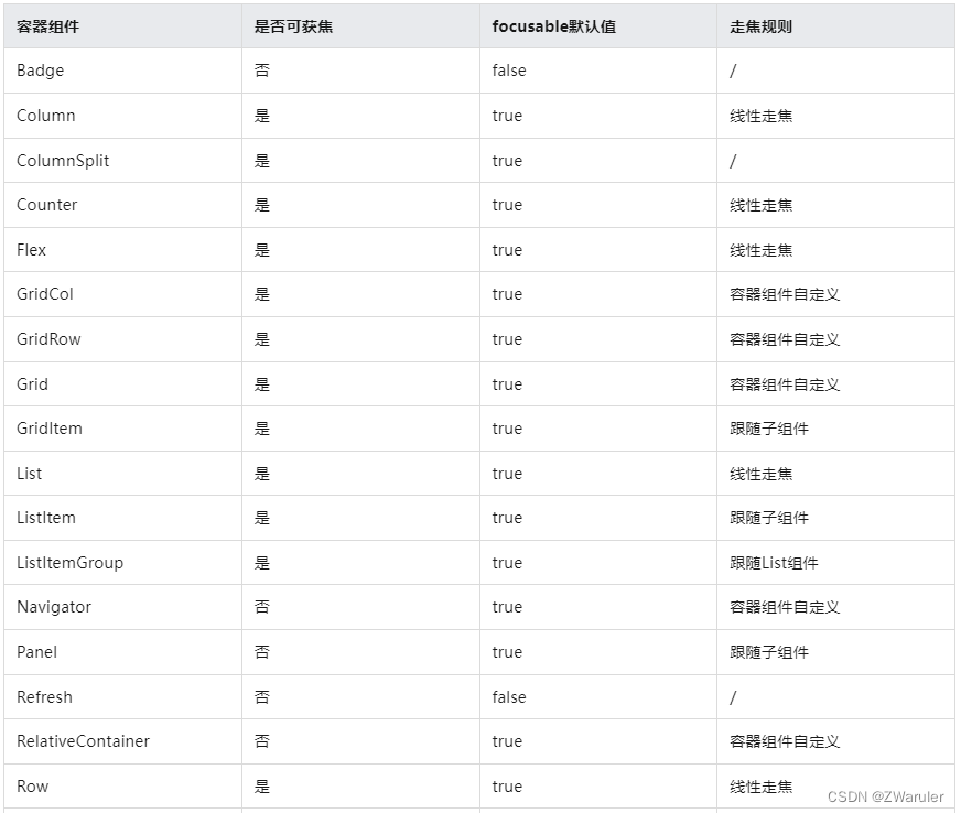
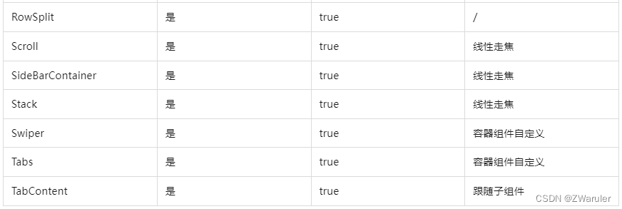
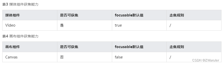
基础组件获焦能力
容器组件获焦能力
4.5 自定义默认焦点
defaultfocus(value: boolean)
焦点系统在页面初次构建完成时,会搜索当前页下的所有组件,找到第一个绑定了defaultfocus(true)的组件,然后将该组件置为默认焦点,若无任何组件绑定defaultfocus(true),则将第一个找到的可获焦的组件置为默认焦点。
以如下应用为例,应用布局如下:

以下是实现该应用的示例代码,且示例代码中没有设置defaultfocus:
// xxx.ets
import promptaction from '@ohos.promptaction';

class mydatasource implements idatasource {
  private list: number[] = [];
  private listener: datachangelistener;

  constructor(list: number[]) {
    this.list = list;
  }

  totalcount(): number {
    return this.list.length;
  }

  getdata(index: number): any {
    return this.list[index];
  }

  registerdatachangelistener(listener: datachangelistener): void {
    this.listener = listener;
  }

  unregisterdatachangelistener() {
  }
}

@entry
@component
struct swiperexample {
  private swipercontroller: swipercontroller = new swipercontroller()
  private data: mydatasource = new mydatasource([])

  abouttoappear(): void {
    let list = []
    for (let i = 1; i <= 4; i++) {
      list.push(i.tostring());
    }
    this.data = new mydatasource(list);
  }

  build() {
    column({ space: 5 }) {
      swiper(this.swipercontroller) {
        lazyforeach(this.data, (item: string) => {
          row({ space: 20 }) {
            column() {
              button('1').width(200).height(200)
                .fontsize(40)
                .backgroundcolor('#dadbd9')
            }

            column({ space: 20 }) {
              row({ space: 20 }) {
                button('2')
                  .width(100)
                  .height(100)
                  .fontsize(40)
                  .type(buttontype.normal)
                  .borderradius(20)
                  .backgroundcolor('#dadbd9')
                button('3')
                  .width(100)
                  .height(100)
                  .fontsize(40)
                  .type(buttontype.normal)
                  .borderradius(20)
                  .backgroundcolor('#dadbd9')
              }

              row({ space: 20 }) {
                button('4')
                  .width(100)
                  .height(100)
                  .fontsize(40)
                  .type(buttontype.normal)
                  .borderradius(20)
                  .backgroundcolor('#dadbd9')
                button('5')
                  .width(100)
                  .height(100)
                  .fontsize(40)
                  .type(buttontype.normal)
                  .borderradius(20)
                  .backgroundcolor('#dadbd9')
              }

              row({ space: 20 }) {
                button('6')
                  .width(100)
                  .height(100)
                  .fontsize(40)
                  .type(buttontype.normal)
                  .borderradius(20)
                  .backgroundcolor('#dadbd9')
                button('7')
                  .width(100)
                  .height(100)
                  .fontsize(40)
                  .type(buttontype.normal)
                  .borderradius(20)
                  .backgroundcolor('#dadbd9')
              }
            }
          }
          .width(480)
          .height(380)
          .justifycontent(flexalign.center)
          .borderwidth(2)
          .bordercolor(color.gray)
          .backgroundcolor(color.white)
        }, item => item)
      }
      .cachedcount(2)
      .index(0)
      .interval(4000)
      .indicator(true)
      .loop(true)
      .duration(1000)
      .itemspace(0)
      .curve(curve.linear)
      .onchange((index: number) => {
        console.info(index.tostring());
      })
      .margin({ left: 20, top: 20, right: 20 })

      row({ space: 40 }) {
        button('←')
          .fontsize(40)
          .fontweight(fontweight.bold)
          .fontcolor(color.black)
          .backgroundcolor(color.transparent)
          .onclick(() => {
            this.swipercontroller.showprevious();
          })
        button('→')
          .fontsize(40)
          .fontweight(fontweight.bold)
          .fontcolor(color.black)
          .backgroundcolor(color.transparent)
          .onclick(() => {
            this.swipercontroller.shownext();
          })
      }
      .width(480)
      .height(50)
      .justifycontent(flexalign.center)
      .borderwidth(2)
      .bordercolor(color.gray)
      .backgroundcolor('#f7f6dc')

      row({ space: 40 }) {
        button('cancel')
          .fontsize(30)
          .fontcolor('#787878')
          .type(buttontype.normal)
          .width(140)
          .height(50)
          .backgroundcolor('#dadbd9')

        button('ok')
          .fontsize(30)
          .fontcolor('#787878')
          .type(buttontype.normal)
          .width(140)
          .height(50)
          .backgroundcolor('#dadbd9')
          .onclick(() => {
            promptaction.showtoast({ message: 'button ok on clicked' });
          })
      }
      .width(480)
      .height(80)
      .justifycontent(flexalign.center)
      .borderwidth(2)
      .bordercolor(color.gray)
      .backgroundcolor('#dff2e4')
      .margin({ left: 20, bottom: 20, right: 20 })
    }.backgroundcolor('#f2f2f2')
    .margin({ left: 50, top: 50, right: 20 })
  }
}
当前应用上无任何defaultfocus设置,所以第一个可获焦的组件默认获取焦点,按下tab键/方向键让获焦的组件显示焦点态样式
假设开发者想让应用打开的时候,无需执行多余的切换焦点操作,直接点击按键的空格/回车键,就可以执行button-ok的onclick回调操作,那么就可以给这个button绑定defaultfocus(true),让它成为该页面上的默认焦点:
button('ok')
  .defaultfocus(true)    // 设置button-ok为defaultfocus
  .fontsize(30)
  .fontcolor('#787878')
  .type(buttontype.normal)
  .width(140).height(50).backgroundcolor('#dadbd9')
  .onclick(() => {
    promptaction.showtoast({ message: 'button ok on clicked' });
  })
4.6 自定义tab键走焦顺序
tabindex(index: number)
tabindex用于设置自定义tab键走焦顺序,默认值为0。使用“tab/shift+tab键”走焦时(方向键不影响),系统会自动获取到所有配置了tabindex大于0的组件,然后按照递增/递减排序进行走焦。
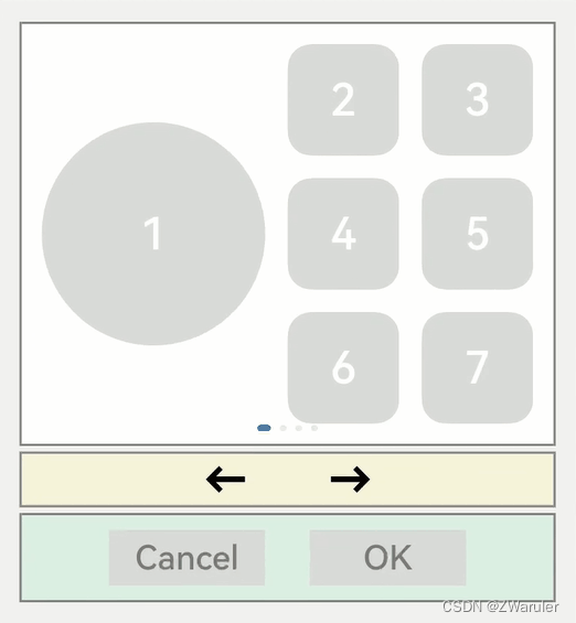
默认的走焦顺序从第一个获焦组件一路走到最后一个获焦组件,会经历button1->button4->button5->button7->左箭头->右箭头->buttonok。这种走焦队列比较完整,遍历了大部分的组件。但缺点是从第一个走到最后一个所经历的路径较长。
如果想实现快速的从第一个走到最后一个,又不想牺牲太多的遍历完整性,就可以使用tabindex通用属性。
比如:开发者把白色的区域当为一个整体,黄色的区域当为一个整体,绿色的区域当为一个整体,实现button1->左箭头->buttonok这种队列的走焦顺序,只需要在button1、左箭头、buttonok这三个组件上依次增加tabindex(1)、tabindex(2)、tabindex(3)。tabindex的参数表示tab走焦的顺序(从大于0的数字开始,从小到大排列)。
  button('1').width(200).height(200)
    .fontsize(40)
    .backgroundcolor('#dadbd9')
    .tabindex(1)    // button-1设置为第一个tabindex节点

  button('←')
    .fontsize(40)
    .fontweight(fontweight.bold)
    .fontcolor(color.black)
    .backgroundcolor(color.transparent)
    .onclick(() => {
      this.swipercontroller.showprevious();
    })
    .tabindex(2)    // button-左箭头设置为第二个tabindex节点
 button('ok')
  .fontsize(30)
  .fontcolor('#787878')
  .type(buttontype.normal)
  .width(140).height(50).backgroundcolor('#dadbd9')
  .onclick(() => {
    promptaction.showtoast({ message: 'button ok on clicked' });
  })
  .tabindex(3)    // button-ok设置为第三个tabindex节点
-
当焦点处于tabindex(大于0)节点上时,tab/shifttab会优先在tabindex(大于0)的队列中寻找后置/前置的节点,存在则走焦至相应的tabindex节点。若不存在,则使用默认的走焦逻辑继续往后/往前走焦。
-
当焦点处于tabindex(等于0)节点上时,tab/shifttab使用默认的走焦逻辑走焦,走焦的过程中会跳过tabindex(大于0)和tabindex(小于0)的节点。
-
当焦点处于tabindex(小于0)节点上时,tab/shifttab无法走焦。
1. groupdefaultfocus
groupdefaultfocus(value: boolean)
自定义tab键走焦顺序中所展示的使用tabindex完成快速走焦的能力有如下问题:
每个区域(白色/黄色/绿色三个区域)都设置了某个组件为tabindex节点(白色-button1、黄色-左箭头、绿色-buttonok),但这样设置之后,只能在这3个组件上按tab/shifttab键走焦时会有快速走焦的效果。
解决方案是给每个区域的容器设置tabindex,但是这样设置的问题是:第一次走焦到容器上时,获焦的子组件是默认的第一个可获焦组件,并不是自己想要的组件(button1、左箭头、buttonok)。
这样便引入了groupdefaultfocus通用属性,参数:boolean,默认值:false。
用法需和tabindex组合使用,使用tabindex给区域(容器)绑定走焦顺序,然后给button1、左箭头、buttonok绑定groupdefaultfocus(true),这样在首次走焦到目标区域(容器)上时,它的绑定了groupdefaultfocus(true)的子组件同时获得焦点。
// xxx.ets
import promptaction from '@ohos.promptaction';

class mydatasource implements idatasource {
  private list: number[] = [];
  private listener: datachangelistener;

  constructor(list: number[]) {
    this.list = list;
  }

  totalcount(): number {
    return this.list.length;
  }

  getdata(index: number): any {
    return this.list[index];
  }

  registerdatachangelistener(listener: datachangelistener): void {
    this.listener = listener;
  }

  unregisterdatachangelistener() {
  }
}

@entry
@component
struct swiperexample {
  private swipercontroller: swipercontroller = new swipercontroller()
  private data: mydatasource = new mydatasource([])

  abouttoappear(): void {
    let list = []
    for (let i = 1; i <= 4; i++) {
      list.push(i.tostring());
    }
    this.data = new mydatasource(list);
  }

  build() {
    column({ space: 5 }) {
      swiper(this.swipercontroller) {
        lazyforeach(this.data, (item: string) => {
          row({ space: 20 }) {    // 设置该row组件为tabindex的第一个节点
            column() {
              button('1').width(200).height(200)
                .fontsize(40)
                .backgroundcolor('#dadbd9')
                .groupdefaultfocus(true)    // 设置button-1为第一个tabindex的默认焦点
            }

            column({ space: 20 }) {
              row({ space: 20 }) {
                button('2')
                  .width(100)
                  .height(100)
                  .fontsize(40)
                  .type(buttontype.normal)
                  .borderradius(20)
                  .backgroundcolor('#dadbd9')
                button('3')
                  .width(100)
                  .height(100)
                  .fontsize(40)
                  .type(buttontype.normal)
                  .borderradius(20)
                  .backgroundcolor('#dadbd9')
              }

              row({ space: 20 }) {
                button('4')
                  .width(100)
                  .height(100)
                  .fontsize(40)
                  .type(buttontype.normal)
                  .borderradius(20)
                  .backgroundcolor('#dadbd9')
                button('5')
                  .width(100)
                  .height(100)
                  .fontsize(40)
                  .type(buttontype.normal)
                  .borderradius(20)
                  .backgroundcolor('#dadbd9')
              }

              row({ space: 20 }) {
                button('6')
                  .width(100)
                  .height(100)
                  .fontsize(40)
                  .type(buttontype.normal)
                  .borderradius(20)
                  .backgroundcolor('#dadbd9')
                button('7')
                  .width(100)
                  .height(100)
                  .fontsize(40)
                  .type(buttontype.normal)
                  .borderradius(20)
                  .backgroundcolor('#dadbd9')
              }
            }
          }
          .width(480)
          .height(380)
          .justifycontent(flexalign.center)
          .borderwidth(2)
          .bordercolor(color.gray)
          .backgroundcolor(color.white)
          .tabindex(1)
        }, item => item)
      }
      .cachedcount(2)
      .index(0)
      .interval(4000)
      .indicator(true)
      .loop(true)
      .duration(1000)
      .itemspace(0)
      .curve(curve.linear)
      .onchange((index: number) => {
        console.info(index.tostring());
      })
      .margin({ left: 20, top: 20, right: 20 })

      row({ space: 40 }) {    // 设置该row组件为第二个tabindex节点
        button('←')
          .fontsize(40)
          .fontweight(fontweight.bold)
          .fontcolor(color.black)
          .backgroundcolor(color.transparent)
          .onclick(() => {
            this.swipercontroller.showprevious();
          })
          .groupdefaultfocus(true)    // 设置button-左箭头为第二个tabindex节点的默认焦点
        button('→')
          .fontsize(40)
          .fontweight(fontweight.bold)
          .fontcolor(color.black)
          .backgroundcolor(color.transparent)
          .onclick(() => {
            this.swipercontroller.shownext();
          })
      }
      .width(480)
      .height(50)
      .justifycontent(flexalign.center)
      .borderwidth(2)
      .bordercolor(color.gray)
      .backgroundcolor('#f7f6dc')
      .tabindex(2)

      row({ space: 40 }) {    // 设置该row组件为第三个tabindex节点
        button('cancel')
          .fontsize(30)
          .fontcolor('#787878')
          .type(buttontype.normal)
          .width(140)
          .height(50)
          .backgroundcolor('#dadbd9')

        button('ok')
          .fontsize(30)
          .fontcolor('#787878')
          .type(buttontype.normal)
          .width(140)
          .height(50)
          .backgroundcolor('#dadbd9')
          .defaultfocus(true)
          .onclick(() => {
            promptaction.showtoast({ message: 'button ok on clicked' });
          })
          .groupdefaultfocus(true)    // 设置button-ok为第三个tabindex节点的默认焦点
      }
      .width(480)
      .height(80)
      .justifycontent(flexalign.center)
      .borderwidth(2)
      .bordercolor(color.gray)
      .backgroundcolor('#dff2e4')
      .margin({ left: 20, bottom: 20, right: 20 })
      .tabindex(3)
    }.backgroundcolor('#f2f2f2')
    .margin({ left: 50, top: 50, right: 20 })
  }
}
2. focusontouch
focusontouch(value: boolean)
点击获焦能力,参数:boolean,默认值:false(输入类组件:textinput、textarea、search、web默认值是true)。
点击是指使用触屏或鼠标左键进行单击,默认为false的组件,例如button,不绑定该api时,点击button不会使其获焦,当给button绑定focusontouch(true)时,点击button会使button立即获得焦点。
给容器绑定focusontouch(true)时,点击容器区域,会立即使容器的第一个可获焦组件获得焦点。
示例代码:
// requestfocus.ets
import promptaction from '@ohos.promptaction';

@entry
@component
struct requestfocusexample {
  @state idlist: string[] = ['a', 'b', 'c', 'd', 'e', 'f', 'n']

  build() {
    column({ space:20 }){
      button("id: " + this.idlist[0] + " focusontouch(true) + focusable(false)")
        .width(400).height(70).fontcolor(color.white).focusontouch(true)
        .focusable(false)
      button("id: " + this.idlist[1] + " default")
        .width(400).height(70).fontcolor(color.white)
      button("id: " + this.idlist[2] + " focusontouch(false)")
        .width(400).height(70).fontcolor(color.white).focusontouch(false)
      button("id: " + this.idlist[3] + " focusontouch(true)")
        .width(400).height(70).fontcolor(color.white).focusontouch(true)
    }.width('100%').margin({ top:20 })
  }
}
button-a虽然设置了focusontouch(true),但是同时也设置了focusable(false),该组件无法获焦,因此点击后也无法获焦;
button-b不设置相关属性,点击后不会获焦;
button-c设置了focusontouch(false),同button-b,点击后也不会获焦;
button-d设置了focusontouch(true),点击即可使其获焦;
由于焦点态的阐述的特性,焦点态在屏幕接收点击事件后会立即清除。因此该示例代码在每次点击后,需要再次按下tab键使焦点态再次显示,才可知道当前焦点所在的组件。
3. focuscontrol.requestfocus
focuscontrol.requestfocus(id: string)
主动申请焦点能力的全局方法,参数:string,参数表示被申请组件的id(通用属性id设置的字符串)。
使用方法为:在任意执行语句中调用该api,指定目标组件的id为方法参数,当程序执行到该语句时,会立即给指定的目标组件申请焦点。
代码示例:
// requestfocus.ets
import promptaction from '@ohos.promptaction';

@entry
@component
struct requestfocusexample {
  @state idlist: string[] = ['a', 'b', 'c', 'd', 'e', 'f', 'n']
  @state requestid: number = 0

  build() {
    column({ space:20 }){
      row({space: 5}) {
        button("id: " + this.idlist[0] + " focusable(false)")
          .width(200).height(70).fontcolor(color.white)
          .id(this.idlist[0])
          .focusable(false)
        button("id: " + this.idlist[1])
          .width(200).height(70).fontcolor(color.white)
          .id(this.idlist[1])
      }
      row({space: 5}) {
        button("id: " + this.idlist[2])
          .width(200).height(70).fontcolor(color.white)
          .id(this.idlist[2])
        button("id: " + this.idlist[3])
          .width(200).height(70).fontcolor(color.white)
          .id(this.idlist[3])
      }
      row({space: 5}) {
        button("id: " + this.idlist[4])
          .width(200).height(70).fontcolor(color.white)
          .id(this.idlist[4])
        button("id: " + this.idlist[5])
          .width(200).height(70).fontcolor(color.white)
          .id(this.idlist[5])
      }
    }.width('100%').margin({ top:20 })
    .onkeyevent((e) => {
      if (e.keycode >= 2017 && e.keycode <= 2022) {
        this.requestid = e.keycode - 2017;
      } else if (e.keycode === 2030) {
        this.requestid = 6;
      } else {
        return;
      }
      if (e.type !== keytype.down) {
        return;
      }
      let res = focuscontrol.requestfocus(this.idlist[this.requestid]);
      if (res) {
        promptaction.showtoast({message: 'request success'});
      } else {
        promptaction.showtoast({message: 'request failed'});
      }
    })
  }
}
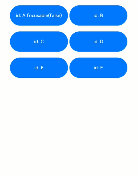
解读:页面中共6个button组件,其中button-a组件设置了focusable(false),表示其不可获焦,在外部容器的onkeyevent中,监听按键事件,当按下a ~ f按键时,分别去申请button a ~ f 的焦点,另外按下n键,是给当前页面上不存在的id的组件去申请焦点。
-
按下tab键,由于第一个组件button-a设置了无法获焦,那么默认第二个组件button-b获焦,button-b展示焦点态样式;
-
键盘上按下a键,申请button-a的焦点,气泡显示request failed,表示无法获取到焦点,焦点位置未改变;
-
键盘上按下b键,申请button-b的焦点,气泡显示request success,表示获焦到了焦点,焦点位置原本就在button-b,位置未改变;
-
键盘上按下c键,申请button-c的焦点,气泡显示request success,表示获焦到了焦点,焦点位置从button-b变更为button-c;
-
键盘上按下d键,申请button-d的焦点,气泡显示request success,表示获焦到了焦点,焦点位置从button-c变更为button-d;
-
键盘上按下e键,申请button-e的焦点,气泡显示request success,表示获焦到了焦点,焦点位置从button-d变更为button-e;
-
键盘上按下f键,申请button-f的焦点,气泡显示request success,表示获焦到了焦点,焦点位置从button-e变更为button-f;
-
键盘上按下n键,申请未知组件的焦点,气泡显示request failed,表示无法获取到焦点,焦点位置不变;


发表评论