 我要评论
我要评论1 stage模型应用程序包结构
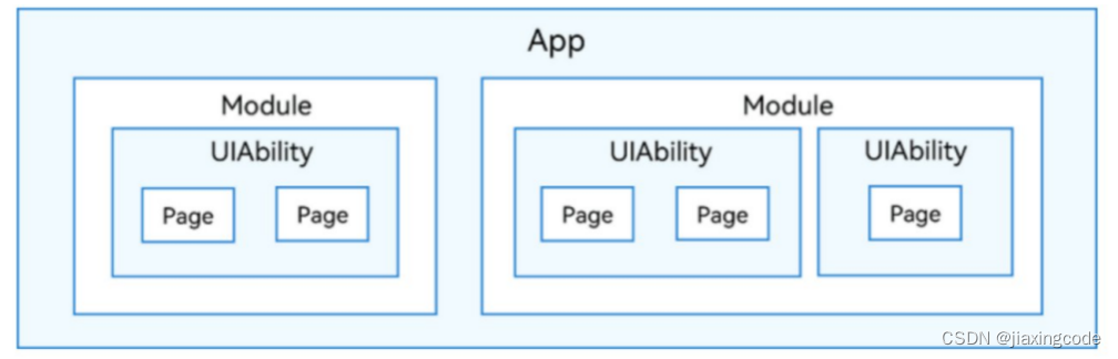
在开发态,一个应用包含一个或者多个module,可以在deveco studio工程中创建一个或者多个module。module是harmonyos应用/服务的基本功能单元,包含了源代码、资源文件、第三方库及应用/服务配置文件,每一个module都可以独立进行编译和运行。module分为“ability”和“library”两种类型,“ability”类型的module对应于编译后的hap(harmony ability package);“library”类型的module对应于har(harmony archive),或者hsp(harmony shared package),har相当于android中的lib下的jar或者aar。hsp相当于通过gradle引入第三方包。一个module可以包含一个或多个uiability组件。
module与uiability组件关系示意图
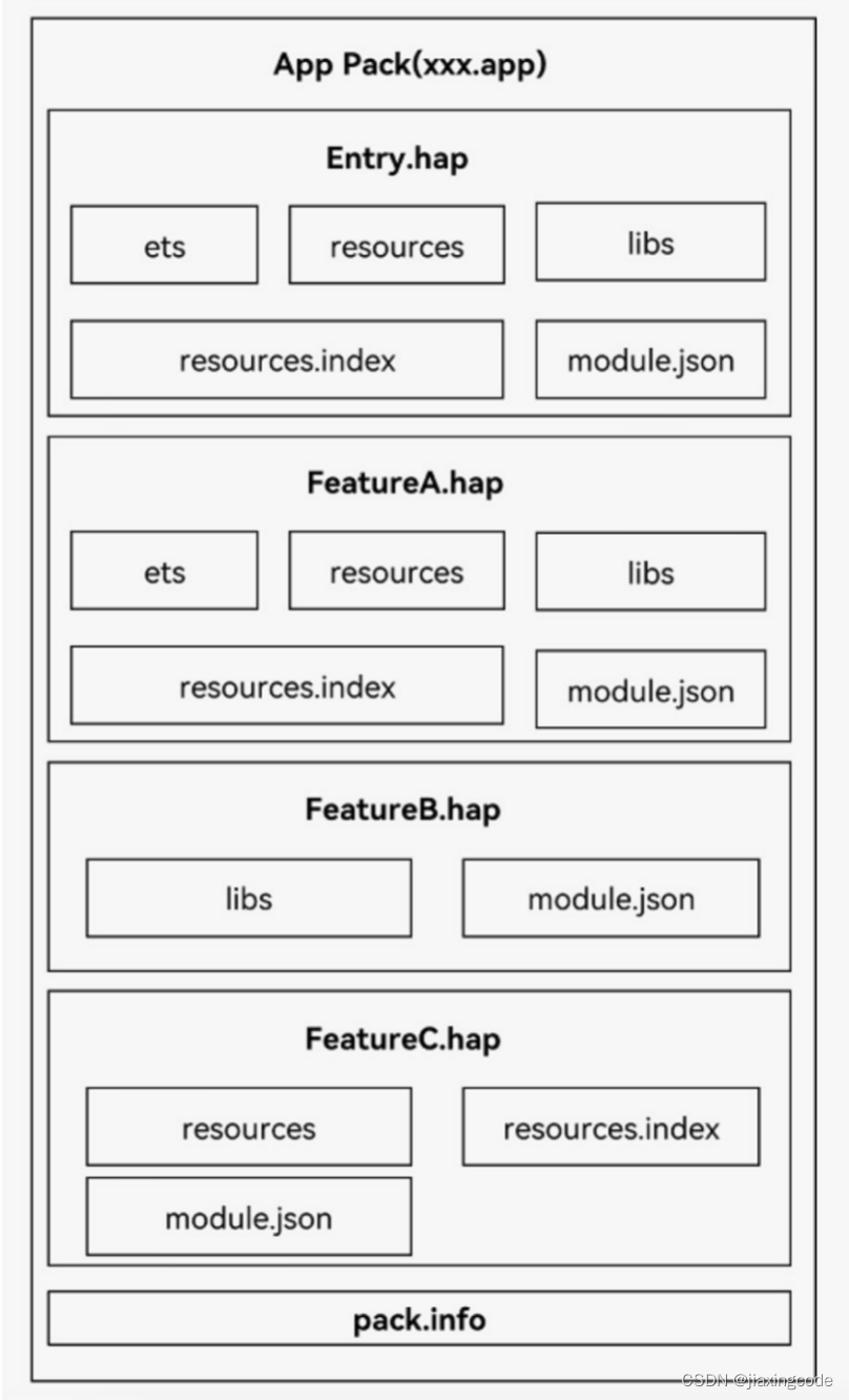
开发者通过deveco studio把应用程序编译为一个或者多个.hap后缀的文件,即hap。hap是harmonyos应用安装的基本单位,包含了编译后的代码、资源、三方库及配置文件。hap可分为entry和feature两种类型。
- entry类型的hap:是应用的主模块,在module.json5配置文件中的type标签配置为“entry”类型。在同一个应用中,同一设备类型只支持一个entry类型的hap,通常用于实现应用的入口界面、入口图标、主特性功能等。
- feature类型的hap:是应用的动态特性模块,在module.json5配置文件中的type标签配置为“feature”类型。一个应用程序包可以包含一个或多个feature类型的hap,也可以不包含;feature类型的hap通常用于实现应用的特性功能,可以配置成按需下载安装,也可以配置成随entry类型的hap一起下载安装(请参见module对象内部结构中的“deliverywithinstall”)。
每个harmonyos应用可以包含多个.hap文件,一个应用中的.hap文件合在一起称为一个bundle,而bundlename就是应用的唯一标识,在应用上架到应用市场时,需要把应用包含的所有.hap文件(即bundle)打包为一个.app后缀的文件用于上架,这个.app文件称为app pack(application package),其中同时包含了描述app pack属性的pack.info文件;在云端(服务器)分发和终端设备安装时,都是以hap为单位进行分发和安装的。打包后的hap包结构包括ets、libs、resources等文件夹和resources.index、module.json、pack.info等文件。
- ets目录用于存放应用代码编译后的字节码文件。
- libs目录用于存放库文件。库文件是harmonyos应用依赖的第三方代码(.so二进制文件)。
- resources目录用于存放应用的资源文件(字符串、图片等),便于开发者使用和维护,详见资源分类与访问。
- resources.index是资源索引表,由ide编译工程时生成。
- module.json是hap的配置文件,内容由工程配置中的module.json5和app.json5组成,该文件是hap中必不可少的文件。ide会自动生成一部分默认配置,开发者按需修改其中的配置。详细字段请参见应用配置文件。
- pack.info是bundle中用于描述每个hap属性的文件,例如app中的bundlename和versioncode信息、module中的name、type和abilities等信息,由ide工具生成bundle包时自动生成。
应用程序包结构(stage模型)
资源访问
应用开发过程中,经常需要用到颜色、字体、间距、图片等资源,在不同的设备或配置中,这些资源的值可能不同。
1、应用资源:借助资源文件能力,开发者在应用中自定义资源,自行管理这些资源在不同的设备或配置中的表现。
2、系统资源:开发者直接使用系统预置的资源定义(即分层参数,同一资源id在设备类型、深浅色等不同配置下有不同的取值)
base目录
base目录是默认存在的目录,二级子目录element用于存放字符串、颜色、布尔值等基础元素,media、profile存放媒体、动画、布局等资源文件。
目录中的资源文件会被编译成二进制文件,并赋予资源文件id。通过指定资源类型(type)和资源名称(name)引用。
限定词目录
en_us和zh_cn是默认存在的两个限定词目录,其余限定词目录需要开发者根据开发需要自行创建。二级子目录element、media、profile用于存放字符串、颜色、布尔值等基础元素,以及媒体、动画、布局等资源文件。
同样,目录中的资源文件会被编译成二进制文件,并赋予资源文件id。通过指定资源类型(type)和资源名称(name)来引用。
限定词目录的命名要求
限定词目录可以由一个或多个表征应用场景或设备特征的限定词组合而成,包括移动国家码和移动网络码、语言、文字、国家或地区、横竖屏、设备类型、颜色模式和屏幕密度等维度,限定词之间通过下划线(_)或者中划线(-)连接。开发者在创建限定词目录时,需要遵守限定词目录的命名规则。
限定词的组合顺序:
_移动国家码_移动网络码-语言_文字_国家或地区-横竖屏-设备类型-颜色模式-屏幕密度_。开发者可以根据应用的使用场景和设备特征,选择其中的一类或几类限定词组成目录名称。
限定词的连接方式:
语言、文字、国家或地区之间采用下划线(_)连接,移动国家码和移动网络码之间也采用下划线(_)连接,除此之外的其他限定词之间均采用中划线(-)连接。例如:zh_hant_cn、zh_cn-car-ldpi。
页面和自定义组件生命周期
自定义组件:@component装饰的ui单元,可以组合多个系统组件实现ui的复用,可以调用组件的生命周期。
页面:即应用的ui页面。可以由一个或者多个自定义组件组成,@entry装饰的自定义组件为页面的入口组件,即页面的根节点,一个页面有且仅能有一个@entry。只有被@entry装饰的组件才可以调用页面的生命周期。
页面生命周期,即被@entry装饰的组件生命周期,提供以下生命周期接口:
- onpageshow:页面每次显示时触发一次,包括路由过程、应用进入前台等场景。
- onpagehide:页面每次隐藏时触发一次,包括路由过程、应用进入后台等场景。
- onbackpress:当用户点击返回按钮时触发。
组件生命周期,即一般用@component装饰的自定义组件的生命周期,提供以下生命周期接口:
- abouttoappear:组件即将出现时回调该接口,具体时机为在创建自定义组件的新实例后,在执行其build()函数之前执行。
- abouttodisappear:在自定义组件析构销毁之前执行。不允许在abouttodisappear函数中改变状态变量,特别是@link变量的修改可能会导致应用程序行为不稳定。
生命周期流程如下图所示,下图展示的是被@entry装饰的组件(页面)生命周期。

应用程序包更新流程
harmonyos包管理服务提供了应用程序包更新能力,更新方式如下。
- 应用市场内更新:新版本应用通过应用市场上架后,应用市场通知终端用户该应用有新版本,终端用户可以根据通知到应用市场(客户端)进行应用升级。
- 应用内检测升级:终端用户启动应用时,应用市场检测到该应用有新版本会通知终端用户,可以到应用市场进行应用的下载更新。
您正在浏览harmonyos开发者3.1/4.0版本配套的开发者文档,对应api能力级别为api 9 release,详细版本配套关系请参考版本说明。
创建自定义组件
在arkui中,ui显示的内容均为组件,由框架直接提供的称为系统组件,由开发者定义的称为自定义组件。只有@entry声明的组件才有页面生命周期
@entry
@component
struct parentcomponent {
  build() {
    column() {
      text('arkui message')
      hellocomponent({ message: 'hello, world!' });
      divider()
      hellocomponent({ message: '你好!' });
    }
  }
}
2 h5和鸿蒙通信
为了兼容当前h5使用的dsbridge框架,鸿蒙端使用dsbridge-harmonyos库和h5进行通信
3 装饰器
全局的装饰器需要使用function关键字,组件内的装饰器不需要使用function
3.1 @builder装饰器
又叫自定义构建函数,将重复使用的ui元素抽象成一个方法,在build方法里调用。自定义构建函数的参数传递有按值传递和按引用传递两种(默认按值传递)。如果一个变量用@state修饰,变量值改变需要刷新ui,那么需要使用按引用传递。如果不需要刷新ui可以使用按值传递
按值传递
@builder function overbuilder(parama1: string) {
row() {
text(`usestatevarbyvalue: ${parama1} `)
}
}
@entry
@component
struct parent {
@state label: string = 'hello';
build() {
column() {
overbuilder(this.label)
}
}
}
按引用传递
@builder function overbuilder($$: { parama1: string }) {
row() {
text(`usestatevarbyreference: ${$$.parama1} `)
}
}
@entry
@component
struct parent {
@state label: string = 'hello';
build() {
column() {
// 在parent组件中调用abuilder的时候,将this.label引用传递给abuilder
overbuilder({ parama1: this.label })
button('click me').onclick(() => {
// 点击“click me”后,ui从“hello”刷新为“arkui”
this.label = 'arkui';
})
}
}
}
3.2 @builderparam装饰器
用来装饰指向@builder方法的变量,开发者可在初始化自定义组件时对此属性进行赋值,为自定义组件增加特定的功能。@builderparam装饰的方法只能被自定义构建函数(@builder装饰的方法)初始化
@builder function overbuilder($$ : {label: string }) {
text($$.label)
.width(400)
.height(50)
.backgroundcolor(color.green)
}
@component
struct child {
label: string = 'child'
// 无参数类型,指向的componentbuilder也是无参数类型
@builderparam custombuilderparam: () => void;
// 有参数类型,指向的globalbuilder1也是有参数类型的方法
@builderparam customoverbuilderparam: ($$ : { label : string}) => void;
build() {
column() {
this.custombuilderparam()
this.customoverbuilderparam({label: 'global builder label' } )
}
}
}
@entry
@component
struct parent {
label: string = 'parent'
@builder componentbuilder() {
text(`${this.label}`)
}
build() {
column() {
this.componentbuilder()
child({ custombuilderparam: this.componentbuilder, customoverbuilderparam: overbuilder })
}
}
}
3.3 @styles装饰器
定义组件重用样式。@styles装饰器可以将多条样式设置提炼成一个方法,直接在组件声明的位置调用。通过@styles装饰器可以快速定义并复用自定义样式。
- 组件内@styles的优先级高于全局@styles。
- 框架优先找当前组件内的@styles,如果找不到,则会全局查找
// 全局
@styles function functionname() { ... }
// 在组件内
@component
struct fancyuse {
@styles fancy() {
.height(100)
}
}
使用场景
// 定义在全局的@styles封装的样式
@styles function globalfancy () {
.width(150)
.height(100)
.backgroundcolor(color.pink)
}
@entry
@component
struct fancyuse {
@state heightvalue: number = 100
// 定义在组件内的@styles封装的样式
@styles fancy() {
.width(200)
.height(this.heightvalue)
.backgroundcolor(color.yellow)
.onclick(() => {
this.heightvalue = 200
})
}
build() {
column({ space: 10 }) {
// 使用全局的@styles封装的样式
text('fancya')
.globalfancy()
.fontsize(30)
// 使用组件内的@styles封装的样式
text('fancyb')
.fancy()
.fontsize(30)
}
}
}
3.4 @extend装饰器
用于扩展原生组件样式,仅支持定义在全局
// @extend(text)可以支持text的私有属性fontcolor
@extend(text) function fancy () {
.fontcolor(color.red)
}
// superfancytext可以调用预定义的fancy。组件内的fancy在“3.3 @styles装饰器”里声明过
@extend(text) function superfancytext(size:number) {
.fontsize(size)
.fancy()
}
使用场景
以下示例声明了3个text组件,每个text组件均设置了fontstyle、fontweight和backgroundcolor样式
@entry
@component
struct fancyuse {
@state label: string = 'hello world'
build() {
row({ space: 10 }) {
text(`${this.label}`)
.fontstyle(fontstyle.italic)
.fontweight(100)
.backgroundcolor(color.blue)
text(`${this.label}`)
.fontstyle(fontstyle.italic)
.fontweight(200)
.backgroundcolor(color.pink)
text(`${this.label}`)
.fontstyle(fontstyle.italic)
.fontweight(300)
.backgroundcolor(color.orange)
}.margin('20%')
}
}
@extend将样式组合复用
@extend(text) function fancytext(weightvalue: number, color: color) {
.fontstyle(fontstyle.italic)
.fontweight(weightvalue)
.backgroundcolor(color)
}
通过@extend组合样式
@entry
@component
struct fancyuse {
@state label: string = 'hello world'
build() {
row({ space: 10 }) {
text(`${this.label}`)
.fancytext(100, color.blue)
text(`${this.label}`)
.fancytext(200, color.pink)
text(`${this.label}`)
.fancytext(300, color.orange)
}.margin('20%')
}
}
4 statestyles
多态样式。@styles和@extend仅仅应用于静态页面的样式复用,statestyles可以依据组件的内部状态的不同,快速设置不同样式。组件状态分为
- focused:获焦态。
- normal:正常态。
- pressed:按压态。
- disabled:不可用态
使用场景
@entry
@component
struct statestylessample {
build() {
column() {
button('button1')
.statestyles({
focused: {
.backgroundcolor(color.pink)
},
pressed: {
.backgroundcolor(color.black)
},
normal: {
.backgroundcolor(color.red)
}
})
.margin(20)
button('button2')
.statestyles({
focused: {
.backgroundcolor(color.pink)
},
pressed: {
.backgroundcolor(color.black)
},
normal: {
.backgroundcolor(color.red)
}
})
}.margin('30%')
}
}
5 状态管理
5.1 @state装饰器
- 组件内状态同步,当状态改变时ui会发生对应的渲染改变。@state装饰的变量叫做状态变量,必须初始化。
- 不管是基本数据类型还是引用类型,只能观察到一层数据的变化
- 父组件中常规变量、@state、@link、@prop、@provide、@consume、@objectlink、@storagelink、@storageprop、@localstoragelink和@localstorageprop装饰的变量,可以初始化子组件中@state装饰的变量
- 父组件中@state装饰的变量,可以初始化子组件中常规变量、@state、@link、@prop和@provide装饰的变量
使用场景
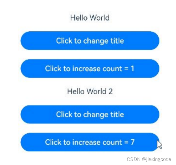
- 自定义组件mycomponent定义了被@state装饰的状态变量count和title,其中title的类型为自定义类model。如果count或title的值发生变化,则查询mycomponent中使用该状态变量的ui组件,并进行重新渲染。
- entrycomponent中有多个mycomponent组件实例,第一个mycomponent内部状态的更改不会影响第二个mycomponent。
class model {
public value: string;
constructor(value: string) {
this.value = value;
}
}
@entry
@component
struct entrycomponent {
build() {
column() {
// 此处指定的参数都将在初始渲染时覆盖本地定义的默认值,并不是所有的参数都需要从父组件初始化
mycomponent({ count: 1, increaseby: 2 })
.width(300)
mycomponent({ title: new model('hello world 2'), count: 7 })
}
}
}
@component
struct mycomponent {
@state title: model = new model('hello world');
@state count: number = 0;
private increaseby: number = 1;
build() {
column() {
text(`${this.title.value}`)
.margin(10)
button(`click to change title`)
.onclick(() => {
// @state变量的更新将触发上面的text组件内容更新
this.title.value = this.title.value === 'hello arkui' ? 'hello world' : 'hello arkui';
})
.width(300)
.margin(10)
button(`click to increase count = ${this.count}`)
.onclick(() => {
// @state变量的更新将触发该button组件的内容更新
this.count += this.increaseby;
})
.width(300)
.margin(10)
}
}
}
5.2 @prop装饰器
- 父向子单向同步,当状态改变时ui会发生对应的渲染改变。@prop装饰器不能在@entry装饰的自定义组件中使用。不可以在子组件中初始化(文档说可以,编译器说不可以)
- 不管是基本数据类型还是引用类型,只能观察到一层数据的变化
- 父组件中常规变量、@state、@link、@prop、@provide、@consume、@objectlink、@storagelink、@storageprop、@localstoragelink和@localstorageprop装饰的变量,可以初始化子组件中@prop装饰的变量
- 父组件中@prop装饰的变量,可以初始化子组件中常规变量、@state、@link、@prop、@provide装饰的变量
使用场景
如果图书馆有一本图书和两位用户,每位用户都可以将图书标记为已读,此标记行为不会影响其它读者用户。从代码角度讲,对@prop图书对象的本地更改不会同步给图书馆组件中的@state图书对象。
class book {
public title: string;
public pages: number;
public readit: boolean = false;
constructor(title: string, pages: number) {
this.title = title;
this.pages = pages;
}
}
@component
struct readercomp {
@prop title: string;
@prop readit: boolean;
build() {
row() {
text(this.title)
text(`... ${this.readit ? 'i have read' : 'i have not read it'}`)
.onclick(() => this.readit = true)
}
}
}
@entry
@component
struct library {
@state book: book = new book('100 secrets of c++', 765);
build() {
column() {
readercomp({ title: this.book.title, readit: this.book.readit })
readercomp({ title: this.book.title, readit: this.book.readit })
}
}
}
5.3 @link装饰器
- 父向子双向同步,当状态改变时ui会发生对应的渲染改变。@link装饰器不能在@entry装饰的自定义组件中使用。不可以在子组件中初始化(文档说可以,编译器说不可以)
- 不管是基本数据类型还是引用类型,只能观察到一层数据的变化
- 父组件中常规变量、@state、@link、@prop、@provide、@consume、@objectlink、@storagelink、@storageprop、@localstoragelink和@localstorageprop装饰的变量,可以初始化子组件中@link装饰的变量
- 父组件中@link装饰的变量,可以初始化子组件中常规变量、@state、@link、@prop、@provide装饰的变量
使用场景
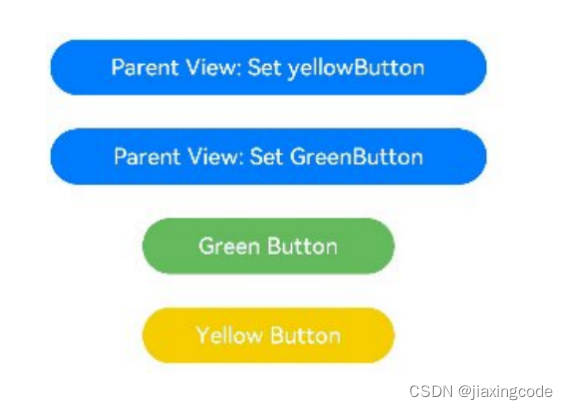
1.点击子组件greenbutton和yellowbutton中的button,子组件会发生相应变化,将变化同步给父组件。因为@link是双向同步,会将变化同步给@state。
2.当点击父组件shufflingcontainer中的button时,@state变化,也会同步给@link,子组件也会发生对应的刷新。
class greenbuttonstate {
width: number = 0;
constructor(width: number) {
this.width = width;
}
}
@component
struct greenbutton {
@link greenbuttonstate: greenbuttonstate;
build() {
button('green button')
.width(this.greenbuttonstate.width)
.height(40)
.backgroundcolor('#64bb5c')
.fontcolor('#ffffff,90%')
.onclick(() => {
if (this.greenbuttonstate.width < 700) {
// 更新class的属性,变化可以被观察到同步回父组件
this.greenbuttonstate.width += 60;
} else {
// 更新class,变化可以被观察到同步回父组件
this.greenbuttonstate = new greenbuttonstate(180);
}
})
}
}
@component
struct yellowbutton {
@link yellowbuttonstate: number;
build() {
button('yellow button')
.width(this.yellowbuttonstate)
.height(40)
.backgroundcolor('#f7ce00')
.fontcolor('#ffffff,90%')
.onclick(() => {
// 子组件的简单类型可以同步回父组件
this.yellowbuttonstate += 40.0;
})
}
}
@entry
@component
struct shufflingcontainer {
@state greenbuttonstate: greenbuttonstate = new greenbuttonstate(180);
@state yellowbuttonprop: number = 180;
build() {
column() {
flex({ direction: flexdirection.column, alignitems: itemalign.center }) {
// 简单类型从父组件@state向子组件@link数据同步
button('parent view: set yellowbutton')
.width(312)
.height(40)
.margin(12)
.fontcolor('#ffffff,90%')
.onclick(() => {
this.yellowbuttonprop = (this.yellowbuttonprop < 700) ? this.yellowbuttonprop + 40 : 100;
})
// class类型从父组件@state向子组件@link数据同步
button('parent view: set greenbutton')
.width(312)
.height(40)
.margin(12)
.fontcolor('#ffffff,90%')
.onclick(() => {
this.greenbuttonstate.width = (this.greenbuttonstate.width < 700) ? this.greenbuttonstate.width + 100 : 100;
})
// class类型初始化@link
greenbutton({ greenbuttonstate: $greenbuttonstate }).margin(12)
// 简单类型初始化@link
yellowbutton({ yellowbuttonstate: $yellowbuttonprop }).margin(12)
}
}
}
}
5.4 @provide装饰器和@consume装饰器
- 与后代组件双向同步,可以跨层级传递
- @provide装饰的状态变量自动对其所有后代组件可用,即该变量被“provide”给他的后代组件。由此可见,@provide的方便之处在于,开发者不需要多次在组件之间传递变量。
- 后代通过使用@consume去获取@provide提供的变量,建立在@provide和@consume之间的双向数据同步,与@state/@link不同的是,前者可以在多层级的父子组件之间传递。
- @provide和@consume可以通过相同的变量名或者相同的变量别名绑定,变量类型必须相同。
// 通过相同的变量名绑定
@provide a: number = 0;
@consume a: number;
// 通过相同的变量别名绑定
@provide('a') b: number = 0;
@consume('a') c: number;
@provide和@consume通过相同的变量名或者相同的变量别名绑定时,@provide修饰的变量和@consume修饰的变量是一对多的关系。不允许在同一个自定义组件内,包括其子组件中声明多个同名或者同别名的@provide装饰的变量。
使用场景
在下面的示例是与后代组件双向同步状态@provide和@consume场景。当分别点击compa和compd组件内button时,reviewvotes 的更改会双向同步在compa和compd中。
@component
struct compd {
// @consume装饰的变量通过相同的属性名绑定其祖先组件compa内的@provide装饰的变量
@consume reviewvotes: number;
build() {
column() {
text(`reviewvotes(${this.reviewvotes})`)
button(`reviewvotes(${this.reviewvotes}), give +1`)
.onclick(() => this.reviewvotes += 1)
}
.width('50%')
}
}
@component
struct compc {
build() {
row({ space: 5 }) {
compd()
compd()
}
}
}
@component
struct compb {
build() {
compc()
}
}
@entry
@component
struct compa {
// @provide装饰的变量reviewvotes由入口组件compa提供其后代组件
@provide reviewvotes: number = 0;
build() {
column() {
button(`reviewvotes(${this.reviewvotes}), give +1`)
.onclick(() => this.reviewvotes += 1)
compb()
}
}
}
5.5 @observed装饰器和@objectlink装饰器
- @objectlink和@observed类装饰器用于在涉及嵌套对象或数组的场景中进行双向数据同步:
- 被@observed装饰的类,可以被观察到属性的变化;
- 子组件中@objectlink装饰器装饰的状态变量用于接收@observed装饰的类的实例,和父组件中对应的状态变量建立双向数据绑定。这个实例可以是数组中的被@observed装饰的项,或者是class object中的属性,这个属性同样也需要被@observed装饰。
- 单独使用@observed是没有任何作用的,需要搭配@objectlink或者@prop使用。
- @objectlink装饰的成员变量仅能监听到其子属性的变化,再深入嵌套的属性便无法观测到了
总结 @state 组件内同步,单层
@prop 父子单向同步,单层
@link 父子双向同步,单层
@provide/@consume 父子子子双向同步,单层
@observed/@objectlink父子双向同步,多层
5.6 localstorage
- 页面级ui状态存储(存储在内存中)
- 页面内共享,通过@entry接收一个localstorage实例,这个实例可以在页面内共享
- 页面间共享,在uiability实例内创建localstorage实例,实现页面间共享
使用步骤
①使用构造函数创建localstorage实例storage;
②使用@entry装饰器将storage添加到localstoragepage顶层组件中;
③建立数据同步
@localstoragelink绑定localstorage对给定的属性,建立双向数据同步。
@localstorageprop绑定localstorage对给定的属性,建立单向数据同步
// 创建新实例并使用给定对象初始化
let storage = new localstorage({ name:'tom' });
// 使localstorage可从@component组件访问
@entry(storage)
@component
struct localstoragepage {
// @localstorageprop变量装饰器与localstorage中的'name'属性建立单向绑定
@localstorageprop('name') myname:string = ''
build() {
row() {
column() {
text(this.myname)
.fontsize(50)
.fontweight(fontweight.bold)
//点击按钮后,只改变当前组件显示的myname,不会同步到localstorage中
button('更改名字').onclick(()=>{
this.myname = 'jack'
})
//子组件child
child()
}
.width('100%')
}
.height('100%')
}
}
@component
struct child {
// @localstorageprop变量装饰器与localstorage中的'name'属性建立单向绑定
@localstorageprop('name') myname:string = ''
build() {
row(){
//当父组件改变时,子组件不会改变,myname显示 'tom'
text(`child-${this.myname}`).fontsize(30)
}
}
}
5.7 appstorage
- 特殊的单例localstorage对象。由ui框架在应用程序启动时创建,为应用程序ui状态属性提供中央存储(存储在内存中)
- @storageprop(key)是和appstorage中key对应的属性建立单向数据同步
- @storagelink(key)是和appstorage中key对应的属性建立双向数据同步
appstorage.setorcreate('money', 50);
@entry
@component
struct appstoragepage {
@storagelink('money') storlink: number = 1;
build() {
row() {
column() {
text(`appstorage ${this.storlink}`)
.fontsize(30)
.onclick(() => this.storlink += 1)
}
.width('100%')
}
.height('100%')
}
}
5.8 persistentstorage
- 持久化存储ui状态,通常和appstorage配合使用,选择appstorage存储的数据写入磁盘,以确保这些属性在应用程序重新启动时的值与应用程序关闭时的值相同。类似于安卓的sp,建议存储数据不超过2kb,同步操作(存储在磁盘中)
- 如果需要存储大量的数据,建议使用数据库api。
- 支持number, string, boolean, enum ,可以被json.stringify()和json.parse()重构的对象
- 不支持嵌套对象(对象数组,对象的属性是对象等)。因为目前框架无法检测appstorage中嵌套对象(包括数组)值的变化,所以无法写回到persistentstorage中。
- 不支持undefined 和 null
5.8.1 persistprop
static persistprop<t>(key: string, defaultvalue: t): void
将appstorage中key对应的属性持久化到文件中。该接口的调用通常在访问appstorage之前。
persistentstorage.persistprop('money',50)
1、persistentstorage中没有money属性,使用appstorag中的money属性持久化,如果appstorage
中没有money属性则使用默认值(50)持久化
2、persistentstorage中有money属性,则将money属性的值写入appstorag的money属性里
persistentstorage.persistprop('money',50)
@entry
@component
struct persistentstoragepage {
@state message: string = 'hello persistentstoragepage'
@storagelink('money') money:number = 10
build() {
row() {
column({space:10}) {
text(this.message).fontsize(30)
// 应用退出时会保存当前结果。重新启动后,会显示上一次的保存结果
text(`money:${this.money}`).fontsize(30).fontweight(fontweight.bold)
.onclick(()=>{
this.money += 1
})
}
.width('100%')
}
.height('100%')
}
}
5.9 environment
- 设备环境查询。开发者如果需要应用程序运行的设备的环境参数,以此来作出不同的场景判断,比如多语言,暗黑模式等,需要用到environment设备环境查询。
- environment是arkui框架在应用程序启动时创建的单例对象。它为appstorage提供了一系列描述应用程序运行状态的属性。environment的所有属性都是不可变的(即应用不可写入),所有的属性都是简单类型。
// 将设备languagecode存入appstorage中
environment.envprop('languagecode', 'en');
@entry
@component
struct index {
@storageprop('languagecode') languagecode: string = 'en';
build() {
row() {
column() {
// 输出当前设备的languagecode
text(this.languagecode)
}
}
}
}
5.10 @watch装饰器
- 状态变量更改通知。@watch用于监听状态变量的变化,当状态变量变化时,@watch的回调方法将被调用
@component
struct totalview {
@prop @watch('oncountupdated') count: number;
@state total: number = 0;
// @watch 回调
oncountupdated(propname: string): void {
this.total += this.count;
}
build() {
text(`total: ${this.total}`)
}
}
@entry
@component
struct countmodifier {
@state count: number = 0;
build() {
column() {
button('add to basket')
.onclick(() => {
this.count++
})
totalview({ count: this.count })
}
}
}
初步总结
- 页面内,页面间共享变量可以使用 appstroage/localstorage/globalthis
- uiability与页面之间共享变量可以使用 eventhub(监听数据改变)/appstroage/localstorage/globalthis
- 类似安卓中的sp存储数据使用首选项。
- 类似安卓中的room存储数据使用关系型数据库
6 渲染控制
6.1 if/else:条件渲染
- 每当if或else if条件语句中使用的状态变量发生变化时,条件语句都会更新并重新评估新的条件值。如果条件值评估发生了变化,这意味着需要构建另一个条件分支。此时arkui框架将:
- 删除所有以前渲染的(早期分支的)组件。
- 执行新分支的构造函数,将生成的子组件添加到其父组件中。
- 在以下示例中,如果count从0增加到1,那么if语句更新,条件count > 0将重新评估,评估结果将从false更改为true。因此,将执行条件为真分支的构造函数,创建一个text组件,并将它添加到父组件column中。如果后续count更改为0,则text组件将从column组件中删除。由于没有else分支,因此不会执行新的构造函数
@entry
@component
struct viewa {
@state count: number = 0;
build() {
column() {
text(`count=${this.count}`)
if (this.count > 0) {
text(`count is positive`)
.fontcolor(color.green)
}
button('increase count')
.onclick(() => {
this.count++;
})
button('decrease count')
.onclick(() => {
this.count--;
})
}
}
}
6.2 foreach:循环渲染
@entry
@component
struct parent {
@state simplelist: array<string> = ['one', 'two', 'three'];
build() {
row() {
column() {
foreach(this.simplelist, (item: string) => {
childitem({ 'item': item } as record<string, string>)
}, (item: string) => item)
}
.width('100%')
.height('100%')
}
.height('100%')
.backgroundcolor(0xf1f3f5)
}
}
@component
struct childitem {
@prop item: string;
build() {
text(this.item)
.fontsize(50)
}
}
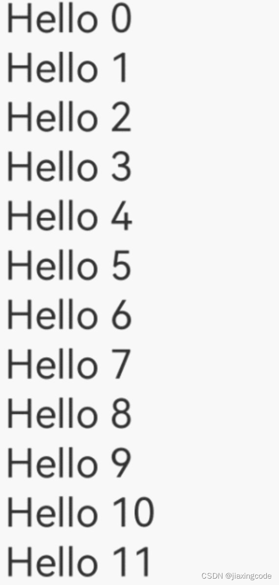
6.3 lazyforeach:数据懒加载
- lazyforeach从提供的数据源中按需迭代数据,并在每次迭代过程中创建相应的组件。当在滚动容器中使用了lazyforeach,框架会根据滚动容器可视区域按需创建组件,当组件滑出可视区域外时,框架会进行组件销毁回收以降低内存占用
- 在lazyforeach首次渲染时,会根据上述键值生成规则为数据源的每个数组项生成唯一键值,并创建相应的组件。
// basic implementation of idatasource to handle data listener
class basicdatasource implements idatasource {
private listeners: datachangelistener[] = [];
private origindataarray: string[] = [];
public totalcount(): number {
return 0;
}
public getdata(index: number): string {
return this.origindataarray[index];
}
// 该方法为框架侧调用,为lazyforeach组件向其数据源处添加listener监听
registerdatachangelistener(listener: datachangelistener): void {
if (this.listeners.indexof(listener) < 0) {
console.info('add listener');
this.listeners.push(listener);
}
}
// 该方法为框架侧调用,为对应的lazyforeach组件在数据源处去除listener监听
unregisterdatachangelistener(listener: datachangelistener): void {
const pos = this.listeners.indexof(listener);
if (pos >= 0) {
console.info('remove listener');
this.listeners.splice(pos, 1);
}
}
// 通知lazyforeach组件需要重载所有子组件
notifydatareload(): void {
this.listeners.foreach(listener => {
listener.ondatareloaded();
})
}
// 通知lazyforeach组件需要在index对应索引处添加子组件
notifydataadd(index: number): void {
this.listeners.foreach(listener => {
listener.ondataadd(index);
})
}
// 通知lazyforeach组件在index对应索引处数据有变化,需要重建该子组件
notifydatachange(index: number): void {
this.listeners.foreach(listener => {
listener.ondatachange(index);
})
}
// 通知lazyforeach组件需要在index对应索引处删除该子组件
notifydatadelete(index: number): void {
this.listeners.foreach(listener => {
listener.ondatadelete(index);
})
}
}
class mydatasource extends basicdatasource {
private dataarray: string[] = [];
public totalcount(): number {
return this.dataarray.length;
}
public getdata(index: number): string {
return this.dataarray[index];
}
public adddata(index: number, data: string): void {
this.dataarray.splice(index, 0, data);
this.notifydataadd(index);
}
public pushdata(data: string): void {
this.dataarray.push(data);
this.notifydataadd(this.dataarray.length - 1);
}
}
@entry
@component
struct mycomponent {
private data: mydatasource = new mydatasource();
abouttoappear() {
for (let i = 0; i <= 20; i++) {
this.data.pushdata(`hello ${i}`)
}
}
build() {
list({ space: 3 }) {
lazyforeach(this.data, (item: string) => {
listitem() {
row() {
text(item).fontsize(50)
.onappear(() => {
console.info("appear:" + item)
})
}.margin({ left: 10, right: 10 })
}
}, (item: string) => item)
}.cachedcount(5)
}
}
7 应用模型
7.1 uiability组件
- uiability组件是一种包含ui界面的应用组件,主要用于和用户交互。
- uiability组件是系统调度的基本单元,为应用提供绘制界面的窗口;一个uiability组件中可以通过多个页面来实现一个功能模块。每一个uiability组件实例,都对应于一个最近任务列表中的任务。
使用代码
为使应用能够正常使用uiability,需要在module.json5配置文件的abilities标签中声明uiability的名称、入口、标签等相关信息。
{
"module": {
// ...
"abilities": [
{
"name": "entryability", // uiability组件的名称
"srcentry": "./ets/entryability/entryability.ts", // uiability组件的代码路径
"description": "$string:entryability_desc", // uiability组件的描述信息
"icon": "$media:icon", // uiability组件的图标
"label": "$string:entryability_label", // uiability组件的标签
"startwindowicon": "$media:icon", // uiability组件启动页面图标资源文件的索引
"startwindowbackground": "$color:start_window_background", // uiability组件启动页面背景颜色资源文件的索引
// ...
}
]
}
}
生命周期
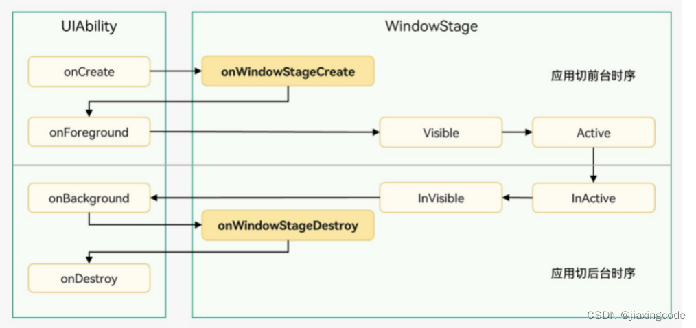
uiability实例创建完成之后,在进入foreground之前,系统会创建一个windowstage。windowstage创建完成后会进入onwindowstagecreate()回调,可以在该回调中设置ui界面加载、设置windowstage的事件订阅
启动模式
uiability的启动模式是指uiability实例在启动时的不同呈现状态。针对不同的业务场景,系统提供了三种启动模式:
8 开发工具
下载地址
deveco studio-harmonyos sdk下载和升级-华为开发者联盟
注意:开发工具默认从美国站点下载sdk,需要更改配置文件改为从中国站点下载sdk
window:
c:\users\username\appdata\roaming\huawei\devecostudio3.0\options,open country.region.xml ,modify countryregion name为“cn”
mac
/users/username/library/application support/huawei/devecostudio3.0/options,open country.region.xml ,modify countryregion name为“cn”
9 环境配置
hdc,nodejs,ohpm在初次安装deveco studio 3.1的时候会提示下载,记住安装路径
9.1 hdc
hdc对应安卓中的adb,调试的命令行工具
- 配置环境变量
export path=$path:/users/zjiaxind/library/huawei/sdk/hmscore/3.1.0/toolchains
export classpath
hdc_server_port=7035
launchctl setenv hdc_server_port $hdc_server_port
export hdc_server_port
9.2 node.js
ohpm依赖nodejs执行,javascript语言的服务器运行环境,javascript可以脱离浏览器直接运行
- 配置环境变量
export node_home=/users/zjiaxind/library/nodejshuawei16.19.1
export path=$node_home/bin:$path
9.3 ohpm
鸿蒙生态三方库的包管理工具,支持openharmony共享包的发布、安装和依赖管理
- 进入“ohpm/bin”目录,打开命令行工具,执行如下指令初始化ohpm。
windows环境下执行:init.bat
linux/macos环境下执行:./init
- 配置环境变量
export ohpm_home=/users/zjiaxind/library/huawei/ohpm
export path=$ohpm_home/bin:$path

发表评论