 我要评论
我要评论
文章目录
前言:
在现代软件开发中,用户界面的美观性和交互性是至关重要的。qt style sheets(qss)作为一种强大的样式定制工具,为开发者提供了类似于css的样式设置机制,使得界面设计更加灵活和多样化。通过qss,开发者可以轻松地为qt应用程序中的控件定义外观和行为,从而创建出既美观又具有良好用户体验的界面。本文将详细介绍qss的选择器、样式属性以及如何利用这些工具来定制各种控件的样式,最终通过一个登录界面的设计示例,展示qss在实际开发中的应用。
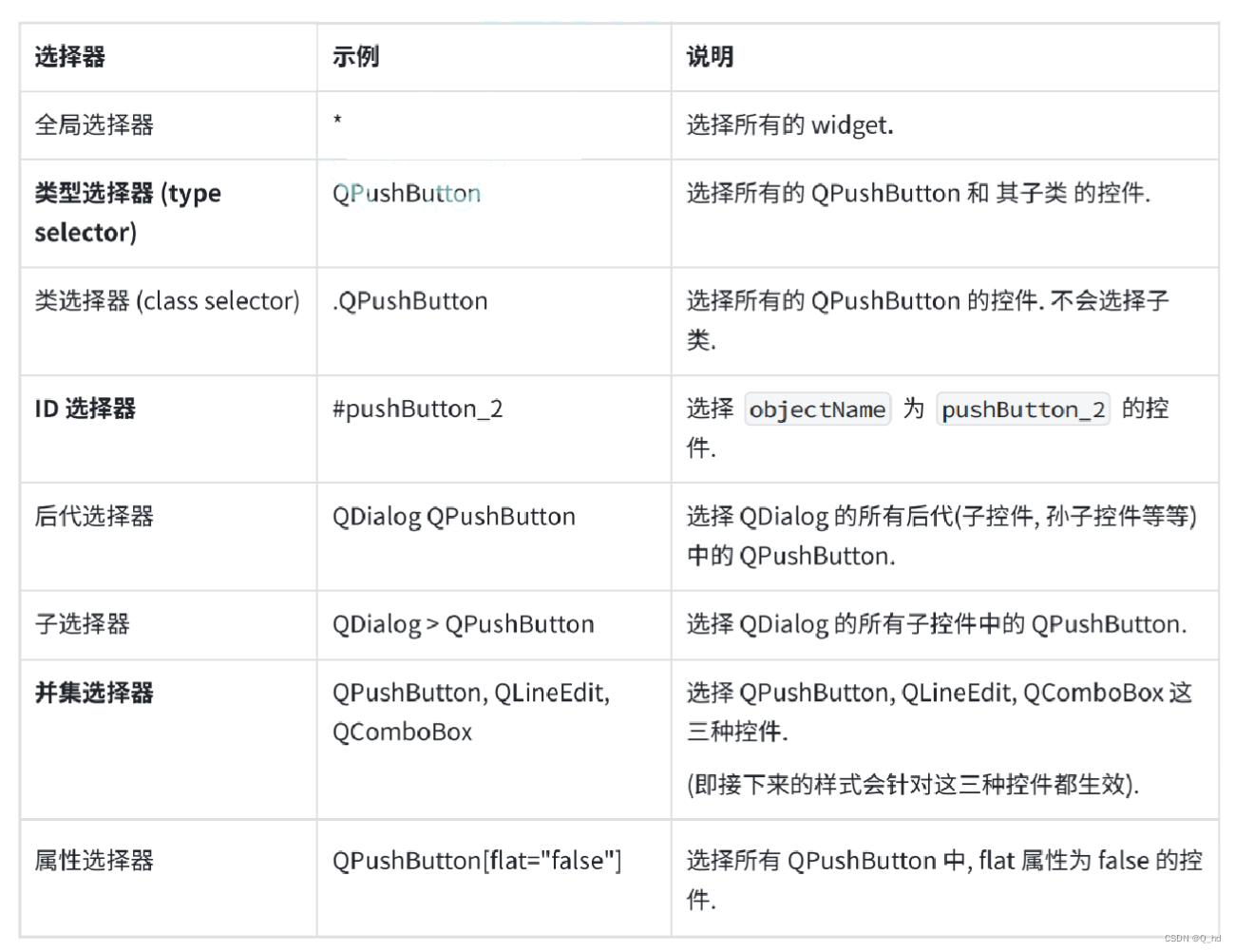
1. qss 选择器
qss 的选择器支持以下几种:
a.setstylesheet("qpushbutton { color : red; }");
这段代码中 qpushbutton 就是 类型选择器了,qpushbutton 也是 qwidget 的子类。
a.setstylesheet(".qwidget { color : red; }");
这段代码中 .qwidget 是 类选择器,不会选中子类。
在开发中,期望不同的控件的样式不同,此时就需要使用 id 选择器了,因为 id 是唯一的。
// main.cpp
#include "widget.h"

#include <qapplication>

int main(int argc, char *argv[])
{
    qapplication a(argc, argv);

    qstring style = "qpushbutton { color: red; }";
    style += "#pushbutton_2 { color: green; }";
    style += "#pushbutton_3 { color: blue; }";

    a.setstylesheet(style);

    widget w;
    w.show();
    return a.exec();
}
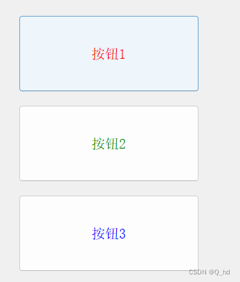
此时当类型选择器 和 id选择器 选中同一个控件的时候,并且设置的样式是冲突的,此时,id选择器的优先级更高。
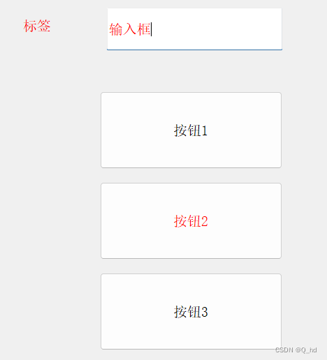
并集选择器:
qstring style = "#pushbutton_2, qlineedit, qlabel{ color: red; }";

a.setstylesheet(style);
2. 子控件选择器(sub-controls)
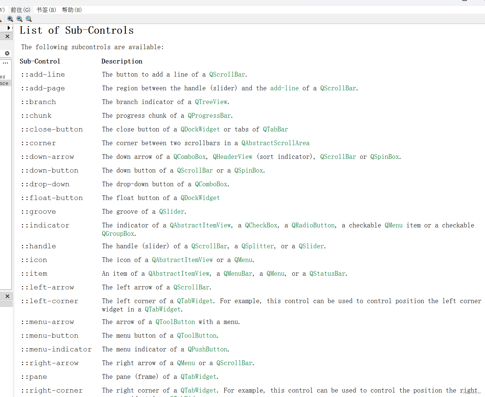
2.1. 示例:给 qcombobox 给下拉按钮加上图标
#include "widget.h"

#include <qapplication>

int main(int argc, char *argv[])
{
    qapplication a(argc, argv);

    qstring style = "qcombobox::down-arrow{ image: url(:/down.png)}";
    a.setstylesheet(style);

    widget w;
    w.show();
    return a.exec();
}
2.2. 示例:修改进度条颜色
qprogressbar::chunk {background-color: #ff0000;
3. 伪类选择器
前面介绍的选择器,都是选中“控件”,伪类选择器,选中的控件的“状态”,“符合一定条件”的控件。
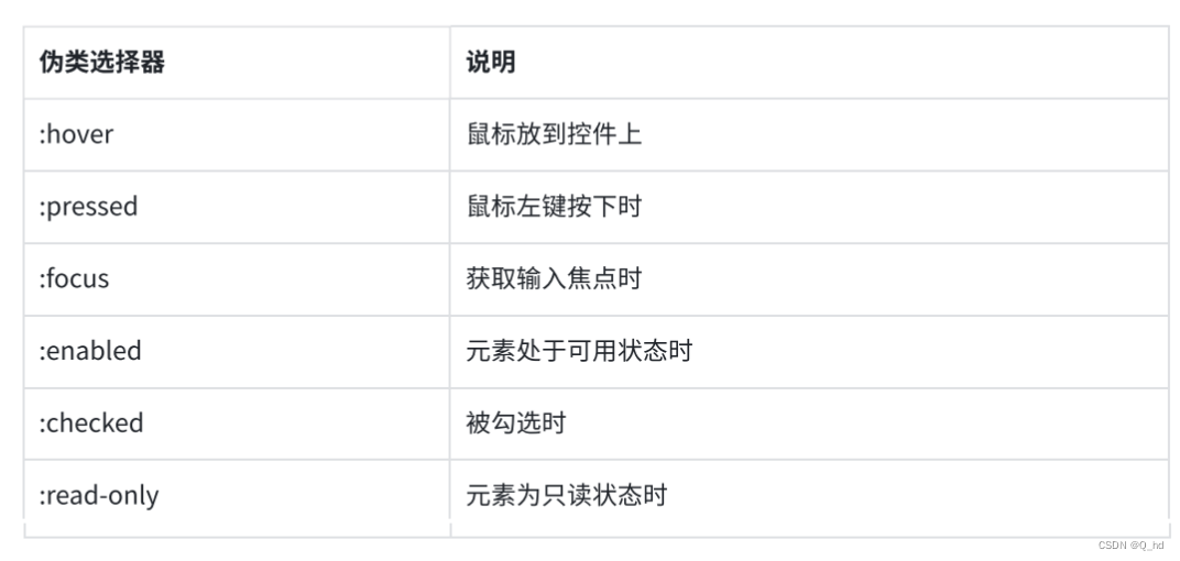
这些状态可以使用! 来取反. 比如 :!hover 就是鼠标离开控件时, :!pressed 就是鼠标松开时,
等等。
3.1. 代码示例: 设置按钮的伪类样式.
#include "widget.h"

#include <qapplication>

int main(int argc, char *argv[])
{
    qapplication a(argc, argv);

    qstring style = "qpushbutton { color: red; }";
    style += "qpushbutton:hover { color: green; }";
    style += "qpushbutton:pressed { color: blue; }";
    a.setstylesheet(style);

    widget w;
    w.show();
    return a.exec();
}

上述代码也可以使用事件的方式来实现.
3.2. 代码示例: 使用事件方式实现同样效果
- 创建
mypushbutton类, 继承自qpushbutton
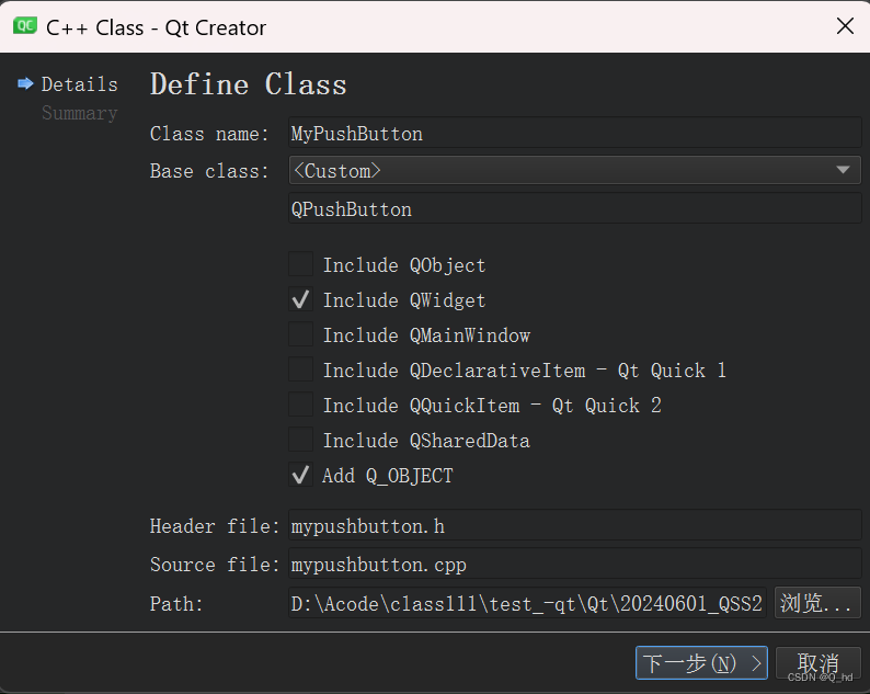
- 把生成代码中的构造函数改成带参数
qwidget*版本的构造函数. (否则无法和 qt designer 生成的代码适配).
// mypushbutton.h
#include <qwidget>
#include <qpushbutton>

class mypushbutton : public qpushbutton
{
    q_object
public:
    mypushbutton(qwidget* parent);
};
// mypushbutton.cpp
#include "mypushbutton.h"

mypushbutton::mypushbutton(qwidget* parent) : qpushbutton(parent)
{

}
- 在界面上创建按钮, 并提升为
mypushbutton类型
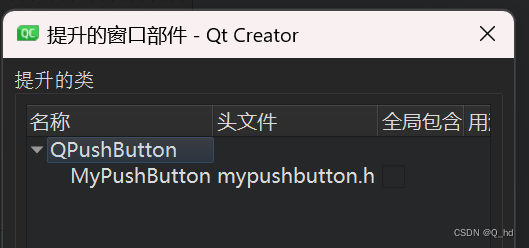
- 重写 mypushbutton 的四个事件处理函数
// mypushbutton.h
class mypushbutton : public qpushbutton
{
    q_object
public:
    mypushbutton(qwidget* parent);

    void mousepressevent(qmouseevent* e);
    void mousereleaseevent(qmouseevent* e);
    void enterevent(qevent* e);
    void leaveevent(qevent* e);

};
// mypushbutton.cpp
#include "mypushbutton.h"

mypushbutton::mypushbutton(qwidget* parent) : qpushbutton(parent)
{
    this->setstylesheet("qpushbutton { color: red; }"); // 初始化值设为红色
}

void mypushbutton::mousepressevent(qmouseevent *e)  // 鼠标按下时设为蓝色
{
    this->setstylesheet("qpushbutton { color: blue; }");
}

void mypushbutton::mousereleaseevent(qmouseevent *e) // 鼠标放开时还原为绿色
{
    this->setstylesheet("qpushbutton { color: green; }");
}

void mypushbutton::enterevent(qevent *e) // 鼠标进入时设为绿色
{
    this->setstylesheet("qpushbutton { color: green; }");
}

void mypushbutton::leaveevent(qevent *e) // 鼠标离开时还原为蓝色
{
    this->setstylesheet("qpushbutton {color: red; }");
}
4. 样式属性
qss 中的样式属性非常多,不需要都记住,核心原则还是用到了就区查,大部分的属性和css是非常相似的。
box model 盒子模型, 来自于 css
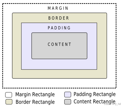
qt 中每个 widget 都是一个矩形
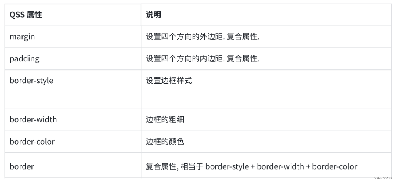
复合属性,比方说,margin 可以拆分成 4 个属性: margin-left、margin-right、margin-top、margin-bottom
margin: 10px; 四个方向都是 10px 的外边距
margin: 10px 20px; 上下是 10px, 左右是 20px
margin: 10px 20px 30px 40px; 上右下左(顺时针)
同样, padding 也是可以拆成 4 个属性:padding-left、padding-right、padding-top、padding-bottom
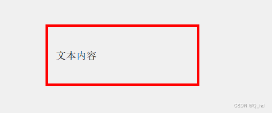
4.1. 代码示例: 设置边框和内边距
int main(int argc, char *argv[])
{
    qapplication a(argc, argv);

    qstring style = "qlabel { border: 5px solid red; padding-left: 10px;}";
    a.setstylesheet(style);

    widget w;
    w.show();
    return a.exec();
}
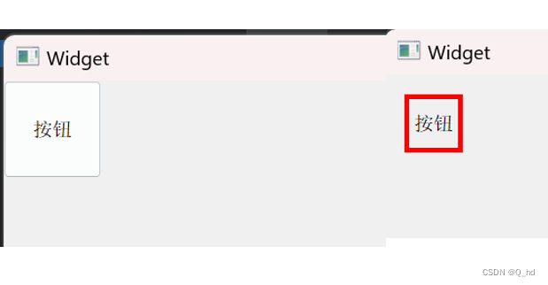
4.2. 代码示例: 设置外边距
#include "widget.h"
#include "ui_widget.h"

#include <qpushbutton>

widget::widget(qwidget *parent)
    : qwidget(parent)
    , ui(new ui::widget)
{
    ui->setupui(this);

    qpushbutton* button = new qpushbutton(this);
    button->setgeometry(0, 0, 100, 100);
    button->settext("按钮");
    button->setstylesheet("qpushbutton { border: 5px solid red; margin: 20px;}");

}

widget::~widget()
{
    delete ui;
}
5. 控件样式示例
5.1. 按钮
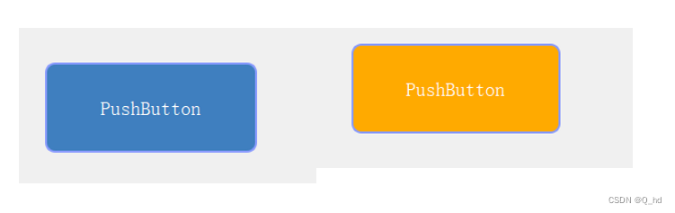
代码示例: 自定义按钮
qpushbutton {
	font-size: 20px;  /*设置字体大小*/
	border: 2px solid rgb(138, 156, 255); /*设置边框*/
	border-radius: 10px;  /*设置圆角*/
	background-color: rgb(63, 127, 191); /*设置背景色*/
	color: rgb(255, 255, 255); /*设置字体颜色*/
}

qpushbutton:pressed {
	background-color: rgb(255, 170, 0);
}
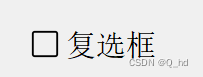
5.2. 复选框
代码示例:自定义复选框
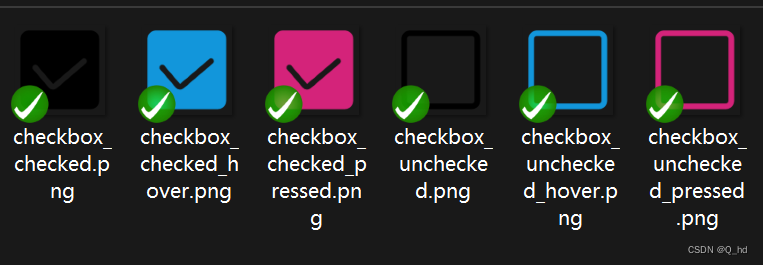
qcheckbox {
	font-size: 30px;
}

qcheckbox::indicator { /*::indicator 子控件选择器,选中checkbox中的勾选的部分*/
	width: 30px;  /*设置子控件宽度,对于普通控件无效(普通控件使用geometry方式设定尺寸)*/
	height: 30px; /*设置子控件高度*/
}

qcheckbox::indicator:unchecked { /*:unchecked 伪类选择器,选中checkbox 未被选中的状态*/
	image:url(:/checkbox_unchecked.png);
}

qcheckbox::indicator:unchecked:hover { /*:hover 伪类选择器,选中鼠标移动上去的状态*/
	image:url(:/checkbox_unchecked_hover.png);
}

qcheckbox::indicator:unchecked:pressed { /*:pressed 伪类选择器,选中鼠标按下的状态*/
	image:url(:/checkbox_unchecked_pressed.png)
}

qcheckbox::indicator:checked { /*:checked 伪类选择器,选中checkbox被选中的状态*/
	image:url(:/checkbox_checked.png);
}

qcheckbox::indicator:checked:hover {
	image:url(:/checkbox_checked_hover.png);
}

qcheckbox::indicator:checked:pressed {
	image:url(:/checkbox_checked_pressed.png)
}
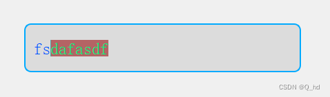
5.3.输入框
qlineedit {
	border-width: 2px;
	border-color: rgb(0, 170, 255);
	border-style: solid;
	border-radius: 10px;
	padding-left: 10px;
	color: rgb(0, 85, 255);
	font-size: 24px;
	background-color:rgb(220, 220, 220);
	selection-color: rgb(0, 255, 127);
	selection-background-color: rgb(180, 100, 100);
}

qlineedit:hover {
    border-color:rgb(0, 85, 255);
}
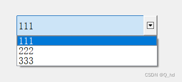
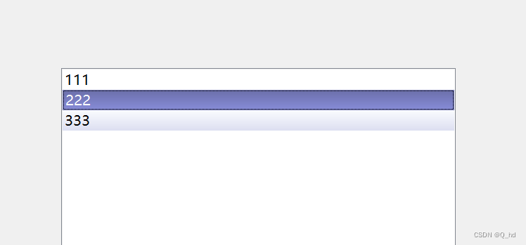
5.4. 列表
qlineargradient 设置渐变色(线性渐变),此处要填写6个参数。
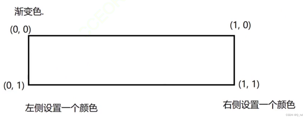
x1: 起点的横坐标
y1: 起点的纵坐标
这里的取值,是非常有限的,要么是0,要么是1
x2: 终点的横坐标
y2: 终点的纵坐标
从左到右的渐变: x1: 0、y1: 0、x2: 1、y2: 0
从上到下的渐变: x1: 0、y1: 0、x2: 0、y2: 1
对角线方向从左上到右下的渐变: x1: 0、y1: 0、x2: 1、y2: 1
qlistview::item:hover {
 background: qlineargradient(x1: 0, y1: 0, x2: 0, y2: 1,
 stop: 0 #fafbfe, stop: 1 #dcdef1);
}
qlistview::item:selected {
 border: 1px solid #6a6ea9;
 background: qlineargradient(x1: 0, y1: 0, x2: 0, y2: 1,
 stop: 0 #6a6ea9, stop: 1 #888dd9);
}
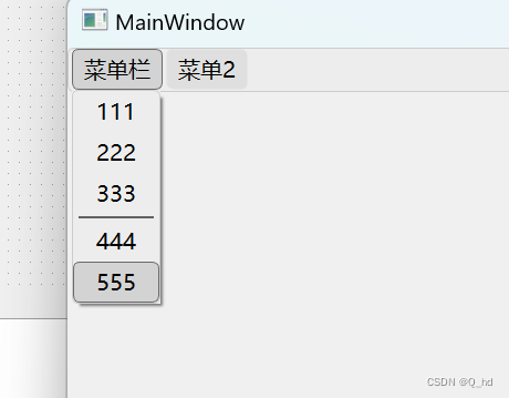
5.5 菜单栏
qmenubar {
    background-color: #ededed; /* 背景颜色 */
    border: 1px solid #cccccc; /* 边框 */
    border-radius: 6px; /* 设置菜单栏圆角 */
	spacing: 3px; /*菜单项的间隔*/
}

qmenubar::item {
    background-color: #dfdfdf; /* 每个菜单项的背景颜色 */
    padding: 4px 10px; /* 调整内边距 */
    margin: 0px;
    border-radius: 6px; /* 设置菜单项圆角 */
    border: 1px solid transparent; /* 清除边框,还可以保证文字不会错位 */
}


qmenubar::item:selected {
	border: 1px solid #6a6a6a; /* 边框 */
    background-color: #d3d3d3; /* 选中菜单项的背景颜色 */
}

qmenu {
    background-color: #ededed; /* 下拉菜单背景颜色 */
    border: 1px solid #cccccc; /* 下拉菜单边框 */
	border-radius: 6px; /* 设置下拉菜单栏圆角 */
}

qmenu::item {
    background-color: transparent; /* 清除下拉菜单项的背景色 */
    border: 1px solid transparent; /* 清除边框,还可以保证文字不会错位 */
    padding: 4px 20px; /* 调整内边距 */
	border-radius: 6px; /* 设置下拉菜单项圆角 */
}

qmenu::item:selected {
    background-color: #d3d3d3; /* 选中下拉菜单项的背景颜色 */
	border: 1px solid #6a6a6a; /* 边框 */
    border-radius: 6px; /* 设置菜单项圆角 */
}

qmenu::separator {
	height: 2px;
	background-color: rgb(98, 98, 98);
	margin:2 5px;
}
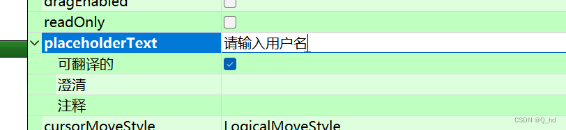
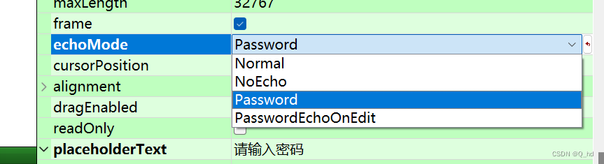
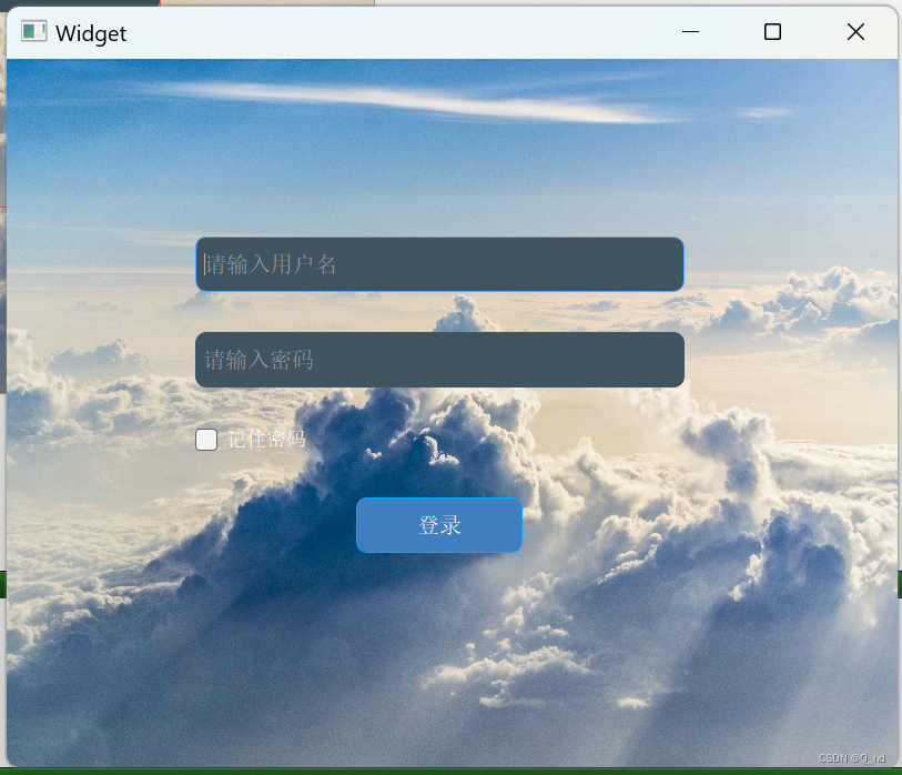
6. 登录界面
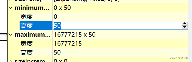
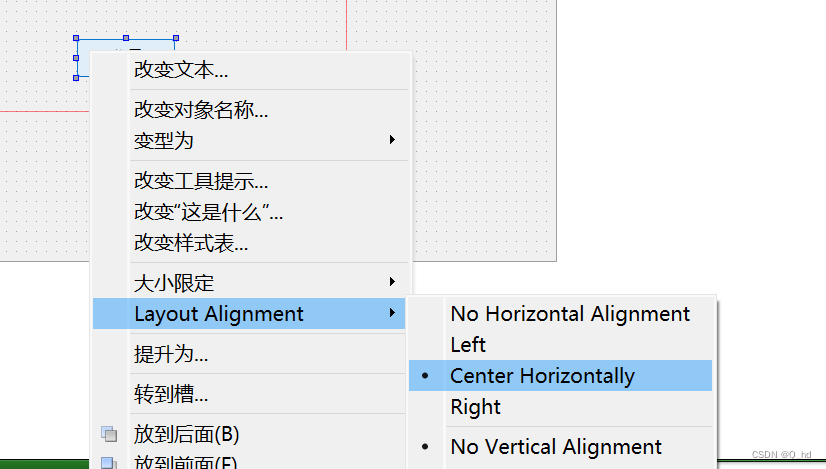
基于上述学习过的 qss 样式,制作一个美化板本的登录界面,
调整输入框高度
居中对齐
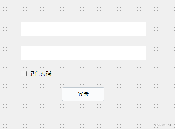
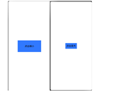
让一个窗口变的好看,其中最明显的一点就是设置背景。
直观想法,是直接给 qwidget 顶层窗口设置背景图,但是 qt 中存在限制,直接给顶层窗口设置背景会失效。(原因暂时不可考)
可以给上述控件外头套上套一个和窗口一样大小的 qframe 控件。也是 qwidget 的一个子类。
qt 中设置背景图,除了background-image 之外,还有border-image 属性。
background-image :固定大小。
border-image:通过这种方式设置的背景,会自动跟随控件的大小变化。
qframe {
	border-image: url(:/background.jpg);
}

qlineedit {
	border: 1px solid transparent;
	color: rgb(221, 221, 221);
 	background-color: #405361;
 	padding: 0 5px;
 	font-size: 20px;
 	border-style: none;
 	border-radius: 10px;
}

qlineedit:focus {
    border: 1px solid rgb(85, 170, 255); /* 获取焦点时的边框颜色 */
}

qcheckbox {
	color: white;
	font-size: 18px
}

qpushbutton {
	font-size: 20px;  /*设置字体大小*/
	border: 1px solid rgb(0, 170, 255); /*设置边框*/
	border-radius: 10px;  /*设置圆角*/
	background-color: rgb(63, 127, 191); /*设置背景色*/
	color: rgb(255, 255, 255); /*设置字体颜色*/
}

qpushbutton:pressed {
	background-color:rgb(0, 121, 181);
}
总结:
- qss 是什么,类似于 css 这样的一种设置样式的机制,
- qss 基本用法
- 选择器的使用
- 子控件选择器
- 伪类选择器
- 盒子模型
- 代码例子,qss 支持的样式属性值是很多的
通过本文的学习,我们了解到qss是一种类似于css的样式设置机制,它允许开发者通过选择器来指定控件的样式,并使用丰富的样式属性来定制界面。本文首先介绍了qss的基本选择器,包括类型选择器、类选择器、id选择器和并集选择器,然后详细探讨了子控件选择器和伪类选择器的使用,这些选择器能够帮助开发者对控件的特定部分或状态进行精确的样式设置。接着,文章通过多个代码示例展示了如何使用qss来设置边框、内边距、外边距等样式属性,以及如何为按钮、复选框、输入框、列表和菜单栏等常见控件定制样式。最后,通过一个登录界面的设计示例,我们看到了qss在实际开发中的综合应用,如何通过背景设置、控件样式定制以及布局调整来创建一个既美观又实用的用户界面。通过本文的学习,开发者可以更加熟练地运用qss来提升应用程序的界面设计,增强用户体验。


发表评论