 我要评论
我要评论前言
在vue 3项目中,使用element plus构建弹出框是一项常见的任务。为了简化这个过程,我们可以封装一个公共组件,使弹出框的调用变得简单而高效。本文将介绍如何通过vue 3和element plus,使用一个自定义的弹出框组件实现这一目标。
1. 弹出框组件封装
首先,我们封装了一个通用的弹出框组件,具体实现位于 util.js 文件中。通过 initinstance 方法,我们可以动态创建一个弹出框实例,并将其挂载到指定的容器上。以下是简要代码:
// util.js

import { h, render } from 'vue';

export function initinstance(component, container, option) {
    const vnode = h(component, option);
    render(vnode, container);
    document.body.appendchild(container.firstelementchild);
    return vnode.component;
}

export function getcontainer() {
    return document.createelement('div');
}
2. 自定义弹出框配置
接下来,我们定义了一个名为 portpop 的自定义弹出框配置。这个配置使用了前面封装的通用方法,同时为弹出框提供了一些特定的配置。以下是简要代码:
// common.js

import { initinstance, getcontainer } from "./util";
import portpop from "../components/portpop";

const instancemap = new map();

export const portpop = (option, call) => {
    const container = getcontainer();
    let opt = {
        ...option,
        oncomfrim: (data) => {
            call(data);
        },
        onvanish: () => {
            render(null, container);
            instancemap.delete(vm);
        },
    };
    const component = initinstance(portpop, container, opt);
    const vm = component.proxy;
    component.exposed.opendialog();
    instancemap.set(vm, { option: opt });
};
3. 弹出框组件实现
首先,我们要先封装一下el-dialog组件
<template>
  <el-dialog
    :model-value="modelvalue"
    :title="title"
    :width="width"
    :modal="modal"
    draggable
    destroy-on-close
    :close-on-click-modal="false"
    append-to-body
    :before-close="beforeclose"
    @close="dialogcolse"
    @closed="dialogcolsed"
  >
    <slot />
    <template #footer>
      <span class="dialog-footer">
        <slot name="footer" />
      </span>
    </template>
  </el-dialog>
</template>
<script setup name="dialog">
import { eldialog } from "element-plus";
const props = defineprops({
  modelvalue: {
    type: [boolean],
    default: false,
  },
  title: {
    type: [string],
    default: "",
  },
  width: {
    type: [string],
    default: "",
  },
  modal: {
    type: [boolean],
    default: false,
  },
  beforeclose: [function],
});
const emits = defineemits(["update:modelvalue", "onclosed", "closed"]);
function dialogcolse() {
  emits("update:modelvalue", false);
}
function dialogcolsed() {
  emits("onclosed", false);
  emits("closed", false);
}
</script>

<style lang="scss">
</style>
最后,我们实现了具体的弹出框组件 portpop,这个组件使用了 element plus 的 dialog 组件,并在其中嵌套了一些其他组件,以实现特定的功能。以下是简要代码:
<template>
  <div>
    <dialog :title="props.title" v-model="dialog" width="920px">
        <!-- ... 弹出框内容 ... -->
        <template #footer>
            <div class="dialog-footer">
              <el-button type="primary" size="small" @click="confrim">
                确定
              </el-button>
              <el-button @click="dialog = false" size="small">取消</el-button>
            </div>
          </template>
    </dialog>
  </div>
</template>

<script setup lang="tsx">
import {
  nexttick,
  ref, useattrs,
} from 'vue'
import dialog from '@/components/dialog'
import {
  elinput,
  elbutton,
} from 'element-plus'

const props = defineprops({
  title: {
    type: [string],
    default: '',
  },
  type: {
    type: [string],
    default: '',
  },
})

const emits = defineemits(['comfrim'])
const attrs = useattrs()
const dialog = ref(false)
function opendialog() {
  dialog.value = true
}
const confrim = async () => {
  emits('comfrim', "传递给父组件的数据")
  nexttick(() => {
    dialog.value = false
  })
}
defineexpose({ opendialog })

</script>
<style lang="scss">
</style>
4. 使用自定义弹出框组件
最终,我们可以在需要调用弹出框的地方,简单地执行portpop方法,并传递相应的配置和回调函数。这样,弹出框就会显示出来,用户可以与之交互。
// 在需要的地方调用自定义弹出框
import { portpop } from "./customdialog";
// 示例调用
portpop({ title: '自定义弹出框', defaultkeyword: '关键字' }, (data) => {
// 处理弹出框确认后的数据
console.log('用户选择的数据:', data);
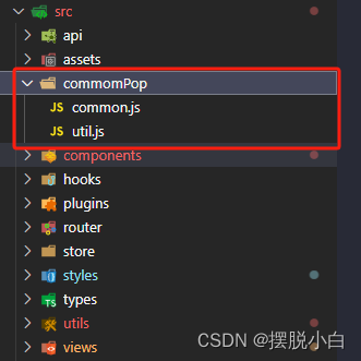
});文件结构示例
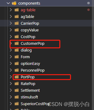
组定义组件文件示例
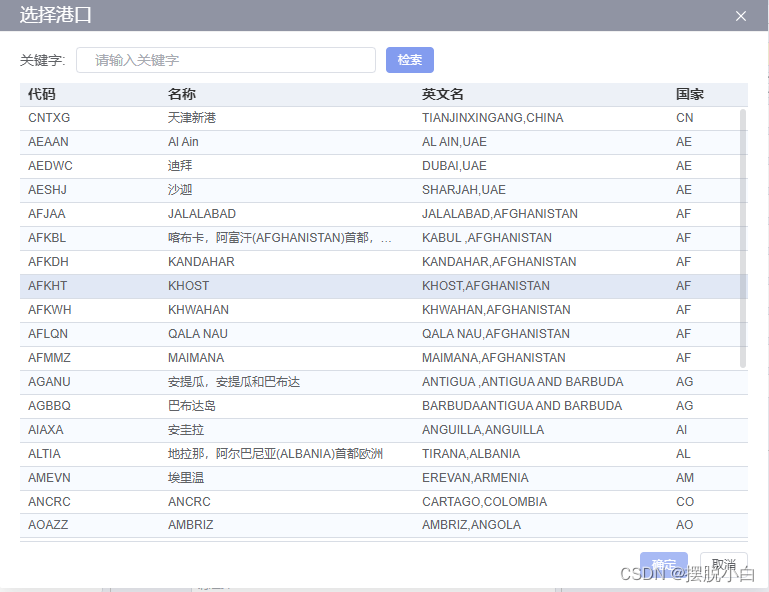
效果:
总结
到此这篇关于如何通过vue3+element plus自定义弹出框组件的文章就介绍到这了,更多相关vue3 elementplus自定义弹出框组件内容请搜索代码网以前的文章或继续浏览下面的相关文章希望大家以后多多支持代码网!


发表评论