 我要评论
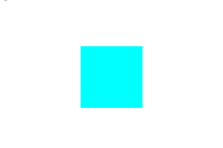
我要评论1. grow-shadow
鼠标移入盒子放大并出现底部阴影
效果:

代码
<div class="box"></div>
.box {
width: 200px;
height: 200px;
background-color: aqua;
-webkit-transform: perspective(1px) translatez(0);
transform: perspective(1px) translatez(0);
box-shadow: 0 0 1px rgba(0, 0, 0, 0);
-webkit-transition-duration: 0.3s;
transition-duration: 0.3s;
-webkit-transition-property: box-shadow, transform;
transition-property: box-shadow, transform;
}
.box:hover,
.box:focus,
.box:active {
box-shadow: 0 10px 10px -10px rgba(0, 0, 0, 0.5);
-webkit-transform: scale(1.1);
transform: scale(1.1);
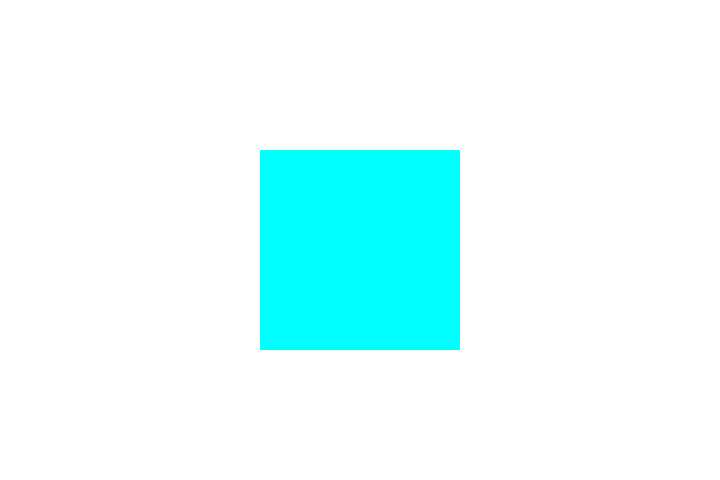
}2. move-shadow
鼠标移入盒子,盒子向上移动并出现底部阴影
效果:
代码
<div class="box"></div>
.box {
  width: 200px;
  height: 200px;
  background: aqua;
  -webkit-transform: perspective(1px) translatez(0);
  transform: perspective(1px) translatez(0);
  box-shadow: 0 0 1px rgba(0, 0, 0, 0);
  position: relative;
  -webkit-transition-duration: 0.3s;
  transition-duration: 0.3s;
  -webkit-transition-property: transform;
  transition-property: transform;
  &::before {
    pointer-events: none;
    position: absolute;
    z-index: -1;
    content: "";
    top: 100%;
    left: 5%;
    height: 10px;
    width: 90%;
    opacity: 0;
    background: -webkit-radial-gradient(
      center,
      ellipse,
      rgba(0, 0, 0, 0.35) 0%,
      rgba(0, 0, 0, 0) 80%
    );
    background: radial-gradient(
      ellipse at center,
      rgba(0, 0, 0, 0.35) 0%,
      rgba(0, 0, 0, 0) 80%
    );
    /* w3c */
    -webkit-transition-duration: 0.3s;
    transition-duration: 0.3s;
    -webkit-transition-property: transform, opacity;
    transition-property: transform, opacity;
  }
}
.box:hover,
.box:focus,
.box:active {
  -webkit-transform: translatey(-5px);
  transform: translatey(-5px);
  &::before {
    opacity: 1;
    -webkit-transform: translatey(5px);
    transform: translatey(5px);
  }
}
3. curl-bottom-right
鼠标移入盒子,盒子右下角卷起
效果:
代码
<div class="box"></div>
.box {
  width: 200px;
  height: 200px;
  background: aqua;
  -webkit-transform: perspective(1px) translatez(0);
  transform: perspective(1px) translatez(0);
  box-shadow: 0 0 1px rgba(0, 0, 0, 0);
  position: relative;
  &::before {
    pointer-events: none;
    position: absolute;
    content: "";
    height: 0;
    width: 0;
    bottom: 0;
    right: 0;
    background: white;
    /* ie9 */
    background: linear-gradient(
      315deg,
      white 45%,
      #aaa 50%,
      #ccc 56%,
      white 80%
    );
    box-shadow: -1px -1px 1px rgba(0, 0, 0, 0.4);
    -webkit-transition-duration: 0.3s;
    transition-duration: 0.3s;
    -webkit-transition-property: width, height;
    transition-property: width, height;
  }
}
.box:hover:before,
.box:focus:before,
.box:active:before {
  width: 25%;
  height: 25%;
}
到此这篇关于css鼠标悬浮动画-hover属性的文章就介绍到这了,更多相关css鼠标悬浮动画内容请搜索3w代码以前的文章或继续浏览下面的相关文章,希望大家以后多多支持3w代码!


发表评论