 我要评论
我要评论一、flex-direction: (元素排列方向)
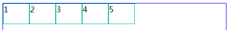
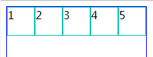
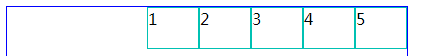
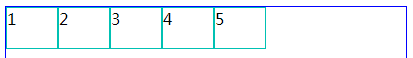
※ flex-direction:row (横向从左到右排列==左对齐)
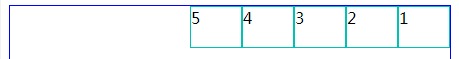
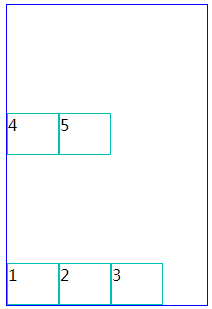
※ flex-direction:row-reverse (与row 相反)
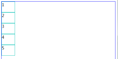
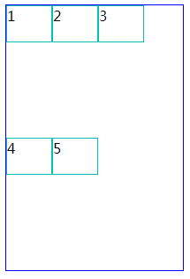
※ flex-direction:column (从上往下排列==顶对齐)
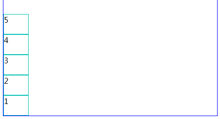
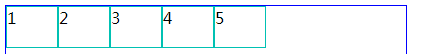
※ flex-direction:column-reverse (与column 相反)
二、flex-wrap: (内容一行容不下的时候才有效)
※flex-wrap:nowrap (超出不换行,很奇怪里面的宽度会变成100%)
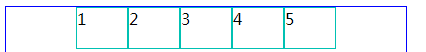
※ flex-wrap:wrap (超出按父级的高度平分)
※flex-wrap:wrap-reverse(与wrap 相反)
三、justify-content: (水平对齐方式)
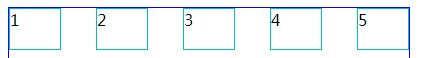
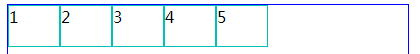
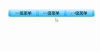
※flex-start (水平左对齐)
※ justify-content:flex-end; (水平右对齐)
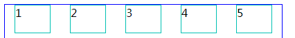
※ justify-content:center;(水平居中对齐)
※justify-content:space-between; (两端对齐)
※justify-content:space-around; (两端间距对其)
四、align-items: (垂直对齐方式)
※ align-items:stretch; (默认)
※align-items:flex-start; (上对齐,和默认差不多)
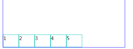
※align-items:flex-end; (下对齐)
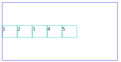
※ align-items:center;(居中对齐)
=※align-items:baseline; (基线对齐)
如弹性盒子元素的行内轴与侧轴(纵轴)为同一条,则该值与'flex-start'等效。其它情况下,该值将参与基线对齐。
flex容器属性
/*1.方向*/
        /*默认方向(row正方向)*/
        /* flex-direction: row; */
        /*row反方向*/
        /* flex-direction: row-reverse; */
        /*columnz正方向*/
        /*flex-direction: column;*/
        /*columnz反方向*/
        /*flex-direction: column-reverse;*/

        /*2.换行*/
        /*flex-wrap: wrap;*/
        /*flex-wrap: wrap-reverse;*/

        /*3.direction+wrep组合*/
        /*flex-flow: row wrap-reverse;*/

        /*4.主轴对齐*/
        /*起点左对齐*/
        /*justify-content: flex-start;*/
        /*起点右对齐*/
        /*justify-content: flex-end;*/
        /*起点居中对齐*/
        /*justify-content: center;*/
        /*间隔左右分散*/
        /*justify-content: space-between;*/
        /*间隔内边距相等*/
        /*justify-content: space-around;*/
        /*间隔相等*/
        /*justify-content: space-evenly;*/

        /*5.交叉轴对齐 当flex-direction: row;修饰y轴, 当flex-direction: column;修饰x轴*/
        /*默认交叉轴对齐*/
        /*align-items: stretch;*/
        /*默认交叉轴居中*/
        /*align-items: center;*/
        /*默认交叉轴上对齐*/
        /*align-items: flex-start;*/
        /*默认交叉轴下对齐*/
        /*align-items: flex-end;*/
        /*默认交叉轴内容对齐*/
        /*align-items: baseline;*/

        /*6.多行交叉轴对齐*/
        /*align-content: stretch;*/
        /*多行交叉轴居中对齐*/
        /*align-content: center;*/
        /*多行交叉轴上对齐*/
        /*align-content: flex-start;*/
        /*多行交叉轴下对齐*/
        /*align-content: flex-end;*/
        /*多行交叉轴内边距相等*/
        /*align-content: space-around;*/
        /*多行交叉轴间隔左右分散*/
        /*align-content: space-between;*/
        /*多行交叉轴间隔相等*/
        /*align-content: space-evenly;*/
flex项目属性
/*1.控制项目次序*/
        /*order: 2;*/
        /*2.按比例扩大空间,数越大空间越大,0值不扩大*/
        /*flex-grow: 2;*/
        /*3.按比例缩小空间,数越大空间越小,0值不压缩*/
        /*flex-shrink: 2;*/
        /*4.需要flex-direction配合使用,row=宽 column=高,并且优先级高于width hight, auto值 让位优先级*/
        /*flex-basis: 600px;*/
        /*5.flex=grow+shrink+basis*/
        /*grow =1 && shrink = 1 && basis = auto*/
        /*flex: auto;*/
        /*grow =0 && shrink = 1 && basis = auto*/
        /*flex: initial;*/
         /*grow =0 && shrink = 0 && basis = auto*/
        /*flex: none;*/
        /*6.align-self覆盖容器的align-items*/
        /*align-self: flex-start;*/
到此这篇关于css3 flex实现div内容水平垂直居中的几种方法的文章就介绍到这了,更多相关css3div水平垂直居中内容请搜索代码网以前的文章或继续浏览下面的相关文章,希望大家以后多多支持代码网!


发表评论