 我要评论
我要评论用css3将input框写出类似google登录页面的动画效果
效果一
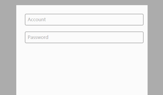
代码如下
css
body{
    background-color:#acacac;
  }
  .form-container{
    display: block;
    position: relative;
    width: 400px;
    height: 400px;
    background: #fff;
    margin: 50px auto;
    padding: 30px;
  }

  input{
    display: block;
    position: relative;
    background: none;
    border: 2px solid #acacac;
    border-radius:5px;
    width: 100%;
    font-weight: bold;
    padding-left:10px;
    font-size: 16px;
    height:35px;
    z-index: 1;
  }

  label{
    display: inline-block;
    position: relative;
    top: -32px;
    left: 10px;
    color: #acacac;
    font-size: 16px;
    z-index: 2;
    transition: all 0.2s ease-out;
  }

  input:focus, input:valid{
    outline: none;
    border: 2px solid #00aced;
  }

  input:focus + label, input:valid + label{
    top: -50px;
    font-size: 16px;
    color: #00aced;
    background-color:#fff;
  }
html
<div class="main">
    <div class="form-container">
      <input type="text" name="input1" required>
      <label for="input1">account</label>

      <input type="text" name="input2" required>
      <label for="input2">password</label>
    </div>
  </div>
效果二
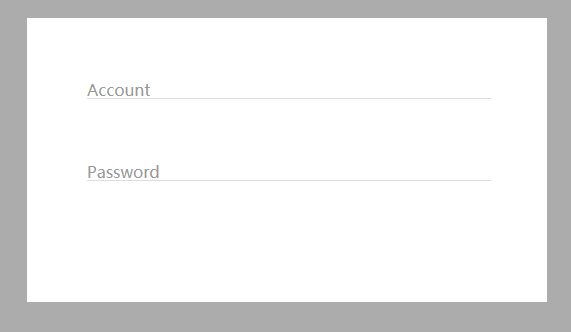
代码如下:
css
body{
    background-color:#acacac;
  }
  .form-container{
    display: block;
    position: relative;
    width: 400px;
    background: #fff;
    margin: 50px auto;
    padding: 60px;
  }

  input{
    display: block;
    position: relative;
    background: none;
    border: none;
    border-bottom: 1px solid #ddd;
    width: 100%;
    font-weight: bold;
    font-size: 16px;
    z-index: 2;
  }

  label{
    display: block;
    position: relative;
    top: -20px;
    left: 0px;
    color: #999;
    font-size: 16px;
    z-index: 1;
    transition: all 0.3s ease-out;
    margin-bottom:40px;
  }

  input:focus, input:valid{
    outline: none;
    border-bottom: 1px solid #00aced;
  }

  input:focus + label, input:valid + label{
    top: -50px;
    font-size: 16px;
    color: #00aced;
    background-color:#fff;
  }
html
<div class="main">
    <div class="form-container">
      <input type="text" name="input1" required>
      <label for="input1">account</label>
      <input type="text" name="input2" required>
      <label for="input2">password</label>
    </div>
  </div>
总结
到此这篇关于css3 input框的实现代码类似google登录的动画效果的文章就介绍到这了,更多相关css3 input框内容请搜索代码网以前的文章或继续浏览下面的相关文章,希望大家以后多多支持代码网!


发表评论